 |
At the Bay's King Street display window
[Photo by KPA]
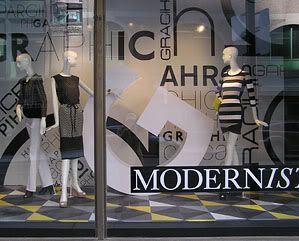
The Bay department store has removed its Christmas window displays, which entertained many a child (and me too). There is now a display based around a concept it calls "Modernist" in its main windows (about six of them) on Yonge Street, with echoes of Mondrian(1), Man Ray(2), modernist graphic design(3) and typography(4).
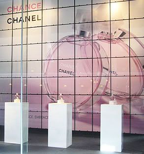
A single window on the side street (King Street) has the above Chanel perfume poster taking up a whole display wall. It is unrelated to the main "Modernist" theme, although it doesn't detract from it at all. It is more an advertisement for the new Chance perfume. Or an homage to spring.
There is still a delicate drama in the poster above. The rigid grid lines seem to be holding back the giant round, rolling perfume bottles. The light pink color of the bottles suggests that Chance is a soft and feminine perfume. Yet the barbed wire in the poster puts an "edge" to it. The real perfume is neither feminine (unfortunately) nor edgy but rather mild and soapy, and is unworthy of the Chanel label. But edginess and insipidity seem to be the style of our postmodern era. People scorn the strength of femininity.
Finally, there are three actual bottles neatly placed and evenly spaced on simple white elongated boxes standing on a shiny dark surface. A muted pink light, bouncing off the background image, is reflected on the dark base.
The Bay has perfected the art of window display, using a myriad of ideas and techniques to get out of the "mannequins wearing clothing from the store's collections" box. Of course, there are still mannequins wearing store clothing, but as the modernist theme shows, they can be part of a bigger, artistic theme.
 |
[Photo by KPA]
-------------------------------------------------------
1. Piet Mondrian (Gallery of paintings)
2. - Man Ray, Les mystères du château de Dé (Video)
- Man Ray, Résurrection des Mannequins (Series of photographs in a
video slide show)
3. The history of visual communication (Web source)4. Modern Typography (Wikipedia)
*"...Man Ray embraced surrealism and dadaism, creeds that emphasized chance effects, disjunction, and surprise."
Man Ray: Masters of Photography. Aperture (June 15, 2005)