 |
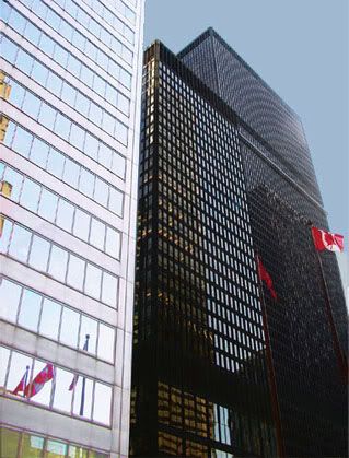
- Building on the right: Mies Van der Rohe's TD Centre
(a single building from the complex)
[Photo by KPA]
I. M. Pei's 1973 Canadian Imperial Bank of Commerce building (left in the above photo) stands next to Mies Van der Rohe's Toronto Dominion Centre complex (only one of these buildings is visible in the above photo). Here is a comprehensive description of the TD complex, including photographs, and here is information on Pei's CIBC building.
Van der Rohe's building above is part of a carefully designed complex of buildings that project up into the air, and expand outwards on the ground. The Pie building is a single highrise, although it is part of Toronto's downtown skyscrapers.
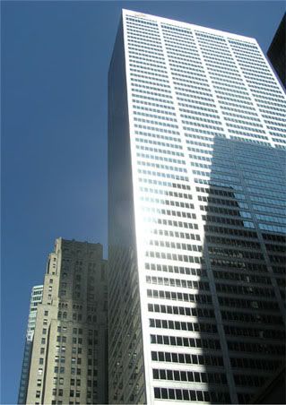 |
architects Darling and Pearson /York and Sawyer
- Building at the front: I. M. Pei's 1979 CIBC building
[Photo by KPA]
The above image is Pei's 1973 CIBC building next to the original 1931 CIBC skyscraper, which was built by Canadian architects Darling and Pearson with the American York and Sawyer acting as consulting architects.
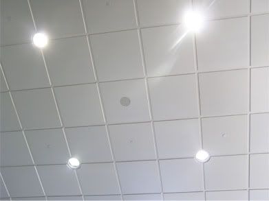
Below is the ceiling inside the Pei bank building with its banal structure and built-in ceiling lights. And below that is the ceiling of the original 1931 CIBC structure with turquoise and gold moldings which were influenced by the Baths of Caracalla in Rome ( I discuss this further here), and one of many chandeliers hanging from an elaborate medallion.
 |
[Photo by KPA]
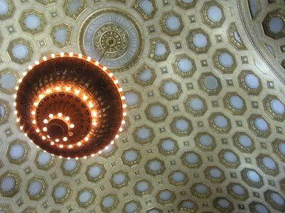 |
CIBC ceiling and chandelier
[Photo by KPA]
My point is that Pei is an inferior architect. He seems to be able to convince people of his buildings' importance through some architectural concept such as minimalism, and overbearing size. Minimalism can also be the philosophy behind bathroom tiles, and that is what the ceiling in Pei's CIBC building looks like. The exterior doesn't look much better. The glass in the building's windows reflect its surroundings (whether it is the sky or the looming skyscrapers), and merge the building with its environment, further adding to its banality.
Van der Rohe also used minimalism and overbearing size, but he also worked with form and color to infuse his structures with power, giving us his grand TD Centre complex. For example: The dark steel structures set the complex apart from the surroundings, making it stand out; The windows are bronze tinted, adding unexpected bursts of color that contrast with the dark steel frames; The grouping of six buildings, of varying heights, adds spatial complexity.
One way to judge a building is to stand next to it. Van der Rohe's complex feels grand and imposing. Pei's looks like another, hurriedly constructed, highrise (the rage all over downtown Toronto these days). One hardly notices it passing by, or even standing beneath it.
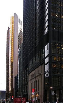 |
wraps around the art deco building of the Design
Exchange in an interesting way. The gold-covered
Royal Bank building is in the background.
[ Photo by KPA]
Pei is the architect behind the glass pyramid that stands next to the centuries-old Louvre palace. There is a jolt of interest, an avant-garde technique of shock factor, seeing these two structures juxtaposed, and it is clever to have the glass structure act as some kind of prism through which one can view the palace. But nothing much remains after the cleverness has worn out. This is perhaps the strategy of minimalism, to pull us in (to seduce us) with clever ideas. The Pei pyramid is itself the epitome of an empty shape, an empty idea. It is not a building as much as a skeleton, an incomplete structure, which gains some of its strength by parasitically swallowing the external world around it.
But Pei's cleverness quickly disintegrates into ugliness. Here are examples of his structures. Here is Pei's addition to the National Gallery of Art in Washington D.C (and as the linked article asks: "Guess which one is falling apart?"). Pei's addition reminds me of Louis Kahn's buildings. Kahn is an American architect who made his name with a fort-like building he designed for the Bangladesh National Assembly. Here is what I wrote about Kahn:
[The]...ultimate conceit of these modern architects...means of forcefully interjecting into society their inner drives and inconclusive ideas.There is no-one to call out Pei's odd, and often ugly, designs. So far at least. Like Kahn, he might be hiding behind his foreignness to sell us his ideas: "This is the work of a minimalist, Chinese intellect," might be his argument, or one that his Western spokesmen might make for him. Using fancy words such as "minimalism" and "conceptual art" also allows these elitist, but ignorant, sophisticates to advance such projects. But, ordinary people will someday catch on when we've had enough of living with such edifices.
I think that is why they are such globe-trotters. They cannot commit to a local style, where eventually the inhabitants will demand a building they can relate to.
By shifting geography constantly, they can dot the world's landscape with their inner musings, until they either get rejected, or find another location and move on.
This was how Louis Kahn lived.