Anna Sui is an Asian fashion designer who has been somewhat under the radar, but has entered the limelight due to some fascination for all things Asian. At the February 2012 New York Fashion Week, her collection of prints don't quite get the grade, as I explain with samples of designs below.
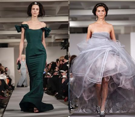
On the other hand, Oscar de la Renta convinces us that prints are back again, from tweed suits to prints made from images of magnified jewels.
Below, I compare de la Renta's works with Sui's, and later on, how glamor is presented by an old pro.
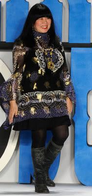 |
I've written about this trend where (some) designers
present themselves in unattractive attire,
and how this actually reflects on their works.
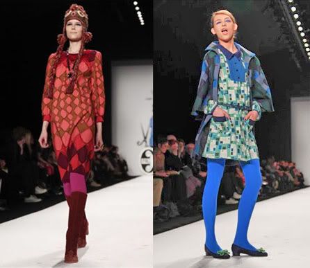 |
Left: The pattern is erratic, and the colors unattractive
(and in some places, they clash - fuchsia with orange?)
Right: Layering of prints doesn't work,
unlike de la Renta's better approach to mixing prints (see comment below)
Her prints on wool look like a faint imitation of tweed: the pattern is unbalanced and the colors unattractive. Her prints on the lighter material are more successful, with an interesting play on squares, but the dress as a whole, which is too short, and with an odd collar and unnecessary pockets, doesn't work. Her layering of prints which are very different (the jacket vs. the dress) simply makes the overall outfit look badly designed.
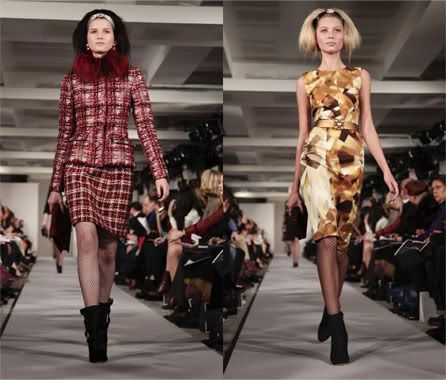 |
Right: His colorful print on the right are enlarged images of jewels
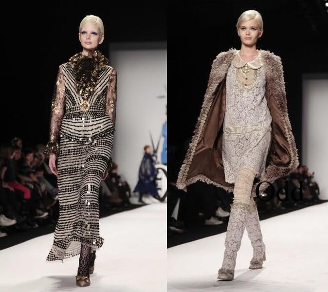 |
Right: Clumsy, heavy faux fur jacket with jacquard print, and matching jacquard boots? A buttoned-down round collar for evening wear?
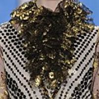 |
Another mish-mash of materials, without much structure or design. It looks like a mop with glitter. An open neck-line (with a v-collar), following the direction of the design, would have been more attractive, and more classic.
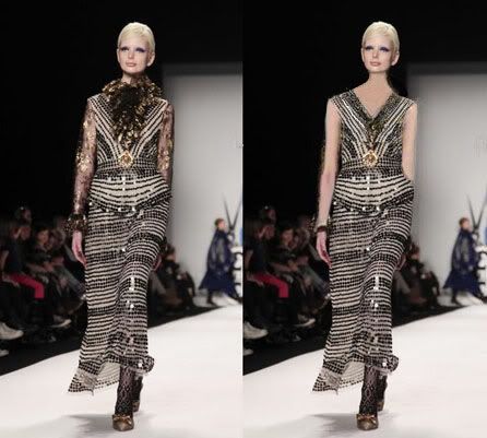 |
I've done a simple photoshop edit to remove the fluffy neck-line (and the sleeves). I think that without it, there is more shape to the dress. There is still something ungainly about the horizontal stripes, the odd drop waist, the transparent sleeves with embroidered designs that compete with the rest of the dress, as do the lace stockings. There's too much going on!, which is the criticism I have of the blue dress. When in doubt, keep adding, is usually the motto of the mediocre.
 |
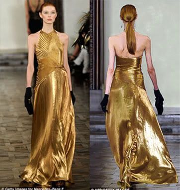 |
with old Hollywood glamor as reference