 |
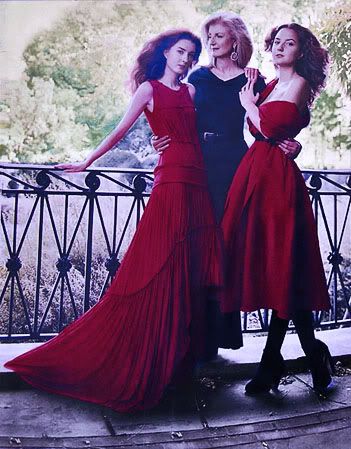
in the October 2011 Vogue
Left: Isabella in Vera Wang
Right: Christina in Prabal Gurung
Center: Arianna in Lanvin
 |
Vogue, work by Arianna Huffington's daughter
Here's more on that much-touted, mediocre designer Vera Wang.
To the detriment of being called racist, I repeatedly find myself bewildered at the subtle ineptitude I find in "Asians" - the category in the West which now includes Chinese, Korean and Japanese (but probably a more accurate term would be East Asians, since South Asians includes the far different race of Indians, Bangladeshi and Pakistani, also from the Asian continent).
For example, I was in the bank yesterday, withdrew some money, and asked the teller for my balance. She wrote it on a piece of paper. I said I would prefer a print out, so that it is an official record. Her response was a mixture of lies (that I had already finished a transaction and the system had switched off), laziness (unwilling to log back into my account) and possibly ineptitude, the cause of which I haven't figured out other than if the system does shut down after a log off from a recent transaction, she doesn't know how to turn it back on for the same transaction. All this was communicated to me in broken English in a Chinese accent.
(As a side, but important, note, there is a huge influx of Chinese in Toronto these days. I think many are entering on "economic" and "education" immigration quotas. I think there is also a racial component to their ability to enter Canada relatively easily. Blacks and Muslims, and to a lesser extent Indians, appear to be more "different" than whites, so the Chinese are a better choice to fill the immigration quotas promised by almost all the political parties. Their contribution in both those areas are suspect, and I will provide some information, research and conclusions on these soon.)
Back to the Chinese teller. If I had been really difficult (I did throw back the scrap of paper at her after telling her it was unacceptable), I would have asked for her manager, reported her behavior, and indicated that this wasn't the first "lack of communication" that had occurred with Chinese tellers in the bank, who either: don't understand sufficient English to be tellers; or don't have sufficient training to be tellers. I suspect it is a combination of all the above.
This isn't an isolated incident. It happens at coffee shops, in department stores, even on streets where negotiating the sidewalk with Chinese pedestrians is a weird event where they seem to think that ceding the sidewalk space is the responsibility of the other person - something which I no longer do, with interesting effect.
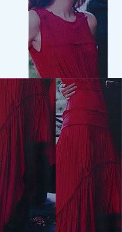
Back to Vera Wang. Above are the dresses from the October 2011 Vogue issue where she designed one of the dresses for Arianna Huffington's daughter, Isabella. (The other is by another "Asian" designer, Prabal Gurung, but more on him in a later blog post, but here is his odd, mediocre - there's that word again - Spring 2011 collection.) Below are close-ups of parts of Wang's dress, with my critique of what's wrong with the dress.
 |
- The fabric: For a "flowing gown" which this dress seems to attempt to be, why use such heavy fabric, which rather than flowing seems to be dragged down by its own weight?
- The collar area: This shapeless, formless cut looks like a cheap, quick cut by a mediocre tailor.
- The gathering: These shapeless gatherings add nothing to the aesthetics of the dress. In fact, they make it look like some home-decor fabric, like a curtain.
-The waist: There is no distinct cut or shape for a waistline, other than a weird gather around the waist. The drop waist with a thick inelegant band makes the dress even more shapeless. Isabella is a thin girl, with very little of a waist. This dress gives her no figure, nor helps accentuate a waistline through cut or tailoring.
- The sleeves: Isabella's thin arms are dwarfed through the gaping holes that pass for sleeves. Longer sleeves, or some busy pattern even on these short sleeves, would have made her arms more attractive.
- The "train": For want of a better word, that's what the fabric dragging at the back seems to resemble. But what the dress looks like is a long gown with a piece missing in the front.
- The color: The red color has a blue tint. Red with a blue tint is cold and dark. Why not go for a more festive brighter red? After all, Isabella is only 21. I think color in design is a very important part, which often makes or breaks the design. Wang was unable to deliver in this category.
---------------------------------------------------------------------------------------------
Entries on Vera Wang at Camera Lucida:
- Vera Wang's Aggressive Asian Outreach: Part I, September 21, 2011
- Vera Wang's Aggressive Asian Outreach: Part II, September 21, 2011
- Vera Wang's Aggressive Asian Outreach: Part III, September 22, 2011
- Vera Wang vs. Amsale Aberra, August 9, 2011
- Wang's Wedding Dress Fit for a Vampire's Bride, August 24, 2010
- More Thoughts on Chelsea's Wedding, August 7, 2010
- Vera Wang: Wedding Dress Designer?, July 29, 2010
- Modern Bridal Wear, January 27, 2010
- The Global Runway: Part 3, August 4, 2006