 |
I watched the Oscars to see (to validate) that there will be few unconventional, unglamorous gowns, and that most women will want to look attractive. This was the case.
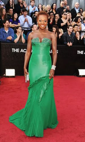
But I can't help singling out the designer-du-jour Vera Wang, who has come up once again with an "almost" dress. This time, it is a bright emerald green dress that actress Viola Davis wore.
The dress looks attractive at first glance. But, there is that odd protruding bust line, which is cut too deep; the tight, fitted bodice with the incongruously loose bottom; the frilly diagonal seam which doesn't fit with the upper bodice or the lower train; the train itself which doesn't have a clear structure, but seems to be a loose patchwork of pieces; and a band around the waist, which disrupts the flow of the bodice. And if I get really fussy, the clutch she's carrying doesn't quite match her lighter bracelet, and neither match the colored stones which decorate the bodice.
 |
Above is that band. Although it seems barely visible on the dress, I think it is small details like this which affect the overall look of a dress, and which is why, when I saw the gown on Viola, it didn't look right.
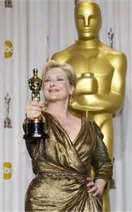
Meryl Streep won the Oscar for Best Leading Actress, and coming to accept her trophy, she momentarily channels some deeper voice (it must be Margaret Thatcher's), before she becomes herself again. I've always thought that she was a little kooky. She throws herself into her roles, leaving a little of herself in them nonetheless. I wasn't going to watch Iron Lady, but now I think I will.
 |
Above is a great photo with Meryl Streep and her Oscar. The photographer captured a moment, possibly inadvertently (or predictably, since this is happening at the Oscars after all), where Meryl, in her gold Oscar dress, is playfully thrusting her mini-Oscar directly at us with her arm akimbo, while the real thing is standing sternly behind her with arms crossed making sure things don't go out of hand. The contrasts between Meryl's playfulness and the Oscar's seriousness, and the small trophy statue referring to the large gatekeeper in the background, all in one perspective, couldn't have been better shot. All this is further linked together with the gold theme, including Meryl's dress (I think she playfully planned a gold "Oscar" dress for the event) and the gold circles with the ABC logo on the curtain. But the Oscar prints on the curtain tell us who is the real star of the show.
Perhaps what Vera Wang ultimately lacks is a playfulness, or lightness, to drive her creativity, and whenever she tries that, she tries too hard and it comes out in distorted forms like the dress I described above (and like almost all her other designs). All serious designers like Christian Dior and Valentino often have a wistful lightness, with some like Galliano going full-steam, and Wang might just be trying to be part of that esteemed company.