Saturday, May 31, 2008

Fairgrounds

And their significance

Carousel in "Strangers on a Train"

Three fairgrounds in three important films of the 20th century:

- Fernand Leger's erratic rides in his 1924 "Le Ballet Mecanique" where man and machine fuse as one, even during man's most abandoned and playful moments.

- The 1920 German Expressionist film "The Cabinet of Dr. Caligari" directed by Robert Wien, in which the protagonist, Dr. Caligari, uses a carnival to introduce his somnambulist Cesare.

- Alfred Hitchcock's 1951 "Strangers on a Train" has both a murder and the identification of a murderer occur at a fairground.

Leger uses fairgrounds to wax poetic about machines. Robert Wien makes the expressionist fairground into some kind of unearthly place full of macabre fantasies.

Hitchcock's carousel juxtaposes the horrors of the crime committed by the deranged criminal full of his internal fantasies, with the speed and distorted figures of the wooden horses, to finally evict the murderer through the centrifugal force of the mechanical carousel onto stable ground, where he can be identified and convicted.

Hitchcock took a little of each of the two previous films to make his approachable, human film where man is separated from machine and fantasy, and made to pay for his sins.

I'm always surprised at how moralistic Hitchcock is. After all, his films for the most part are about murder and crime. But, I think he really separates man from other things - nature, machine, psychosis (which is an inferior version of rational, sensible man.) Hitchcock has trust in man, despite his ambiguities and insecurities.

Unlike the other two filmmakers, whose protagonists are outside of the human (machine or fantasy), Hitchcock stays grounded in his portrayals of his fellow being.


Sunday, May 25, 2008

Good Things

Come in threes

I think it is important to present some of the postive and beautiful things that are around us, while at the same time I hammer away at those that are trying to destroy them.

Here are three new things I learned about the craft and design world in the past few days:

1. Charles Voysey is my favorite fabric designer (he worked with tapestries, carpets, fabric and also wallpaper design.) I especially love the way he hides birds in his designs, making them blend in with the foliage and other surroundings.

Voysey Birds:
Left for textile design ca. 1916 (how many birds are in the foliage?)
Right: For a greeting card ca. 1901

I didn't know that he was also an accomplished architect. He had a distinctive style of low roofs and horizontal windows.

His homes have the same simplicity and harmony that his designs do, but their wholeness and beauty is further accentuated by their austerity.

The Orchard (1899)
One of Voysey's low-roofed house with horizontal windows. The Orchard was his home.

2. Felt is not just for hats. It is making a comeback in textile design. I think part of the attraction is that you don't need especially complicated equipment to make your own felt, and it is a very malleable and versatile material.

But, I didn't know this, and it makes sense, that it is one of the oldest fabrics, and that it is still in use, mainly in central Asia. Here are some current attempts at working with felt today.

Left: Laser-cut felt rugs
Middle: Scarves using various felting techniques
Right: Penny Rug from early American and Canadian crafts

3. Rosenthal Porcelain from Germany is world-renowned, and considered one of the best both for its porcelain and for its design.

"Le Jardin de Versace"

A Rosenthal/Versace collaboration.


Sunday, May 18, 2008

Now The Good News

Original plans still exist in Ryerson U.


It is like a breath of fresh spring air to see this kind of landscape planning in a university campus that is definetely going for broke these days.

Ryerson's landscape architects put a lot of solemnity and respect around the university's founder to have his statue surrounded by beautiful, yearly blooming trees.

There will be a lot of correctly planned floral and arboreal ornamentation for the newly planned campus, but I wonder what it will be surrounding?


First The Bad News

They may have kept the facade


But, I doubt very much that this will remain one of those 3-storey buildings.

In a matter of weeks, this apartment building was left only with its skeleton. Admittedly, its windows were boarded up for a while, but why demolish the whole thing? Why not just add new windows? These old buildings had very solid structures. Now with record building time, mostly of pre-fabricated walls, standards will be going down as floors keep zooming up.

The condo craze, of which I presume this will be a part, is actually a concerted effort by real estate developers to by pass laws which prevent building on farm land and other vulnerable lands on the rims of Toronto.

Instead, the city is accommodating the increasing population (read here 250,000 immigrants) accepted yearly into the country.

Sprawl upwards has replaced sprawl outwards.


Thursday, May 15, 2008

Olympian Ordeals

Can we regain our national symbols in time for Summer 2008?

Note: I sent this article to around 37 Ontario papers (and 3 national ones) and so far have received responses from two papers. And those two asked if I was living locally - in Hamilton or Guelph. If a provincial, and even a national, issue like the desecration of true blue Ontario symbols does not garner attention from publishers, then I don't know what will. I'm still waiting, though.

Trillium grandiflorum

I’ve always said that a country with no clear national symbols is likely to grab whatever one catches its fancy. Well, in Canada, we have just crossed that threshold with our Team Canada Olympics uniform for 2008.
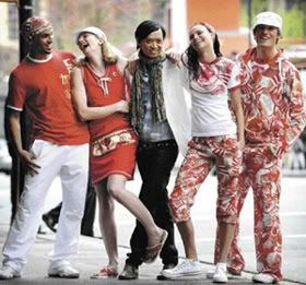
The 2008 Summer Olympics uniform

There has been a surprising amount of negative reaction to the initial unveiling of the uniform, but much of it is on the wrong track. People are subconsciously reacting to the bad idea, that generated other bad ideas, ad infinitum. Most of the reaction concerns the ungainly print that makes up the Olympics Village-wear sets, some calling them pajamas, others saying they resemble costumes for a circus troop. Politicians (from the opposition, of course) are irate about the non-Canadian manufacturing source of 80% of the uniform. They are, not at all ironically, Made in China.

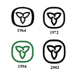
Changes in the Ontario logo between 1964 and 2006

So, what is the real story? Here in Ontario, the provincial logo of a stylized 
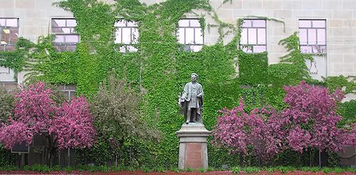
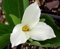
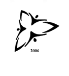
Trillium grandiflorum was transformed in 2006 into what looks like a group of people stringed together by triangular hooks. Probably only those privy to the original trillium logo would be able to recognize the flower in this new design. The trillium was originally proposed as a flower to place on the overseas graves of Canadian servicemen from the First World War. Although that was not adopted, the flower was later taken up as the provincial emblem in 1937. It was later incorporated into the provincial logo in 1964. Unlike the precarious linking of anonymous stick figures, this original logo was a real, recognizable part of the Ontario landscape translated into a ubiquitous, powerful and beloved motif.

This is where the 2008 Olympics symbolism starts to make sense. The designers, two Asian-Canadians, Tu Ly and Vivienne Lu, under the direction of Suzanne Timmins of the Hudson Bay’s Company, claimed that they were fusing cultures and symbols when designing the Olympics uniform. "We are the world, we are the children…" It’s beginning to sound like the hooked stick figures in the new trillium logo. But, it is all even more insidious than that. The lyrics should be: "We aren’t Canadians, so who are we…."

The Ontario trillium logo has gone through three changes between its inaugural in 1964 and 2002 that were almost identical to the original save a slight thickening of the lines, or a minor lengthening of the flower. But, the final revision in 2006 completely changed its form, because its symbolism also changed. The original logo was a visual representation of Ontario, and what better way to do it than through the landscape, picking the perfect flower right in our very own back yard, created for an infallible design. The 2006 version was a superficial attempt to connect disparate Ontarians in a ring of feel-good unity.

Who are this circle of Ontarians? We are now as much Indian as Chinese, Portuguese as Italian, all hyphenated Canadians. The Portuguese, Italian, Ukrainian and even Jewish members of the hyphenated have managed to blend their lives and aspirations within the original founding of the country and slowly let go of their hyphens. The more current crop of Indians and Chinese have histories and memories so radically different from this country’s and from each others’, that they perennially keep importing, either directly or through community lore, a little bit of their lost and abandoned lands into their new Ontario homes. With such tremendous changes in Ontario’s demography, and probably geography too (who really gets to see trilliums in the retreating woods, anyway), the glue that bind us together is melting away. So much for a circle of unity.

It is no surprise, then, that Ly and his co-designer Lu should get excited about their patterns adorning the Olympics uniforms, with the events taking place on a continent they left generations ago (metaphorically or literally). What an opportunity to regain some of their Asian identity back again. Where these designers got off target, intentionally or not, is in failing to recognize that these outfits are about a Canadian team that is going to China, as a national competitor, and not their visual fantasy of a China transported to Canada, transported back to China by some magical merging of design and geography. And their design director should have alerted them to this, and put a stop to it from the beginning.

But, to the delight of our multicultural hyphenated conglomeration, everyone apparently wants to keep it that way. Asians - South or East, Africans – Caribbean or Mainland, Latinos and all the rest make our cities so colourful, why dismantle them into the boring hegemony of a bland un-hyphenated Canadian? So Suzanne Timmins felt as excited as her two Asian-Canadian designers (judging from the interviews she has given) to let this parody play itself out to its logical conclusion: an abrasive and jarring design with no style or elegance, and with no definable character. Chinese tattoos meshed with Canadian sceneries; China reds instead of autumnal tones; Chinese lucky eights and fire, wood, metal, earth and water symbolisms colouring Canadian landscapes. A confused vision will always give confused creations.

We may think that hyphenated Canadians are part of the “we are the world” crowd of the new provincial logo, all wishing to hold hands to make Ontario a better place. But they are actually extremely exclusive, giving special treatment only to their kind and at any opportunity. And these alternate worlds are increasingly competing with the reality of Canada. Lu and Ly certainly demonstrated that.

Our Canadian athletes have now the added burden of warding off the mixed signals their clothing gives them. If there ever was an unlucky charm, it would have to be their costume, which drains the Canadianness out of the athletes and infuses them with their competitor’s spells. How can a Canadian olympian expect to win a medal for his country if he cannot get his costume, and hence his identity, to mean something to him? In their logical quest to regain their Asian identities, Ly and Lu have made Canadians, athletes and spectators, lose ours.

As fast as our forests with our trilliums are receding, we are now confronted with figures and signs that have nothing to do with our physical landscape. We are faced every day with buildings, signage, holidays and languages whose meanings we know absolutely nothing about, and whose sources are thousands of geographical and symbolic miles away. Without concrete symbols, which we can touch and see and feel, we are prone to accepting anything that comes in our view disguised as the real thing, but which will only confuse and disappoint us like our olympians’ uniforms. And there will be plenty of go-betweens to introduce their symbols to us, all for the sake of making their own alien geographical and cultural links stronger.


Monday, May 12, 2008

When National Symbols Are Lacking

I've always said that if there is no concerted effort at keeping national symbols alive and well, something else will come along and take up the space.

This is just what happened with the Canadian Summer Olympics team uniform, under the direction of the Hudson's Bay Company Suzanne Timmins.

One of the designers, Tu Ly, apparently designed the "award winning" uniform for the Canadian team at the 2006 Winter Olympics. I tried finding Tu Ly's other works online, including his supposed knitwear for Saks Fifth Avenue, but came up with nothing. Same thing for his co-designer Vivienne Lu.

Tu Ly's 2006 work was commissioned by Roots Canada, and I get the feeling that he was under strict directions by Roots to follow their austere "everyman" designs and probably didn't have too much creative leeway.

Well, now that he does, here's what he, and his design team, has come up with.

Here are some of the design elements of the Canadian Olympics team uniform:

Font: Bamboo
Font direction: Up to down to mimicking Chinese script
Main background color: China Red
Style: Hip-hop camouflage
Inspiration behind the designs:
- Chinese tattoos
- Chinese astrology elements: Fire, Wood, Water, Earth Metal
- Chinese lucky number eight
- "Organic" maple leaf

I thought Olympics, as friendly as they are, are about giving strength to your own team, with dynamic home-grown symbols and designs.

What the designers have come up with is not Team Canada, but a subversive act to make Canadians into pseudo-Chinese.

At a CBC interview, critic Stig Larsson, a designer and owner of sports store Level Six and himself a national athlete, was concerned that designs makes the clothing too prominent, diminishing the athletes. I agree with him, and upon viewing his company's products, it is a real surprise that he wasn't part of (if not leading) the Olympics design team.

One last thing, 80% of the clothing were made in China, which given the direction of the design should come as no surprise.

Left: Chinese tattoo prints with "organic" maple leaf
Right: The number 8 as an emblem

Left: The Village-wear print with China red background
Middle: Close-up of print with mixture of Chinese and Canadian symbols
Right: "Organic" maple leaf, looking like a marijuana leaf

Left: The five Chinese astrological signs
Right: Bamboo font text from top to bottom (instead of left to right)

Wednesday, May 7, 2008

Update on Good Shape

More like "good form"

Here's a revealing comment by Christopher Alexander:
[F]orms must arise that come from the technology and economics and social circumstances of that era. So that if one sets out a program where you're essentially sort of copying old forms in any version, you're liable to be in a hell of a lot of trouble...But [people] don't know what to do about it...And I think that it is necessary to spend time - I would say major amounts of time - thinking only about form and geometry. Thinking about the language of form that is appropriate now.
This puts a lot of things into perspective, which I had only subconsciously understood until now.

Almost all of my colleagues, professors and acquaintances in the art and design fields seem to be stuck on this search for "the language of form that is appropriate now."

Hence:
- The name "experimental" for the avant-garde group of current filmmakers, of which I was a member for a few years. There was (is) great emphasis on finding new techniques, and even branching into non-film media such as digital and computerized manipulations. Thus calling themselves "experimental."

- A recent bizarre project by fellow board-member (at a post I had at Trinity Square Video) who uses jello to simulate water in a fountain. In trying to find a new way to design fountains, she tried to redesign the water instead!

- A textile "artist" who has been experimenting with the very ugly, thick - in all aspects - fiber felt to try and come up with sculptural elements. The problem is that felt is not solid, unless stuffed. Trying to find this intrinsic sculptural element in a non-sculptural material hinders the real emphasis. Which should be representing the object itself.

- Textile designer Looolo makes biodegradable, organic and toxin-free home accessories. The simple pillows range from a steep $100-$150. The price is for the dubious material. Design not included. Also, biodegradable fabric! Isn't the idea that it last as long as possible, and not get tossed in the green bin when a little worn? And aren't cotton, silk and wool naturally biodegradable?

What's going wrong here?

As film theorist Siegfried Kracauer quotes avant-garde filmmaker Jacques Brunius: "The cinema [of the avant-garde] is the least realistic of arts."

This holds true for the three examples I've given above. In the single-minded effort to find "the language of form that is appropriate now", these designers, artists and filmmakers have given up on reality!

It's as simple as that.

There is something noble in this experimental, almost scientific, attempt at finding the right form. But, I think where they are made their fundamental error is in their disengagement with reality. Form comes from the real world. Trying to find form without the real will only give us deflating sculptures and giant jello for water.


Left: Chung-Im Kim's undecipherable object (worm, horn, shell, ice cream cone?)
made with sewn pieces of felt with a hollow inside.
One clutch and the object is flattened

Right: Gwen Macgregor's "Pool." Water made from jello as part of an "installation"
project with wading pools. Even the project is misdirected, looking at the pools
instead of the structures. The kids don't look too much like they're enjoying themselves.


Looolo pillows:
Left, "Fly" at $140; Center, "Janthur" at $190; Right, "Windows" at $140

The Fly and Janthur pillows defy leaning back on their irregular surface. Isn't that what pillows are for? And design is wanting in the Windows series.


Bruce Elder's Experimental film "The Young Prince" - Photo still
 
[KPA: Film preview of The Young Prince" from original post is no longer available, and I have posted the above still photo instead]


Ten second preview of Bruce Elder's experimental film "The Young Prince"


Sunday, May 4, 2008

Good Shape

Why it matters in design

I am in the middle of reading architect Christopher Alexander's epic four volume work entitled: The Nature of Order describing how recent (he actually dates this from 400 years ago) man-made environments have alienated man from himself, from his surroundings and from nature.

We only have to look at the atrocious modern architecture (and designs) to realize it. Here is my favorite worst:
The new ROM extension - again. (It will never go away)

The book is really a treatise for all designers and artists, and not just architects.

Basically, a good shape is composed of simple, elementary shapes. He cites the following that he has discovered to be building blocks to a good shape:

Square, line segment, arrowhead, hook, triangle, row of dots, circle, rosette, diamond, s-shape, half circle, stars, steps, cross, waves, spiral, tree, octagon.

Here's an example of a bad shape:

With its amorphous, unsimplistic and undefined elemental shapes:

And how a design of a flower can actually be composed of elementary squares, triangles, diamonds, making the overall shape into a good one.


The two bad shapes feel like they have no balance. It feels like the chair would topple you off as soon as you sit on it, and the ROM extension will collapse on you as soon as you pass under it.

Here's Alexander's wonder at a simple, sturdy, and as he calls it beautiful good shape of a simple Japanese teapot stand:


Thursday, May 1, 2008

Update II on Expensive Recruits

More lack of proof of immigrants' creative equity?
Bollywood Bound Going through the 2006 census material over the past couple of days, some interesting points came up: - There has been a dramatic decrease in the Chinese applications to immigrate to Canada - There has been another dramatic decline in Chinese students applying for student visas - More and more "Chinese-Canadians" are returning to China Some of the rationale given is the Chinese inferior knowledge of French and English required in the immigration application; China's own economic growth; more colleges and universities available for Chinese to study in their own country; the perception that Chinese credentials aren't readily accepted due to a long process of degree accreditation; and aggressive recruitments of Chinese by other countries like Australia and New Zealand. I also think there is more of a psychological problem. Despite several generations of living in Canada, and a recent monetary and symbolic apology for the head tax incurred on the original Chinese laborers in Canada, the Chinese will always continue to feel like second-class citizens, scrambling for a piece of the multicultural pie. Richard Florida's hypothesis that Chinese would somehow innovate themselves as leaders, if not dominant players in the Canadian (and Western) society has not been demonstrated. In fact, I will argue that they will always be taking cues, rather than giving directions. I would think it is better to feel a first class citizen in your own country rather then find ways to reach the top in another one which you will always think is trying to thwart your growth. On the other hand, the South Asian immigration rate has increased sharply. There are many factors including strong community and political clout which results in more aggressive recruitment techniques. But, second generation Indians who frequent MyBindi.com, and whose fantasy is to star in a Bollywood movie (via the National Film Board of Canada) surely shows us that they're operating on a different aesthetic? Richard Florida will have a lot to answer for.