Wednesday, February 29, 2012

The Verdict on Vera Wang's Green Dress

Black is beautiful, in garish green and "natural" red hair

I wrote here on the Vera Wang gown that actress Viola Davis wore to the Oscars that "The dress looks attractive at first glance," and then proceeded to outline the flaws in the dress that caused me to instinctively dislike it at first viewing. Well I'm not the only one that didn't like the dress. The Daily Mail on Monday had this headline: And the award for worst-dressed goes to... Not all the stars at the Oscars looked their best. Wang's dress was on the list, with this comment: "Viola Davis, right, had too much going on in Vera Wang."

I was curious what other fashion experts thought of the dress, so I tuned in to watch the Fashion Police show on the Oscar dresses, with Joan Rivers as the crude-mouthed lead commentator. There was nothing but accolades coming from this trio, and they especially liked the green against her skin. I wonder if they are just being polite (i.e. Davis recently got rid of her wig to come out "natural" although what is natural about dyed red hair on a black woman, I don't know. So rather than criticize her hair, they admired her dark skin against the green color, to show that black is indeed beautiful, in all its manifestations).

Here's another fashion site which writes about the green bias:
Viola Davis wore emerald green and Ms. Rivers could only say, "Gorgeous, gorgeous, gorgeous and the color on her was stunning." Kelly and Giuliana [the other two on the Fashion Police "panel"] swooned about the gown and her natural hair choice. Rancic said that she was so tired of wearing wigs and wanted to represent that night.

Tuesday, February 28, 2012

Sunshine on the Bay

[Photo by KPA]

I had errands to run downtown, and I took my camera since that is the architecturally interesting part of the city (south of Queen Street, between Jarvis and Bay Streets). And sure enough, I saw this lovely mottled effect on the facade of The Bay department store on Queen Street. I took the camera out, and I couldn't switch it on. I had forgotten to recharge the batteries, so it was all my fault (my camera remains trusted and true). Quick thinking! I had very little time, especially with the volatile weather these days. So I ran into a nearby pharmacy (no convenience store in sight). They had batteries, which I bought at the exorbitant price of $7.99 (sans tax) for four.

Back outside, the sun was still out, and its light still on the building. I took several shots, just in case. A few passers-by slowed down from their hurried gait, and looked up to see what merited a photo. I hope they appreciated what they saw.

The structured windows and brickwork contrast with the mottled sunlight. And the dark, iron-like branches of the winter-bare trees add another dimension of contrast, where industry and nature compete. Finally, though, it is the sun which wins.

Below is some background on The Bay, from the Ontario Heritage Trust plaque on the building:
Department stores revolutionized shopping in the late nineteenth century by offering selection, low prices and money-back guarantees. In 1895, Robert Simpson commissioned architect Edmund Burke to design his new department store at the southwest corner of Yonge and Queen Streets. It was the first building in Canada with a load-bearing metal frame and a façade clearly patterned on this internal structure. By 1969, Simpson's department store had been enlarged six times and occupied two city blocks between Yonge, Queen, Bay and Richmond Streets. Canada's oldest corporation and largest department store retailer, Hudson's Bay Company, acquired the building in 1978. A Bay store since 1991, it remains one of Canada's great shopping landmarks.
Here is a link for the architect Edmund Burke, who completed The Bay (then known as The Simpson Department Store) in 1908. And here is a link for Robert Simpson, the founder of the department store, who commissioned Burke to design the store.

Below is a 1908 postcard, from BlogTO, which also has many vintage postcards of Toronto.


What a Wonderful World


I don't know about the movies, but here was something good at the Oscars. A singer I've seen only once performed a tribute to past Oscar winners, and to Hollywood, with Louis Armstrong's "What a Wonderful World."

It's a fresh, quiet, and enchanting rendition. The signer is Esperanza Spalding (excuse the mixed nomenclatures: this is the reality of our times). I'm not sure who she is, and how she escaped the heavily melismad [link pdf article] singing style of contemporary black singers, and how she got away with such an afro in the heavily permed style of black celebrities, but here she is:
Spalding grew up in the King neighborhood of Portland, Oregon, a neighborhood she describes as "ghetto" and "pretty scary". Her mother raised her and her brother as a single parent. Spalding has a diverse ethnic background. She notes, "My mom is Welsh, Hispanic, and Native American, and my father is black."
At the Oscars

Monday, February 27, 2012

Muzak with Real Music


I'm pretty sure it is the Bay which plays Van Morrison. I hear it, then forget about it, then hear it again. And I stay just a little longer until the song ends. Fortunately, I haven't made any exorbitant purchases.

I've always like Van Morrison. I think I still have a tape of his music, which I keep meaning to transfer into a CD (i.e. buy the CD version). Wikipedia informs us that Morrison is a "Northern Irish singer songwriter." I thought he was American.

Below is "Brown Eyed Girl":


Vera Wang's Not Quite Gown at the Oscars, and Other Moments


I watched the Oscars to see (to validate) that there will be few unconventional, unglamorous gowns, and that most women will want to look attractive. This was the case.

But I can't help singling out the designer-du-jour Vera Wang, who has come up once again with an "almost" dress. This time, it is a bright emerald green dress that actress Viola Davis wore.

The dress looks attractive at first glance. But, there is that odd protruding bust line, which is cut too deep; the tight, fitted bodice with the incongruously loose bottom; the frilly diagonal seam which doesn't fit with the upper bodice or the lower train; the train itself which doesn't have a clear structure, but seems to be a loose patchwork of pieces; and a band around the waist, which disrupts the flow of the bodice. And if I get really fussy, the clutch she's carrying doesn't quite match her lighter bracelet, and neither match the colored stones which decorate the bodice.


Above is that band. Although it seems barely visible on the dress, I think it is small details like this which affect the overall look of a dress, and which is why, when I saw the gown on Viola, it didn't look right.

Meryl Streep won the Oscar for Best Leading Actress, and coming to accept her trophy, she momentarily channels some deeper voice (it must be Margaret Thatcher's), before she becomes herself again. I've always thought that she was a little kooky. She throws herself into her roles, leaving a little of herself in them nonetheless. I wasn't going to watch Iron Lady, but now I think I will.


Above is a great photo with Meryl Streep and her Oscar. The photographer captured a moment, possibly inadvertently (or predictably, since this is happening at the Oscars after all), where Meryl, in her gold Oscar dress, is playfully thrusting her mini-Oscar directly at us with her arm akimbo, while the real thing is standing sternly behind her with arms crossed making sure things don't go out of hand. The contrasts between Meryl's playfulness and the Oscar's seriousness, and the small trophy statue referring to the large gatekeeper in the background, all in one perspective, couldn't have been better shot. All this is further linked together with the gold theme, including Meryl's dress (I think she playfully planned a gold "Oscar" dress for the event) and the gold circles with the ABC logo on the curtain. But the Oscar prints on the curtain tell us who is the real star of the show.

Perhaps what Vera Wang ultimately lacks is a playfulness, or lightness, to drive her creativity, and whenever she tries that, she tries too hard and it comes out in distorted forms like the dress I described above (and like almost all her other designs). All serious designers like Christian Dior and Valentino often have a wistful lightness, with some like Galliano going full-steam, and Wang might just be trying to be part of that esteemed company.

Saturday, February 25, 2012

Helen Mirren Should Just Go to Walmart!

I guess I just wont let it go. It really annoys me that when people have ample opportunity to do something good, they opt for the bad. Yes, searching for beauty, and aiming for beauty, is doing good.

Helen Mirren has an unlimited supply of designers who would cater to her every wish. She can tell any one of them to get rid of that monstrous bag and make something delicate and feminine. She could even just walk to the nearest Walmart and get a better creation than her thousands-of-dollars worth of ugliness. Yet she opts for the look on the left below. I tried to improve on it by changing the color of the handbag, narrowing the skirt, and changing the shoes to black. Further down is the final photoshopped version of my modest improvements.


From my simple blog, and using rudimentary photo editing, I have given her something which would make her look better (not great, since the whole get-up is odd, but better at least), than the undoubtedly high-priced designer who is experimenting with his inner creativity. Ditch the ugly bag, and go for a purse. What a concept, bringing femininity back on track.


But, the good thing is, as I've noted in previous posts, younger women are tired of the ugly being thrown at their faces. They want to look good, not like some experimental specimen.

It's the Oscars. Of course, ordinary women cannot hope to get those movie star gowns, but what women wear in the limelight often filters to what ordinary women want. Although, as I said above, it seems to be the other way around these days.

The Helen Mirren Makeover that Will Never Happen

Courtesy of KPA photoshop

Helen Mirren is out in public again looking like one of those old women who over-dress, often in exaggerated feminine clothes and gaudy colors, which make them look like much younger women (and often like girls).

I recently wrote about Mirren:
Why cannot I be as young (and attractive) as any fifteen-year-old, at my ripe old age of seventy? Such are the mantra of the equal-opportunity narcissists.
I tried to "mature" Mirren by doing simple photoshop on her appearance, which was mostly to:

- narrow the skirt

- change the gaudy, mismatching colors, and give her a black sweater to subdue the very bright red satin dress

- add a belt to the dress

- narrow the dress from the flair to a more sophisticated straight cut

- change her handbag to black (I wonder what she could have in that mini-suitcase at a glamorous event?)

- give her black shoes (again, I wonder at this choice of clunky sandals)

- give her the necklace that the woman next to her is wearing, although I've narrowed it a little

- get rid of the dangling earrings

I couldn't change her hairstyle, but I think it looks fine with her new look.

What Mirren ends up doing is rejecting beauty, as I wrote here on another outfit of hers:
Mirren looks like those Madames in Western brothels. I don't think that is her intention, though. The underlying problem, as with all liberals, is that she's simply not in touch with beauty and its standards, and can be lured into wearing whatever contemporary stylists, who themselves are hostile towards beauty, pull out for her.
Mirren should hire me as her stylist, rather than whichever "expert" is whispering in her ear.

Friday, February 24, 2012

The (Tyrannically) Good Liberal

[Photoshopped version of original book cover by KPA
(with due respect to Mr. Kalb)]

I've posted various excerpts from Jim Kalb's book The Tyranny of Liberalism: Understanding and Overcoming Administered Freedom, Inquisitorial Tolerance, and Equality by Command [here, here, here and here], and some modest discussion, but I strongly recommend getting the book itself here.

Here's another excerpt (pp100-102):
Liberal Identity

[T]here is of necessity a conception of identity that grows up and takes hold of liberal society, if only because we can think about ourselves and our actions only by reference to what we are. The effect is that liberalism replaces strong and stable identities with weak and problematic ones. As always, we define our identity by reference to common goods our community recognizes. If I say I am American, the claim is insignificant unless Americans are united by something they recognize collectively as good. In liberal society, however, the only thing recognized in common as a substantive good is the goal implicit in all individual desire: the ability to get what one wants. That ability is most readily recognized in the form of money, power, and success, so liberalism turns society into an assembly of individuals related by those things.

A liberal world is one in which the authoritative social reality, the thing by reference to which we are what we are, is a hierarchy of money, power, and influence that excludes all substantive values and so is strictly quantitative. We are allowed public recognition simply as employees and consumers, as nodes in a universal network of production and consumption, individuated and ranked by organizational charts, bank balances, and consumption choices. Under such conditions we lose substantive connection to others. Social and personal identity become hierarchical or quantitative, and self-realization becomes the pursuit of financial and hierarchical superiority or conspicuous consumption.

To the extent systemic imperfections allow traditional identities to have an effect, our identity as employees and consumers is supplemented by the sole identities liberal society recognizes as a legitimate alternative: oppressor, victim, or the good liberal who supports the system in its efforts to perfect itself and us in accordance with its own principles. The hedonism and careerism of advanced liberal society is thus supplemented by resentment, guilt, and a perverse co-opted idealism. The overall effect is that liberal society is pervaded by an obsession with money, power, position, and enjoyment corresponding to its technocratic hedonism - which it must disguise and deny because of its egalitarian moralism. That obsession is all the more fascinating because of its irrationality, emptiness, and radical opposition to proclaimed morality. It is experienced as demonic and obscene, as a constant temptation to oppression and source of vicitmization. It returns us inwardly to a primitive state in which there is no distinction between power and the good, the accursed and the sacred, in which the fundamental spiritual problem is separating ourselves from the evil to which we are bound and by which we are fascinated, and the necessary response is denying it in ourselves and transferring it to another so that it can be driven out in the person of the scapegoat - the man who rejects freedom and equality, the "greedy," the "hater," the "bigot," the "extremist," the "fundamentalist."

That scapegoating creates an almost metaphysical inequality between those who think and feel correctly and are counted as part of the moral community, and those who do not and are not so counted. The resulting hatred and contempt for those counted as bigots serves a necessary function. It gives solidarity to a social order that lacks sustaining goods in common and so needs an enemy to define itself. And it provides an irrefutable justification for the rule of the class that defines correct though. Since incorrect thoughts are quite common among the people at large, the actual people need be counted as part of the political people, and their desires and views treated as legitimate, only to the extent they support the regime and its principles. The position of the ruling class thus becomes impregnable.

Thursday, February 23, 2012

I Told You So: Part CCXXII (Or Just Part IV, to keep the list going)


I really thought this was a joke:
Asian American Journalists Association releases guidelines on Jeremy Lin media coverage.
Even after I'd read the full report.

Traffic was so heavy at the AAJA website to access these guidelines, that it crashed. Yahoo has put the whole guidelines up.

Below are the guidelines in full from Yahoo News:
THE FACTS

1. Jeremy Lin is Asian American, not Asian (more specifically, Taiwanese American). It's an important distinction and one that should be considered before any references to former NBA players such as Yao Ming and Wang Zhizhi, who were Chinese. Lin's experiences were fundamentally different than people who immigrated to play in the NBA. Lin progressed through the ranks of American basketball from high school to college to the NBA, and to characterize him as a foreigner is both inaccurate and insulting.

2. Lin's path to Madison Square Garden: More than 300 division schools passed on him. Harvard University has had only three other graduates go on to the NBA, the most recent one being in the 1950s. No NBA team wanted Lin in the draft after he graduated from Harvard.

3. Journalists don't assume that African American players identify with NBA players who emigrated from Africa. The same principle applies with Asian Americans. It's fair to ask Lin whether he looked up to or took pride in the accomplishments of Asian players. He may have. It's unfair and poor journalism to assume he did.

4. Lin is not the first Asian American to play in the National Basketball Association. Raymond Townsend, who's of Filipino descent, was a first-round choice of the Golden State Warriors in the 1970s. Rex Walters, who is of Japanese descent, was a first-round draft pick by the New Jersey Nets out of the University of Kansas in 1993 and played seven seasons in the NBA; Walters is now the coach at University of San Francisco. Wat Misaka is believed to have been the first Asian American to play professional basketball in the United States. Misaka, who's of Japanese descent, appeared in three games for the New York Knicks in the 1947-48 season when the Knicks were part of the Basketball Association of America, which merged with the NBA after the 1948-49 season.

DANGER ZONES

"CHINK": Pejorative; do not use in a context involving an Asian person on someone who is Asian American. Extreme care is needed if using the well-trod phrase "chink in the armor"; be mindful that the context does not involve Asia, Asians or Asian Americans. (The appearance of this phrase with regard to Lin led AAJA MediaWatch to issue statement to ESPN, which subsequently disciplined its employees.)

DRIVING: This is part of the sport of basketball, but resist the temptation to refer to an "Asian who knows how to drive."

EYE SHAPE: This is irrelevant. Do not make such references if discussing Lin's vision.

FOOD: Is there a compelling reason to draw a connection between Lin and fortune cookies, takeout boxes or similar imagery? In the majority of news coverage, the answer will be no.

MARTIAL ARTS: You're writing about a basketball player. Don't conflate his skills with judo, karate, tae kwon do, etc. Do not refer to Lin as "Grasshopper" or similar names associated with martial-arts stereotypes.

"ME LOVE YOU LIN TIME": Avoid. This is a lazy pun on the athlete's name and alludes to the broken English of a Hollywood caricature from the 1980s.

"YELLOW MAMBA": This nickname that some have used for Lin plays off the "Black Mamba" nickname used by NBA star Kobe Bryant. It should be avoided. Asian immigrants in the United States in the 19th and 20th centuries were subjected to discriminatory treatment resulting from a fear of a "Yellow Peril" that was touted in the media, which led to legislation such as the Chinese Exclusion Act.
Who knows, it could still be a joke.

I Told You So:
Part I
Part II
Part III

Trump's Facade

Tile-like facades on the glass/stone
structure of the Toronto Trump building.
I've outlined the facades in red.


The Trump building is next to the
Bay-Adelaide Centre, which is a glass
highrise using the 1920s National Building
facade


Describing the buildings on Adelaide Street, I also mentioned the Trump highrise, where I wrote:
Around the corner from the building is the new Trump International Hotel and Tower, the reason I went in that neighborhood in the first place...It is the usual, glass-heavy, post-modern architecture that is sprouting all over major cities these days, but has none of the beauty and, I think, lasting power, of the older skyscrapers like the Concourse building. The Bell Canada building looks like it was the bridge between the "old" skyscraper age and our new one. Glass and marble are not cheap and they are hard to carve and decorate. So many current buildings are left plain. And it is as thought the expense of the material is enough to throw out ornament.
Wikipedia describes the Trump building as:
[A] 65-story (57 occupiable floors)[tower which is] 276.9 meters (908 feet) tall and is clad with a steel, glass, and stone facade.
Trump cleverly uses many elements to make his building "fit" in the Bay-Adelaide neighborhood, including the glass and steel with a stone facade, and decorative mosaic.

Here's how I think he achieved that:

- Trump's building is steps away from the famous Toronto landmark, the Mies van der Rohe's Dominion Centre, which uses steel and tinted glass much more aesthetically (although austerely). I asked the bustling attendant in the Trump hotel if the green color on the glass is the tint on the glass, or shades. She answered that it is a tint, a one-way tint to be exact. The van der Rohe building has no residential sections and tinted bronze glass works there. Besides, the bronzed glass is much more attractive than the opaque green used on the Trump windows. So, whatever happened to elegant curtains and drapes?

- The glass highrise right next to the Trump building, the Bay-Adelaide Centre, demonstrates perfectly how unaesthetic glass facades are, (although the architects tried to overcome that by placing the building on top of another legacy building, the 1920s National Building). Trump positioned his building (perhaps it wasn't deliberate, but the effect is the same) next to this insipid building, which would make anything look attractive, including the Trump tower's uninspiring design.

- The stone facade resemble bathroom tiles, like the nearby I. M. Pei building. But Trump's "tiles" are less rigidly placed, and are combined with other elements, to make his building more interesting.

- The mosaic is a blurry rendition of a crowd. The informative attendant in front of the building told me that the designer is Stephen Andrews, and that the crowd is from photographs of audiences in the Air Canada Centre and the Roy Thomson Hall ("watching us"). He called it a multicultural piece, although I gently told him that concert hall audiences are hardly multicultural, and there are no "multicultural" faces in the panel. I think he was just repeating what he had been told (to say) by his superiors.

I think Trump (or his designers) took the idea of a mosaic from the nearby Wilson mural, which although abstract in nature, has recognizable images embedded in the works. Andrew's is one big lump of blurry, faceless, pinkish heads.

Mosaic in the Trump building driveway

Detail of the mosaic

- Trump tried to jazz up the entrance of the building with shiny steel framed doorways, Italian marble in the ceiling of the reception area, and walls of dark onyx. A back wall is adorned with a crude rendition of branches, encrusted with coarse crystals from the Czech Republic (as a pleasant receptionist told me. I'm impressed by how much the ordinary staff know about the hotel!).

- Although marble, guild and chandeliers are part of the older hotels and buildings in the neighborhood, they are more discreetly and artistically incorporated into the designs. The historical One King West, again not far from the Trump building, is a hotel and residential complex where Trump might have got his inspiration from, but without the classic (and I think, enduring) effect.

Rather than a classy hotel, what comes across in Trump Toronto is a gaudy and ostentatious building, where the underlying factor is "money, money, money, moneeeeee."

Still, let me give Trump (or his architects and designers) some credit. I took this photo of the hotel's entrance because I liked the curving lines of the steel frames on the building and the luggage dolly, the shiny reflections on the light marble. These elements combined got my attention briefly to take not a documentary picture, but attempt an artistic one.

Trump

[All photos by KPA]

Wednesday, February 22, 2012

Another Almost Moment

Max Bretos and his Asian wife, and Asian-looking half white son

I've written before that this seems to be the era of the Asians. I blogged about the brouhaha around Chinese basketball player Jeremy Lin when Max Bretos, an anchor for ESPN, was suspended for using "Chink in the armor" in a discussion, and a sportswriter for ESPN was fired for using "Chink in the armor" in an article. Both were referring to Lin, the Knicks player whose team lost to the New Jersey Nets, putting a glitch in the Knicks' winning streak. I wrote on Lin:
I don't understand the eulogies that go alongside Lin's name, as though he could do no wrong. He is only one, tall Chinese guy, after all.
Jared, a commentator at Larry Auster's View From the Right says something similar to what I've written, albeit in a gentler way:
Lin was asked by the media about the situation. He said,
"They've apologized, and so from my end, I don't care anymore.... You have to learn to forgive, and I don't even think that was intentional."
What he should have said was:
"To be honest, I'm very disappointed with ESPN. In fact, it's despicable and insulting to think that the Asian community would take offense to such a ridiculous thing. Even if it were meant as a racial insult, which it wasn't, I think I speak for all Asian Americans by saying that we would laugh something like that off without a moment's notice. We are better than that and I am far more insulted that ESPN made more of it than it really is."
And Larry Auster replies, humorously:
Thank you for providing all this useful perspective on the Lin story.

No one asks: Is the familiar expression, "a chink in the armor," or "a chink in the wall," now outlawed if there is a Chinese person anywhere within earshot? Or, I should say, if there is a Chinese person anywhere on the continent?
Lin had his "almost" moment. I've written about other prominent Asians in the West and their "almost" moments (here, here, and here). My take is on these "almost" moments in the world of fashion design, where something is amiss in the creations of big-name Asian designers, and their clothes don't quite come up to par with those of the classic Valentino and even the flamboyant Jean Paul Gualtier.

Tuesday, February 21, 2012

Little Mosque on the Praries Still Going Strong


The Jerusalem Post's Middle Eastern Musings has recently referenced my article "How Canada's Little Mosque on the Prairie is aiming for our souls" which was published in the American Thinker a couple of years ago (December 13, 2008, to be exact). That was more than three years ago. And what I've written in the article hasn't changed one iota. Little Mosque on the Prairie is still running, now on Mondays at 8:30pm, the best of prime time right after the weekend. I'm not sure who is watching the show, since it was struggling with funds when I wrote the article. But the CBC puts on many shows by using government funds to advance its ideological (leftist) stance, as I explain in the article, and the mosque show is no exception.

The writer of the article exclaims, "we ought to consider that this show’s creators mean to conscript their viewers into the great Ummah. Scary." She continues that "the popularity of Little Mosque on the Prairie leaves me simultaneously shocked, flabbergast, uneasy, and numb."

She wrote this in response to my observations in my article that the show:
intends to introduce, as unobtrusively as possible, the Muslim presence to the Canadian public. By borrowing well-recognized and often beloved Canadian symbols [like Laura Wilder's Little House on the Prairie] to advance their show, Muslims can be portrayed as being just like any other Canadian -- in fact they are now the new pioneers of the vast, empty prairies, building their societies like Laura and her family had done.
Well, Muslims are aided and abetted by the culture at large, without whose assistance they wouldn't be able "to conscript their viewers into the great Ummah." And the CBC is the prime culprit.

I still don't know who watches the show. The last time I skimmed through it, the jokes were not funny, the storyline uninteresting, the acting was pretty bad (over-exaggeration is the method), and the town's whites are still classified as the duds while the Muslims the new, brave, smart pioneers. It is easy to write off the show as an obscure program that no-one really watches, a little like infomercials. But, this is part of the unobtrusive march that Muslims are so clever at sustaining, and then suddenly burqa and mosque (and halal) become part of our everyday vocabulary, if not practice.

We can blame overtly leftist organizations for turning our societies upside-down, but they are aided and abetted by our silence, which translates to acquiescence. So, we should stop blaming the obvious culprits, and start by denouncing their tactics. This of course requires an increased awareness and vigilance. And the times require that now. It is no longer an excuse to be uniformed and thus unaware.

Flowers for an Emperor


I don't think I've ever posted photos of myself, other than my profile picture. This blog isn't really about "me" although I hope my voice is distinct in what, and how, I write. Personalized blogs are really boring, after the initial fascination with who the individual is, so I've always avoided that.

Now, after that long explanation! I decided to post the above photo.

I was chosen to present flowers to Emperor Haile Selassie. The dress and cape were especially made for the occasion. I wasn't really instructed on what to do, how to do it, and what to do after I gave the flowers. But, I do remember following closely behind. I was rewarded with a call from the Emperor to join him at the end of the tour. He took my hand, my wrist as I remember and as the photo shows, and led me toward the exit, asking me my name, and questions about my school. I was not shy at all, and talked, like little girls do, to this nice old man, with the pleasant smile who didn't seem at all like the imposing figure that everyone seemed to fear.

Later on, people were gently admonishing me for looking straight in his eyes when giving the flowers. But look at how seriously he took my small task of giving him the flowers. And he must have found me just a little amusing, with his interested and gentle smile as he took my hand.

Within a year of my flower presentation, my family left hurriedly for France, which projected me into a whirlwind of cities and countries from Paris, to Dover (England), Pennsylvania, New Jersey and Connecticut in the US, and now in Toronto Canada.

And not short after that, the Emperor was no more.

It is only recently that Ethiopians who believed in those "changes" are having second (weak) thoughts about those events. Things didn't turn out as they had planned (although "planned" is too definitive of "revolutions." A better work, to give them some credit, might be "hoped.")

The country will never return to monarchy, but ordinary people are yearning for some kind of hierarchical stability, where good men, and good kings, through spiritual and traditional guidance, tried to rule with their best interests at heart.

Monday, February 20, 2012

Beauty in unexpected places

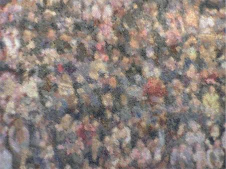
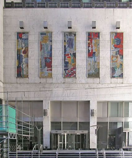
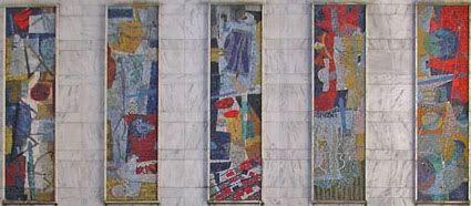
Below are close-ups of the Ronald York Wilson mosaic panels at the Toronto Bell Canada building, which I blogged about here. These close-ups are mentioned in Mills' biography by his wife Lela Wilson, York Wilson: His Life and Work1, but she doesn't provide any images. I went looking for them in various other biographical books and on the internet, and couldn't find them anywhere. So, I went back with my trusted camera and took more photographs.

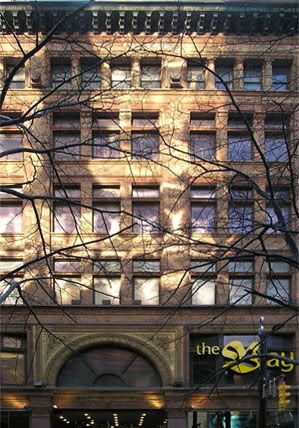
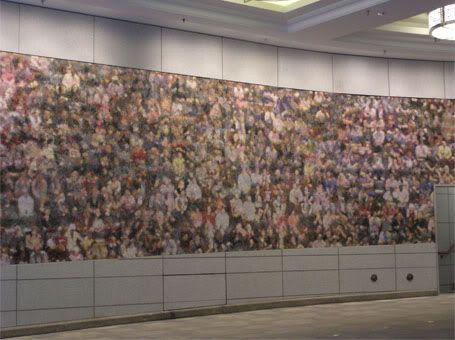
Color is hard to find in Toronto, but sometimes it surprises us in unexpected places. Despite the unattractive building, which stands right across the street from the beautiful Art Deco Concourse building, the murals on the Bell Canada facade add much appreciated color to the surroundings.
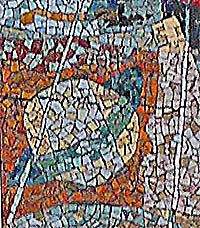
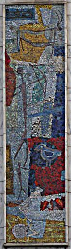
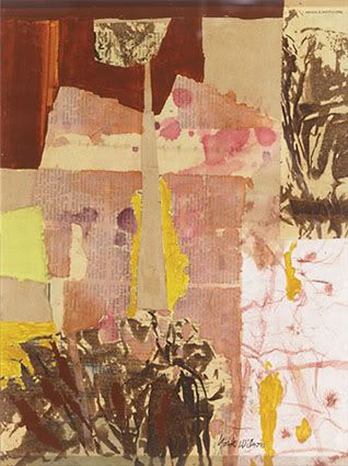
"Satellite in Action"

Prehistoric men

Prehistoric animal

Panel with "Satellite in Action"
[image center left]


Panel with prehistoric men
and animal


Below is an excerpt from Lela Wilson's York Wilson: His Life and Work which describes a little of the method behind his murals, including the collage effect he achieved which I discuss here.
A mosaic for the Bell Telephone company

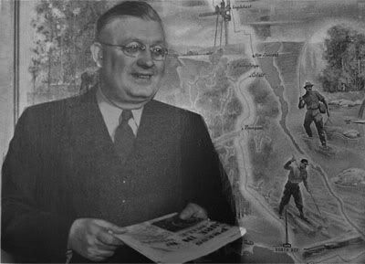
Russell Branddon’s book Roy Thomson of Fleet Street was published in 1965. Inside was a photograph from the early 1940s of Thomson posed in front of Land, Lakes and Forests, the mural he commissioned York to complete for his Timmins Press Building in 1940. It was York’s first mural.[continued below]
I'll break here to add some information about Roy Thomson, for whom York designed his first mural 
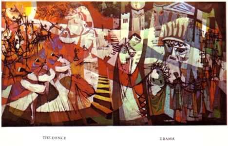
Land, Lakes and Forests, and which then got him many other commissions around Canada, including his famous ones in the Sony Centre for the Performing Arts (which I've posted here).

Roy Thomson, who was known as Lord Thomson of Fleet due to some obscure lineage and for which he denounced his Canadian citizenship to become British to receive his title, died in 1976 a British citizen in London, never having reclaimed his Canadian citizenship. Nevertheless, the concert hall in downtown Toronto, the Roy Thomson Hall, is named after him. I think is partly in honor of his enterprising spirit and legacies of radio stations and newspapers he left behind. His family had also donated $5.4 million towards the construction of the hall.

Thomson started out modestly by selling radios. He then set up his own radio station in Timmins, a northern Ontario town. Eventually, he bought the Timmins Daily Press, and thus began expanding both his radio station and newspaper business. While in Timmins, he got Wilson to design Land, Lakes and Forests for his office, which depicts the rugged nature of northern Ontario.

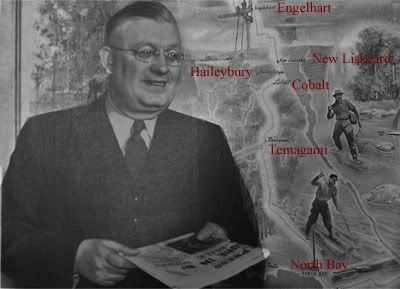
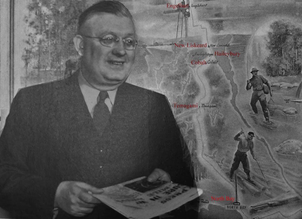
Below is a photograph of Roy Thomson in his Timmins office, presumably holding the Timmins Daily Press, with Wilson's mural behind him.


I've added the names of the towns in red. A bigger version is here.

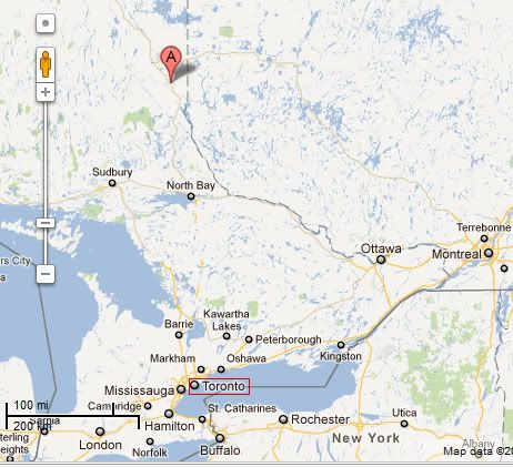
And below is a map which shows the distance from Toronto (and Ottawa and Montreal) to Engelhart - shown as point A on the map.


North Bay is what most Canadians would think of as the beginning of the (mythical) north, with its wild wilderness and empty landscape. A harsh place with long winters, and very little reprieve in the warmer months, with hardly any spring and a short summer. Thomson's venture up north was bold, as his later business acumen would show.

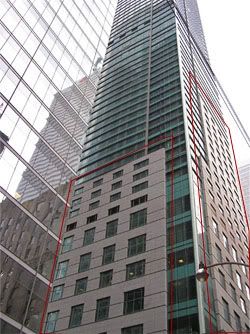
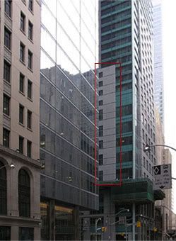
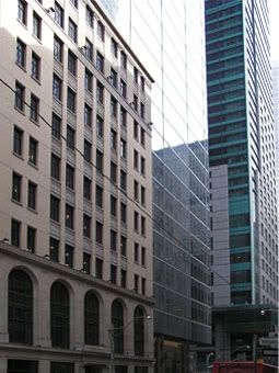
Below, I continue with the excerpt from Lela Wilson's biography, describing Wilson's commission to design the Bell Canada mural, which still stands today, in a side street below Queen Street in downtown Toronto, which I've never noticed before until recently, when I started to photograph the buildings around the downtown area. Most of these buildings are impressive, solid highrises, some skyscrapers, with beautiful turn-of-the-twentieth century Art Deco ornaments. The Bell Canada building, as I wrote here, was built much later in 1965, but it seems to be a "bridge between the "old" skyscraper age and our new [glass] one" as I wrote here.
A mosaic for the Bell Telephone company [cont.]

More than two decades later, York received a commission for a mural at the new Bell Telephone building on Adelaide Street in Toronto. York completed this project and the Port Arthur General Hospital murals during the eighteen month period separating our return from Paris in early 1964 and our departure for a world-round trip in late 1965.

York was thrilled at the prospect of a mosaic mural for Bell. He had been interested in mosaics ever since we stopped at Ravenna while en route from Venice to Rome in the autumn of 1957. York had discussed mosaics with architect Ronald Dick and Franklin Arbuckle when they visited us in Paris in late 1963. When the building was contracted to Marani, Routhwaite and Dick architectural firm, Ron Dick recalled that Paris conversation and contacted York. In a letter of April 25, 1964 to Dick, York outlined his theme and declared the mosaic medium desirable “in that it would introduce colour in an unusual way, where it would have value both as decoration and as identification.”

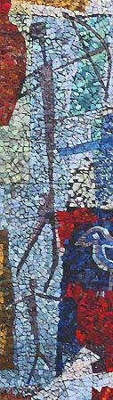
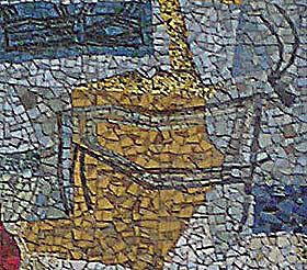
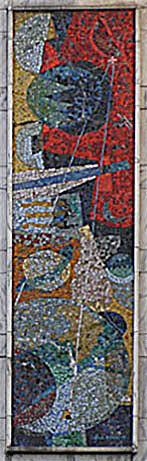
The mural was to take the form of five vertical panels, each 20’ by 5’, installed on the building’s external façade. The mural’s title was Communications. Each panel expressed a different of the theme: written, drawn, musical, verbal and electronic. Within the panels are many symbols, including Greek, Moabite, and Etruscan letter forms, early Spanish cave paintings, bars of music, abstracted human faces, and a satellite in action [note: I've posted some of these images above, from photographs I took of the mosaics].

To execute the Bell mural, York contracted the services of Alex Von Svoboda of Toronto’s Conn-Arts Studio, a firm specializing in mosaics, murals, designs and sculptures for ecclesiastical and commercial projects. York designed the mural, selected the material and Conn-Arts did the installation. At the Conn-Arts studio, York enlarged his sketches onto heavy brown paper later marked like the pieces of a jigsaw puzzle. The tesserae were glued face down onto the paper in their final design; when the tesserae were embedded in cement, the brown paper was removed and the panels were installed on the building. Throughout the process, York enjoyed an excellent rapport with Alex and was pleased with the finished mural, installed in 1965.

In “Wilson Rings Bell with Mosaics,” published in the Globe and Mail (June 12, 1965) shortly before the mural’s installation, Kay KritzWeiser discussed the project’ genesis and execution, and noted that York had been careful to mimic the uneven surfaces of early mosaics, “so that the play of light and shadow during day and night will become a continuous wonder. Rain will sluice away soot. Sun will catch the glitter of gold leaf impregnated between layers of glass.”

These beautiful colour murals, surrounded by white marble, are best appreciated when viewed up close. Unfortunately, they are placed so high that one cannot appreciate them fully, and the mosaics are no longer lit at night. Bell’s brochure, which featured a colour reproduction of the finished mural, is no longer available. York made a small sample mosaic section which the AIO toured to schools and small towns in Ontario in 1965. At that time, numerous buildings in Toronto featured mural decorations. As an article in the Toronto Daily Star (August 9, 1965) queried, “What’s a Business Without a Mural?” York’s works for Imperial Oil, the O’Keefe Centre and Bell are mentioned therein.
Reference:
1. Lela M. Wilson. Edited by Sandra Dyck (1997). York Wilson: His Life and Work, 1907-1984. Carleton University Press.
pp171-172

[Photographs by KPA]

Saturday, February 18, 2012

"Chink in the Armor"

[Photoshop by KPA]

I remember when newspaper headlines were fun to read. Those in charge of finding titles seemed to enjoy themselves, and had no pcpolice at their throats monitoring their words.

The New York Post has been my source on the recent New York Fashion Week, with great images and reports. I still go there to read the regular stories on fashion and entertainment, so I would have caught this headline anyway:

"ESPN apologizes for racist Lin headline"

I've been following Lin, somewhat, although I'm not really interested in basketball, and I don't think I've ever watched a full game. So I was curious what the "racist" headline would be. And here it is:

"Chink in the Armor."

I think this is funny.

It is perfect, in that it describes exactly what happened. A Chinese player (the only one, hence the chink) who is supposed to be the star player pulling the team (the armor) together, was found to be deficient, and became the liability.

On a more serious note, I don't understand the eulogies that go alongside Lin's name, as though he could do no wrong. He is only one, tall Chinese guy, after all.

And on yet another serious note, black basketball player who went to China found that the Chinese players had no politically correct sentiments when fending off aggressive blacks. Although it came as a shock to the black players, I don't really see anything redeemable for the Chinese either. I get the feeling that they can be as vicious as any black, and perhaps even more so.

I think that we should keep an eye out on the Chinese. My blog has been writing on that for a while now.

Dolly Girl

Anna Sui's fragrance Dolly Girl.
Channeling her inner China Doll?

I posted on Anna Sui and her designs at the New York Fashion Week. There is very little biographical information on Sui other than that she was born in Detroit Michigan, and her parents lived in Paris before they settled in the US.

Anna Sui and Family:
[Image Source]

[Image Source]

Neither of these sources give full information on the members of this family, if they are all indeed part of the family. Why post images without telling us what or who they depict? Anyway, the best I can come up with is this:
- Sui's parents are both Chinese, so the elderly Chinese woman in the second image is most likely her mother.

- Various biographical sources write that Sui has two brothers, so it is likely that the two older Chinese men are her brothers.

- One is sitting close to a white woman holding a young child, in the top photograph. She looks like she's the same woman with the child in the bottom photograph, standing next to a man holding another child. These children could be their children, they do have the half Caucasian, half Chinese features, so they must be part of the family at some generational level.
- The other Chinese man, with the his hand on the young girl's shoulder in the bottom photograph, at the far right, could be the girl's father.

- The two young girls in the two photographs are likely the same girls. They also look half Caucasian, half Chinese, and may be the children of either one of the brothers - Sui, as far as I can find out, is not married, and has no children.

- The boy in the top photograph, sitting second from the right, looks like the same boy in the bottom photograph, sitting in the middle of the front row. He also looks half Caucasian, half Chinese, and could be the son of either one of Sui's brothers.

The boy next to him in the top photograph looks Chinese (not mixed). It's hard to deduce who he could be. I'm assuming that the Chinese-looking boy is not part of the family since all the other younger members of the photograph look like they have some mixture.

- The boy in the bottom photograph at the far right looks like a mix (Hispanic and Chinese?), and it is also hard to deduce who he could be, but it could be that the Chinese part resulted with darker skin than the others.

- Is the white man standing at the far left in the bottom photograph Sui's husband/etc? He looks like he's part of the family, and perhaps doesn't want the publicity that goes with being associated with a famous person, and may be keeping out of the radar.
My point really is that Chinese families are now a mix, of mostly white and Chinese. And it is mostly Chinese women and white men who make this mix, as Sui's photographs seem to show.

Sui's Inspirations:

Sui's inspirations are numerous and eclectic (this is another way of saying that she's promiscuously all over the place.) In another interview, she says:
"There’s something about the ‘60s. I love the color palette, and so much of the ‘60s was inspired by folk art but also the Victorian period, and I love that," Sui said in an interview.
Rock and Roll and Punk Rock is another theme that comes up. According to Fashion Encyclopedia:
When Anna Sui started her own apparel company in 1980, her mission was to sell clothes to every rock 'n' roll store in the country. "It was right after the punk rock thing and I was so into that," said the designer, who has earned a reputation for bringing a designer's sensibility to wild-child, rocker clothes with a vintage spin.
Her enthusiasm runs the gamut from Art Deco (she also gratuitously adds in Art Nouveau) to Vienna’s Wiener Werkstätte, and an obsession with the1920s fashion illustrator Aubrey Beardsley, according this this:
Everyone’s talking about Copenhagen right now and a lot of people go there for research,” she offers. “I went to Finland and Stockholm but we didn’t have time to go! In Finland they had vintage Art Deco — there was a flea market there, really good old stuff, for nothing!” The Art Deco movement is just one of Sui’s enthusiasms, which run the gamut from textile maven Zika Ascher to obscure 1970s rock to patterns from Vienna’s Wiener Werkstätte at the turn of the last century. Each collection expresses the latest tangent of Sui’s curiosity (“If you saw my office, it’s shock full of inspiration — layers of inspiration!”), often trimmed in crochet, handmade lace and other decorative trims.
Rock stars and glam girls seem to be part of this 47-year-old's psyche. Here's what she says at her website:
People are attracted to my fashions because of all the elements I try to put into it -- There's always a very sweet feminine, girly aspect…a touch of nostalgia. There’s also the aspect of trendiness; the hipness I try to create by always adding a rock-and-roll coolness. There's always that ambiguity…the Good Girl/Bad Girl thing. All these facets have to go into my designs, or it doesn't look like "Anna Sui". Every product I put my name on has to personify the "World of Anna Sui". When a customer buys a tube of lipstick, it should give them the same excitement as buying a dress from my collection. If it doesn’t, then I'm not really doing my job.
And of course, China.
Growing up and learning about Chinese culture from my parents, and hearing them talk about all the different places they had lived…prepared me for thinking globally. This perspective took away any fears of being able to function in a foreign country. Their experiences were a gift to me.
This erratic, unfocused, state of mind is apparent in her work. As I wrote in the previous post on her designs at New York Fashion Week:
There's too much going on!.... When in doubt, keep adding, is usually the motto of the mediocre.
This is similar to what I wrote about another Asian fashion designer, Vera Wang:
Most brides still prefer their dresses in white (or ivory)[note: Wang is designing off-white, beige, grey and black wedding dresses], so I wonder how Wang even makes good profit off her bridal designs? Not surprisingly, she has branched out into "regular" fashion design (I'm getting tired of shoddy dresses thrown at us by mediocre and irresponsible designers), as well as standard home decor, which other designers have done better. I don't see any particularly stand-out products from any of her departments.
Sui also designs perfumes, which is standard fare for fashion designers, but here are the names of her fragrances, referencing her girly, rock and roll, hippy, good girl/bad girl, Chinese glam girl facets:

- Night of Fancy
- Flight of Fancy
- Live Your Dream
- Sui Love (as in Sui Generis?)
- Classic
- Forbidden Affair
- Rock Me!
- Rock Me! Summer of Love
- Sui Dreams
- Secret Wish
- Secret Wish: Magic Romance
- Dolly Girl (As in "China Doll?)

I go to my trusted online perfume connoisseurs at Fragrantica to see what the word is on Sui's perfume Dolly Girl. Below is what "missk" (Miss K?) writes. Her writing is lucid, and she doesn't seem to have the giddy opinions which seem to come mostly from teenage girls on the site, which this floral/fruity/juicy perfume seems to be geared toward:
I didn't have high expectations prior to testing this fragrance, and not surprisingly I wasn't blown away by this scent.

There was nothing unpleasant about it, but then again there was nothing overly wonderful about it either. Looking at all the unique and interesting notes listed, I'm wondering where all those notes were.

I could definitely not smell cinnamon or melon in the top notes, which is a damn shame, because those notes when blended with the apple and bergamot should have created something interesting. However, I was met with a scent that can only be compared to a cheap drugstore fragrance.

What is supposed to be a beautiful heart of florals, turns out to be so faint that you can hardly smell it. In fact, Dolly Girl hardly lasts at all. It's possibly one of the worst fragrances when it comes to lasting strength.

I didn't get any of the powderyness that everyone is describing here, instead I got a big jumbled mess of fruits and flowers, making it very difficult to distinguish any particular notes.

Although I find the bottle design creative, up close it looks rather cheap and tacky. Unfortunately there's nothing about Dolly Girl that I actually like. Even the name is a little ridiculous and childish.

I haven't tried the other fragrances in the Dolly Girl series, but here's hoping they are much better than the original.
Another Asian designer "almost" moment.

Sears, at the Eaton Centre has a stand, right by the escalators, with Anna Sui products. I always walk by them a little fascinated. Everything seems so over-exaggerated. Large black roses are carved on gaudy pink, yellow and reds plastic tubes, on a counter which looks more like a boudoir than a makeup stand. My first impression, when I saw this was not "Who is the designer?" but "What do these exaggerated colors and bottles really hide?" As in, "Is the product as good as the packaging?" It seems like fruity/floral/juicy concoctions for the perfume, geared at teen-agers like Vera Wang's Princess, and just another red - Vivid, as Sui blandly names her red lipstick.

Vivid

Friday, February 17, 2012

New York Fashion Week Revelations

Asian designers have "almost" moments, as I wrote about Vera Wang's dresses (view my recent entries under "Fashion" for more on this). They are clever at marketing themselves, and also clever at picking up (copying) certain current trends. But their works lack something. It is partly creativity, partly craftsmanship, and the overall effect is oddly inferior work which almost passes as something of quality.

Anna Sui is an Asian fashion designer who has been somewhat under the radar, but has entered the limelight due to some fascination for all things Asian. At the February 2012 New York Fashion Week, her collection of prints don't quite get the grade, as I explain with samples of designs below.

On the other hand, Oscar de la Renta convinces us that prints are back again, from tweed suits to prints made from images of magnified jewels.

Below, I compare de la Renta's works with Sui's, and later on, how glamor is presented by an old pro.

Sui herself, probably in one of her "creations."
I've written about this trend where (some) designers
present themselves in unattractive attire,
and how this actually reflects on their works.


Sui brings on a mish-mash of pseudo-prints
Left: The pattern is erratic, and the colors unattractive
(and in some places, they clash - fuchsia with orange?)
Right: Layering of prints doesn't work,
unlike de la Renta's better approach to mixing prints (see comment below)


Her prints on wool look like a faint imitation of tweed: the pattern is unbalanced and the colors unattractive. Her prints on the lighter material are more successful, with an interesting play on squares, but the dress as a whole, which is too short, and with an odd collar and unnecessary pockets, doesn't work. Her layering of prints which are very different (the jacket vs. the dress) simply makes the overall outfit look badly designed.

Left: Oscar de la Renta reintroduces the classic tweed, but with a twist with a non-matching jacket and skirt, and a large (giant) fur collar
Right: His colorful print on the right are enlarged images of jewels


Left: Sui's sequins any which way. Stripes down would have made the dress more elegant. And the feathers around the neck?
Right: Clumsy, heavy faux fur jacket with jacquard print, and matching jacquard boots? A buttoned-down round collar for evening wear?

Close-up of neck-line of Sui's evening gown

Another mish-mash of materials, without much structure or design. It looks like a mop with glitter. An open neck-line (with a v-collar), following the direction of the design, would have been more attractive, and more classic.


I've done a simple photoshop edit to remove the fluffy neck-line (and the sleeves). I think that without it, there is more shape to the dress. There is still something ungainly about the horizontal stripes, the odd drop waist, the transparent sleeves with embroidered designs that compete with the rest of the dress, as do the lace stockings. There's too much going on!, which is the criticism I have of the blue dress. When in doubt, keep adding, is usually the motto of the mediocre.

Emerald elegance for de la Renta. And even his mounds of chiffon is inventive, with swirls adding drama for evening wear.

Ralph Lauren's inventive bodice,
with old Hollywood glamor as reference


Thursday, February 16, 2012

Architecture and Art

Toronto's Bell Canad building on 76 Adelaide Street with the
five-panel mosaic "Communication"by Roland York Wilson.
The panel was constructed in 1965
[Photo by KPA]


Close-up of the mosaic "Communication"
[Photo by KPA]


I recently posted on the Art Deco Concourse building in downtown Toronto, and found that the mosaic in the archway was by Group of Seven artist J.E.H. MacDonald. Across the street from this building is a more recent highrise, with a five-panel mosaic mural on the wall above the entrance. I asked several people about the panels, but the only answer (help) I could get was to look for the information on the Bell Canada site, since the building is the Bell office in Toronto.

Above are photographs of the Bell Canada building with the mosaic panels, and a close-up of the panels. I couldn't find more information on the panels other than that they're collectively called "Communication." The works are clearly of an abstract nature, so what part of their imagery relates to "communication" remains a mystery to me. They appear to be some kind of collage mosaics. Some even look like colored paper that has been ripped or torn, and pasted together to form the image. But they certainly add color to the building and the street.

The building is far less interesting than the Concourse building just across the street, although the marble facade and the railings at the very top might make it more attractive once the construction ramps are removed. The architects are Marani, Morris Allen, who built several other important, but nondescript, buildings around Toronto. The Bell Canada building was completed in 1965.

Around the corner from the building is the new Trump International Hotel and Tower, the reason I went in that neighborhood in the first place. The hotel (which is really a combination of condominiums and hotel rooms) is now complete. It is the usual, glass-heavy, post-modern architecture that is sprouting all over major cities these days, but has none of the beauty and, I think, lasting power, of the older skyscrapers like the Concourse building. The Bell Canada building looks like it was the bridge between the "old" skyscraper age and our new one. Glass and marble are not cheap and they are hard to carve and decorate. So many current buildings are left plain. And it is as thought the expense of the material is enough to throw out ornament.

The artist who designed the panels is Ronald York Wilson (1907-1984) about whom Lawren Harris, another Group of Seven artist, writes:
"Although it is certainly not my customary habit to write so-called fan letters to my colleagues, in this singular instance I feel moved to do so. I made a point of stopping over in Toronto with the express purpose of seeing your imperial oil Murals. I am happily convinced that this break in my journey was completely justified and rewarded, for the murals proved to be beyond my furthest expectations. You have succeeded in a gigantic undertaking, the very thought of which would undoubtedly terrify the great majority of your contemporaries in your own profession..."

(Lawren Harris to York Wilson, 1959)[Source]
Here's a brief biographical information on Wilson:
Ronald York Wilson, painter (b at Toronto, Ont 6 Dec 1907; d there 10 Feb 1984). Wilson studied commercial art at Central Technical School and first worked at Brigden's engraving house in Toronto (1926), where he was influenced by Charles COMFORT and Will OGILVIE. Wilson was first recognized for paintings of the burlesque, such as those he exhibited with the Canadian Group of Painters at the World's Fair in New York (1939), and other social commentary pictures. He became a full-time painter in 1950. Trips to Mexico in 1950 and 1953 exposed him to the influence of Rico Lebrun and stimulated an interest in mural painting.

Wilson was best known for his commissioned murals, including those for McGill University's library (Montréal, 1954) and the Imperial Oil Building (Toronto, 1957). In the later 1950s his interest in "picture construction" led him to abstract painting and then, in the 1960s, into geometric art.
And here is more extensive information, including his early influences and decision to take up mural art.

Wilson's work reminds me of early 20th century collage art. Although none of his biographers describe his work as collage, some of his painting clearly have that influence. For example, the piece "Blue Opus" which I've posted below is described as "Ink, Lithography, Paper, Print" by one source, and as "Colour mixed media print" by another.

Blue Opus
1978, colour mixed media print, 14" x 18.5"


Below is an example of a collage-like painting:

Cape Breton Hills
1980, oil on board, 12" × 16"


Facade
Acrylic on Canvas, 24" x 32"


And Wilson did create mixed media or collage work.

Penatantes
1943-45, Collage, 15" x 11 1/2"


Wilson's Mural in the Sony Centre for the Performing Arts, Toronto

The Lincoln Center also has panels of murals, by Chagall, in its foyer. Perhaps that is where the Sony Centre got its idea from. On another note, Sony Centre, with its clear reference to a corporate sponsor, has such an empty ring to it compared to the Lincoln Center (which despite this article's ambiguous information, clearly is named after the president).