Friday, December 22, 2006

The Diamond Receptacle

Intermediary between folk and fine art

Ethiopian fine art history consists entirely of religious art. Any non-religious art is the result of very recent modern-day art training and art schools.
But, there is an equally strong folk art history of textiles. I think, at its peak, textile/folk art reached the level of art. This is especially visible in the embroidery of dresses and shawls.
The word for embroidery is "tilet". For art it is "tibeb" – Fine Art being "Sine Tibeb". These borders go both by "tilet" and "tibeb". Somehow, the designers have found a term that would describe these borders both as a folk art (tilet) and as an intermediary between folk and fine art (tibeb). This is a clever nomenclature. I think English terminology could make more use of this.
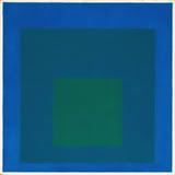
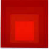
Now for the embroidery. As Albers found through intense and life-long experimentation, these borders did indeed find a receptacle for art to permeate into the wider society. The primary shape that contained these colors is the diamond, rather then Albers' square.
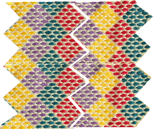
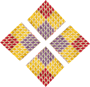
Here is the example of the border. I will try to analyze it briefly.


First -

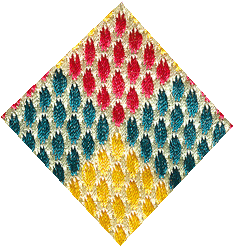
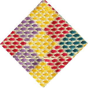
There are four diamond shaped colors as part of the overall theme: purple, yellow, red and green.
The first and second rows are the same colors, but flipped. Purple is substituted for yellow, red for green.
These two rows are then repeated for the rest of the design.


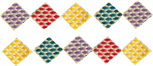
In color terms, purple and yellow are opposites, red and green are opposites. So at the very initial design stage in choosing the colors, the designer made a clear aesthetic decision.
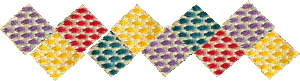


Second
Vertically, the colors have been juxtaposed with their opposing partner – purple with yellow, red with green.


But, to make the design more interesting, each vertical combination was flipped, and joined in rows. Purple-yellow-red-green links with Yellow-purple-green-red.


As complicated as even these four color combinations manage to be, it is in the initial step, where the individual colors were chosen and placed, where this more complicated design becomes possible.

Third
The eye starts to pick up pockets of color where the diamonds have joined making larger diamonds.


So there is a horizontal, vertical and shape-influenced reading of the design.
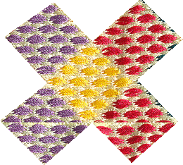
Fourth
The perennial cross shape is clearly decipherable within the design.


Fifth -
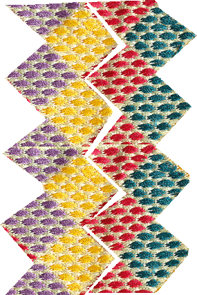
How do the viewers/wearers interact with this "tibeb"?
Well, as mentioned above, they pick up on the various shapes and juxtapositions – vertical and horizontal lines, and diamond and cross shapes.
Also, the shawls are not worn in one position. Draping the cloth and the embroidery across the shoulders and around the back allows for the embroidery to be viewed straight across, at an angle, and moving with the person’s body.
Thus it would seem that the shapes, colors and lines are always fluctuating.
So this diamond shape seen at one angle can look quite different at other angles.


Most importantly, the colors which are doing all this enunciation of shape line and direction also play a separate and independent part.
Yellow is pulled brightly forward, green is more subdued and stays in the background, red is less forceful than yellow, and purple isn't as passive as green.


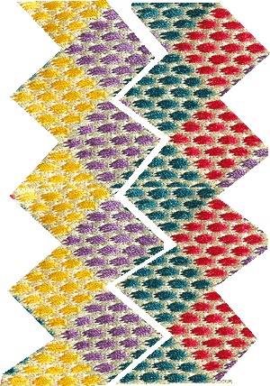
Albers' idea of interacting the "viewer" with the art has gone a step further with this embroidered shawl.
Since the piece is not static, motion, direction of wear, even body size and shape, will all influence the viewer. The initial color choices, with their clever use of color dynamics and juxtapositions act as the important base for the work. The rest is completed by the human body and the human eye.
I wonder what Albers would have made of this subtle work of art?


Thursday, December 21, 2006

Folk and Fine Art

Albers as choice leader

Color as a predominant element in most folk art. The irony is that what is considered the most sophisticated of the arts - the Fine Arts - started to adopt that idea in the 20th century.

Albers, for all his pedagogy and experimentation, is really a Fine (and fine) artist.

But, Albert was always trying to externalize his work and relate it directly to his viewers/audience/the community at large, and keep it within the outside world.

This is not entirely Albers’ conception – all art is really about trying to connect to the outside world some inner realm (usually spiritual). But I think Albers put it to another level, where he tries to make the audience do more of the imaginative work.

A pieta by a renaissance artist already has the story complete in the painting. The audience is expected to appreciate a new rendition of an ancient theme, but his vision is locked in the vision of the artist.

I think Albers tried unlock this method. His strategy was to leave representation out of his art, and instead find a receptacle from which he could unleash his audience’s imagination.

The square worked wonderfully because all people could concentrate on was the colors, and their interactions. And each individual can “fill in the gaps”. Red and green does what? Blue surrounded by yellow evokes what? Each person can fill in his own experience. Each person can make art, in a way.

Now, I don’t really think this is the best way to go for Fine Art, since the onus for the masterpiece is on the artists, and a common viewer can never achieve that level of perfection. But for 20th century artists, in their communal viewpoint, it was crucial to their art.

So, what of folk art and Albers? Well the purpose of folk art is really to involve rhe whole community. Everyone gets to dance, everyone gets to wear the clothes, everyone gets to paint the house.

Everyone participates. With a few choice leaders, of course. Which is the role that Albers has been trying to take all his life.

Still, for all his attempt at popularity, Albers remains in the tradition of the Fine Artists whose work is influenced by their more mundane.


Saturday, December 9, 2006

Color within Form

Study of Josef Albers' Design Strategy 

Josef Albers used his “Homage to the Square” series to try to contain color in form, but to keep color the center of attention.

A tree painted in saturated and vibrant colors will still be a painting of a tree, irrespective of the strength and force of the colors. Thus, form takes precedence over color.

Albers managed to side-step this difficulty of form almost always overriding color by making the most basic of forms, the square, the container of color.

There is no pronounced visual, psychological, cultural, contextual meaning attached to the square. It is just a square.

Thus, Albers put his juxtaposition of colors in this square (or nested squares) to get us to concentrate on color instead.

No randomness, no abstraction and no alien shapes and elements. A simple form of a square saturated with color.

But, what was his intention?

His response, as all artists will have a reason as to why they do things, is that he wanted people to interact with these colors in their own time, and in their own way.

How does an outer dark blue square interact with a nested bright green one? How about the an outer-most square of a brighter blue and its relationship with both these nested squares?


Study for Homage to the Square: Beaming 1963

[The squares] move forth and back, in and out, and grow up and down and near and far, as well as enlarged and diminished. All this, to proclaim color autonomy as a means of plastic organization.'
Josef Albers


Homage to the Square: MMA-2, 1970


Tuesday, December 5, 2006

Visual Experience

In NYC


Josef Albers, Hommage to the Square, 1963

I took advantage of my recent trip into New York City to upgrade my visual vocabulary, or at least my visual experience.

Besides realizing the greatness of New York architecture, there was a lot to see.

The Metropolitan had the Weimar Republic German artists do their rendition of that decaying society. But, one can see their supreme (for lack of a better word) talent when viewing their drawings. I believe it is the drawing that makes the artist, and these ones are no exception.

Since the theme was German (well, I also got to see the Tiffany estate collection, the American Painters in Paris and Sean Scully’s Wall of Light - more of a patchwork colorist - I went to the nearby Whitney to see the exhibition on the Bauhaus designers Josef Albers and Moholy-Nagy. These were the artists that were eventually kicked out of Germany by the Nazis.

Albers experimented with color extensively. His deceptively simple squares are really an attempt to put color, and our interactions with color, to the forefront.

I think he succeeded both experimentally and in a small, genius sort of way, artistically.

I am working on another blog entry called “Albers and the Abyssinians”. Another charming genius creation, which I’m sure Albers would have appreciated.


Friday, November 10, 2006

Ode to Cathedrals

Jacques Brel's Poetry

Here is some Jacques Brel, to enjoy reading and to listen to.
Audio/Video of Le Plat Pays.


Le Plat Pays

Avec la mer du Nord pour dernier terrain vague
Et les vagues de dunes pour arrêter les vagues
Et de vagues rochers que les marées dépassent
Et qui ont à jamais le cœur à marée basse
Avec infiniment de brumes à venir
Avec le vent de l'ouest écoutez le tenir
Le plat pays qui est le mien

Avec des cathédrales pour uniques montagnes
Et de noirs clochers comme mâts de cocagne
Où des diables en pierre décrochent les nuages
Avec le fil des jours pour unique voyage
Et des chemins de pluie pour unique bonsoir
Avec le vent d'est écoutez le vouloir
Le plat pays qui est le mien

Avec un ciel si bas qu'un canal s'est perdu
Avec un ciel si bas qu'il fait l'humilité
Avec un ciel si gris qu'un canal s'est penduvAvec un ciel si gris qu'il faut lui pardonner
Avec le vent du nord qui vient s'écarteler
Avec le vent du nord écoutez le craquer
Le plat pays qui est le mien

Avec de l'Italie qui descendrait l'Escaut
Avec Frida la blonde quand elle devient Margot
Quand les fils de Novembre nous reviennent en Mai
Quand la plaine est fumante et tremble sous Juillet
Quand le vent est au rire, quand le vent est au blé
Quand le vent est au sud, écoutez le chanter
Le plat pays qui est le mien


The Flat Country

With the North Sea for the last bit of waste land
And the waves of dunes to stop the waves
And the shapeless rocks that the tides pass over
And who forever have their heart at low tide
With an infinity of mists still to come
With the wind from the west listen to it hold
The flat country that is mine

With cathedrals for its only mountains
And black church towers for greasy poles
Where devils in stone unhook the clouds
With the passing of the days for the only journey
And roads of rain for the only good evening
With the wind from the east listen to it want
The flat country that is mine

With a sky so low that a canal lost itself
With a sky so low that it acts humiliated
With a sky so gray that a canal hung itself
With a sky so gray that you just have to forgive it
With the wind from the north that comes tearing itself through
With the wind from the north listen to it break
The flat country that is mine

With a little of Italy which will climb down the Escaut
With Frida the blond when she becomes Margot
When the sons of November return to us in May
When the plain is steaming and trembles under July
When the wind is for laughter, when the wind is for the wheat
When the wind is from the south, listen to it sing
The flat country that is mine


Wednesday, October 25, 2006

Warhol's Universe

Mastery over the stars


Andy Warhol, Silver Liz as Cleopatra, 1963
Silver paint, silk-screen ink and pencil on linen


The small but effective Andy Warhol Supernova: Stars, Deaths and Disasters exhibit at the Art Gallery of Ontario ended just after I got a chance to visit it. There were a few bonuses for this delay, including a free audio device with commentary by David Cronenberg, who acted as guest curator.

Warhol was a savvy promoter. He did work as a graphic illustrator for various agencies before becoming "an artist." The medium he eventually settled on, silk-screening, avoids all the meticulousness and time required for painting or drawing. And unlike photography, there is no attempt at continuously and obsessively trying to get the perfect image.

One of the things that always struck me about Warhol's silk-screens was how his images started off grid-like and relatively unblemished, with each image squeegeed with more-or-less the same amount ink. Then, progressively near the end, they are full of smears and overlaps.

My only conclusion was that he wants to degenerate his subjects, destroy them. Not only that, he wants to destroy the "work" altogether. I think that his lazy and controlling nature spawned this proclivity for destruction. Since he cannot make a masterpiece, he may as well dramatize his incompetence by destroying it. I've noticed such a tendency toward degeneration by many "artists" who have forfeited mastery and skill for self-expression, which eventually portrays itself as outrage and destruction.

Warhol's unimpassioned car crashes and race riots silk-screens are really a camouflage for his real interest – his desire to control creation and destruction all at once. He cannot be those Hollywood stars, so he may as well create, then destroy them, from his alternate Hollywood in his New York art studios.

It seems his whole being was infused in finding his own star. He certainly found something, albeit longer than the fifteen minutes he predicted for everyone else. But then, he was always a savvy self-promoter.


Saturday, September 30, 2006

Warhol's Icons

Heeding the warnings of Byzantine Emperors


Golden Marilyn, 1962

I've been busy these past few days, with visitors and also updating my website and completing a design study. I'll be posting on those soon.

Meanwhile, a lot has been going on. The Pope initiated a scholarly dialogue about Islam, and has had to make some amends with public relations meetings with Muslim leaders.

He quoted a Byzantine Emperor’s interaction with a Persian scholar, on the nature of Mohammed.

An exhibition entitled Andy Warhol / Supernova Stars, Deaths and Disasters is currently on show at the Art Gallery of Ontario.

Now, there is a connection somewhere, which I will try to elaborate in a later blog entry and possibly an essay.

Mainly, that Warhol, who was Byzantine Catholic, produced some very iconic-like works which are reminiscent of the Byzantine religious imagery.

If the Byzantine Emperor were to see Warhol’s imagery, given that his Empire went through the infamous Iconoclastic period where icons were destroyed following the 10th commandment’s ordinance against worshiping graven images:


Exodus 20:4-5
4 Thou shalt not make unto thee any graven image, or any likeness of any thing that is in heaven above, or that is in the earth beneath, or that is in the water under the earth.
5 Thou shalt not bow down thyself to them, nor serve them


I wonder what he would think of Warhol’s art? And does art like Warhol put Christian civilizations at risk for the kind of Islamic invasions the Byzantine Emperor was describing?

The whole of Warhol’s life, and not just his art, appears to be forsaking these very Biblical verses. He made iconic images of famous stars and people who were the subject of admiration, at the very least, by great numbers of people, including himself.


Monday, September 18, 2006

St. Paul's Conversion

Depictions in Images


Left, Conversion on the Way to Damascus,Caravaggio,1601
Right,The Conversion of Saul, Fresco by Michelangelo, 1542-45
[Click on images to see larger versions]

And here is a late Medieval one by a less-well-known French painter Jean Fouquet (Paul's Conversion). Less emotional, but still full of symbolism. And Saul's horse is ever present. I couldn't find detailed information on it, but I think it is part of an illuminated manuscript, with the curved writing at the top, and the simple formality of its design.


Saturday, September 9, 2006

Article: Vermeer's Discerning Light

The Art of Painting, 1667

It is probable that Vermeer traced his images projected from the camera obscura - that precursor to the photographic machine. We feel that his paintings are attentive to every detail in the frame, as though he had the luxury of viewing and contemplating these domestic scenes day-in and day-out. We do know that Vermeer took many liberties with his compositions, and not all details are articulately present, and some might even have been invented. Nonetheless, what lures us into his paintings' sense of completeness is light. His paintings invite us into the glowing chambers of the camera obsucra by gently receding the heavy curtains that cover the entrance into that magical box.

The Milkmaid,1657-58

Vermeer floods his paintings with light. It is not the harsh glare of the spotlight, or the diluted glow of foggy ambience, but the honest light that touches upon everything and reveals all of the subjects and objects in equal clarity. It is almost as thought Vermeer were rebelling against the drama of his countryman Rembrandt, whose light was inseparable from the composition, and who was still in the thralls of the biased chiaroscuros. Vermeer's light is separate from his compositions. It is the illuminant or the revelation to his paintings. What influences us to what is worth seeing isn't just the arrangements of the objects, but the light which puts things into view. Vermeer separated (or freed) light from the painting and made it the master instead.

Vermeer's light-infused paintings always take us aback. We as moderns are used to the illuminated, light-dependent photographs, and their infinite points of detail. It is always a surprise that a painting seems to do the same. Perhaps it is his view-finder the camera obscura, which like our modern-day camera cannot produce anything in the dark, that influenced Vermeer to use light in such a way . What he saw through the camera obscura, and probably tried to copy, was its uncanny ability to make images and colors exceptionally vivid and saturated, as thought they are bathed in light. Like the figures we see on a piece of photographic slide or the incredibly fluid and concentrated images that are on film celluloid, it is the light that makes them work. This democratic lighting system, imbuing everything within its reach, is no longer a tool, as in the chiaroscuro tradition of composing a picture, but rather is an aesthetic device – the aesthetic device - of Vermeer’s painting. And I strongly believe that when Vermeer saw everything so clearly through his camera obscura, he fell into the spell of the all-illuminated picture. His was a clear, dispassionate view that had few of the dramatic shadows and glaring spotlights so popular of his contemporaries and predecessors.

But here lies the genius of Vermeer's art. We can see everything of say the beautiful Lacemaker down to the last workings of her industrious fingers. But do we really know who she is? Light may externally illuminate her, but the secret makings of her inner world remain a dark mystery to us. Vermeer's dispersed light exposes this subtle contradiction, and make his paintings all the more poignant. We may see all the details, yet that still doesn't make us any closer to the subjects (or objects). Rembrandt's emotional chiaroscuros (even, or especially, the darkened corners) reveal more of the characters of his men and women than Vermeer's photographic light ever does. In the ambiguities of Vermeer’s art it is all exposure but little revelation. Upon freeing light from composition (and emotion), Vermeer has turned light into a warden of his subjects. He has frozen them in the enclosure of his perfect light. Yet Vermeer's strategy is a blessing in disguise. Since his unfaltering, unexcitable light cannot make his subjects tell us who they are and how they feel, his subjects become our symbols instead. We begin to idealize them. We put our own generalized labels upon them with words like “industrious”, “heroic”, or even merely “faithful”. They become our emblems of an unswerving humanity.

The Lacemaker,1670

In our modern world, with all these light-dependent image recording devices available at any corner store, subway station, mobile telephone and even the now good old-fashioned tourist's camera, we are in constant reach with reproduced images. At one time image production was sacred or at least time-consuming. Now the recorded image (the photographic image and now the digital image) occurs at the click of a finger and of course with the cooperation of the surrounding light. Yet we know as little or perhaps even less about ourselves as we do about Vermeer's personalities. Our quick photographic light may illuminate, but it doesn't make us any wiser? And photography, for all its modern prowess as revelation and information, still refuses to give us what the subject doesn't want us to know.

Eminent painters like Vermeer understood this and used this with such patient finesse. Some of his paintings took years to finish. He labored hard to make his emotionally distant figures into iconic representations for the human race. Unlike Vermeer, we haven’t really learned the art of patient discrimination. Everything still has to happen at the quick click of the finger. Vermeer may have been generous with his light, but he was very discerning about who received it. The Milkmaid, the Astronomer, the Lacemaker, all have somehow earned his prejudice, and with that given us an enlightened world.

The Geographer, 1669

References:

Steadman, Philip. Vermeer's camera : uncovering the truth behind the masterpieces. Oxford University Press, 2001

Friday, August 18, 2006

The Politics of Design

The Design of Politics
William Morris, Jasmine Wallpaper

Politics is a popular occupation. By that I mean it requires a mingling with the general public. Even at its most elitist, when Kings and Queens were born into that specific family, its whole being depended on the people. Which went from the lowly peasant who shouted "God save the King" to the conspiring attendants in court. Without people, there would be no politics.

This is the same with art and design. Artists and designers these days conveniently forget this.

William Morris was one such designer who combined his art and his politics almost leaving no discernible line between the two.

He was one of the founders of the British Arts and Crafts movement, which eventually also influenced American designers. He made wallpapers, fabric, carpets, and even published poems and novels.

His lofty insistence on making only hand-crafted objects, eschewing the machine-made demands of the day, earned him a great reputation.

His designs are still popular today.


Friday, August 11, 2006

Blurring God

Through imagery

The Evangelical Outpost has some insights on the importance of the image. The Reuters debacle, with the photoshopped smokes (rubber stamp tool) sent a wave of skepticism about newspapers and their photographs. There is really nothing new in this. Images have been used as much to instruct and inform as to manipulate and deceive.

But, the blogger goes on to quote David Boorstein, author of "The Image":


By a diabolical irony the very facsimiles of the world which we make on purpose to bring it within our grasp, to make it less elusive, have transported us into a new world of blurs.


In other words, do images make the world more real to us, or less so? Does a photograph of Niagara Falls replace the real thing? Does it bring it closer to us?

More interestingly, though, something which The Evangelical Outposter didn't pick up on, how about all those Christian imagery we have, all the pietas, all the crucifixions, all the scenes from the Gospels? This is very different from idolatry, since these images are not to be worshipped, but act as a way of reminding us of those stories and episodes of the New and Old Testaments.

But do they bring us closer to God, or are they mere blurring effects?

The evolution in Christianity has always been to have less and less representational imagery, and depend more on the experienced reality of Christ.

I'm not sure if this is a good thing, since the efforts of a great artist who depicts these scenes is not only to represent reality, but to transmit some of its holiness and awesomeness as well.

But, maybe, just a simple, undecorated, unglamorous Church does a better job of allowing us to experience that reality. Perhaps praying in the Sistine Chapel could be a challenge – the beauty of those paintings might actually blur and compete with our real experience of God.


Monday, August 7, 2006

Sketches of Ontario

The Simcoes of Upper Canada


Niagara Falls, Elizabeth Simcoe


"... These scenes have afforded me so much delight that I class this day with those in which I remember to have felt the greatest pleasure from fine objects, whether of Art or Nature ... " Elizabeth Simcoe, 1793


Summer is scattered with holidays. This Monday is Simcoe Day, or Civic Holiday, for most Ontarians, named in honour of the first Lieutenant-Governor, John Graves Simcoe, of Upper Canada (1791-1796.)

His wife, Elizabeth Simcoe, recorded her impressions of Canada through a diary, sketches and watercolors.

The Simcoes returned to England, in 1796.


Wednesday, August 2, 2006

Heresy, Donkey Style

Bresson’s contempt for Christ

Final scene from "Pickpocket"

I've noticed that many non-Christians have a Jesus complex. John Lennon was famous for saying that the Beatles were "more popular than Jesus." And I've heard artists say things like "I am god", when they really mean "I am God." In other words, supreme creators.

Well, after seeing several Bresson films, and reviewing both internet and book sources about his views, methods and background, I can only conclude that Bresson himself has a Christ complex.

This is most apparent in his film about a donkey "Au Hazard Balthazar."

As one writer put it:

The Christ-like nature [of Balthazar's suffering] is particularly evident in the scenes where Balthazar is baptized, where he leads the funeral cortege, and where he dies among a flock of sheep, a Lamb of God.1


Bresson seems to confuse the donkey with the humble beast that carried Mary to the stable, and Jesus through Jerusalem. But just as those who mean "I am God", when they actually say "I am god", I think Bresson is clear about his intentions. He doesn’t mean the beast of burden, he means Christ himself.

Now, why should it bother me that Bresson uses a lowly donkey to present a Christ-like figure?

Because he has the behavior all wrong.

Christ was never meek, silent nor submissive, like this donkey is portrayed. Yes, the donkey gallops off once in a while (maybe just once) at the atrocities performed against him, but for the most part, he just stays and bears it.

Christ came to suffer, with fellow-men, certainly. But he also came to teach, and to provide a point for salvation. And He wasn't a meek secondary character who silently watched humanity move in its destructive course.

So, what's Bresson's point?

Subtly, by playing at our emotions, Bresson is trying to capture our sympathy for this innocuous donkey.

By implication, this then means that Jesus, who is as "lovable" as this donkey, is also as ineffective.

Therefore, the most we can feel for this donkey/Christ is a sense of pity, and eventually, like I did, contempt.

Bresson’s heretic message, by making us subliminally dislike this little beast, is actually that Christ is as equally offensive and ineffective.

And worse. Bresson might indeed have this Christ complex where he deems himself and his creations greater than the Son of God Himself. And he has to find a way to diminish Him.

------------------------------------------------------
1 Lindley Hanlon. Fragments: Bresson's Film Style. Rutherford [N.J.]Press, c1986.


Saturday, July 29, 2006

The Evil that Lurks in Bresson’s Films

Is sin relative?

I've always been bothered by Bresson's films ever since I watched a whole retrospective of them at the Cinematheque Ontario a few years back.

Well, thanks to TFO (la télévision éducative et culturelle de l'Ontario français - as their website describes it), there have been a few Bresson films to watch recently.


Two that I taped, and watched at least twice – more if I include the repeat shows later during the week - are "Au Hazard Balthazar" and "Mouchette".

I've even consulted a couple of books from the library[1,2] to elucidate to me the greatness of these films.

Needless to say, it is very difficult to find any negative criticism of Bresson's films. This is hardly surprising, since most of his critics are the type that would never watch a "Hollywood movie", let alone a film as romantically glossy as "Black Beauty".

My only conclusion is that Bresson believes in degrees of sin. He starts from the truly wilful sinners and goes on to those that seem to sin as though some automatic hand were guiding them to expose their weakness.

He seems to say that the hard and deprived life Mouchette leads might be the reason for her weakness. The evil around her (her alcoholic father, Arsène who rapes here) act as an explanation for her "unwilled" sins and her final act of suicide.

With "Au Hazard Balthazar", he sets the backdrop of a donkey as a saint (what do animals know of sin, anyway?) and contrasts it with truly unsavoury characters who then appear to downplay the waywardness of those who once again seem to act on unconscious automation. Thus, Balthazahr is the saint, Marie performs sin as a reaction to her environment, and Gérard is the true evil.

Bresson excuses this secondary category, those with unwilled waywardness. They’re close to being good, he says, so their breech from righteousness is not their fault.

I think this is the mindset of someone who tries to defy God, who tries to rewrite God’s word, and who is so self-centered or arrogant to consider his "petits péchés" worthy of correction, or even expiation. These small deviations can add up to bigger ones, as we witness with Mouchette's demise.

Finally, if he believes in degrees of sin, where Marie, who succumbs to Gérard’s evil seductions is less sinful than Gérard (who beats the donkey and later Marie) because she "can’t help herself", then he has entered dangerous territory.

It is dangerous to relativise sin. To each his own, and to each his own exit, is the only mindset that works.

----------------------------------------------


1. The Films of Robert Bresson. Ed. Ian Cameron. Praeger Inc., NY, 1970


2. Robert Bresson : a spiritual style in film. Joseph Cunneen. Continuum , New York, 2003.


Tuesday, July 25, 2006

A Tale of Two Movies

About animals

Anna Sewell’s novel Black Beauty has been made into several films. The one I watched was the 1994 version, in splendid color.

Robert Bresson’s tale of a donkey - Au Hasard Balthazar (1966) – comes in grim black and white.

I know there is a danger of over-romanticizing stories, but ultimately it is the writer who chooses the mood, message and content (and the ending) of the story.

Bresson gives us a cute, underdeveloped, mute donkey who really becomes the silent beast of burden. Bresson’s script revolves around a group of unsavoury, narcissistic characters. I don’t even know why he put in the donkey, other than perhaps to garner our sympathy towards him despite this acrid and bitter storyline.

Sewell’s story tells us of the redemptive powers of life, and of people. Animals suffer, but somehow, somewhere, a small miracle occurs when just the right master (despite the gruelling job) appears on the scene.

Like I said, romanticizing animal life can get a little tedious, but I would rather Sewell’s morality tale of a black stallion to Bresson’s silent mockery of a poor donkey.


Thursday, July 20, 2006

The Whimsy of Design

Stig Lindberg


Interlocking leaf design on ceramic plate

Here's a lull (only) from the regular architecture and society blogs I've been posting for a little while now...

I always associate Scandinavian design with light, pastel colors. Perhaps it is their way of dealing with the dark, long winters. Or, as I find the case to be here in Toronto, the sun does shine brightly in winter, and the white snow does give a light, airy glow to the surroundings.

Swedish designer Stig Lindberg's works are currently on display at the National Museum in Sweden. What comes across are whimsical, humorous ceramics and textiles with the ever-present touch of color.

One of the mandates of the Swedish Cooperative Union and Wholesale Society, which bought out the struggling Gustavesberg porcelain factory for whom Lindberg worked, was to produce aesthetically pleasing, high quality products for ordinary consumers. Lindberg was immensely successful with that vision, and the cooperative profitted accordingly.


Vases and cups
[click images to view enlarged photos]

Although designers always take themselves seriously, Lindberg apparently took himself seriously with a dosage of humor and whimsy. His designs come out as playful, elegant and intelligent. With of course the requisite color added in for our bonus.


Clever monochromatic (almost) print, and Stig's pottery on textile
[click images to view enlarged photos]

Friday, July 14, 2006

From Sea, to Sea, to Sea

Canada's Threesome


Canadian Museum of Civilization

Canada's motto "from sea to sea" is being considered for a change to "from sea to sea to sea" at the request of the northern territories (which are predominantly Indian).

This third "sea" includes the Artic Ocean, which is now probably going to hold the same position as the other two - the Pacific and the Atlantic - in defining the "Canadian landscape", both geographically and culturally.

I don't know if this is such a great idea, but here is a very clear instance of what we should expect of the future of Canada.

During a wonderful hiatus in Ottawa, I visited the Canadian Museum of Civilization twice. Each time, I was overwhelmed by the architecture and the location.

What struck me here was not the three seas, as much as three peoples - the French, the English and the Indian - which the museum tries to depict (or better incorporate). Unfortunately, though, at the rate all this is going, there is going to have to be many other "seas" created to accommodate what we've seen of the Haitian, the Chinese, the East Indians, and the list goes on.

The building itself is a unique, almost incongruent, mass. It looks like moulded, rounded hills, all white and textured and beautiful. Douglas Cardinal, the architect, who is part native Indian, said his intention was just that: to bring out the natural elements of rock and erosion into a symbolic building.

Sitting in Hull, Quebec, facing the Parliament Hill, this imposing building tries to unite these three elements of Canadian life (the Indian, the French and the English) in a forceful way.

Yet, there is little, really, joining these distinctly three "solitudes".

Each is imposing in its own way, but a simple bridge from Hull to Ottawa while sitting on Quebec land does not merge these three, and the museum's "organic" structure is just as alien to the Parliament Hill’s pinnacled rooftops as it is to the artificial bilingualism enforced in its interior - how does that let the real Quebec inside?


....................................................
Parliament Hill from Musuem ...............Bridge across the Ottawa River
............................[click images to view enlarged photos]

Nonethelss, it is a brave project, which has given us a uniquely beautiful and imposing building.

Unlike the new Toronto opera house's architect, this one is certainly no weak character.

Tuesday, June 27, 2006

Monty Pythonesque

The funniest story in the world: Script


On December 8, 1978, two Zairian air force jets approached Kinshasa, the capital. The tower radioed the pilots, telling them they couldn’t land because of low visibility. The pilots, presented with this problem, ejected from their planes and parachuted to safety. The perfectly good—and very expensive—Mirage jets crashed into the Atlantic Ocean. Problem solved.


Via VFR,where a cogent analysis is given about a story originally posted at NRO.

It is funny, but...

Saturday, June 24, 2006

Glass at the ROM

Déco Lalique


Bowl [with intertwining fish design], press-moulded opalescent glass, "Martigues" model. French, Lalique, model introduced in 1920.

The Royal Ontario Museum is displaying another type of glass. The elegant, decorative Lalique designs are on view until January 2007, which is around the time when the new Crystal extension will be completed.

The early 20th century designer understood beauty and style. It is a pity that he wasn't the architect of the 21st century glass debacle - The Crystal.

Still, I am thankful that a supporting structure is being built which will hopefully house many more of these Lalique-type exhibitions in the future.


Tuesday, June 20, 2006

Commerce over Spirit

The New Royal Ontario Museum Extension


The Crystal addition
[All images can be clicked to view larger ones]

Architects these days are spending an inordinate amount of energy building delicate glass structures. And Daniel Libeskind, chosen for the ROM project, already had a dubious attempt at designing one.

He somehow got unofficially elected to build the “Freedom Tower” where the World Trade Center once stood. But his design later appeared so unstable that a second architect - David Childs - was put in charge to solidify it.


Original Freedom Tower design..............New Freedom Tower design

The Crystal at the ROM will have no such problems. Libeskind opted for sturdy rather than delicate. I would have called it “The Tank”, like Libeskind’s Jewish Museum in Berlin. Libeskind is cultivating some kind of tradition, after all. But unlike the Freedom Tower whose faulty structure only architects could see, we the public will forever wonder if these discombobulated cubes will cave in on us.

I’m astonished that the Berliner Jews allowed their sacred, Biblical sign to be so irreverently disfigured. Libeskind’s various slits for windows are parts and pieces of the lines that make the disjointed Star of David.


Libeskind's Jewish Museum in Berlin

There is no concern for the sacred when designing the ROM extension. But should there be? I don’t know what it is with architects in Toronto. Diamond (of the Toronto Opera House fame) complained about lack of funds, when it is more likely a lack of talent. What is Libeskind’s excuse? I must conclude that at the heart of it is a propensity for selling himself, covering up the real problem which is once again a scarcity of artistic ability. Testament to this is his Freedom Tower debacle.

And it’s not only Toronto that is short-changed. One of the finalists for the New York project came up with a spiralling set of glass towers. The simple symbolics of two towers (joined in the middle) spiralling upwards, with light emitting into the dark heavens above (carrying the souls of the departed?), would have surely garnered the appreciation and thanks of New Yorkers and visitors.


Design by finalists Frederic Schwartz and Rafael Vinoly
from THINK Designs


The THINK blueprint was the original recommendation by the Lower Manhattan Development Corporation. Instead, Libeskind’s salesmanship won the show. And he offered New York a faulty tower that's unable to carry the ghosts of the departed to their rightful place.

Once again, his ulterior motive becomes apparent. Salesmanship is easier than spirituality.


Wednesday, June 14, 2006

Our Own Private Opera House

Toronto's Four Seasons Center for the Performing Arts


Architect columnist for the Toronto Star, Christopher Hume, described the new Toronto Opera House (known as The Four Seasons Center for the Performing Arts, after the famous hotel of the same name, whose owner was a big donor) as "at least Le Corbusier would have approved".

Perhaps he means the famous Corbusier domino house prototype “Maison Dom-Ino” depicting tall vertical structures as “machines for living”. Or he may mean the functional low-income housing designs Corbusier initiated – now notorious for those French suburban Muslims who set off the riots last year.


Top: Dom-Ino Designs by Corbusier; Bottom Clichy Sous Bois low income houseing (HLM)

Or, in the ever-expanding lines of influence, perhaps the Toronto designer, Jack Diamond, did have a real, French Opera House in mind. But, it is likely the more recent Opera de la Bastille (which always reminded me of a giant swimming pool interior), not the grand old dame which Parisians still keep dear to their hearts.


In any case, aesthetics and grandeur were not on the agenda. And what is opera without that?

Diamond talks about lack of funds in making some of his decisions. He also describes his desire for the building to blend in with the surroundings (to the extent that the back of the building resembles a warehouse!).

But, I somehow think it was more of a lack of skill, coupled with a lack of imagination. Look at the environmentally attuned, beautiful Sydney Opera House.


Top: Opera de la Bastille; Middle: Opera National de Paris; Bottom: Sydney Opera House

But, if there is ever an equivalent center that is both modern and dignified, it is surely the Lincoln Center, which didn’t sacrifice anything for the sake of functionality and modernity.


Saturday, June 10, 2006

Blogging Wish List

Is that why we blog?

The Evangelical Outpost describes our (or rather his) inner conflicts regarding blogging. He says:


- We hope for. . . community. But we often reward ... individuality
- We hope for. . . eternal perspective. But we often reward ... focus on the trivial and ephermeral
- We hope for. . . depth and breadth of interest. But we often reward ... shallowness - and narrowness of concern
- We hope for. . . wisdom. But we often reward ... foolishness
- We hope for. . . unity. But we often reward ... division
- We hope for. . . faith, hope, and love. But we often reward ... doubt, pessimism, and uncharitableness


I honestly made a concerted effort to avoid all the traps the Evangelical Outpost says we eventually fall into. See for yourselves!

I think blogging is serious. It is not really an online diary (at least not in the expected sense). For me, it has been a way to articulate many ideas, concerns and events that have affected me either negatively or positively.

I really do try to follow my blog heading: "A place to explore and shed light on how art, culture and society converge".

I think there are serious things going on in the world. By writing about them I try to find the missing (or insightful) links.

Tuesday, June 6, 2006

Another Symbolic Gesture

This time falls afoul

From Canada's MacLeans magazine - not online - "Draft and dodge controversy":

The Welcoming Peace Sculpture, featuring a Canadian greeting U.S. draft dodgers, was commissioned by a Nelson, B.C., resident for an anti-war festival. But when some U.S. veterans threatened a tourism boycott against the town, Nelson city council said it couldn’t go on public land. Then, there were rumors that nearby Castlegar and its peace-loving Doukhobor residents were going to take it off Nelson’s hands. But now, the matter has been settled and the statue will sit in ht front yard of Ernest Hekkanen, a draft dodger from Seattle who lives in Nelson. (The final nine-foot bronze will be unveiled in July).


The sculpture shows a man (a Canadian?) warmly greeting another man (an American draft dodger?) while a woman looks nervously behind her shoulder. This symbolic gesture of pandering to traitors was fortunately nixed by worthy Canadians and Americans.

Ernest Hekkanen can keep his garden troll, if he wishes.

Thursday, June 1, 2006

Preserving Memory

But is that enough?


Repeat Pattern for textile or
wallpaper print of "Lilac Bush"


One of the many ways that we can remember things is by making records of them. By pure chance, I had made a record of the the building from my previous post before it got demolished.

I'm not sure what will replace this building, probably a high rise since the neighboring building is one too.

There has been a construction spree going on throughout the downtown. Blogger Dispatches from the Hogtown Front talks about the skyscraperization of Toronto, at least the downtown part. His point is that it is probably increased levels of immigration that is fueling this rapid increase in development.

Although Hogtown Front mostly talks about the encroachment into green areas, where farmland and delicate natural sanctuaries are being destroyed, how different is that from demolishing attractive, sturdy buildings of some historical significance?

Geography and culture are being eroded for the sake of accommodating people from miles away with no compassion, understanding or even love for the real Canada.

I think the issues are more subtle than urban sprawl caused by immigration. Unlike ever before, new immigrants are transforming the symbols of this country into things totally alien to any of the residents here. Even within the diverse immigrant population, these symbols are not interchangeable. What we’re witnessing is replacement not for the better, but by the different, and in many cases for the worse.

Well, my small part has been to inadvertently record this, and what better way than as a textile design, full of the comfort, texture and tradition of cloth.

A larger part will take some thought.

Monday, May 29, 2006

Lilac Memories

An early intuition


I was struck by this beautiful stone house late last spring. There were a lot of contrasts that attracted me: the light grey walls with the dark outlines around the windows, the lilac bush's spontaneity and curvature alongside the rigid architecture of the building, the swirls under the balconies contrasted with the railings. Besides, it looked like a great study on dark charcoal drawing against a more colorful pastel palette.

After taking numerous photos, at various angles, I managed to come up with this cropping that seemed to work.


Here is the end result.


Yet, this year, while I walked along the street (Gerrard Street, just blocks away from Yonge), I came to this shocking discovery! The house was being demolished. And the beautiful lilac trees were gone.


I guess you can call it an early intuition. But, I'm very glad I took the time to make some kind of recorded memory of this understatedly beautiful house and its lovely lilac trees.

Makes one wonder though, who gets to decide which building stays, and which one goes. I assume that the empty space will soon be filled by a bland high rise.