Showing posts with label Design. Show all posts

Saturday, October 13, 2012

Florabotanica


I tried out a new perfume by Balenciaga today. It was the name that caught my attention: Florabotanica. The salesgirl said it was an infusion of roses. I asked her to spray it on the usual test card, and she gave me a small spray sample along with the test card.

"I do smell roses. It is subtle but persistent. But there's another flower there, and it is a little fruit/citrusy too, and the base is just a touch heavy," I said.

"No, no other flower. And it the vetiver and amber in the base that give it the citrus scent," replied the helpful salesgirl.

I wasn't convinced, I left thanking her for the sample spray.

I went online on Balenciaga's site and sure enough there is another flower: the carnation. And the fresh citrusy smell I could detect is mint. The heavy base is from the leafy caladium.

The perfume, as the Balenciaga site describes it, is a paradoxical soft and strong. Our modern age has to dilute whatever it presents to us, reduce its beauty, and uglify it. The perfume itself is just a ghost of the old classics, which didn't need some paradox to show us their strength. And perfume bottles were works of art on their own. This paradoxical concuction is bottled in a flask "which takes its design from laboratory bottles" according to Nicolas Ghesquiere, one of the perfumers.

That waif of a woman, Kristen Stewart, who became famous through a series of vampire movies, is Balenciaga's choice of a spokesgirl. Spokeswoman is a more apt title since Krisren is no girl, but a grown woman in her mid-twenties. Kristen's insipid personality is devoid of any strength, whether to combat gory creatures, or to represent Balenciaga's lofty ideal. Our modern era keeps producing these girl-women who fling themselves into dangerous roles, but who break down at the slightest difficulty.


Sunday, September 9, 2012

Flowers of the Unicorn Tapestry

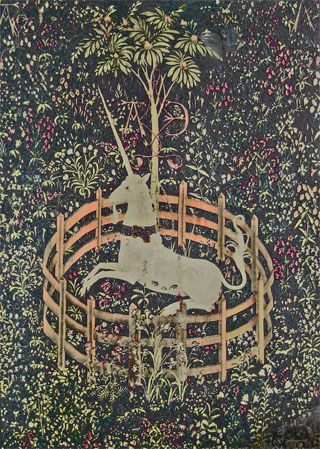
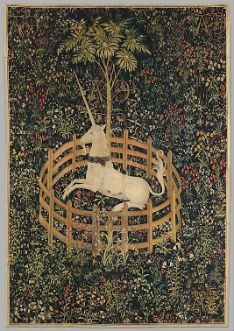
The Unicorn in Captivity
South Netherlandish, 1495-1505
Wool warp with wool, silk, sliver, and gilt wefts
12ft. 7/18 in. x 8 ft. 3 in.
The Cloisters, Metropolitan Museum of Art
Gift of John D. Rockefeller Jr., 1937


I had been wanting to see the Unicorn Tapestries at the Cloisters for many years. I have blogged about them here, and even written about their floral designs in this article (posted on my blog) on plants in the decorative arts (the original pdf article is on pp 3-4 of the Summer 2007 issue of the Botanical Artists of Canada Newsletter). As I wrote in my blog post in 2010 (when I first wanted to see them):
I have never been to The Cloisters, but have always known that they house the beautiful tapestries The Hunt of the Unicorn. But, I was lucky to see another set of unicorn tapestries, The Lady and the Unicorn (La Dame à la Licorne), housed in the Musée de Cluny, in Paris.
And from my article:
One of the most enchanting mergers of scientific observation and religious symbolism are the tapestries of the Hunt of the Unicorn. These tapestries are covered with the late Medieval tradition of fields of millefleurs. When analyzed carefully, many of these flowers are clearly identifiable, in their correct environment. The Madonna Lily, depicted in The Unicorn in Captivity tapestry, is both a religious symbol of the purity of Mary and also a medicinal plant that treated burns, ulcers and ear infections, amongst other things.
Finally, I got to see them during my trip in New York this past August. I tried to take photos (without my flash, as instructed by the guards), but couldn't come up with any decent images, so I had to make do with a postcard of The Unicorn in Captivity from the gift shop.

Here is a link to the Met, which has details of the flowers on the tapestry:
The Unicorn Tapestries: Flowers, Plants and Trees

Sunday, August 12, 2012

A Road Less Taken

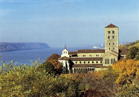
A view of the Cloisters with the Hudson River

I cannot upload photos from my camera to the computer I'm using while in New York. I will make a file (a post) of photos I took here when I return to Toronto.

But, there are plenty of online images to download.

I tried to get to the Cloisters today. They are a branch of the Metropolitan Museum, but they are somewhere in the Netherlands of New York City. They are located in an area called Fort Tyron Park. The closest street intersection is 190th Street. I'm not sure if this is the Bronx, or if it is still Harlem, but I decided to take the M4 bus which supposedly goes straight there. It didn't happen so easily.

There was some kind of parade (actually it was the Puerto Rican Day Parade, or more precisely the National Puerto Rican Day Parade - what is "national" about Puerto Ricans in New York?) which held up buses between 44th and 79th on Fifth Avenue. At one point I waited close to half an hour to get a bus. When one finally arrived and we climbed on, we had to get off on 135th Street because...well the driver couldn't give a reason. He parked the bus and waited inside. Then this parked bus suddenly took life, and the patient group that was waiting for another (some people just left - to catch a cab?!) was allowed back on this one.

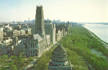
But it really was worth the wait. The ride on the M4 from about 135th street down to 79th was incredible. The bus went down Riverside Drive, along the Hudson and past the beautiful Riverside Church (which I think is even more beautiful than St. Patrick's, or St. John the Divine's just above 110th Street) until the driver turned on 79th Street and took Broadway. I went all the way to 59th Street and Columbus Circle and took the M10 down Central Park West, to get more views of another of New York's beautiful park. I got off just before 110th Street, where Central Park ends, to get to where I was staying on the Upper West Side. The ride took shorter than I thought, although it is a good 45 minutes. I highly recommend this "tour" for a mere bus token ($2.25). There were plenty of tourist buses taking a similar route, and I'm sure their's was an expensive affair.

A view of the Riverside Church with the Hudson River

One of the reasons I wanted (want) to go to the Cloisters is to see the beautiful unicorn tapestries.

The Unicorn in Captivity
At The Cloisters


(I've linked to backgrounds on The Cloisters and the tapestries, but I will write some more tomorrow on how they got to New York and to such a location. It is a fascinating bit of New York history.)

Saturday, August 11, 2012

From Schiaparelli to Prada: Deterioration of Culture


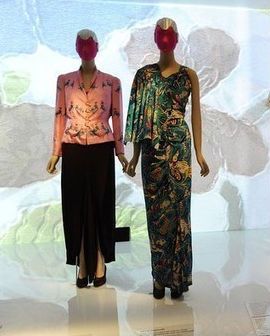
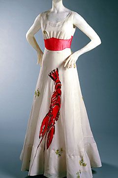
Schiaparelli's designs displayed at the Metropolitan's
Schiaparelli and "Prada: Impossible Conversations",
with the shoe-hat, the lobster dress, and other gowns.


-----------------------------------------------------------------------------------------------------

When a fashion designer says that her aim is to introduce ugliness into women's clothes, what do you do?

That is what Prada said in an imaginary dialogue she held with Schiaparelli, the "avant-garde" designer of the early twentieth century.

The "Dream Dialogue" between Schiaparelli and Prada is part of the Metropolitan Museum's "Schiaparelli & Prada, Impossible Conversations" exhibition that runs through August 19. Prada appears as her self, and Schiaparelli is reincarnated by the actress Judy Davis.

Prada is our contemporary expert on women's clothes. Her clothes are uninteresting, and their ugliness factor is more a boring lack of style than anything "shocking" the avant-gardists attempted through wit and imagination at the peak of their creativity. Prada says she is influenced by Schiaparelli's designs, and hence the exhibit (and her new line of work). But what she's really after is the rebellious essence of the early twentieth century avant-gardists. Of course, she misconstrues their efforts and intentions. They never wanted to destroy beauty, skill and culture, as do die-hard post-modernists like her.

Prada is the avant-gardist of our era, who wishes ugliness for women. That is her "shocking" contribution to her art. Not playful lobster dresses and witty shoe-hats (from the foot to the head, as Schiaparelli joked). But the telling point in Prada's conversation with Schiaparelli was not that she wishes simply ugliness for women and to discard their femininity (if these are just simple things), but that she wishes POWER for women. Power over what? Over men; over their destiny as women (the weaker sex, as she calls women); over their bodies, one of which is of course their ability to have (and NOT have, in Prada's argument) children. Prada, as with all feminists, doesn't really want equality for women, but a recreation of their person-hood. She wants to destroy the feminine woman, destroy her feminine essence and unique strength, which according to feminists is woman's weakness, then create a super creature that presides over all others, and especially over men. What feminists ultimately wish to create, although they would never admit to this, or even recognize this, is an alien creature/monster.

Schiaparelli is the better, the more talented, the more skilled, the more educated designer. Her clothes are well-crafted, her textiles well-chosen, and her designs far more superior than what Prada has to offer. Even her presence is more alluring and imaginative than the frumpy Prada. Still, there is no denying that Schiaparelli's playfulness did contribute to the decline in cultural excellence. She dismissed skill for pure imagination. Prada is ultimately her heir, who works simply with her ideas, without the finesse and skill necessary to back them up.

Prada is the supreme post-modern artist of our era. Ideas (and almost always bad, ugly ideas) are the crutch she leans on, as though things materialize out of the nether worlds of her vapid brain.

I would get Schiaparelli's "lobster dress" and "shoe-hat" any time over Prada's drab dresses.

The exhibition entrance is a suggested $25, but you can enter with a donation of any amount. The guy at the ticket booth took my "donation" of $2 with good humor. You can spend quite a bit of money at the Museum's store, with its overpriced, but one-of-a-kind items made especially for the exhibition, to make up for a lower entrance fee.

My instincts were right about Prada's feminism which leads to equality, which ultimately means power of women over nature. Here is some background on her:
As a young woman, Prada, who has a degree in political science and then studied mime with the Piccolo Teatro in Milan, was a signed-up member of the Communist Party and a reluctant inheritor of her grandfather's leather goods and glass company. She finally took the helm there in 1978.

"Italian society was becoming obsessed with consumerism, but my big dreams were of justice, equality and moral regeneration," she said. "I was a Communist but being left wing was fashionable then. I was no different from thousands of middle-class kids."
I suppose her slabs of ugly glass are some kind of homage to her grandfather Mario Prada, the founder of the Prada line. Yet a convoluted homage it is.
Mario Prada did not believe that women should have a role in business, and so he prevented female family members from entering into his company. Ironically, Mario's son harbored no interest in the business, so it was his daughter Luisa Prada who took the helm of Prada as his successor, and ran it for almost twenty years. Her own daughter, Miuccia Prada, joined the company in 1970, eventually taking over for her mother in 1978.[Source: Wikipedia]
Miu Miu may have never forgotten the second choice women in Mario's family were given to run his business. Her subconscious revenge is to scatter her works with ugly glass and crudely cut leather.

-----------------------------------------------------------------------------------------------------

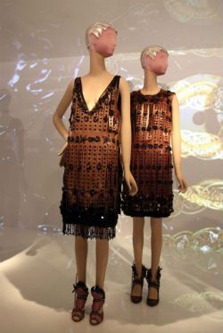
Prada's convoluted homage to her grandfathers glass and leather heritage:

Prada's sack tunic with
what look like glass (but are
probably plastic) slabs from
the Met's exhibition.


Tunics (Roman gladiator?)
at the Met's exhibition
From Prada' s Ready-to-wear
Fall 2009
collection


(More images of the exhibition piece here.)

-----------------------------------------------------------------------------------------------------

And on those avant-gardists. All those I have met (at least the leaders) who SELL the idea of the leftist/communist/anti-establishment avant-garde are bourgeois at heart. Avant-garde is for the common people, who literally, like the advance guard in armies, are sent to the front to fight the real, deadly battles.

Here is how the Department of Defense explains the advance guard:
Detachment sent ahead of the main force to ensure its uninterrupted advance; to protect the main body against surprise; to facilitate the advance by removing obstacles and repairing roads and bridges; and to cover the deployment of the main body if it is committed to action. [Source: Department Of Defense Dictionary of Military Terms]
The common folk get the products that seep out of the distorted imaginations of these armchair avant-gardists, while they live safe and secure bourgeois lives.

That is how Prada is living her life. Her husband is the "boss" as she has arranged it. She acts as the creative force, while he runs the business and rules the staff with his boisterous personality. It is a "family" business, apparently run by the head of the household, Mr. Prada. They have two grown sons, one of whom is joining the family business.

Clever Mrs. Prada, who's kept her name, gives just enough of the reigns to her excitable husband, and sits demurely next to him when necessary.

Prada with her husband in 2011

Prada with her two sons below (in 1999), forming her happy family which is still in tact. Families consisting of husband-wife-two/three kids are only for fake avant-gardists like her. Other "families" can be of any type: homosexual parents, unmarried parents, women bringing up their children alone, etc. All of these make up the foot soldiers who change the messy world below the palaces of the pradas.

Prada with her husband and two sons in 1999

Thursday, August 9, 2012

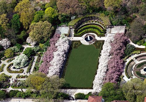
Conservatory Garden in Central Park

Photo from the Central Park Conservatory website

[Larger photo here]


This is a hidden gem (as are many things in New York) in Central Park. It is located between 104th and 105th street, on Fifth Avenue.

Here is what the Central Park website says about the garden:
The Conservatory Garden is divided into three smaller gardens, each with a distinct style: Italian, French and English. The Garden's main entrance is through the Vanderbilt Gate, on Fifth Avenue between 104th and 105th Streets. This magnificent iron gate, made in Paris in 1894, originally stood before the Vanderbilt mansion at Fifth Avenue and 58th Street.
Wikipedia has a little more information:
The Conservatory Garden is the only formal garden in Central Park, New York City. Comprising 6 acres (24,000 m2), it takes its name from a conservatory that stood on the site from 1898 to 1934. The park's head gardener used the glasshouses to harden hardwood cuttings for the park's plantings. After the conservatory was torn down, the garden was designed by Gilmore D. Clarke, landscape architect for Robert Moses, with planting plans by M. Betty Sprout; constructed and planted by WPA workers, it was opened to the public in 1937.
I couldn't find any information on M. Betty Sprout, except that here in Google books (from the the book Garden Guide: New York City) she is mentioned as "[Gilmore D. Clarke's] future wife at the time project was in the planning stages. The Google book reference also mentions Thomas Drees Price as part of the design team.

This site has more information on Price, calling him a landscape architect. He also worked as part of the team which excavated "Horace's Villa" in Rome in 1930.

Sunday, June 17, 2012

Post-Modernism Can Be Defeated!

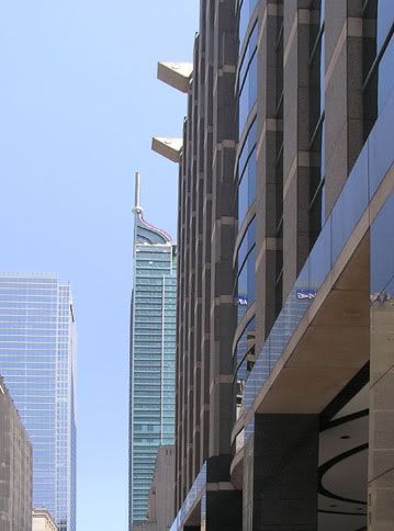
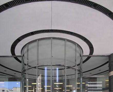
A couple of days ago, I posted a photo of some highrise buildings from near the lakeshore. I identified one building as the Lombard Place. I went back again to have a closer look. I took shots of the interior of the building, which has an Art Deco feel. The building was actually completed in 1962, and functions as an office. Its architects, Bergman and Hamann, have a prolific portfolio around Toronto, including the Toronto Dominion Centre, which was a collaboration with Mies Van der Rohe, and the Eaton Centre, which was recently in the news.

I can't find anything on the interior ground floor ceiling, but it seems to be part of the original design.

Tall, lifeless glass buildings do not have to be part of a city's highrise cityscape. Ingenious designers can produce interesting buildings, as part of a city's cluster of buildings, and with interesting interiors. Post-modernism can be defeated!


[Photos by KPA]

Sunday, June 3, 2012

From Fun to Serious in a Blink

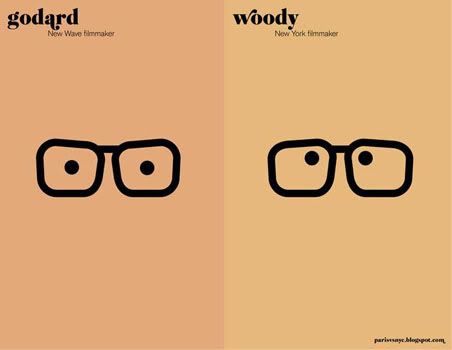
Page from the graphic book Paris Versus New York, by Vahram Muratyan
(Captions read: Godard: New Wave Filmmaker, and Woody: New York Filmmaker)


I personally prefer the films of the the eccentric Woody Allen
to those of the harsh Jean Luc Godard


I went to look for the book Beauty by Roger Scruton from a "specialty" book store in downtown Toronto, but couldn't find the book, nor did the owner know about the book. I was surprised, since I think it is a small, but seminal, piece of work. It even follows some of my own ideas (please excuse my pomposity!) about beauty as viewed through the centuries, and through different cultures, societies and artistic movements.

Instead, sitting on the shelf right by the register, I found one of those "graphic" books titled Paris Versus New York: A Tally of Two Cities. This spiked my curiosity, and I skimmed through it. I started to chuckle quietly. The back cover describes the book thus:
A friendly visual match between two cities told by a lover of Paris wandering through New York. Details, cliches, contradictions: This, way please.
It looks to me like the author of this book (an Armenian - I guessed his nationality to the slight surprise of the unrufflable store owner) knows both Paris and New York pretty well, although he clearly prefers to be a Parisian (a lover of Paris, as he describes himself). This makes sense to me since many Armenians I know have close contacts with France, the French and of course Paris.

Personally, I prefer New York. As much as Paris is an exquisitely beautiful city, there is a slight decadence (old-fashionedness?) to the beauty, and anything that has been erected in the last century and a half is a desperate attempt at bringing Paris to a certain modernity. New York, with its soaring buildings and art deco grandeur, took over Paris, and Europe, at least a century ago, and, I think, is still going strong.

Muratyan turned his blog Paris Versus New York, A Tally of Two Cities into a book of the same name (and, I presume, with many of the same images). He has prints from his book/blog which are for sale starting at a reasonable $35 for a 10"x8" print. He also works on commission as a graphic designer/animator for clients such as the fashion house Prada and the magazine version of the newspaper Le Monde.

Here is a brief background on Muratyan:
Paris, New York and everything in-between.
Vahram Muratyan is a French graphic artist. His work mixes commissioned work in print for high-profile clients and personal projects. In the fall of 2010, during a long stay in New York, Vahram launched his first blog, Paris versus New York, a tally of two cities. A site viewed more than 4 millions times, exhibitions at colette and The Standard, eventually the book Paris versus New York, published by Penguin.

Among his new projects, the weekly column La ville est belle in M, the magazine created by Le Monde in France. And recently, the Prada Spring/Summer 2012 special collaboration, Parallel Universes.
The unrufflable owner of the book store wasn't amused that I found Paris Versus New York amusing. I nonetheless bought the "fun book," as I told his pleasant assistant who was at the cashier, which must have pleased him a little, since (I think) he gave a smile as I paid the $20+tax. "I'll let you know when I find Beauty" I said confidently. He seemed happy with my offer, and I saw a glint of a smile behind his professorial spectacles. Perhaps he will pick up Paris Versus New York in the mean time (although it behooves me why he wouldn't find out the whereabouts of Beauty for himself, except as my theory goes these days, beauty is pretty much out the door for many people).

I ended up buying Beauty from the book chain Chapters, which had several copies at hand.

Saturday, May 19, 2012

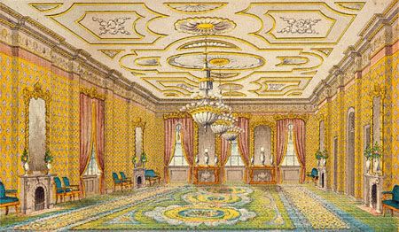
Etching of the East Room at the White House


I had blogged earlier on Michelle Obama and Jill Biden in the White House's East Room, and its "lovely canary yellow drapes." While looking for more information on the East Room, I found this etching from the website The White House Museum, dated "around" 1858. There are more archival photos of the White House rooms at the website, through various renovations and presidents.

Sunday, April 22, 2012

Deconstructing (Destroying) The Union Jack


Stella McCartney (Paul McCartney's daughter) has successfully worked in fashion for a number of years now, and has become one of those avant-garde designers that people rave about. Her reward finally came when she was asked to design the Olympic clothing of the British team. Her design is: "A deconstructed Union flag in blue..." according to the BBC. Here's what she says about her design:
"For me, it's one of the most beautiful flags in the world and it was important for me to stay true to that iconic design but also to modernize it and present it in a complementary way. Ultimately, we wanted the athletes to feel like a team and be proud with the identity we created."
Stella McCartney and her Olympics uniform design on a f"multicultural"
group of athletes


Here is the history of the Union Jack:
In 1603, James VI of Scotland inherited the English and Irish thrones, thereby uniting the crowns of England, Scotland and Ireland.

In 1606, a new flag to represent this regal union was specified in a royal decree, according to which the flag of England and Scotland would be joined together, forming the flag of Great Britain and first union flag.

The current and second Union Flag dates from 1801 with the Act of Union 1800, which merged the Kingdom of Ireland and the Kingdom of Great Britain to form the United Kingdom of Great Britain and Ireland.

The new design added a red saltire, the 'cross of Saint Patrick', for Ireland. The three component crosses that make up the Union Flag are: - The red St. George's Cross, which represents England - The white diagonal St. Andrew's Cross, representing Scotland - The red diagonal St. Patrick's Cross, representing Ireland
Here are some comments on McCartney's Olympic design by ordinary Brits:
The new looks were unveiled on Facebook today, prompting users to express their anger.

One member commented: 'Massive fail!!!! These are not our national colours!!!! Did someone not get the memo.'

Another wrote: 'Needs a LOT more RED !!! - Change it quickly PLEASE!!!'

One member agreed: 'Oh dear! Stella, Stella - did you not think of asking ANYONE on a UK street if they thought it was reasonable for you to take the red off our Union Jack?'
Of course, what McCartney is primarily "deconstructing" from the flag is the red cross.

Left: Union Jack over the years
Right: Stella McCartney with her design on an athlete


Four years ago, the Canadian Olympics team had the same "deconstructed" but ingeniously "reconstructed" uniform. This is what I said at my blog post "When National Symbols are Lacking." The post has images and background of this uniform:
I've always said that if there is no concerted effort at keeping national symbols alive and well, something else will come along and take up the space.
Stella McCartney and her design/cultural team haven't come up with their own unique, un-British version of the an English icon. But cutting up the Union Jack is such a bad enough enterprise that they probably didn't have energy to do any more destruction.

Below is a sample from McCartney's Fall 2010 collection. Look and judge:


Tuesday, April 17, 2012

The Grandness of Train Stations

[A series of photographs are posted at the end of the blog post]

I regularly view the photographs that are posted on the photography blog NYC: Daily Photos (photos are often posted daily, sometimes with a bit of a hiatus), and I saw the recent photo of the interior of New York's Grand Central Terminal.

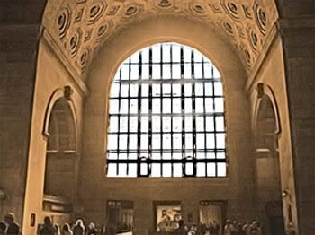
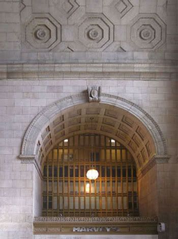
I've posted below photos that I had filed away of Union Station, Toronto's train station. I find similarities between Union Station and Grand Central Terminal, which I discuss pictorially and descriptively below.

I often find that Toronto architecture of the late nineteenth and early twentieth centuries mimic New York buildings of the same era, trying to instill some of the American grandeur into the Canadian cityscape. Union Station is a grand example of this, resembling the imposing architecture of Grand Central Terminal (although I cannot yet verify if Canadian architects were specifically copying Grand Central Terminal, or just using a generalized architecture styles of the period. Impressive train stations were a common feature in large cities of this era).

Here's information on the Beaux Art design and history of Union Station, which opened in 1927.

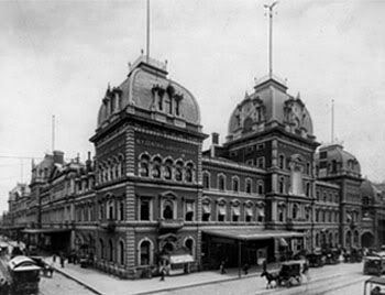
And here's information on Grand Central Terminal's architecture. Grand Central Terminal, as it is called now, opened in 1913. The 1871 original, smaller, building called Grand Central Depot (photo below) was demolished:
After a steam locomotive accident in 1902, the station was redesigned with a two-level terminal to accommodate electric trains.
Here's more on Grand Central Depot:
There have been three structures at East 42nd Street and Park Avenue, bearing the name Grand Central...[The first one, Grand Central Depot], which opened in 1871, brought the lines of the New York Central and Hudson River Railroad, the New York and Harlem River Railroad, and the New York and New Haven Railroad together under one roof.
According to this site, the terminal's reconstruction and renovation history spans over 130 years.
The first terminal of that name [Grand Central] was erected in 1871 at Fourth Avenue (now Park) and 42nd Street, then close to the edge of the built-up part of the city. It was conceived and built by Cornelius Vanderbilt,

The terminal replaced an earlier nondescript building further downtown at 26-27th Street and Fourth Avenue (now Park Avenue South).
Renovations in 1886 began to expand the building:
Long distance and commuter travel grew much faster than expected, so Grand Central had to be expanded in 1886, and comprehensively renovated in 1898. But as traffic continued to grow, it was clear that a new terminal was needed.
And finally, extensive work began in 1902:
[I]n January 1902 there was a disastrous accident. In the tunnel at 58th Street, with visibility greatly impaired by smoke and steam, an inbound express smashed into the rear of a local that had stopped, killing and injuring scores of people. The public was outraged, resulting a year later in both the city and state outlawing the operation of steam locomotives in Manhattan after 1908...

William J. Wilgus (1865-1949), chief engineer of the New York Central, proposed, proposed instead thorough, imaginative, and innovative solutions that function superbly to this day:

1) construct two levels of tracks below street level, the upper for long-distance trains, the lower for suburban trains;
2) eliminate the steam locomotives and move all trains by electric power instead;
3) construct a monumental terminal building; and
4) sell air rights above the new underground train yards, permitting developers to erect buildings there and pay rent to the railroad.
From the Grand Central Terminal site:
[A] comprehensive revitalization plan based on the Master Plan for Grand Central Terminal. Construction began in 1996 with the cleaning of the Main Concourse Sky Ceiling...

The revitalization project culminated with a gala Rededication Celebration of Grand Central Terminal on October 1, 1998. This event garnered both national and international media attention, and marked the beginning of a new chapter of this venerable New York City landmark.
Over the years since these major works, the terminal has gone through various projects, from Donald Trump's renovation of the exterior, to the restoration of the Main Concourse ceiling by the Metropolitan Transportation Authority.
Ending in 2007, the exterior was again cleaned and restored, starting with the west facade on Vanderbilt Avenue and gradually working counterclockwise. The project involved cleaning the facade, rooftop light courts, and statues; filling in cracks, repointing stones on the facade, restoring the copper roof and the building's cornice, repairing the large windows of the Main Concourse, and removing the remaining blackout paint applied to the windows during World War II. The result is a cleaner, more attractive, and structurally sound exterior, and the windows allow much more light into the Main Concourse.
[Source: Wikipedia: Grand Central Terminal Restorations]
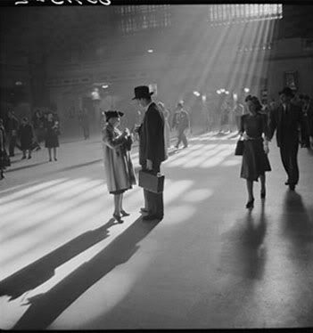
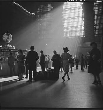
While doing Google image search, I found photographs of Grand Central Terminal in the 1940s by John Collier, including photographs of passengers. According to Wikipedia, Collier worked in photography and visual anthropology, and this education site further elaborates that:
John Collier Jr. applied still photography and film to cross-cultural understanding and analysis.
Many photographers have also documented the building, some artistically. I've posted some impressionable images below.

The full-on light streaming in the early photos of Grand Central (see the 1929 photo posted below - The main concourse at Grand Central Terminal) will never be reproduced according to this photographer because:

(1) skyscrapers now block that exact light from shining through the windows at that position
and
(2) [Grand Central Terminal] is now a ‘smoke free’ place and so the cigarette & cigar smoke that mainly created the haze in the original photo will be never more.
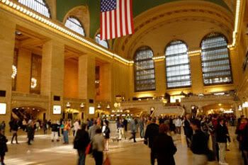
Still, the grandeur of the station remains, and the windows let in enough sun to bathe the interior with majestic light.
-----------------------------------------------------------------------------------------------

Interior of Union Station, Toronto
KPA


Interior of Union Station, Toronto
KPA


Grand Central Depot, ca. 1885
H.A. Dunne Archive


Grand Central Terminal, 1941
John Collier
The Library Of Congress


The main-concourse information
desk at Grand Central Terminal
in New York, October 1941
John Collier
Shorpy.com


The main concourse at
Grand Central Terminal, 1929
New York Transit Museum


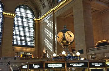
Four-faced clock at a kiosk
inside Grand Central Terminal
on the east side of Manhattan, with
a noticeable amount of sunlight
shining through some of the windows.
Wikipedia [Link to larger image]


Grand Central Station, 2009
Dan K. Allen Photos


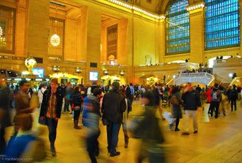
Afternoon rush hour
Grand Central Terminal, Main Concourse
NYC Daily Pictures


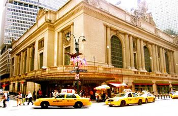
Grand Central Terminal, exterior
Gothamist


Saturday, March 24, 2012

How Immigrants Are Destroying Toronto (And Canada): The Colorful Mosaic That Canada Was Meant To Be

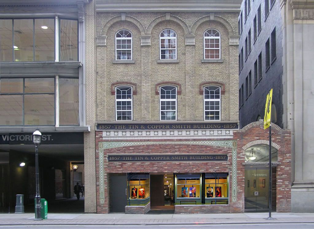
The Tin and Copper Smith Building, on 83 Yonge Street
With the walkway from Yonge to Victoria beneath
the adjacent building at 85 Yonge Street.

[Photo and Photoshop by KPA
Larger, photoshopped version here]


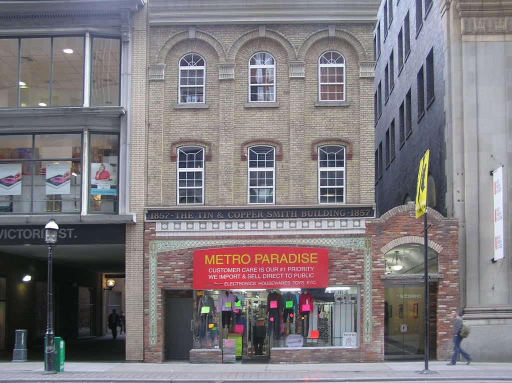
Below is how the building actually looks, with its gaudy red sign and cheap goods sprawling into the street:

[Photo by KPA]

My photographic version of the Tin and Copper Smith Building is to photoshop out the store sign and use the building's original sign, to put frames around the windows, and to add in an art gallery with lit paintings.

I've also "covered" the windows of the adjacent building, which looks like some xerox office that has posters of copy samples pasted on the windows(!).

"No. 83 … surely stood out even in its own day. The cut-stone capitals on the pilasters and radiating brick lintels over the windows rank among the city's finest." Quote by Patricia McHugh, author of Toronto architecture: A city guide.


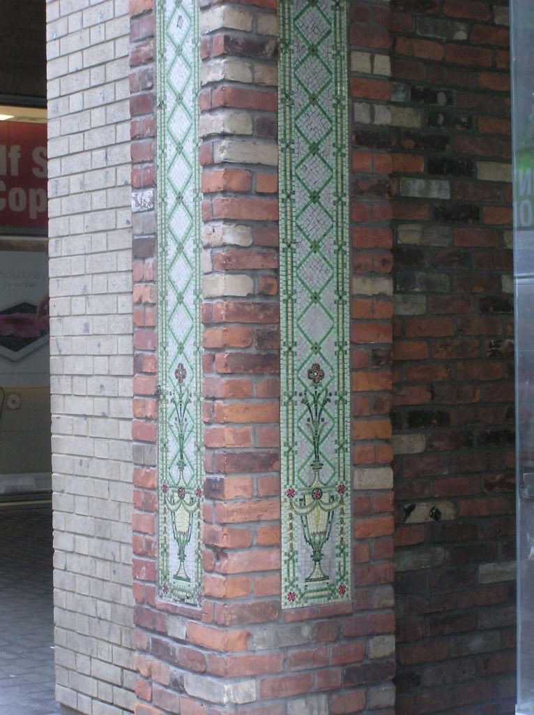
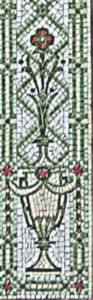
Details of the mosaic on
the bottom half of the building

[Photos by KPA]

I'm not sure if the mosaics are part of the original building. There is no source describing (or interested in) them.

Below is information on the Tin Copper Smith building from TOBuilt:

Tin and Copper Smith Building, 83 Yonge Street, Toronto, Downtown East:

- Alternate names: Hiram Piper & Brother Building / Toronto World Building
- Notes: This building had additions in 1895, and was altered in 1910 and 1914.
- Status Completed
- Year Completed: 1857
- Companies: The following companies are associated with this building:
- Architect: Hand, Harris & Merritt. Responsible for 1914 alterations.
- Architect: Charles J. Gibson. Responsible for 1895 addition.
- Architect: Joseph Sheard. Original building attributed to.

I'm not sure if the bottom half of the building with the brickwork is part of these updates. I think it is attractive, and matches the "brick lintels over the windows" so I will presume that it is part of the updated design.

Splashes of gaudy signs act like sharp, harsh contrasts to the
tawdry drabness all around.


Above is a photo I took of this building a couple of days ago. It's been like that for a long time, and I am sad to say I was never interested in going closer to have a better look at the details.

I took more interest in it this time because I was taking photos of a store window which is directly across the street from this building. I ran across the street to get a better shot of the store window, and stood by this building. Then, I noticed the flowers were actually carefully arranged mosaic tiles. From a distance, I always thought they looked like they were painted on the brick (clumsy graphic paintings) and seemed out of place. They are still out of place, but up close, they reveal themselves as little gems amongst what are mostly boring and generic city buildings.

Part of the reason I ran by them without so much as glancing back is the ugly convenience store that has taken over the ground floor, with cheap goods displayed under a gaudy red sign, which was simply strung on the brick facade without any thought for aesthetics. The store is one of those "dollar store" types, run by heavily accented Indians (or Pakistanis, or Bangladeshi), who have made not a single effort to conform their ways to the Toronto traditions, but are given ample encouragement to do just what they've always done "back home." And that is exactly what they're doing.

Toronto's downtown is becoming this weird, dark, dreary place, where people dressed in the latest Walmart black or grey jackets fill the streets talking in tongues other than English. So much for the colorful mosaic that Canada was supposed to be. And I don't think it is poverty either that makes people look (and settle for) ugliness. I think it is an inner discontent, where there's an alarmed realization that gold and sliver do not line the streets of Toronto after all, and hard work doesn't buy the real riches of Western civilization so generously displayed in TV shows and movies.

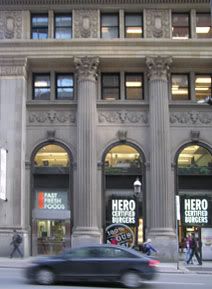
The building just a block down, at 79 Yonge Street, or better known as 8 King Street East (being on the corner of Yonge and King), is considered a "Toronto Heritage Property," and I'll post on that soon (including a ground floor which is taken over by...Hero Burgers - here's a photo I took.)

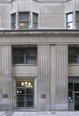
The building on 85 Yonge Street, next to the Tin and Copper Smith Building, is what used to be the Jess Applegath Building, that was also designed by Hand, Harris & Merritt (it was demolished and what stands is a 1989, reasonably O.K. construction). But what is interesting about this building is the walkway beneath it that goes from Yonge Street to the adjacent Victoria Street. It passes through the courtyard of the Metropolitan Resto Bar. I will post some photos of the highrise which houses this restaurant (the restaurant is also quaint and has a good menu, a little multi-culti but this is Toronto, and it is a nice respite from the busy Yonge Street). The highrise, known as the Imperial Life Assurance building, looks like an Art Deco style, but I have to do some more research on it.

In the meantime, below is a photo I took:

Imperial Life Assurance Building
[Photo by KPA}


Thursday, March 22, 2012

Jewels at The Ryrie Building

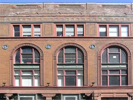
Facade of 225 Yonge Street
[Photo by KPA]

Wikipedia has images of the building through the years


A few days ago, I posted on a jeans store, Buffalo Jeans, and its window poster which promises "The Sexy Escape." I wasn't impressed with their collection, and discovered that their advertizing image promoting this escape was catering to the "inner sluttiness" of young women.

As I noted, the building is attractive, and is clearly one of those heritage buildings that Toronto is trying to preserve. I wish those behind heritage building preservation would not just focus on the facades, but look at what's inside as well. There's no reason why a few years down the road Buffalo Jeans might not decide that it wants a slick, modern building, and slowly do renovations and demolitions that would dismantle this structure to give us those glass and granite cubes that are springing up everywhere.

Below is information on the building's history. I was right to feel that the building deserved more than jeans. It used to be a prestigious jewellery store.
The Ryrie Brothers owned the most prestigious jewellery business in Toronto at the time this office building was re-modelled out of two existing structures by Burke, Horwood & White in 1913.

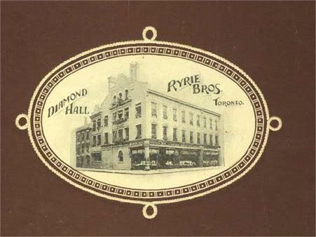
While the Ryries had their retail business down the street in "Diamond Hall" located at Yonge and Adelaide streets, this building at the corner of Shuter Street was an investment property. The Ryrie name survives in the Ryrie Building, but no longer in the jewellery business.

Ryrie Brothers amalgamated with Montreal jewellers Henry Birks & Son following the death of one of the three Ryrie brothers in 1917, and later in the 1930s another Toronto jeweller joined the company to form Ryrie-Birks-Ellis. For many years since however, the firm has been simply known as Birks.
The company describes itself as "jewellers and silversmiths."

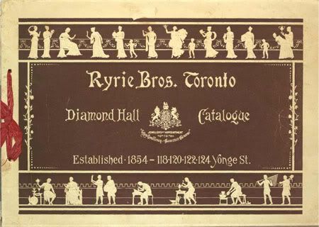
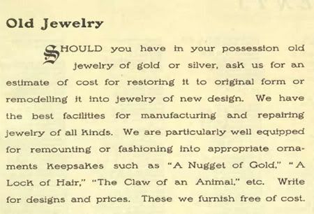
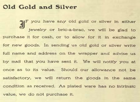
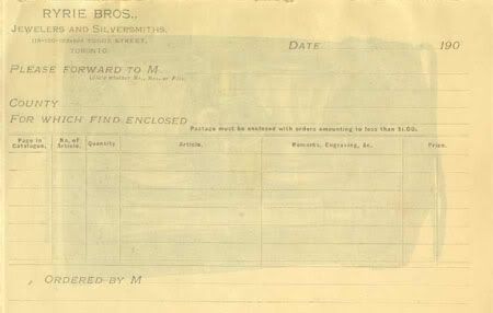
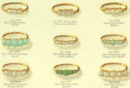
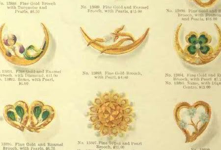
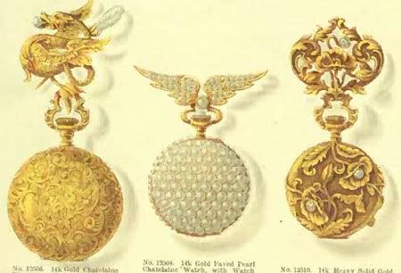
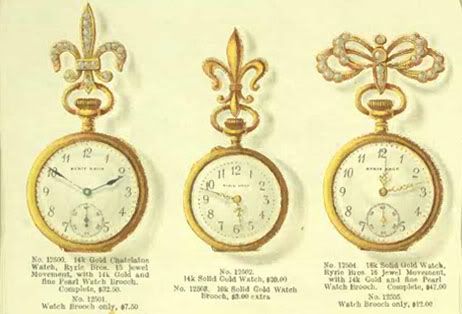
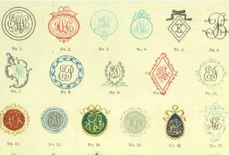
Below are images from their 1913 catalogue. I've included the cover page, and a description of the services. The bottom image is "steel dies for embossing stationary," which shows that the company branched out into various decorative items. The full catalogue includes everything from silver picture frames to silver-embellished pipes, (the complete 1913 catalogue is available here).