Monday, October 31, 2005

Family Portraits

Adolf Wissel vs. Norman Rockwell

While doing research on color and the history of modern art, I came across this website which talks about Hitler's abhorrence for modern art, so much so that he would set up degenerate art exhibitions to ridicule these painters.

Instead, he wanted art that glorified his Aryan concept.

Now, this type of commissioned art had nothing to do with 'artistic' requirements, but rather with ways to decimate Nazi propaganda.

Here is a strange, claustrophobic, family portrait, which is certainly meant to promote the 'happy, Aryan family life.' It fails on many levels, although artistically, it is an exquisitely designed piece.

Farm Family From Kahlenberg. By Adolf Wissel, 1939
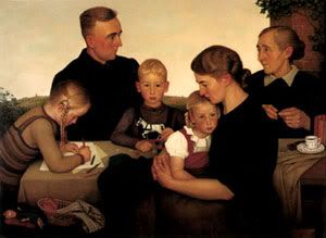
The strangest thing about this portrait is the little boy, who is not quite in the center, and who looks directly at the viewer. Normally, one associates such a bold stare with a mature or heroic character. Not a disconcertingly young, and audacious boy.

But there are many more things going on in this picture:

1. There is no grandfather in the painting, which I'm sure is quite a deliberate omission. As though to say, we don't need our past, but must look into the future alone. It it the child-bearing women (the grandmother is present) who seem to matter more. In other words, create the world anew, by destroying it first - quite in league with the götterdämmerung for a new dawn.


I have manipulated the top picture to centralize the boy.
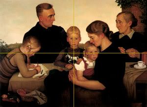
The bottom picture is the original.
(Click on images to view larger sizes without lines)


2. The boy is not really in the center of the original painting. If he were 'designed' thus, he would be visually separate him from everyone else. He would not fit in with his protective father, nor with the nurturing mother, but remain as a direct and lonely focal point

Ironically, the picture with the centered boy is also the more claustrophobic, and it is the less successful design of the two. The artist was correct to compose his painting in the original manner.

Yet, this original composition, as well as being true to design, is really true to sentiment and psychology as well.

As the visually centered character, the boy would then really be on his own. I would suspect that the painter is projecting his own immaturity and lack of independence by avoiding this central position for the boy. But the painter still doesn't underestimate the aggressive and audacious character of the boy, making him stare at us with a bold and insolent stare.

This goes quite well with the National Socialists, who never wanted the father figure too far away, being unable to mature into independent and responsible men. But, they were aggressive, demanding and ruthless little boys at heart.

3. The women seem to have an even stronger presence here. The father's connection is with the old woman, presumably his mother. Not with his father, who is absent. And the rather burly young girl on the left is busy with her books, suggesting the rather masculine role many Nazi women were to play later on. Of course the wife is the child bearer, producing both the young boy (future leader) and the young girls (a future feminist and a future mother).

4. There is no centered visual hierarchy of people here. Although the father dominates a mini-pyramid of his daughter (to the left) and his son, he is in the background. His wife seems to have some more prominence, being in the foreground. And the father's timid eye-contact with the grandmother seems to make her his center. As mentioned, the young boy seems to dominate the scene.

5. The colors are warm browns and yellows, and there appears to be a lively dusk sky behind. But any warmth has be negated by the claustrophobic arrangements of the people in their dark clothes and dour expressions. It really is to close the end of the day/world.

6. For a farm family, there is very little farm food around. Whatever is displayed is consigned to the small left-hand corner of the picture.

7. The horizon seems to have been flattened out as though we’re in some stage-set interior with a backdrop, full of fantasy and manipulation.

Now contrast this with the Rockwell painting.

Freedom from Want. By Norman Rockwell, 1943

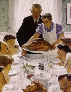
1. The grandfather is the center, both pictorially and actually - there is no ambiguity about that.

2. The picture is designed in the classic pyramidal fashion, with the important figures at the top of the pyramid (grandfather and grandmother) and the rest of family widening out to the base.

3. Unlike the Wissel whose nature which we cannot seem to reach, Rockwell has brought nature into to the family, with the turkey, fruits and vegetables all laid out on the table. Rockwell's Nature is really abundant.

4. All the food follows the central and important axis, with the grandfather at the top. A true thanksgiving for the abundant fruits of the land.

5. Although we are indoors, there is a sense of space and light. The elongated perspective of the white table connects with the bright window at the back which promises to take us out into the sunny mid-day exterior.

6. Finally, this family seems to be fully enjoying the moment. And even the one person looking at us is doing so with a sense of fun and mischief.

Friday, October 28, 2005

October Treat

Veranda Magazine


October is almost over, and here is the rare treat of Veranda Magazine. Here seen is the cover for the September/October issue.


Thursday, October 27, 2005

The Gushing Streams of Wuthering Heights

Society's Antagonists

Whereas "Pride and Prejudice" is like an intricate carpet in the making (all design and geometry), Emily Brontë’s "Wuthering Heights" is like a long, flowing river: sometimes calm, and sometimes agitated; sometimes gushing and other times contained. It spurts downstream in paroxysms of emotion.

In many ways, it is Jane Austen who wins the day. Life goes on in "Pride and Prejudice", in a witty, alert, rather self-conscious but always responsible way. And there is emotion there, in her feisty characters who learn to mature.

Wuthering Heights exhausts itself at the end. We are left with a dried up stream. There is no society left. Only nature.

Perhaps this is all about Natural man vs. Social man. I don't think there is any society which lives by emotion alone. Nature is just too strong!

Kate Bush's great musical version of “Wuthering Heights” captures the mood perfectly.

It is interesting to note that Laurence Olivier has acted in both "Pride and Prejudice" (1940 version) and "Wuthering Heights" (1939 version).

Tuesday, October 25, 2005

Geometry in Pride and Prejudice


Patterns of English Country Dance. [1]

Jane Austen's novel Pride and Prejudice, also enacted in various movie versions - the 1940 version with Laurence Olivier being a classic - is full of geometry.

During the frequent social dances which bring different families and groups together, dances are a common way for people to interact. Dancers are paired off with diagonally opposite partners, then break loose to join those next to them, and travel down lines with yet another. Partners weave in and out of lines and squares to complete the dance. The music prompts you when to start, stop and change directions and patterns.

Finally, at the very end, like a lovely carpet, all the patterns settle in perfect harmony and geometry. Everyone, and everything, is just where they belong.

Such dances are a microcosm of what happens in society itself. The rules of the game are dictated by subtle meters and melodies, decorum and restraint are required, conversation and interaction with partners and groups are carefully choreographed. And the final outcome is an unobtrusive and polite pairing off of the right couples.

-----------------------------------------------------------------

1. Plan and construction of a Country Dance

Friday, October 21, 2005

Ode to Nefertiti

"The Triumph of the Apollonian Image"
Nefertiti Bust, 14th Century B.C.

Camille Paglia defines the world into two contrasting elements:

- The Apollonian (from the Greek sky god Apollo) who personifies culture, order and Art.

- The Dionysian (from Dionysus, the god of wine, agriculture, and fertility of nature) who identifies with the mysterious, the irrational, the impulsive and especially the uncontrollable Nature.

- The Apollonian tries to bring order to the natural through art and rationality.

Camille Paglia describes the Apollonian as "The form-making aspect of the mind." and, "...all art is Apollonian."

Below are quotes from "The Birth of the Western Eye," the second chapter of Camille Paglia's Sexual Personae: Art and Decadence from Nefertiti to Emily Dickenson:
- [Nefertiti] is the triumph of Apollonian image over the humpiness and horror of mother earth. Everything fat, slack, and sleepy is gone. The western eye is open and alert. It has forced objects into their frozen frame…Taut, still, and truncated, Nefertiti is...[w]estern culture, moving up toward Apollonian sunlight…

- She is [the] icy line of Apollonian identity.

Nefertiti is subtraction. Visually, she has been reduced to her essence...She is abbreviation, a symbol or pictogram...

- [T]he idea of beauty is based on enormous exclusions. So much is excluded from the Nefertiti bust that we can feel its silhouette straining against the charged atmosphere, a combat of Apollonian line.

- Nefertiti [is] Apollonian head-magic. Thinking makes it so.

- Nefertiti is like Athena born from the brow of Zeus, a head-heavy armoured goddess.

- With her welcoming but uncanny smile, Nefertiti is western personality in its ritual bonds. Exquisite and artificial, she is mind-made image forever caught in radiant Apollonian freezeframe.

Tuesday, October 18, 2005

About

KPA has an extensive background in the arts. She has studied film and photography at Ryerson University under two of Canada's most renowed artists, Bruce Elder, an experimental film maker, and Don Snyder, a photographer. She has had her film and photogrpahy exhibited in Canada and Europe. Her contribution to the arts community includes as Board of Director for Trinity Square Video, a non-profite video art organization.

Her visual arts background also covers two years of drawing and painting classes under Toronto artist Michael Jenzen, and with botanical artist Leslie Staple. She has also spent two years studying textile design at the Ontario College of Art and Design.

Her other artistic achievements include ballet training as a young girl, winning a regional prize, and more recently, as a performing member in several dance groups, including a modern dance ensemble. She has studied the piano starting at the age of six, and has given many public performances.

Her professional activity combines the graphic and textile arts. Her textile designs incorporate many of her photographs, drawings and paintings, especially of wild flora.

She has a broad theortical and historical knowledge of the arts. Her vision of trying to understand and build upon this art history and theory has enabled her to write many insightful articles on art, society and culture.


Rembrandt's Gentle Men

Beauty and Humanity


"Syndics of the Draper's Guild", 1661

Rembrandt was commisioned to paint many group portriats, unique in 17th century Holland, of guild members, hospitals, town councils and other civic institutions.

Rembrandt paints the group portrait of the "Staalmeesters", also known as "Syndics of the Draper's Guild", while in a meeting.

His unique touch brings out more than just a members' meeting.

- Rembrandt has submerged the protagonists with a gentler light and avoids stark contrasts and sharp demarcations, more common in his earlier paintings.

- This blending of contrasts makes the men to appear more gentle – they are not tormented by dilemmas of Biblical proportions. They are but wealthy citizens trying to bring about civility and order through their dutiful influence.

- At the same time, these are men who make difficult and sometimes harsh decisions, and the caution and wisdom in their faces recognizes that they need to always be alert to their surroundings.

- Technically, Rembrandt achieves this mixture of gentleness and caution with the natural chiaroscuros provided by the by the dark clothes and the contrasting white collars.

Their illumined (enlightened, intelligent) faces are so lit up by the reflected light from the white collars. These faces are not over-flooded with direct ligth, but are lit with the more subdued secondary reflections off the white collars.

Here the costumes are natural props in aiding Rembrandt's perennial technique of playing with light and dark contrasts, light and dark moods, light and dark personalities, and other psychological polarities.

- The rhythm of the white collars take us from one side to the other in gentle curves. Here, Rembrandt seems to want us to see the men one after the other, each individually important, rather than all of them at once.

- There are muted golden tinges everywhere, from the material in front to the panelling in the back wall. This shows us that despite their rather austere clothing, and probably equally restrained passions, these are men of wealth and financial and social security.

- Rembrandt makes us feel as though someone surprised these men with an unexpected entry. They are looking up at the visitor, and one Guild member is standing up to acknowledge (confront) the visitor. This puts a spontaneous, and familiar, tone to the painting, which a formal sitting couldn't.

- Since we cannot see this 'unexpected guest', then could it be us - the viewers? In such a manner, Rembrandt includes us into his painting, and joins us, even several hundred years later, with his gentle men.


Monday, October 17, 2005

Zadie Smith's "On Beauty"

Lack of Beauty

I was immediately struck by Zadie Smith’s latest title “On Beauty”. I am always trying to find ways to describe, understand and study beauty, at least in art.

I must admit that I skipped everything except where Rembrandt was mentioned. And promptly returned the book (although it was never initially my intention) to the bookstore.

Most critics of Smith’s books (“White Teeth” and "On Beauty") talk of her factual inaccuracies.


But what struck me most about "On Beauty" was its inaccuracy starting even with the title. This is evident from the main protagonist, art history professor Howard Belsey, who is writing (or unable to finish writing) a book on Rembrandt called “Against Rembrandt”.

A book 'on beauty' whose main protagonist (and mouthpiece) hates Rembrandt!

Ultimately, I sensed that Zadie Smith is unable to discuss beauty. Along with a lack of real knowledge on the subject, and on Rembrandt, she has no sensitivity toward beauty. In fact, overall, she seems rather anti-beauty. Just like the anti-Rembrandt Howard.

I think this is the danger of this post-modern world. This multicultural world (from which Smith as evidenced in her novel “White Teeth” hails.) She personifies exactly the type of writers or artists who don’t want to spend the time doing the serious work, but would rather land on an interesting idea, only to show how much they really don’t know.

And even more dangerous, how much they discredit centuries of learning and tradition with a careless sweep of the pen (or brush).


Saturday, October 15, 2005

M for Morality

Alfred Hitchcock's "Dial M for Murder"

It is hard to imagine Hitchcock as being a 'moral' person. Most of his films are about murder, deceits, or even nature's supremacy over higher moral codes. He was even quite a harsh and cruel director to his cast. But many of his films do have some kind of moral overcast over them, either directly in the story line, or the decisions Hitchcock makes to direct these storylines.

In "Dial M for Murder" he chose to follow the moral outcome of the original stage play, rather than change it for the logical one.

His main protagonist spent a great deal of time and energy planning his rich wife’s death. He also seems like the kind of guy who could figure out illogical details.

Yet, he got caught (or Hitchcock got him caught) in the tangle of the missing/switched latch key, which his hired gun had used to enter the apartment to kill the wife.

He should have been able to figure out this deliberate set up.


I think this was Hitchcock’s dilemma. Should he let a cold-blooded killer go free, or should he manipulate the script to provide an illogical, but moral outcome?

I am glad that Hitchcock stuck to the original.

I think all artists grapple with this dilemma, but the enduring ones will sacrifice logic for some sense of higher order. I thinks this may make their works imperfect, but they attain an excellence that logic alone cannot provide.

Fast forward 44 years with spin off "A Perfect Murder" and we find both a lack of logic and a lack of morality in this 'updated' version.

I wonder what this tells us about movies of the day?


Wednesday, October 12, 2005

Imaginary Space

The Paintings of Christian Artist Thomas Kinkade

The Evangelical Outpost Blog has a very interesting post on famous Christian artist Thomas Kinkade.

While browsing through the links (and further comments) this post describes what I've identified as the problem with imagined space.

There is a new crop of painters who use a variety of images, many of which they don't draw or paint 100% (I suspect there is a lot of tracing going on and that copy machines and computer downloads are quite active), to create these non-existent places.

I think Kandinsky was aiming for such non-existent places in his vaguely familiar, abstracted paintings. They remind us of something (an animal, a plant, a city?) but we're at a loss to say what.


Kandinsky, Compostition VIII, 1923

Of course, these artists forfeit the long-established perspective drawings, proportions, realistic colorings, and even coherent themes and stories in order to bring us their utopias (or dystopias).


Kristine Moran, Checkpoint, 2005

From a commenter called 'Lizzie' on Kindade's art posted at
Hollywood Jesus News Blog:

At first glance, [Kinkade's]subjects look well drawn, realistically rendered, and believably three-dimensional--what one would expect from any art school graduate…I found misaligned perspectives, awkward proportions, inexplicable light sources, and strange juxtapositions of architecture and landscape. His scenery has no relationship to geographical reality…His churches are buried in deep forests and hover at the edge of swamps, without paths, their front doors, blocked by streams that in any remotely real geography would immediately flood the buildings…

I find it especially telling in the painting of the nature churches, where there seems to be no way for any human to access the church itself. One is cut off by dense forests, giant mountains, and rivers…
Where people are depicted they are awkward, stick-like and blurred: unspecific, faceless figures, barely three dimensional and lacking the color, depth, weight, movement, that he gives inanimate objects…Professional artists spend years trying to capture the human body...

In almost all of his paintings the parts do not fit together naturally… This general mismatching is patched over with the stippled points of light and deliberately brilliant colors to create an artificially uniform effect.


Thomas Kinkade, Streams of Living Water

Now, an interesting question would be: "Why would a 'Christian' artist spend so much time creating his utopia (heaven, paradise?) on earth?"

Monday, October 10, 2005

John Huston's "The Misfits"

Where Have All the Cowboys Gone?

With our regular dose of the Calgary Stampede, it is hard to imagine that the gritty life of the cowboy is really over.

In John Huston’s "The Misfits" we see a trio of spent cowboys going after a handful of mustang horses to sell them for dog meat.

Marylyn Monroe comes in as the prime animal lover (and PETA candidate?) to dissuade them.

Clark Gable’s final wrestling with the great stallion weans him off this enterprise.

It makes one wonder: where have all the cowboys gone, that they need to be subdued by PETA-afficionadas?

Thursday, October 6, 2005

The Emperor's Clothes

Modern Art's Fleeting Arguments

Art critic Terry Teachout on his blog About Last Night:


On the other hand, I also don’t believe in expressing broad-gauge opinions about artists based on insufficient experience of their art… More often, though, I realize that it was necessary for me to grow into a fuller understanding of a work of art to which my powers of comprehension were not at first equal.


But the Emperor does at times have no clothes on.


One case in point. Olitsky's Patusky in Paradise is a lush, ephemeral spray-gun painting. Part of his objective is to produce pure color – and no form. At the same time, he seems to be referring to his renaissance ancestors with his almost invisible ‘chiaroscuros’- light and shades – by changing the density of the sprayed paint.

Yet, despite his work's intellectual sophistication and
beauty, it is difficult to find any added layers of meaning and significance. Patusky in Paradase feels like an iridescent piece of silk fabric left behind on a tailor's table.

Compare that with the real renaissance master Leonardo’s intricate study of the inner workings of cheek muscle tissue to produce that uncanny Mona Lisa smile.


Tuesday, October 4, 2005

Leonardo's Flying Machine

Foolproof Design


In a PBS special, engineers were given the formidable task of putting two of Leonardo's blueprints into life – an 80ft crossbow and a glider.

Faithfully following the blueprints, and consulting Leonardo experts where information was scant, the engineers working on the glider produced the most spectacular result. 500 years later, Leonardo's design was infallible. The glider remained airborne for more than 20 seconds.

There was a magical moment when the creaking of the glider’s wooden frames seemed to be speaking from a different time, connecting Leonardo's profound imagination with
It was a wonderful acknowledgement that there is nothing relative about truth.