Sunday, October 31, 2010

Updates


- I have improved the saturation on the second photo under "Cathedral Forest", and reposted the newest version. The actual (printed) photos have a much more golden glow, and the leaves in both photographs are almost moving with the glistening light. But the blog/digital versions are close enough.

- I have added the current links to my blog posts "Evolutions of Design" on the side bar. So far, there are six links (and six evolutions).

- I have added my most recent articles (albeit the last one was published in June 2010) both on the side bar, and in my "Articles" section. Burqa Prejudice looks at the women from Sex and the City, and their clueless adventures in Arabia.

Saturday, October 30, 2010

Cathedral Forest


Here are two almost identical shots of fall trees that I took in High Park, Toronto's largest park - which is more of a wood/forest - several years ago. I developed and printed them myself, and kept both as pieces with passing grades. It takes tens of trials to get the saturation and color level "just" right - often I have to come back another day in order to get a fresh perspective, and not continue printing without much of a difference.

I like the top photo because the "end" is clear - a burst of trees in focus with shimmering golden lights. The bottom one, in my view, shows a more elusive path. The trees in the back are slightly out of focus yet the glow of the light is more intense, which is what draws one further into the image.

In the top photograph, the path to the trees is less clear (not focused) while the bottom photograph has a clear path, also bathed with the light of the sun.

The photos were taken in late afternoon, when the light from the sun was muted.

Friday, October 29, 2010

Evolution of Design 6: Lake Huron


Lake Huron is part of the Great Lakes body of waters, which is both in Canada and in the U.S.


Below is my original post on the "evolution" of this design:
--------------------------------------------------------

Lake Huron: Rushes and Waves
Thursday, September 25, 2008

I made just a small adjustment to get to the final version. The smaller subset of rushes that are blowing diagonally were originally one rod-like piece facing the same direction. Although this had a good structure - a more bolder diagonal feel - I felt that the small cluster of rushes had a more natural look.

One of the important considerations behind repeat pattern design is to determine what is the predominant direction: horizontal, vertical or diagonal. This is a horizontal piece, with the bands of waves making that a clear distinction. But, to alleviate the monotony of lines going across horizontally, I introduced a small diagonal pull as well.

As with all the designs that I do, I try to get the images to help me with the repeat pattern. In this case, I decided that there was a wind that was blowing the rushes towards the left, giving me a way to exploit the diagonal movement.

And of course, waves are generally horizontal, across a long stretch of sea-scape making a horizontal direction the main focus of this design.

As I mentioned previously, this is a stylization from a photo of a view of Lake Huron.


Other posts on the Great Lakes:

- Water, water everywhere

- Georgian Bay: Geography, History and Aura
(This is the second post I did on Camera Lucida, in 2005)

----------------------------------
Evolution of Design 1: Dove and Dog Rose
Evolution of Design 2: Trillium and Queen Anne's Lace
Evolution of Design 3: Hosta Leaf
Evolution of Design 4: Toronto  Gables
Evolution of Design 5: Allan Gardens Conservatory

Monday, October 25, 2010

Evolution of Design 5: Allan Gardens Conservatory


I tried to capture a toile effect with this design. Toile is often precise drawings printed in monochrome.The Allan Gardens Conservatory is in downtown Toronto. Exotic plants fill the interior year round, and the exterior garden is equally well managed.
------------------------------------------
Evolution of Design 1: Dove and Dog Rose
Evolution of Design 2: Trillium and Queen Anne's Lace
Evolution of Design 3: Hosta Leaf
Evolution of Design 4: Toronto  Gables

Saturday, October 23, 2010

From Quaint Victorian to Grand Modernist

Toronto skyscrapers, most of which are bank headquarters
including the Toronto Dominion designed by Mies van der Rohe.

[Apologies for the "Photobuckets" logo. It is the "free" program I'm using to make the slide show (the payment is in the advertising, I guess). Other programs are too cumbersome to use on blogs.]


Aerial view of Toronto. There is a thin line of high rises
culminating at the shore of Lake Ontario.

The tallest skyscrapers are near the shore, where
the bank headquarters are located.

The elliptical shape indicates the bank headquarters.
--------------------------------------------------------------------------------------------------

There is interesting architecture in Toronto. But, like many things here, I get the impression that architecture was an afterthought. Perhaps Canada was too easily subdued by the British, who considered it an outpost to proceed further south to the indomitable Americans, and they (the British and those they left behind) never had the ambitions for grand (or grandiose) projects. Nonetheless, the architecture shows that lack of commitment.

As I wrote in my previous post, there are some beautifully crafted (I think that's the right word) Victorian homes. But, they are far and few between, and the majority lack any striking impressions.

Grandeur is what is lacking in most of Toronto's architecture, and grandeur is what is especially lacking with most of the city's tall buildings. That is, after all, what Mies van der Rohe was after (see my previous post where I describe his Toronto Dominion Center). Skyscrapers are our modern version of touching the hand of God, as Leonardo ambitiously tried with his painting.

There really is only one part of town with a few impressive skyscrapers. But they hardly compare to the formidable towers in New York. And when seen from above, these skyscrapers are clustered in the southern-most part of the city, near Lake Ontario and the harbor, dwarfed by the flatlands of Toronto. Perhaps it shouldn't be surprising that the most impressive of these buildings are banks, where commerce from the lake's harbor has now entered the computerized offices that banks rely on to fuel their money making activities.

The skyscrapers in the above slide show are part of downtown Toronto's bank and commercial complex. Despite knowing about them (and passing by them) for a long time, I chanced upon them recently while on an errand at a nearby department store. This time, I returned several times, mesmerized by their grandeur. I finally came away with the photos that make up the slide show.

The dark looming buildings (there are several of them, almost identical to one another) are Mies van der Rohe's Toronto Dominion Bank Center. Although named after one bank, the complex includes other large Canadian banks and commercial centers.

Wednesday, October 20, 2010

Evolution of Design 4: Toronto Gables

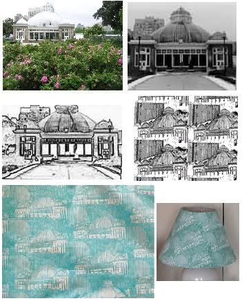
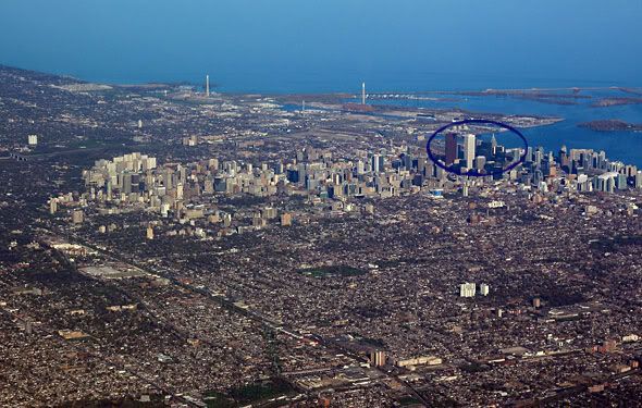
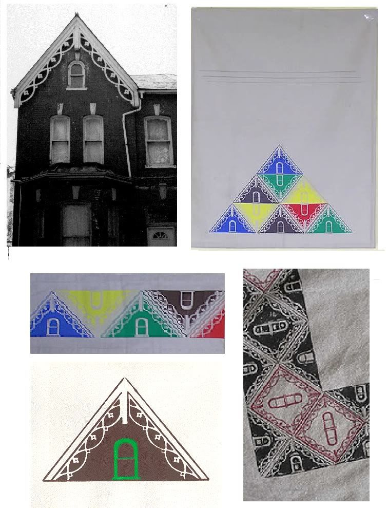
Clockwise from top: Victorian townhouse; Wall hanging;
Table cloth (detail); Card; Table runner (detail);

Toronto is a unique city. In the southernmost part of the downtown, there are high rises tall enough to qualify as skyscrapers. Mies Van der Rohe, the German-American architect, has a fine example of one of his minimalist modern buildings which houses the Toronto Dominion Centre on the grandly named King Street. In fact, most of the bank headquarters are in this part of the city. Is it an attempt (as Canadians always subtly do - but with belligerent denials) to mimic the formidable Americans, and in this case Wall Street in New York City?

Yet, there is another characteristic to this city. In contrast to this modernist influence, Victorian architecture makes up much of central and downtown Toronto. One example is the Cabbagetown neighborhood. That is where I took the above photo of a pretty run-down Victorian townhouse. But look at the beautiful lacework on the gable of this building. This became the inspiration for my "Gable" pieces above. The final pieces are textile and graphic works: a wall hanging, a table runner, a table cloth, and a series of cards.

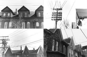
When I studied the townhouses, I realized that despite the intricate, lace-like carvings on many gables, what I liked most about them was their simple, triangular shapes. This led me to focus only on the tops of these buildings.

Gable Collage
Gable Photographs

First, I did a series of gable photographs, which were exhibited in a local venue (my neighbor couldn't understand why I only had shots of the "tops", but I didn't want to go into a lengthy explanation with her). Then, as I grew to understand the gables more, I took a couple of short silkscreen printing course since I had started to work on transferring photographic images onto cloth. The thing with screen printing, especially the rudimentary kind which doesn't involve factory-like environments with complex machinery, is that you have to keep the colors minimal. Each color is separately applied. The fewer colors, the less (manual) work of applying messy paints onto fabric.

This way, the gables took on a much more graphic, and simplistic, form. This helped (encouraged) me to concentrate on their triangular shapes. Color started to become an important factor, which I could manipulate. I started working with juxtaposition of colors: does red and blue go best together, or red and yellow? How about the intensity of color - do saturated colors work well with pastels? What happens when several colors are together? The wall hanging was really the culmination of an exercise in color. The cards started to become more interesting when I added a second color to the windows.

I didn't realize as I was going through these explorations (I did start off in photography, and not in graphic arts) that a whole movement existed  to understand the relationship of colors, and how we react to them. I found out about Josef Albers, and his deceptively simple squares, where Albers:
limited himself to square formats, solid colors, and precise geometry, yet was able to achieve a seemingly endless range of visual effects.[Source: Metropolitan Museum of Art]

The whole world of color started to open up, and this led to my full-scale investigation of color in art and design.

I may have started backwards, and the road was longer and more winding than it should have been, but I think without color, there would be no art or design. This is not a naive or simplistic comment. Our modern world has forgotten about color (is it black and white film that did that, or something more sinister such as a general decline in art and beauty?). But, it is good to know that we still have those references to fall back on, and pick them up from where they have been discarded.

[The next posting will be an unpublished essay I wrote on theories of color from Newton, Geothe down to the Impressionists. It is essentially an essay on the demise of color in art. I don't think we've been able to regain its importance yet.]

Sunday, October 17, 2010

Fashion and Art: A Continuing Exploration

The Legacy of Aubrey Beardsley

Since one of my ongoing themes at Camera Lucida these days is fashion and art, I have reproduced below a much earlier blog entry on Vogue illustrations. Aubrey Beardsley, a well-known illustrator in his time, produced drawings and illustrations that reminded me of the early Vogue covers from the 1920s. I am not sure if he directly influenced those Vogue illustrators, but when I compare them with his drawings, I am compelled to conclude that he did indeed influence those styles.

This  once again shows (me at least) that the early 20th century was infused with art and creativity (see the links to my previous posts on this subject at the end of this one),  and painters, illustrators, designers and all kinds of creative professionals constantly borrowed from one another.

We might be heading in that direction in the early 21 century, but I wouldn't hold my breath just yet. Still, one example I ran across is a photographic rendition of actress Nicole Kidman as the American painter John Singer Sargent's Madam X in the October 2010 issue of Vogue. Sargent  lived into his seventies until 1925, and thus saw something of the avant-garde.

Kidman's photograph is by fashion photographer Steven Meisel and was originally in the June 1999 issue of Vogue . There is nothing derisive about being called a "fashion photographer" these days. In fact it is something of an honor. There are more interesting fashion photographs now than many other styles of photography.

The early post "The Legacy of Aubrey Beardsley" is reproduced below.

---------------------------------------------------------------------------

The Legacy of Aubrey Beardsley


Aubrey Beardsley lived a short life of twenty five years. His drawings, many used to illustrate books and posters, had a sense of foreboding about them, often with androgynous figures with cruel expressions. Kenneth Clark, the art critic and writer says that Beardsley knew about Evil.

(Left, Aubrey Beardsley, The Black Cape)
(Right, Condé Nast Vogue Cover, 1920s)


His many illustrated books included: Oscar Wilde’s play “Salomé”, an art an literary magazine called “The Yellow Book” of which he was the art editor, and Alexander Pope’s “The Rape of the Lock”.

( Left: Aubrey Beardsley's Cover design for Smithers catalogue of rare books)


(Left: Condé Naste Vogue Cover, 1920s) 
(Right Aubrey Beardsley, Isolde)


Close to his death (due to tuberculosis) he converted to Catholicism and died at the very end of the nineteenth century.


These Condé Nast Publications for Vogue Magazine reminded me of Beardsley’s illustrations. Most of the Vogue illustrations are from the turn of the twentieth century (1912-15). Beardsley’s beautiful (but disturbing) images have found their true place. Decorating the women he tried so much to put in a favorable light.

(Left: Aubrey Beardsley: La Dame aux Camelias)
(Right: Condé Nast Vogue Cover, 1920s)


(Aubrey Beardsley: The Peacock Skirt)


Previous posts on art and fashion in the early 20th century:

Small Gems at the Art Gallery of Ontario
Fashion and Art: Music's Influence
Lalique and Chanel
Gabriel Yared's Soundtrack for Coco and Igor
Reliving the 1920s through Perfume
Chanel's Concoctions: Perfume and Culture


Saturday, October 16, 2010

Evolution of Design 3: Hosta Leaf

Clockwise, top to bottom: a) Original hosta leaf 
which I chose for its shape, b) A watercolor of the leaf, 
c) Finding the right "fit", d) The final repeat pattern.

It is unusual that I work with a single element. In this case, it is a hosta leaf. But I think there are enough variations within the leaf - the white lines, the darker shadows, and the curved shape of the leaf, to make it interesting by itself. Also, the shape of the leaf helped to form some kind of puzzle, by flipping and rotating the leaf. Inadvertently- design does this all the time, so it is always a good idea to just let the pieces speak for themselves - I formed a diagonal direction with the leaves. Diagonals are more dynamic than straight lines - horizontal or vertical. So, this extraneous element, the direction of the movement, also helped the design to stand with one shape (item) alone.

Tuesday, October 12, 2010

Evolution of Design 2: Trillium and Queen Anne's Lace


Design is a slow evolution of ideas, and how to best juxtapose different elements. I think the best reference is nature itself, and later on many motifs and ideas start coming together. It is also easier to work in threes - two flowers, one leaf, etc. I drew both important elements - the trillium and the Queen Anne's lace before I worked on putting them together. I used the structured trillium with the more powdery and whimsical Queen Anne's lace, and brought still more structure into the design by placing flowers in (and around) a spiral.

Queen Ann's lace has another mundane name: Wild carrot. But here is the interesting information about the two names (from the site lined above): "Queen Anne's Lace is the wild progenitor of the domesticated carrot."

Evolution of Design 1: Dove and Dog rose


I started by drawing the dog rose (it is really a watercolor). Then a few months later, I found an image of a dove that I really liked, and I drew it in pastels. Since I work most of my images into some kind of design, the final product is a repeat pattern of the dog rose as a background to the doves sitting on a branch surrounded by leaves.

The idea really came from art deco designer Charles Voysey, who has done many pieces with flowers and birds (the previous link is to Voysey's collection at the Victoria and Albert Museum, and includes textiles, wallpapers, and furniture). He was a contemporary of William Morris and the Arts and Crafts movement.

Here is his "The Columba" from the Victoria and Albert Museum collection.