Monday, August 30, 2010

Snakewoman

Eve revisited

Blumarine's Snakewoman (my appellation) appears
in many of this Fall's fashion magazines.

Blumarine is the core brand of the Italian fashion house Blufin.

---------------------------------------------------------------------------

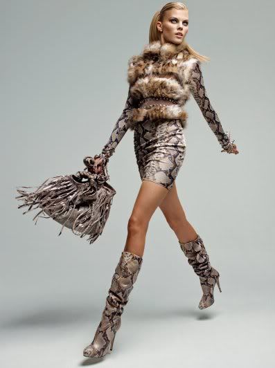
Analysis of the above photograph

- The woman has a slinky, elongated snake-like form
- She moves in a sinewy way, like a snake
- The snake skin skirt and jacket appear like her second skin
- Although the rest of her body is sheathed in the snake skin, her legs remain uncovered, as though they are the seducing, human female elements.
- She has strange, colorless eyes like a snake's
- Her handbag has undulating ruffles, mimicking snake tongues
- Her long pony tail swerves from side to side, like a snake's body, or a snake's tongue
- The leopard fur vest she is wearing only enunciates her feline femininity

(More of Blumarine's animal, and snake, prints here).

---------------------------------------------------------------------------

Snakewoman: Eve Revisited

Fashion has always been fascinated with animal print. I think it stems form man's primordial need to subjugate and control his environment. It is of course man who often subdues the wild. Then, he adorns his woman with parts of these fallen creatures, (or gives her the raw material to convert to nutrition for him and their off spring). And woman obliges and shows her status and importance through the conquests of her man.

But when woman herself gets close to wild beasts, the result is calamity - from her inability to confront and destroy the dangerous creatures, to her succumbing to their seduction, as happened to Eve. And I believe that often when woman is corrupted into wrongdoing (as in Eve's seduction by the serpent), man is sure to follow. Evil is perhaps a form of seduction for man.

Above is an ad for a fashion label Blumarine (now in many of the fall fashion magazines). There are so many things strange with this image, one of which is that the model is slowly converting to, or merging with, a serpent.

The actress Nastassja Kinski once posed naked with a snake undulating around her body. But this image still left woman intact - she was only interacting with the snake (albeit, very provocatively). Could Blumarine's Snakewoman be the offspring of this strange union? In the Blumarine fashion photo, she seems to be a newly formed creature: the ultimate, dangerous seductress. In this mature age of feminism, this is probably the kind of "woman power" images we should expect. Woman, in all her vanity, wants to use all her feminine guile to seduce and control man. She will no longer wear (or no longer need to wear) those ugly, masculine power suits which barely lasted a generation, and which gave her only minimal entry into man's domain (contrary to what feminists say). A more effective gear is one that enunciates her femininity, and swathes her in the best of Vogue's fashions. Still, look what happened to Eve, and to Adam.

Thursday, August 26, 2010

Julia Robers neither Eats, Prays nor Loves

Julia "eating?" 
[Image downloaded from Elle.com.
You can view the slide show at Elle.com]

I recently typed down the National Post's funny take on Eat, Pray Love - an Oprah Book Club selection, and now a movie featuring Julia Roberts.

Here is a synopsis of the film at imdb.com:
Liz Gilbert (Roberts) had everything a modern woman is supposed to dream of having - a husband, a house, a successful career - yet like so many others, she found herself lost, confused, and searching for what she really wanted in life. Newly divorced and at a crossroads, Gilbert steps out of her comfort zone, risking everything to change her life, embarking on a journey around the world that becomes a quest for self-discovery. In her travels, she discovers the true pleasure of nourishment by eating in Italy; the power of prayer in India, and, finally and unexpectedly, the inner peace and balance of true love in Bali.
Roberts is featured in the September 2010 issue of Elle Magazine, where she is photographed in various poses which are meant to signify her eating, praying, or loving. I don't think she does any of these. Love looks more like lust, and she is sitting on a kitchen table, obviously not eating, and looking gaunt and underweight. I may be harsh on the "pray" part. Julia (being a convert to Hinduism) clearly does pray...

So much for a movie and a movie star which are meant to be celebrating the simple things in life. Julia, in these photo shoots, demonstrates none of that joie de vivre which one would expect from a movie with such a title.

And for a character who is trying to return to the simpler things in life, all the dresses that Roberts is wearing in the ELLE photos cost thousands of dollars (OK, it is a fashion magazine). Still, she's wearing "her own rings," which I suppose includes her wedding ring. But, here's how she met her husband (from Wikipedia):
Roberts met her current husband, cameraman Daniel Moder, on the set of her movie The Mexican in 2001. At the time, Moder was married to Vera Steimberg Moder. He filed for divorce a little over a year later, and after it was finalized, he and Roberts wed on July 4, 2002, at her ranch in Taos, New Mexico. Together, they have three children, twins Hazel Patricia Moder and Phinnaeus "Finn" Walter Moder (born November 28, 2004) and Henry Daniel Moder (born June 18, 2007).
Anyway, here's what she's wearing in the above photo:
Cotton and lace dress, $4,795, silk and lace bodysuit, $1,295, both, Dolce & Gabbana, at select Dolce & Gabbana boutiques nationwide. Platinum and diamond bracelet, Bulgari, price upon request. Her own rings.
I guess one way for someone to recover from a divorce is to buy expensive clothes and go to India.

The frightening thing about this movie is that it is a memoir. In other words, it is supposed to be a true story (the expensive clothes and jewelery are the creative license of the director, I presume). And, as I mentioned above, it is given the full force of Oprah's approval.

The Politically Incorrect Wintour - Editor-in-chief of Vogue

Gaborey Sidibe and Wintour
[Image downloaded from New York Daily News]

I wrote in the previous post about Anna Wintour, editor-in-chief of Vogue, who unceremoniously keeps refusing or "firing" stars from posing for Vogue (on the cover and in the articles).

Well, so far, here's the list, and I agree with all of her decisions:

- Pop star Rihanna lost her spot after nude photos of hers emerged on the internet (she is in fact banned from the Vogue cover).

- Victoria Beckham, wife of the English transport football player David Beckham who now plays for the Los Angeles Galaxy soccer team, has begged to be on American Vogue. Wintour won't cede, and Beckham has to resort to less prestigious international editions, including Turkish Vogue ! I don't blame Wintour. Who wants this anorexic woman, with no grace and who never smiles, to be on one's magazine?

- Wintour is clearly not politically correct. While everyone fawns over the newest affirmative action movie star, Gaborey Sidibe - who plays a black, single mother on welfare in the movie Precious, Wintour won't have her on her magazine saying that Sidibe's weight is an issue.

- Wintour refused Jennifer Lopez her Vogue cover saying that Lopez was too "low class."

There are surely more Vogue Cover Rejects as mandated by Wintour, but these ones seem right to me.

Vampiric Brides - Update

[Image downloaded from Bridalwave.tv]
This dress resembles the one I'm describing.
You can view the actual dress at Vera Wang's site,
where it is the first of a stream of images to flash at 
her main page.

I wrote in yesterday's post that Vera Wang's black "gown" (and what to me looks like a black version of her wedding dress) appears on the August issue of  Elle USA. It is actually in the September 2010 Elle USA (already!). And you can still view it flash across Vera Wang's website.

Tuesday, August 24, 2010

Wang's Wedding Dress Fit for a Vampire's Bride


[Image downloaded from Bridalwave.tv]

This dress resembles the one I'm describing.
You can view the actual dress at Vera Wang's site,
where it is the first of a stream of images to flash at 
her main page.

Vera Wang is at it again. I recently saw Wang's black wedding dress monstrosity in Elle USA (August 2010 issue), but fortunately it can be viewed (with caution) at her site.

I had recently written about her "mounds of chiffon, " and the same mound she designed for Chelsea Clinton's wedding. Well, I can really only blame those pomo brides, whose aesthetic is: "no aesthetic." Wang is their wedding dress designer from heaven. Or more precisely, she fits the current mood for a vampiric netherworld perfectly. But none of these pseudo-goth brides would know what to do if a real vampire bit them.

Wang used to be a fashion critic and only turned to fashion design later in life. But, besides her dearth of actual design background and training, I still think it is the abhorrence of beauty (what a state of mind!) that is her guiding principle, and the guiding principle of many contemporary artists and designers. But, of course, people who hate beauty hate standards, hard work, and intricate study to get things perfect. "Let's just pile it on, with satin and chiffon," could be Wang's mantra. And the public (some with millions to spare) buys it all, words and chiffon.

Here is one more incriminating (yes, I will be that harsh) information about Wang. From Wikipedia:
Wang was a senior fashion editor for Vogue for sixteen years. In 1985, she left Vogue after being turned down for the editor-in-chief position currently filled by Anna Wintour and joined Ralph Lauren as a design director for two years. In 1990, she opened her own design salon in the Carlyle Hotel in New York that features her trademark bridal gowns.
I think Anna Wintour brings quality and style to Vogue, as much as she can in this pomo world. Wintour recently turned away another lackadaisical character - actress Sienna Miller - who had been slotted to model for Vogue.

Well, the Chelseas and other young brides will only look at their dresses twenty years down the road and wonder. If they don't, their children and grandchildren will. One can at least hope.

Monday, August 23, 2010

Turner's Watercolors

A few months ago, I wrote about Turner's mesmerizing paintings in the blog post "Turner's Watercolors: Capturing Ether." I talk a little about these mesmerizing qualities in a recent blog post: "Turner's Revenge."

I have posted the full blog post from January 28, 2010, "Turner's Watercolors: Capturing Ether," below.

-------------------------------------------------------

Turner's Watercolors
Capturing Ether
Camera Lucida, January 28, 2010

Margate, 1830

I've been looking at Turner's watercolors lately. I love their ethereal quality. It is surprising that a major artist should dedicate so many paintings to watercolor. Near the end of his life, Turner spent his days looking at the sky. Perhaps he was contemplating Heaven through the clouds he loved to observe. He understood their nuances, and I think also understood that watercolors can capture their delicate and fleeting character, perhaps better than oil. Looking at clouds is also looking at light in its many manifestations, whether diffused and subtle as in a grey winter’s day, or bursting with radiance and full of a mysterious glory.

Arth on the Lake of Zug. Early Morning. Ca. 1842–43

Turner's Contrasts

I have posted my article Turner's Contrasts below. I linked to it in a previous blog post, "Turner's Revenge" where I write about the current millions of dollars sales of Turner's paintings. At his time, though relatively popular, Turner wasn't much respected by the art critics. I tend to agree with some of their criticisms, and I wrote (in my blog post "Turner's Revenge"):
I think Turner was the precursor to the Impressionists, who led the way to abstraction, which, I think, is the end of art. Perhaps his fellow critics were right, after all. Still, I cannot but be mesmerized by his works.
The article "Turner's Contrast" was inspired by the exhibition: Turner, Whistler, Monet: Impressionist Visions at the Art Gallery of Ontario, Toronto, from June 12 to September 12, 2004.

Here is the article the AGO posted on the exhibition: Turner, Whistler, Monet: Impressionist Visions.

-------------------------------------------------------------------------------------------------------------

Turner's Contrasts
By: Kidist P. Asrat

Turner never resorts to melodrama. Yet, with the pastel contrasts of a “Sun Setting over Lake” through the turmoil of "The Burning of the House of Lords and Commons", he gives us all the range of colors and emotions possible to set up real drama.

Most art critics of his time, expect Ruskin, called Turner's painting the works of the Devil. Not for their darkness and sobriety, but for their sensuousness in color, light and texture, and for their apparent elusiveness and lack of finish. In their view, a painting had to be a completed drawing with sombre, even moralistic themes. But Turner's paintings are much more elemental than what his critics could imagine. His celestial and ephemeral inclinations (the colourful sensuousness that were undermined) are not biased towards the Devil's bright lures, but are contrasts to the heavy and important subjects of Good verses Evil, Light versus Dark. In fact these were the oppositions which he studied throughout his paintings.

Turner’s gentle pastel colored canvasses do not shy away from these contrasts. Here in "Sun Setting over Lake", the blue of the sky (intermingled with the white and pale mauve clouds) provides a close to perfect diagonal mirror image to its opposite orangish-yellows. The center of each, with the tiny dot of a sun and its halo on one side and the small swirl of clouds on the other, equidistant from each other, once again suggesting a relationship of opposites. The pale blue seems to be softly pulling us farther and deeper into some unknown realm, whereas the bright firey yellows are inviting us to plunge in. Could it be a commentary on Heaven and Hell?

His contrasts are bolder in "The Burning of the House of Lords and Commons". The blue is deeper and darker, and the yellow contrast is much clearer. His white (the bridge in this case) is now contrasted with darker elements on the opposite sides of the canvass - both in the sky and in the crowd. Once again, there is a dividing diagonal, dramatic sweep across the painting. And we are left with the eerily white architecture. It is not clear whether the fury of the flames will destroy it, or some saving Grace in the form of rain or wind from the skies might save it still.

“The Dogano, San Giorgio, Citella Steps of the Europa” from his Venice paintings is like a silk embroidery of buildings glistening in a hazy, light pink sky. But the contrasts, true to their polar opposite whites, have to be dark; and they are. The deep brown patches of barges and people seem to ground us back to the earthly ports (or at least onto the secure boats) away from the ethereal castles and silvery water-skyscape. There is even a tiny dark dog, giving us the details of the mundane. These dark areas remind us how beautiful and unreachable are these airy wonderlands. But Turner has been there, or at least has felt their presence, so there is hope yet for the rest of us.

A tiny statue of Napoleon is surrounded by a pool of swirling reds and yellows in “War: The Exile and the Rock Limpet” (Red, yellow, blue, light and dark being the most important hues and values of Turner's work). The bluish mauve in the sky provides that hopeful glint beyond the carnage of the red, but it is also a technical contrast to the abundant golden yellows. Napoleon’s greatness off-centered and giving space to the even greater sun is further diminished by the shadow of a single soldier. Napoleon is also closer to the pool of yellow, and soon to be engulfed into this burning gold, as is already his reflection. The heavens, in contrasting blues and mauves are beyond his reach, radiating farther upwards as he sinks slowly below. Napoleon has entered a hostile terrain, where he has only himself and his loyal shadow to contend with.

In "Shade and Darkness and "Light and Color", Turner painted two panels of what seem to be a before and after sequence. Rather than use color as the contrasting elements, his focus this time is strongly on dark and light. It is also toward the end of Turner's life (he is to die in 1851 and he was already an elderly 68 at this point) and he must be concerned with such opposing forces. It has been suggested that his spiral paintings resemble ceiling frescoes, adding a further touch into the mysteries of the heavens where the viewer is forced to look up. But besides this technical and historical prop, the swirls add to the emotional and dramatic urgencies of these paintings.

In "Light and Color", the darkened populace is swooped around and off the edges of the painting, out of the canvass. The light also seems to be a centrifugal force, gaining strength from the right, and pushing the darkness and all its elements off the canvass. We would expect the scene to eventually project nothing but pure light.

Moses sits in the middle - or close to the middle of the bright halo in "Light and Color". Yet what is at the dead center is the snake. What are we to make of this except to wonder at Turner's insecurities about his final destination. Further, Turner's main character in this painting comes from the Book of Exodus where: Exodus 20:21-22 The people remained at a distance, while Moses approached the thick darkness where God was. Then the LORD said to Moses, "Tell the Israelites this: 'You have seen for yourselves that I have spoken to you from heaven'.

It seems that Turner is placing Moses in the earthly, ungodly, bright turmoil, which is also home to the serpent, exactly as his contemporary critics must have viewed the world. It is the dark sombre core where God is housed. With all these ambiguities, one hopes that Turner finally reconciled his Light and Dark/Good and Evil meditations which seemed to have taken on an urgency, and perhaps an uncertainty, toward the end of his life.


-----------------------------------------------------------------------------------------------------------------------------

This article inspired by the exhibition at the Art Gallery of Ontario in Toronto, Turner, Whistler, Monet: Impressionist Visions, on view from June 12 to September 12, 2004.

Toronto was the first stop for the exhibition. It traveled to the Grand Palais in Paris, then to the Tate in England, in 2005.

Reference:
Colour in Turner : Poetry and Truth. By John Gage. London : Studio Vista, 1969

Saturday, August 21, 2010

"The Incredible Shrinking Moon'"

So, whose nibbling at the cheese?
Image downloaded from NASA website article:  
NASA's LRO Reveals 'Incredible Shrinking Moon

Many of my designs incorporate nature, and one specifically the moon (filed under "Landscape"). I spent some time figuring out how to represent a full and crescent moon together, and opted for an imagined "moon shadow." I added a cluster of grass to make it more interesting and to depict a harvest moon, when the moon is at its brightest.

Nasa has an article and images on its website reporting that the moon is shrinking. And here is an interview (with a transcript) at NPR with space scientist Thomas Watters explaining the phenomenon.

Tuesday, August 17, 2010

Another Turner Painting Fetched Millions

Giudecca, La Donna della Salute and San Giorgio 
[Image downloaded from Christie's]


I recently wrote a post on a Turner painting that went for close to $45 million at Sothesby's this past July. In 2006, another Turner was equally high-priced (well, only ten million less). The "Giudecca, la donna della salute and san giorgio" sold for $35.8 million at Christies, to a Casino owner no less. Who says that high and low art cannot mingle?

Saturday, August 14, 2010

Oprah's Book Club Selection, Eat, Pray Love, now a Movie

Starring Julia Roberts

I haven't seen the movie (nor read the book), but I just might go and watch Julia Roberts in Eat, Pray, Love for the fun of it. After all, a $10 movie ticket is cheaper than a $20 book, if I choose to leave before the end.

The usually stuffy National Post paid homage to the movie's release in Canada by heading all their movie reviews in the three-word style. Here are some funny examples (the italicized and bold section is the actual name of the movie currently playing):

- Sweet Delayed Stuff: the National Post's contribution to Eat, Pray, Love
- Geek, Play, Love: Scott Pilgrim Vs. The World.
- Defeat Stray Loves: Scott Pilgrim vs. the World (again!)
- Offbeat, Grey, Beloved: Joan Rivers - A piece of work
- Meat, Prey, Shove: The Expendables (with Sylvester Stallone)
- Swede Plays Tough: The Expendables (again!)
- Eat, Fillet, Love: Soul Kitchen
- Beat, Slay, Shove: Mesrine - Killer Instinct
- Bleak, G'day, Rough: Animal Kingdom (an Aussie movie)
- Elite Grave Buffs: Get Low (with Bill Murray)
- Sweet Sashay Above:  If I knew What You Said

The National Post should now hold a competition for the best pre-title descriptor for a currently playing movie.

Turner's Contemporaries

Critiquing his paintings
 
J.M.W. Turner, "Modern Rome - Campo Vaccino" 1840
[Uploaded from Wikipedia: Modern Rome – Campo Vaccino. Click image to see larger version]

Here are some quotes from art critics who were Turner's contemporaries, writing on his Modern Rome - Campo Vaccino, which was recently sold for US$44.9 million at a Sothesby's auction.

From: Martin Butlin & Evelyn Joll, The Paintings of J.M.W. Turner, (Yale University Press, New Haven and London, Evelyn Joll’s 1977 intro. Revised Edition, 1984) 2 vols. Pp 210-211

--------------------------------------------

Modern Rome - Campo Vaccino Exh. 1839 (Plate 355)
A large stone in the centre foreground is inscribed 'PONT [IFEX?] MAX.' The goats which are gambolling behind it are surely included as a recollection of Claude.

Exhibited with the following from Byron [from Childe Harold's Pilgrimage]:
'The moon is up and yet it is not night,
The sun as yet divides the day with her'.
The same quotation was to be used again by Turner as a caption to his Approach to Venice. The first line is that of verse xxvii of Canto IV of Childe Harolds Pilgrimage but Turner has altered Byron's second line which should read:
'Sunset divides the sky with her - a sea'.
[...]

At the R.A. [Royal Academy] the picture received mixed opinions, the most favourable appearing in the Art Union of 15 May which considered it 'A fine and forcible contrast to No. 66 [Ancient Rome; Agrippina Landing with the Ashes of Germanicus]. The glory has departed. The eternal city, with its splendours - its stupendous temples, and its great men - all have become a mockery and a scorn. The plough has gone over its grandeurs, and weeds have grown in its high places.' Thackeray, writing under the name of Michael Angelo Titmarsh in Fraser's Magazine for June, after praising the Temeraire [No. 377] admitted that Turner's 'other performances are for the most part quite incomprehensible to me.'

[...]
--------------------------------------------

Friday, August 13, 2010

Moratorium on Islamic Art and Design in the West

Trillium and Queen Anne's Lace

This is, of course, wishful thinking. But I have issued a moratorium on Islamic designs at Our Changing Landscape.

Wednesday, August 11, 2010

Occasions for Hats

Let the beauty shine through
 
Hats for Chéri

Once again, in keeping with these weeks of "fashion and art" posts, I am re-posting below my July 15, 2009 blog on  the movie Chéri released last year (which is a cinematic reproduction of Collette's famous novel by the same name). Michelle Pfeiffer is just great in the role, albeit a little ephemeral. The novel's protagonist, who has an affair with the much younger Chéri, is an older woman who seems to maneuver herself very well around high society and young hearts.

Throughout the film, Michelle wore beautiful hats. We don't wear hats anymore. And if we do, it is with an apologetic air, as though we are a little embarrassed by what we perceive to be a flamboyant behavior.

But recently, hat designers are coming to the fore. The late hat fashion icon Isabella Blow brought some glamor to hats, and was the muse to milliner, and Royal Ascot hat designer, Philip Treacy. And extravagant fashion designers like John Galliano are reviving period hats through creative hat designers like Steve Jones. But who would were those hats? The Royal Ascot does bring out all those hats (I will forever be entranced by those lovely scenes at the races in My Fair Lady, where Eliza Dolittle was transformed into the quintessential lady because of her hats). But, that is an extravagant and unique occasion.

We hardly have such social moments for wearing hats as beautiful objects these days. They are used to shield us from the elements - snow, rain, sun, cold. But, we could be brave enough to use the weather as a pretext, and just let the aesthetics shine through. And summer hats are the perfect way to start.

-------------------------------------------------------------------------------

Modern People Can't Handle Beauty
Michelle Pfeiffer in "Chéri"
From Camera Lucida blog article, July 15, 2009

Michelle Pfeiffer is radiant (and tragic, like a rose whose petals are falling off) in Colette's novel-turned-film "Chéri."

The petals scene I described is actually from the film. This is yet another decadent French story, this time of a much older woman and a younger man, who remain for six years together until reality hits them.

Colette's novel is magnificently brought to the silver (or I should say, bejewelled) screens, with Michelle's subtle and intelligent acting winning all the scenes.

I was surprised to see the film critics can this film. When I first read them, my first thought (after seeing the trailer) was that they couldn't handle how beautiful it was - like too much chocolate, said one critic.

Well, yes, it is beautiful. Yet, surprisingly, there is an attempt to ground the two characters in some kind of morality. Although Michelle saved her young man from drugs, alcoholism and general debauchery, she understood that she had left him addicted to a kind of narcissistic love that she (or anyone else) could never fulfill.

Beauty cannot stand on its own. It needs Truth and Goodness. Michelle's character, Léa, tried all that, but the latter two came too late.

Only the French know how to do decadent with a moral twist.

Of course, I would watch the film only for the costumes and the hats, and the beautiful gardens that seemed to be everywhere. Film is only film, after all.


Monday, August 9, 2010

Turner's Revenge?

Exorbitant price for his painting "Modern Rome - Campo Vaccino" 

J.M.W. Turner, "Modern Rome - Campo Vaccino" 1840
[Uploaded from Wikipedia: Modern Rome – Campo Vaccino. Click image to see larger version]

Recently, a Turner painting, "Modern Rome Campo Vaccino," sold for US$44.9 million at a Sotheby's auction. (The painting can be viewed at Sotheby's site).

Many of Turner's contemporaries believed his art came from the devil, except for his devout follower, the art critic John Ruskin. Here is an article I wrote on Turner which I titled: Turner's Contrasts.

I think Turner was the precursor to the Impressionists, who led the way to abstraction, which, I think, is the end of art. Perhaps his fellow critics were right, after all. Still, I cannot but be mesmerized by his works.

Toronto Star's Surprisingly Lucid (and Funny) Commentary on Chelsea's Wedding Dress

Keep in mind that the Star is a left-leaning, boho-culture-loving 
national Canadian newspaper
 
Chelsea's wedding gown by Vera Wang: Intricate mounds of chiffon.
(Downloaded from Us Magazine)

Even the Toronto Star wasn't too thrilled about Chelsea's wedding gown (which I've called "mounds of chiffon"). Below is the Star's Sunday August 8, 2010 review of the photos and columns on Chelsea's wedding that were published in the celebrity gossip magazine OK! (link to more wedding photos).
This week in wedding dresses
Congratulations on your upcoming nuptials. I hear you'd like a dress exactly like the one Chelsea Clinton wore, except cheap. OK! can help. Here's what you do: Buy a sheet and some toilet paper and a disco belt and three flowers from the dollar store and glue it all together. Pretty.
For once, the Toronto Star is actually funny.

Saturday, August 7, 2010

More Thoughts on Chelsea's Wedding

And her legacy (or influences)
 
Chelsea's wedding gown by Vera Wang: Intricate mounds of chiffon.
(Downloaded from Us Magazine)

Perhaps it is not fair to criticize Chelsea's choice of a wedding gown (and groom), and I should just let her live her life to the best of her ability. As I wrote earlier, the groom is the son of a convicted politician. That is hardly the groom's fault (or Chelsea's). Still, the reason she is in the limelight is because of her infamous parents. And, who can ignore her husband's notorious family background? Perhaps they were destined to meet and wed.

I couldn't help make these notes as I followed her wedding story. I headed the list with the title:
Wedding Mishaps
a. The most relevant news to me was that the wedding was "interfaith," with both a Methodist Minister and a Rabbi presiding over the ceremony. Will Chelsea convert to Judaism, as is customary for non-Jewish brides? Will her children be Jewish? Will they become a modern, atheist/pagan family with their own "creative," created rituals encompassing some Jewish, some Christian, and some "other" elements, as was the wedding?

b. During the ceremony, Chelsea dropped her husband-to-be's ring.

c. The wind flipped a page of the Minister's prayer book, leading him to forget some of the words. Chelsea was able to remind him of them, and the ceremony continued.

d. Chelsea, innocently enough, chose a poem which served as a code for British spies.
e. The National Post wrote a long article on the poem titled "Deadly Wedding Poems." The newspaper's sardonic take was that the poem deals with death (even if we ignore its cryptic elements).

f. I have written a negative review of her wedding dress, from the choice of the designer to the dress itself. Even the celebrity-adulating television show Entertainment Tonight used some unflattering words like: "raw-edged tussles," "asymmetrical bodice" to describe the dress.

g. Of course, the under-reported political news of the whole wedding is that her husband's father, Ed Mezvinsky,  is a convicted felon, who served time in prison. Here is a quote from Politics Daily about Mezvinksy Sr.:
Marc Mezvinsky is the son of two former members of Congress. His mother, Marjorie Margolies-Mezvinsky (D-Pa.), served one term (1992-1994) and his father, Edward M. Mezvinsky (D-Iowa), served two (1973-1977.) Ed Mezvinsky pleaded guilty in 2002 to swindling dozens of investors out of $10 million and served five years in prison. He was released in April 2008, but remains on federal probation and still owes almost $9.4 million in restitution to his victims.
In contrast, here is what Jenna Bush wore at her wedding.