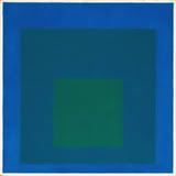
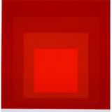
Josef Albers used his “Homage to the Square” series to try to contain color in form, but to keep color the center of attention.
A tree painted in saturated and vibrant colors will still be a painting of a tree, irrespective of the strength and force of the colors. Thus, form takes precedence over color.
Albers managed to side-step this difficulty of form almost always overriding color by making the most basic of forms, the square, the container of color.
There is no pronounced visual, psychological, cultural, contextual meaning attached to the square. It is just a square.
Thus, Albers put his juxtaposition of colors in this square (or nested squares) to get us to concentrate on color instead.
No randomness, no abstraction and no alien shapes and elements. A simple form of a square saturated with color.
But, what was his intention?
His response, as all artists will have a reason as to why they do things, is that he wanted people to interact with these colors in their own time, and in their own way.
How does an outer dark blue square interact with a nested bright green one? How about the an outer-most square of a brighter blue and its relationship with both these nested squares?
 |
Study for Homage to the Square: Beaming 1963
[The squares] move forth and back, in and out, and grow up and down and near and far, as well as enlarged and diminished. All this, to proclaim color autonomy as a means of plastic organization.'
Josef Albers
 |
Homage to the Square: MMA-2, 1970