Wednesday, October 14, 2009

Hosta Repeats

From leaf to pattern

From this:

To this:

To this:

Tuesday, October 13, 2009

Why Does Oprah Cry On Air?

A little for the camera, and more for herself


Oprah seems to be going back to her sensationalism style of the 80s. This must mean that she's hard up for ratings. In fact, they have gone down since she disappointed all those women when she cast her support publicly and actively for Obama.

Well, I recently managed to catch the tail end of her interview with Mike Tyson, and thank God - who wants to go through a whole hour of the creepy man, with a tattoo across his face, no less. Tyson has just had a documentary about him, and supposedly was with Oprah to talk about this.

The part I caught has Oprah talking about hearing Mike Tyson say in the documentary how all he wanted was to live a better life, be a better person. Oprah said this made her cry.

Now, Oprah cries much more than expected. Ellen Degeneres, the Crown Princess of talk shows, hardly ever cries, except when it was to have a break down on air when her adopted dog was taken away from her. Martha Stewart never cries, but then her shows are sane, pleasant moments and often with beautiful things like her own flower arrangements.

As I've written in a previous post where she interviewed Whitney Housten, Oprah delves into the dark side of people, and has her moment when she makes them out to be weak and pathetic. This is something Whitney resisted during her time with Oprah.

Of course, the genuinely pathetic Tyson just loved all this, and the attention too, and broke down crying himself during Oprah's interview. I didn't get to watch this, but it is all over the internet.

Why does Oprah cry? I don't think she cries for the people she interviews. I really don't think she's an empathetic person. I actually think it is two layers of things going on: one is to make herself look good on T.V. – somewhat; and the other is that she's crying for herself. As I mentioned in the Whitney episode, I think these journeys and probings into the dark sides of people she interviews are really ways to understand her sad and violent childhood, something I think she has never gotten over, and something that she keeps returning to with her strange collection of guests. I think she cries to alleviate that pain. But she does so in this detached, unconnected manner, as though it is the little girl – distant and faded – who's crying. Hence, her crying looks a little forced, and disconnected from her guests or the stories she's portraying. Of course, being the narcissist she is, Oprah cries a little for the camera as well.

It is during these moments that I feel sorry for her, except that I resume my original view that she is the most dangerous woman in the media now, and needs to fight her own inner demons alone and away from the millions of impressionable viewers.

Monday, October 12, 2009

New Website in the Works

Update

I am remodeling my design website. Originally I had called it Kidist Designs, and it included graphic and other non-textile works. I am building up my portfolio, and this new website will feature just my textile and pattern work. Furthermore, I will change its name. Kidist Designs is too esoteric (although it has a lovely meaning, which is "blessed designs"). Still, I love the word "pattern" and the many meanings it holds, so I am working on a workable (and web-available) name that incorporates that word.

Kidist Designs in now non-functional.

Exquiste Design

All for a chair

Below is a very rough sketch I did on my lined paper in blue ink as I was going through the Period Rooms (there is a very good summary at the link provided, including photographs) in the newly completed American Wing of the Metropolitan Museum of Art. The sketch is of the seat of an upholstered chair of the "neoclassical" period, and unfortunately I cannot find an image of it in the Met's vast online database.

I drew it because it characterized many things for me.

* Design, and fabric design, has always been about aesthetics, at times mere prettiness, at other times overwhelming luxury and sometimes just pure beauty.

* I felt going throughout the Period Rooms, which showcased about twenty rooms dating from the late seventeenth century to the early twentieth century, that people then had the confidence to design strong, beautiful pieces. Unlike our own period, whose gloomy designs I think begin around the 1970s - but more on that later.

* Craftsmanship was very important, but for the sake of constructing a harmonious, coherent piece.

* Color, intricate designs, patterns and other ornamentations were always present. There was hardly ever a "plain" chair, and if it existed, it was embellished by careful caning and weaving or luxurious materials like velvet.

* Looking at these rooms, there was nothing repellent about them, nothing "edgy." They were meant to be lived in, to be admired, and to be sources of pride for their owners.

Sketch of the upholstered seat of a "neoclassical" chair of the late eighteenth century.

This small chair, hidden in a side room besides the "neoclassical" section, got my attention right away. This was a chair that was certainly not kept as a piece of art, but merely as a household furniture to keep a person comfortably seated, a person who probably only briefly glanced at it before sitting down. Yet so much attention was paid its design.

There are several design elements going on at once in the upholstery:

1. The background color of the upholstery is a creamy, ivory white.

2. There is a checkered pattern near the middle – where alternate squares are colored in pale pink so the overall middle section is dominated by this pale pink.

3. The outlines of gold flowers were embroidered on top of these checkers.

4. Realistic vines and leaves, were embroidered in the spaces to the right and left of the checkers, in variations of greens and browns – adding shading and texture to the vines and leaves.

5. On either side of the vines, were curved lines, embroidered again in gold.

6. The stripes were all done in greyish/silver to offset against the ivory white of the background.

So there was a mixture of: stylized flowers and realistic vines with leaves; straight and curved lines; and checkered squares filled alternately with delicate color. Such rich design, done with the utmost delicacy to harmonize everything together on a seat!

Of course this all didn’t come out of nowhere. In the room adjacent to this exquisite chair – notwithstanding my inadequate sketch! – two of the big three 18th century furniture designers’ books were cited:

George Hepplewhite’s Cabinet-maker and upholsterer’s guide (1788)
Thomas Sheraton’s Cabinet-maker and upholsterer’s drawing book (1793)

The third big name was Thomas Chippendale.

Friday, October 9, 2009

Vermeer's Light and Movement

A precursor to cinema?

The Milkmaid, 1657–58

At one point, Vermeer was my favorite painter. I still think he's magnificent - although that is not really the word used to describe the quiet and almost serene paintings.

I was able to see The Milk Maid at the Metropolitan Museum of Art in New York. The painting was on loan from Holland's Rijksmuseum, to commemorate the 400th anniversary of Henry Hudson's voyage from Amsterdam to Manhattan. The museum's other five paintings by Vermeer were also on display, as well as paintings by Dutch artists who were contemporaries of Vermeer.

I won't say much about this painting, since I really had a just few minutes (maybe three) in front of it, since the gallery was so crowded. So, I will only write of my impressions.

As always, with Vermeer, I am struck by the light surrounding many of his subjects. This is a diffuse, all-over light, which illuminates them delicately, unlike the dramatic flashes that Rembrandt uses. Another thing that strikes me about these paintings (portraits, more like) is that they almost appear as though the subjects are moving, but not just performing their task, but moving (or about to move) their heads as though in contemplation. The milk maid stands with her jug ready to pour the milk, but at the same time, she could turn her head to look out of the window maybe to look for someone, or wishing she were outside.

I have done two pieces on Vermeer. One is an article, which I wrote sometime in 2006 (unpublished) which I called Vermeer's Discerning Light, an expository piece on this diffuse, gently illuminating light that Vermeer uses. You can read it hear.

The other is a short animation I did of The Lacemaker, again partly a contemplative piece, and partly a piece about this lacemaker’s task (although in the final version, I opted not to include movements of her hands working on the lace). The animation was done with Photoshop, then in a film editing software called Premier.

The Lacemaker, 2000

So, light and movement - a precursor to cinema, all those centuries ago.

Thursday, October 8, 2009

Two Mountain Ranges

In one trip

I made a mistake a couple of days ago when I said I traveled through the Adirondack mountains. I did travel through two mountain ranges, one was the Pocono, the other was the Allegheny, which is north of the Pocono, but south of the Adirondack, cutting through both Pennsylvania and New York State. The Adirondacks are much further up north New York State.

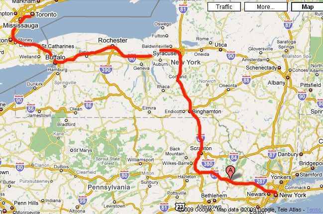
Here are maps of the mountain ranges, and one of my trip's route, which I've marked in red. I like looking at maps when I travel, it gives me a sense of a place - both orientation-wise and the geography around the place. I can also see cities and towns in relation to one another. Unfortunately, for this bus ride, I had no map, and was craning my neck to see signs of towns and cities as they passed by me.

The Pocono Mountains, and the Allegheny in Pennsylvania
[Click image to see larger map]

The Allegheny Plateau (or Mountains) in New York, and the Adirondacks
[Click image to see larger map]

Route from New York City to Toronto, stopping at Binghamton, Syracuse, Rochester, and Buffalo
[Click image to see larger map]

Tuesday, October 6, 2009

Burke's Wisdom

The Evils of Revolution

Edmund Burke wrote an extraordinary book titled A Philosophical Enquiry into the Origin of Our Ideas of the Sublime and Beautiful which I was quite taken by, and which I will discuss sometime in the future. Burke wrote it at nineteen years of age. I found this book looking for his seminal Reflections On The French Revolution. I'm slowly working my way through this, but just before I set off on my trip, I found Penguin’s 84-page selection from Reflections On The French Revolution which is titled: The Evils of Revolution. The longer title on this booklet includes this prescient phrase: "What is liberty without wisdom, and without virtue? It is the greatest of all possible evils," which is a quote from Reflections.

There is much to quote from this tiny book, which is just a preliminary for getting into the real thing. Here are just a few:

About the wrong, and destructive, types of leaders:
Compute your gains: see what is got by those extravagant and presumptuous speculations which have taught your leaders to despise all their predecessors, and all their contemporaries, and even to despise themselves, until the moment in which they became truly despicable.
On leaders:
There is no qualification for government, but virtue and wisdom, actual or presumptive. Wherever they are actually found, they have, in whatever state, condition, profession or trade, the passport of Heaven to human place and honour.
On revolutions:
The worst of these politics of revolution is this; they temper and harden the breast, in order to prepare it for the desperate strokes which are sometimes used in extreme occasions...This sort of people are so taken up with their theories about the rights of man, that they have totally forgot his nature.
On religion and Christianity:
We know, and it is our pride to know, that man is by his constitution a religious animal; that atheism is against, not only our reason but our instincts; that it cannot prevail long.