Operatic
I know that most classical music aficionados scorn at pop music. But if you look at the history of opera, for example, it was very much for the masses, it was popular! And I would call Toni Braxton's performance in "Un-break my heart", both musically and in her "narrative", as operatic. The depth of emotion in her voice, and the final soaring, endless cri de coeur is worthy of any Lincoln Center performance.
Un-break my heart
Sunday, September 28, 2008
Art Critics
And finding God
Fire Island Sunset, 2004. By James Collins - Founder of
The Hudson River School for Landscape
James Panero of The New Criterion wrote one huge piece (all of 1,881 words) on the revival of the Hudson River School painting style. In all those words, he managed to do just three things: there is a revival, the original Hudson River School were looking for God in nature, and the current crop haven't found God.
What does finding God in a painting look like? How does he know that the young painters, obviously just starting out, will not seek and find God as they progress with their art and craft? Did the original Hudson River School painters enter the mountains with such a lofty goal in mind, or were they eventually, and inevitably, drawn to the spiritual in nature?
Since Panero is obviously a wordsmith, has a whole ivy league arts education under his belt, and is supposedly a "critic", he is bound to write the way he does. He's not giving these brave young students any slack, and slashes them gently with his erudite vocabulary.
I say this from experience, because whenever an artist or a designer embarks on a tentative, different path, all the "experts" descend on him. I'm not sure why this is, although I've often thought that it is something to do with them jealously guarding their shaky edifice which is about to collapse at any moment. Much of modern art and modern criticism is based on shaky ground.
Panero's final sentence struck me as especially disingenuous: "Deep in the Catskill wilderness, they may be in a house of God, but that doesn’t mean they’ve got religion." He's making the Hudson River School revival to be some kind of evangelical revivalism.
I came upon another article of his on Picasso. Anyone who has studied Picasso will realize the fraud that he is, just as Tom Wolfe writes. Every step of Picasso's, which was so radically different from his previous steps (from his blue period, to his "cubism" to name the more famous ones), was a copy of other more serious artists in his milieu. An art critic who doesn't recognize this is being dishonest, to say the least.
For all his "they are the products of an art world that shouts but has little to say", presumably a jab at the current Damien Hirst-like atrocities going on, he still isn't much different from those who look suspiciously and cynically at artists who try to pull themselves out of that very rut. A little nod of encouragement might have been more magnanimous. But then, these courageous students have already come a long way without the supporting words of critics and teachers.
 |
The Hudson River School for Landscape
James Panero of The New Criterion wrote one huge piece (all of 1,881 words) on the revival of the Hudson River School painting style. In all those words, he managed to do just three things: there is a revival, the original Hudson River School were looking for God in nature, and the current crop haven't found God.
What does finding God in a painting look like? How does he know that the young painters, obviously just starting out, will not seek and find God as they progress with their art and craft? Did the original Hudson River School painters enter the mountains with such a lofty goal in mind, or were they eventually, and inevitably, drawn to the spiritual in nature?
Since Panero is obviously a wordsmith, has a whole ivy league arts education under his belt, and is supposedly a "critic", he is bound to write the way he does. He's not giving these brave young students any slack, and slashes them gently with his erudite vocabulary.
I say this from experience, because whenever an artist or a designer embarks on a tentative, different path, all the "experts" descend on him. I'm not sure why this is, although I've often thought that it is something to do with them jealously guarding their shaky edifice which is about to collapse at any moment. Much of modern art and modern criticism is based on shaky ground.
Panero's final sentence struck me as especially disingenuous: "Deep in the Catskill wilderness, they may be in a house of God, but that doesn’t mean they’ve got religion." He's making the Hudson River School revival to be some kind of evangelical revivalism.
I came upon another article of his on Picasso. Anyone who has studied Picasso will realize the fraud that he is, just as Tom Wolfe writes. Every step of Picasso's, which was so radically different from his previous steps (from his blue period, to his "cubism" to name the more famous ones), was a copy of other more serious artists in his milieu. An art critic who doesn't recognize this is being dishonest, to say the least.
For all his "they are the products of an art world that shouts but has little to say", presumably a jab at the current Damien Hirst-like atrocities going on, he still isn't much different from those who look suspiciously and cynically at artists who try to pull themselves out of that very rut. A little nod of encouragement might have been more magnanimous. But then, these courageous students have already come a long way without the supporting words of critics and teachers.
Lucky 8.
And Ukrainian eggs
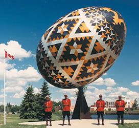
Giant Ukranian egg in Vegreville, Alberta
I've blogged about the inability of second generation Asian immigrants to get their India out of their mind.
I actually think this is a natural thing. The Irish have kept their traditions alive (look at the phenomenon of the Riverdance) and the Scottish have their favorite son (and their Highland games), and I'm sure the Ukrainians will never leave out their eggs during Easter.
Surely, though, there is a point where this foreign and main stream culture can converge. But, as Mark Krikorian from the Center for Immigration Studies says, all these cheap flights have made ancestral contacts all the more easier to reach.
Still, I think something more basic than cheap flights is going on. How can cultures so fundamentally different as are the Indian and the American (and Canadian) ever find a meeting ground?
Here is one Chinese-American who thinks she's making that connection, but is just as ethnocentric as are the Indians I've written about.
Jenny 8. is apparently a writer for the New York Times Metro section, but you would never know it from her website. Granted she has recently written a book about Chinese food in America (that already proves my point), but her whole website is based on her Chineseness - starting from that China red. She calls Chinese food, of course as all ethnocentrics are wont to do, "as American as apple pie."
Well, not really. You could say the same thing about pizzas, hamburgers and probably soon about falafel. But to see where people really connect with their food, go to their holiday meals. I doubt that Americans will sit at the Christmas, Easter or Thanksgiving table eating General Tso's chicken.
After all those years as a NYT journalist, Jenny 8.'s seminal book has been all about her Chinese identity.
 |
I've blogged about the inability of second generation Asian immigrants to get their India out of their mind.
I actually think this is a natural thing. The Irish have kept their traditions alive (look at the phenomenon of the Riverdance) and the Scottish have their favorite son (and their Highland games), and I'm sure the Ukrainians will never leave out their eggs during Easter.
Surely, though, there is a point where this foreign and main stream culture can converge. But, as Mark Krikorian from the Center for Immigration Studies says, all these cheap flights have made ancestral contacts all the more easier to reach.
Still, I think something more basic than cheap flights is going on. How can cultures so fundamentally different as are the Indian and the American (and Canadian) ever find a meeting ground?
Here is one Chinese-American who thinks she's making that connection, but is just as ethnocentric as are the Indians I've written about.
Jenny 8. is apparently a writer for the New York Times Metro section, but you would never know it from her website. Granted she has recently written a book about Chinese food in America (that already proves my point), but her whole website is based on her Chineseness - starting from that China red. She calls Chinese food, of course as all ethnocentrics are wont to do, "as American as apple pie."
Well, not really. You could say the same thing about pizzas, hamburgers and probably soon about falafel. But to see where people really connect with their food, go to their holiday meals. I doubt that Americans will sit at the Christmas, Easter or Thanksgiving table eating General Tso's chicken.
After all those years as a NYT journalist, Jenny 8.'s seminal book has been all about her Chinese identity.
Post 1960s Movies
Jimmy Stewart and Shenandoah
I've said many times [1, 2, 3, 4] that movies which were made after that magical date of 1960 deteriorate in storyline, cinematography and in a deeper intellectual, poetic or aesthetic strength.
One such movie at the cusp of the cut-off date is "Shenandoah", made in 1965 and starring the indomitable Jimmy Stewart. Stewart really does try very hard to redeem the film, but it's a downhill ride.
I've never heard of a civil war-era family refusing to go to war (for either side.) Stewart says his family never earned slaves, and freeing the slaves from the South is not his business. He's an independent, self-sufficient Virginian farmer, who asks for nothing, wouldn't you know. And he has these grown sons (in their early to mid twenties) who disagree with him, but respectfully follow his orders. What grown son, who's sure of his principles, wouldn't leave home for a war, or any other endeavor, for that matter?
Totally senseless, as is the rest of the plot where:
- The daughter marries a Confederate soldier, despite the family being technically Union supporters.
- The youngest son is taken prisoner by Union soldiers for wearing accidentally a Confederate hat.
- The father and sons start out on a search for this young boy.
- The oldest son stays behind with his wife and new born daughter.
- The daughter goes with the troupe!
- Stewart and his sons never fight in the war. Their battle was to bring the young son back.
- A young black worker, who is not a slave, is told by two different people that he is free (i.e. not a slave, which is quite clear from the beginning). So he "takes" his freedom by walking down this lane, going wherever he wants, as one white woman tells him he can.
Of course, 1965 is the civil rights era, the Vietnam war, the rise of the feminist movement, and other such social turbulences in the US. So, this film was really about the 1960s, and nothing to do with the civil war.
I don't mean to write a synopsis of the story, it is available online. What struck me is how bad the storyline was, and how good the acting. In later years, though, both storyline and acting suffer considerably.
So, I have to conclude that the 1960s were terrible for American cinema. Someone has to snap that tradition out of this rut.
Of course, any contemporary "Western" is just a big disaster.
I've said many times [1, 2, 3, 4] that movies which were made after that magical date of 1960 deteriorate in storyline, cinematography and in a deeper intellectual, poetic or aesthetic strength.
One such movie at the cusp of the cut-off date is "Shenandoah", made in 1965 and starring the indomitable Jimmy Stewart. Stewart really does try very hard to redeem the film, but it's a downhill ride.
I've never heard of a civil war-era family refusing to go to war (for either side.) Stewart says his family never earned slaves, and freeing the slaves from the South is not his business. He's an independent, self-sufficient Virginian farmer, who asks for nothing, wouldn't you know. And he has these grown sons (in their early to mid twenties) who disagree with him, but respectfully follow his orders. What grown son, who's sure of his principles, wouldn't leave home for a war, or any other endeavor, for that matter?
Totally senseless, as is the rest of the plot where:
- The daughter marries a Confederate soldier, despite the family being technically Union supporters.
- The youngest son is taken prisoner by Union soldiers for wearing accidentally a Confederate hat.
- The father and sons start out on a search for this young boy.
- The oldest son stays behind with his wife and new born daughter.
- The daughter goes with the troupe!
- Stewart and his sons never fight in the war. Their battle was to bring the young son back.
- A young black worker, who is not a slave, is told by two different people that he is free (i.e. not a slave, which is quite clear from the beginning). So he "takes" his freedom by walking down this lane, going wherever he wants, as one white woman tells him he can.
Of course, 1965 is the civil rights era, the Vietnam war, the rise of the feminist movement, and other such social turbulences in the US. So, this film was really about the 1960s, and nothing to do with the civil war.
I don't mean to write a synopsis of the story, it is available online. What struck me is how bad the storyline was, and how good the acting. In later years, though, both storyline and acting suffer considerably.
So, I have to conclude that the 1960s were terrible for American cinema. Someone has to snap that tradition out of this rut.
Of course, any contemporary "Western" is just a big disaster.
Friday, September 26, 2008
Blog
Update
Please excuse the posting problems (of images) that I'm encountering. In the meantime, you can read up on the various posts I recently made, especially the one on Narcisco Rodriguez and the slow destruction of heritage buildings (images of which you can see at the Urban Toronto Forum.)
And here's an update on the Canadian real estate bubble, with a revealing comment by one of the experts.
My latest, and completed, design can be viewed here, with notes on how I made my decisions.
Please excuse the posting problems (of images) that I'm encountering. In the meantime, you can read up on the various posts I recently made, especially the one on Narcisco Rodriguez and the slow destruction of heritage buildings (images of which you can see at the Urban Toronto Forum.)
And here's an update on the Canadian real estate bubble, with a revealing comment by one of the experts.
My latest, and completed, design can be viewed here, with notes on how I made my decisions.
Thursday, September 25, 2008
Lake Huron
Rushes and Waves
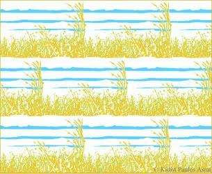
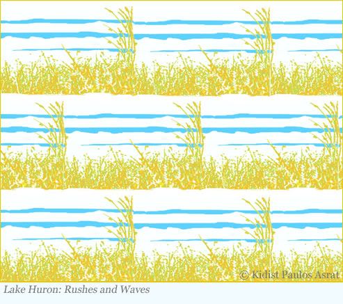
Final version of "Lake Huron: Rushes and Waves"
[click here for larger version]
I made just a small adjustment to get to the final version. The smaller subset of rushes that are blowing diagonally were originally one rod-like piece facing the same direction. Although this had a good structure - a more bolder diagonal feel - I felt that the small cluster of rushes had a more natural look.
One of the important considerations behind repeat pattern design is to determine what is the predominant direction: horizontal, vertical or diagonal. This is a horizontal piece, with the bands of waves making that a clear distinction. But, to alleviate the monotony of lines going across horizontally, I introduced a small diagonal pull as well.
As with all the designs that I do, I try to get the images to help me with the repeat pattern. In this case, I decided that there was a wind that was blowing the rushes towards the left, giving me a way to exploit the diagonal movement.
And of course, waves are generally horizontal, across a long stretch of sea-scape making a horizontal direction the main focus of this design.
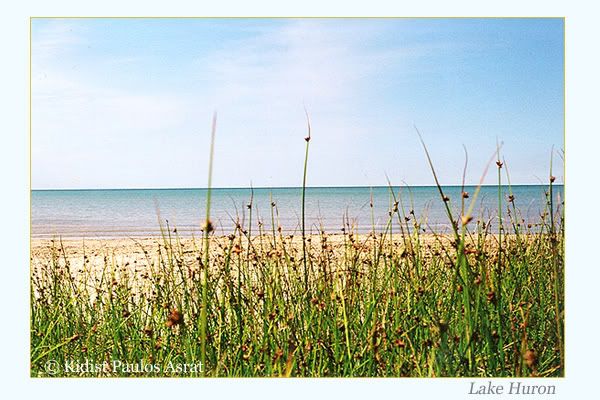
As I mentioned previously, this is a stylization from a photo of a view of Lake Huron.
 |
[click here for larger version]
I made just a small adjustment to get to the final version. The smaller subset of rushes that are blowing diagonally were originally one rod-like piece facing the same direction. Although this had a good structure - a more bolder diagonal feel - I felt that the small cluster of rushes had a more natural look.
One of the important considerations behind repeat pattern design is to determine what is the predominant direction: horizontal, vertical or diagonal. This is a horizontal piece, with the bands of waves making that a clear distinction. But, to alleviate the monotony of lines going across horizontally, I introduced a small diagonal pull as well.
As with all the designs that I do, I try to get the images to help me with the repeat pattern. In this case, I decided that there was a wind that was blowing the rushes towards the left, giving me a way to exploit the diagonal movement.
And of course, waves are generally horizontal, across a long stretch of sea-scape making a horizontal direction the main focus of this design.
As I mentioned previously, this is a stylization from a photo of a view of Lake Huron.
Narcisco Rodriguez
Trying to find the right print
Rodriguez's Spring/Summer 2008print version
of Kapoor's painting
Raoul Dufy's bold floral prints
on silk of the early 20th century
There is a long tradition of modern artists working on textiles and other crafts. Picasso, Klee, Matisse, Mondrian and even Kandinsky have made such creations. Painter Raoul Dufy turned exclusively into textile design, working for the famous fashion designer Paul Poiret. Others, like Pollack and a string of abstract expressionists, were the inspiration for many anonymous designers and their prints on skirts and dresses.
Narciso Rodriguez recently displayed his Spring/Summer 2008 collection with this tradition in mind using the prints of artist Anish Kapoor to decorate some of his clothes.
Kapoor doesn't use recognizable imagery in his paintings. No landscapes or still lifes for him. He is in fact well known for his conceptual sculptures, some of which resemble those Indian festivals of colored powder.
Well, there was nothing impressive Rodriguez's collection. Some of his attempts look like exercises in tie-dye, others were so unsophisticated than even a first-year design student could have produced them.
For many years now, I've noticed that print is a difficult thing for designers to wrap their fingers around. The monochromatic blacks, whites, greys and navy blues, with the occasional splatter of primary colors, have dominated the fashion files. Even the great Valentino goes light on patterns.
It's really time to put the variety and color of print into our textiles. But prints made with boldness, like for example what Pucci has been doing for several decades now. Not Rodruguez's feeble attempts.
If artists cannot, or will not, provide inspiration, then designers just have to work it out on their own.
 |
of Kapoor's painting
 |
on silk of the early 20th century
There is a long tradition of modern artists working on textiles and other crafts. Picasso, Klee, Matisse, Mondrian and even Kandinsky have made such creations. Painter Raoul Dufy turned exclusively into textile design, working for the famous fashion designer Paul Poiret. Others, like Pollack and a string of abstract expressionists, were the inspiration for many anonymous designers and their prints on skirts and dresses.
Narciso Rodriguez recently displayed his Spring/Summer 2008 collection with this tradition in mind using the prints of artist Anish Kapoor to decorate some of his clothes.
Kapoor doesn't use recognizable imagery in his paintings. No landscapes or still lifes for him. He is in fact well known for his conceptual sculptures, some of which resemble those Indian festivals of colored powder.
Well, there was nothing impressive Rodriguez's collection. Some of his attempts look like exercises in tie-dye, others were so unsophisticated than even a first-year design student could have produced them.
For many years now, I've noticed that print is a difficult thing for designers to wrap their fingers around. The monochromatic blacks, whites, greys and navy blues, with the occasional splatter of primary colors, have dominated the fashion files. Even the great Valentino goes light on patterns.
It's really time to put the variety and color of print into our textiles. But prints made with boldness, like for example what Pucci has been doing for several decades now. Not Rodruguez's feeble attempts.
If artists cannot, or will not, provide inspiration, then designers just have to work it out on their own.
Subscribe to:
Posts (Atom)