 |
With the walkway from Yonge to Victoria beneath
the adjacent building at 85 Yonge Street.
[Photo and Photoshop by KPA
Larger, photoshopped version here]
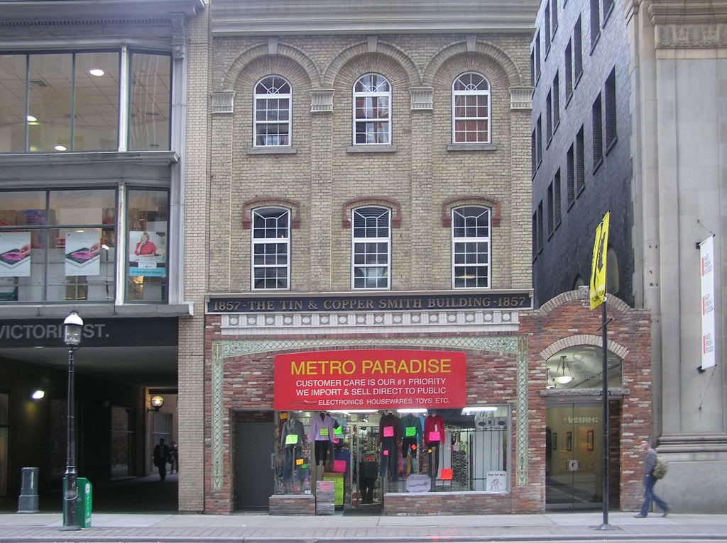
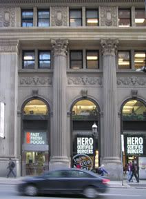
Below is how the building actually looks, with its gaudy red sign and cheap goods sprawling into the street:
 |
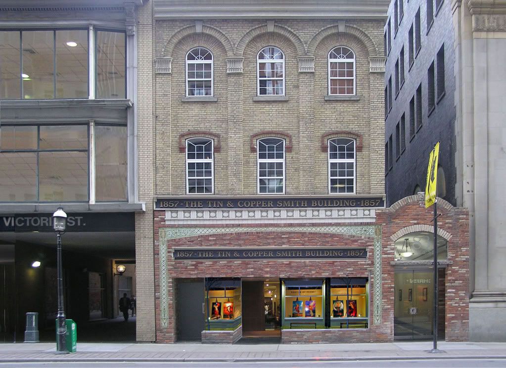
My photographic version of the Tin and Copper Smith Building is to photoshop out the store sign and use the building's original sign, to put frames around the windows, and to add in an art gallery with lit paintings.
I've also "covered" the windows of the adjacent building, which looks like some xerox office that has posters of copy samples pasted on the windows(!).
"No. 83 … surely stood out even in its own day. The cut-stone capitals on the pilasters and radiating brick lintels over the windows rank among the city's finest." Quote by Patricia McHugh, author of Toronto architecture: A city guide.
 |
 |
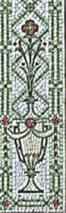 |
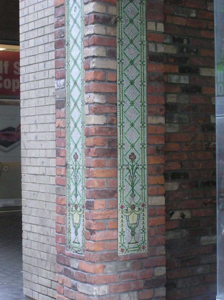
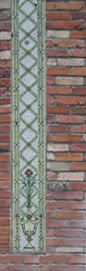
the bottom half of the building
[Photos by KPA]
I'm not sure if the mosaics are part of the original building. There is no source describing (or interested in) them.
Below is information on the Tin Copper Smith building from TOBuilt:
Tin and Copper Smith Building, 83 Yonge Street, Toronto, Downtown East:
- Alternate names: Hiram Piper & Brother Building / Toronto World Building
- Notes: This building had additions in 1895, and was altered in 1910 and 1914.
- Status Completed
- Year Completed: 1857
- Companies: The following companies are associated with this building:
- Architect: Hand, Harris & Merritt. Responsible for 1914 alterations.
- Architect: Charles J. Gibson. Responsible for 1895 addition.
- Architect: Joseph Sheard. Original building attributed to.
I'm not sure if the bottom half of the building with the brickwork is part of these updates. I think it is attractive, and matches the "brick lintels over the windows" so I will presume that it is part of the updated design.
| |
tawdry drabness all around.
Above is a photo I took of this building a couple of days ago. It's been like that for a long time, and I am sad to say I was never interested in going closer to have a better look at the details.
I took more interest in it this time because I was taking photos of a store window which is directly across the street from this building. I ran across the street to get a better shot of the store window, and stood by this building. Then, I noticed the flowers were actually carefully arranged mosaic tiles. From a distance, I always thought they looked like they were painted on the brick (clumsy graphic paintings) and seemed out of place. They are still out of place, but up close, they reveal themselves as little gems amongst what are mostly boring and generic city buildings.
Part of the reason I ran by them without so much as glancing back is the ugly convenience store that has taken over the ground floor, with cheap goods displayed under a gaudy red sign, which was simply strung on the brick facade without any thought for aesthetics. The store is one of those "dollar store" types, run by heavily accented Indians (or Pakistanis, or Bangladeshi), who have made not a single effort to conform their ways to the Toronto traditions, but are given ample encouragement to do just what they've always done "back home." And that is exactly what they're doing.
Toronto's downtown is becoming this weird, dark, dreary place, where people dressed in the latest Walmart black or grey jackets fill the streets talking in tongues other than English. So much for the colorful mosaic that Canada was supposed to be. And I don't think it is poverty either that makes people look (and settle for) ugliness. I think it is an inner discontent, where there's an alarmed realization that gold and sliver do not line the streets of Toronto after all, and hard work doesn't buy the real riches of Western civilization so generously displayed in TV shows and movies.
The building just a block down, at 79 Yonge Street, or better known as 8 King Street East (being on the corner of Yonge and King), is considered a "Toronto Heritage Property," and I'll post on that soon (including a ground floor which is taken over by...Hero Burgers - here's a photo I took.)
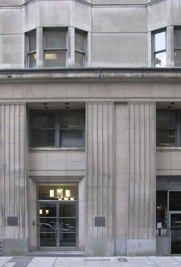
The building on 85 Yonge Street, next to the Tin and Copper Smith Building, is what used to be the Jess Applegath Building, that was also designed by Hand, Harris & Merritt (it was demolished and what stands is a 1989, reasonably O.K. construction). But what is interesting about this building is the walkway beneath it that goes from Yonge Street to the adjacent Victoria Street. It passes through the courtyard of the Metropolitan Resto Bar. I will post some photos of the highrise which houses this restaurant (the restaurant is also quaint and has a good menu, a little multi-culti but this is Toronto, and it is a nice respite from the busy Yonge Street). The highrise, known as the Imperial Life Assurance building, looks like an Art Deco style, but I have to do some more research on it.
In the meantime, below is a photo I took:
 |
[Photo by KPA}