Tuesday, June 27, 2006

Monty Pythonesque

The funniest story in the world: Script


On December 8, 1978, two Zairian air force jets approached Kinshasa, the capital. The tower radioed the pilots, telling them they couldn’t land because of low visibility. The pilots, presented with this problem, ejected from their planes and parachuted to safety. The perfectly good—and very expensive—Mirage jets crashed into the Atlantic Ocean. Problem solved.


Via VFR,where a cogent analysis is given about a story originally posted at NRO.

It is funny, but...

Saturday, June 24, 2006

Glass at the ROM

Déco Lalique


Bowl [with intertwining fish design], press-moulded opalescent glass, "Martigues" model. French, Lalique, model introduced in 1920.

The Royal Ontario Museum is displaying another type of glass. The elegant, decorative Lalique designs are on view until January 2007, which is around the time when the new Crystal extension will be completed.

The early 20th century designer understood beauty and style. It is a pity that he wasn't the architect of the 21st century glass debacle - The Crystal.

Still, I am thankful that a supporting structure is being built which will hopefully house many more of these Lalique-type exhibitions in the future.


Tuesday, June 20, 2006

Commerce over Spirit

The New Royal Ontario Museum Extension
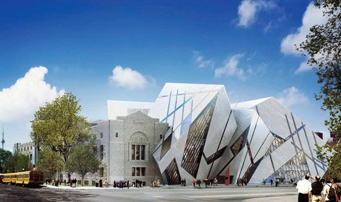

The Crystal addition
[All images can be clicked to view larger ones]

Architects these days are spending an inordinate amount of energy building delicate glass structures. And Daniel Libeskind, chosen for the ROM project, already had a dubious attempt at designing one.

He somehow got unofficially elected to build the “Freedom Tower” where the World Trade Center once stood. But his design later appeared so unstable that a second architect - David Childs - was put in charge to solidify it.


Original Freedom Tower design..............New Freedom Tower design

The Crystal at the ROM will have no such problems. Libeskind opted for sturdy rather than delicate. I would have called it “The Tank”, like Libeskind’s Jewish Museum in Berlin. Libeskind is cultivating some kind of tradition, after all. But unlike the Freedom Tower whose faulty structure only architects could see, we the public will forever wonder if these discombobulated cubes will cave in on us.

I’m astonished that the Berliner Jews allowed their sacred, Biblical sign to be so irreverently disfigured. Libeskind’s various slits for windows are parts and pieces of the lines that make the disjointed Star of David.
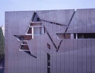

Libeskind's Jewish Museum in Berlin

There is no concern for the sacred when designing the ROM extension. But should there be? I don’t know what it is with architects in Toronto. Diamond (of the Toronto Opera House fame) complained about lack of funds, when it is more likely a lack of talent. What is Libeskind’s excuse? I must conclude that at the heart of it is a propensity for selling himself, covering up the real problem which is once again a scarcity of artistic ability. Testament to this is his Freedom Tower debacle.

And it’s not only Toronto that is short-changed. One of the finalists for the New York project came up with a spiralling set of glass towers. The simple symbolics of two towers (joined in the middle) spiralling upwards, with light emitting into the dark heavens above (carrying the souls of the departed?), would have surely garnered the appreciation and thanks of New Yorkers and visitors.
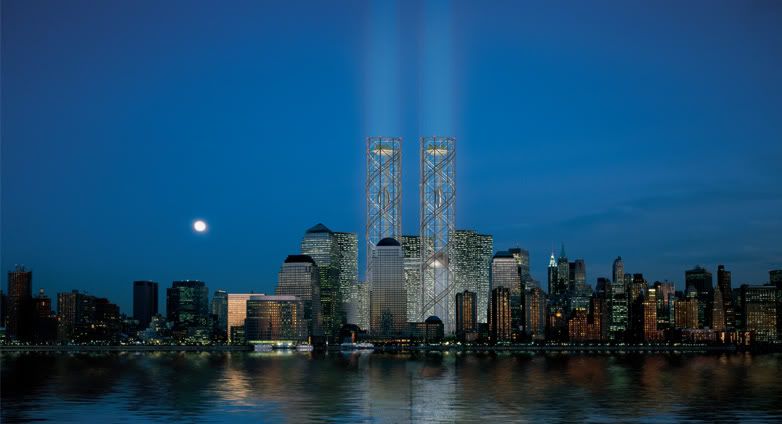

Design by finalists Frederic Schwartz and Rafael Vinoly
from THINK Designs


The THINK blueprint was the original recommendation by the Lower Manhattan Development Corporation. Instead, Libeskind’s salesmanship won the show. And he offered New York a faulty tower that's unable to carry the ghosts of the departed to their rightful place.

Once again, his ulterior motive becomes apparent. Salesmanship is easier than spirituality.


Wednesday, June 14, 2006

Our Own Private Opera House

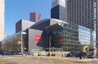
Toronto's Four Seasons Center for the Performing Arts


Architect columnist for the Toronto Star, Christopher Hume, described the new Toronto Opera House (known as The Four Seasons Center for the Performing Arts, after the famous hotel of the same name, whose owner was a big donor) as "at least Le Corbusier would have approved".

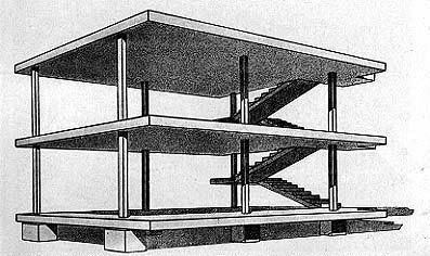
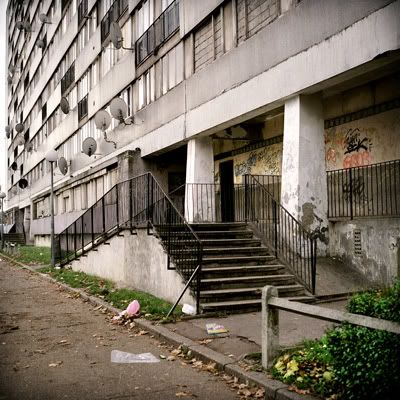
Perhaps he means the famous Corbusier domino house prototype “Maison Dom-Ino” depicting tall vertical structures as “machines for living”. Or he may mean the functional low-income housing designs Corbusier initiated – now notorious for those French suburban Muslims who set off the riots last year.


Top: Dom-Ino Designs by Corbusier; Bottom Clichy Sous Bois low income houseing (HLM)

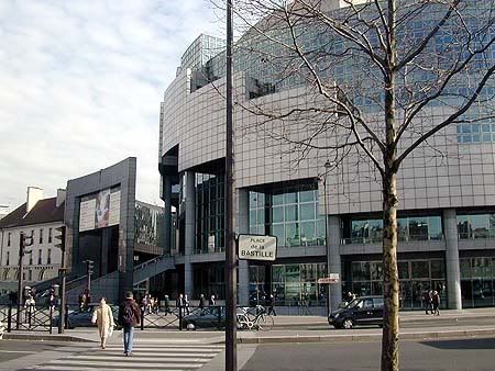
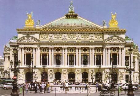
Or, in the ever-expanding lines of influence, perhaps the Toronto designer, Jack Diamond, did have a real, French Opera House in mind. But, it is likely the more recent Opera de la Bastille (which always reminded me of a giant swimming pool interior), not the grand old dame which Parisians still keep dear to their hearts.


In any case, aesthetics and grandeur were not on the agenda. And what is opera without that?

Diamond talks about lack of funds in making some of his decisions. He also describes his desire for the building to blend in with the surroundings (to the extent that the back of the building resembles a warehouse!).

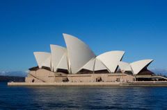
But, I somehow think it was more of a lack of skill, coupled with a lack of imagination. Look at the environmentally attuned, beautiful Sydney Opera House.


Top: Opera de la Bastille; Middle: Opera National de Paris; Bottom: Sydney Opera House

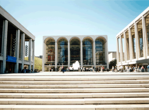
But, if there is ever an equivalent center that is both modern and dignified, it is surely the Lincoln Center, which didn’t sacrifice anything for the sake of functionality and modernity.


Saturday, June 10, 2006

Blogging Wish List

Is that why we blog?

The Evangelical Outpost describes our (or rather his) inner conflicts regarding blogging. He says:


- We hope for. . . community. But we often reward ... individuality
- We hope for. . . eternal perspective. But we often reward ... focus on the trivial and ephermeral
- We hope for. . . depth and breadth of interest. But we often reward ... shallowness - and narrowness of concern
- We hope for. . . wisdom. But we often reward ... foolishness
- We hope for. . . unity. But we often reward ... division
- We hope for. . . faith, hope, and love. But we often reward ... doubt, pessimism, and uncharitableness


I honestly made a concerted effort to avoid all the traps the Evangelical Outpost says we eventually fall into. See for yourselves!

I think blogging is serious. It is not really an online diary (at least not in the expected sense). For me, it has been a way to articulate many ideas, concerns and events that have affected me either negatively or positively.

I really do try to follow my blog heading: "A place to explore and shed light on how art, culture and society converge".

I think there are serious things going on in the world. By writing about them I try to find the missing (or insightful) links.

Tuesday, June 6, 2006

Another Symbolic Gesture

This time falls afoul

From Canada's MacLeans magazine - not online - "Draft and dodge controversy":

The Welcoming Peace Sculpture, featuring a Canadian greeting U.S. draft dodgers, was commissioned by a Nelson, B.C., resident for an anti-war festival. But when some U.S. veterans threatened a tourism boycott against the town, Nelson city council said it couldn’t go on public land. Then, there were rumors that nearby Castlegar and its peace-loving Doukhobor residents were going to take it off Nelson’s hands. But now, the matter has been settled and the statue will sit in ht front yard of Ernest Hekkanen, a draft dodger from Seattle who lives in Nelson. (The final nine-foot bronze will be unveiled in July).


The sculpture shows a man (a Canadian?) warmly greeting another man (an American draft dodger?) while a woman looks nervously behind her shoulder. This symbolic gesture of pandering to traitors was fortunately nixed by worthy Canadians and Americans.

Ernest Hekkanen can keep his garden troll, if he wishes.

Thursday, June 1, 2006

Preserving Memory

But is that enough?


Repeat Pattern for textile or
wallpaper print of "Lilac Bush"


One of the many ways that we can remember things is by making records of them. By pure chance, I had made a record of the the building from my previous post before it got demolished.

I'm not sure what will replace this building, probably a high rise since the neighboring building is one too.

There has been a construction spree going on throughout the downtown. Blogger Dispatches from the Hogtown Front talks about the skyscraperization of Toronto, at least the downtown part. His point is that it is probably increased levels of immigration that is fueling this rapid increase in development.

Although Hogtown Front mostly talks about the encroachment into green areas, where farmland and delicate natural sanctuaries are being destroyed, how different is that from demolishing attractive, sturdy buildings of some historical significance?

Geography and culture are being eroded for the sake of accommodating people from miles away with no compassion, understanding or even love for the real Canada.

I think the issues are more subtle than urban sprawl caused by immigration. Unlike ever before, new immigrants are transforming the symbols of this country into things totally alien to any of the residents here. Even within the diverse immigrant population, these symbols are not interchangeable. What we’re witnessing is replacement not for the better, but by the different, and in many cases for the worse.

Well, my small part has been to inadvertently record this, and what better way than as a textile design, full of the comfort, texture and tradition of cloth.

A larger part will take some thought.