Saturday, March 31, 2012

The Arrogant Aggression of Scruffy Jeans


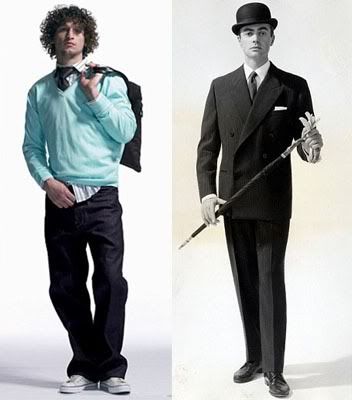
Notice how the slip of the un-tucked shirt, slovenly and
deliberate, on the "modern" man on the left mimics the
neatly folded handkerchief whose tip is showing in the
breast pocket of the formally attired man on the right.

Slovenly may be an adjective I use, but to the man on
the left, it is his style.

These images are from the Daily Mail, which has an article
agreeing, somewhat, with my post, titled:
"How Britain has become a nation of scruff-bags"

The article's point, though, is that this scruffy look is harming
young men's careers, whereas I think that it is their style of
choice, and that is how they succeed in their own version
of the board room.

--------------------------------------------------------------------------------------------

This must be the only civilization in the history of our planet where men define their masculinity wearing scruffy pants. It looks, at first, quick glance, that men are abandoning fashion and "style," but they're not.

There is a very particular "look" to the scruffy jean ensemble: the un-tucked shirt; the "just so" length of the pants, which fold over sneakers and scrape the floor; those sneakers which are never dirty, but have a clean, almost brand new look; a (clean) sweater with the shirt hanging out from underneath; a loosely tied tie; a tote bag, or some "man" purse, as an accessory; probably some kind of twisted thread bracelet, or a copper or silver bangle, and a ring on one ear or some body piercing, all acting as jewellery; scruffy, over-grown hair; and a day-old beard, although clean-shaven is also acceptable. The clothes look clean and washed, and if they have a few rips or tears, they are part of the style.

The slouch, which looks, once again, casual and flexible, is the uniform posture from which these young men assess their surroundings, pretending to look nonthreatening, whereas they are observing closely to make the necessary moves (obvious or subtle) to maintain their stakeout.

I began noticing this look around town, and realized that it is a very cultivated look, and not at all spontaneous and nonchalant. The men sporting this look, usually in their early to late twenties, look like they spent some time putting it together, although with practice it probably doesn't take them too long.

I started looking at their expressions and behaviors, and I began noticing a self-centered narcissism emanating from them. For example, they are unlikely to cede (in a gentlemanly sort of way) the sidewalk to me, and expect me to walk a half a circle around them to avoid collision. Although these days, I just stop in my tracks and wait for them to make the adjustments. If they are with women, they walk very fast, oblivious (I think it's more that they're uncaring than not noticing) the extra fast pace the woman has to walk to keep up with them.

I wrote about this style and look here, on an ad for jeans in a down town store.

I wrote:
The guy [in the ad] looks arrogantly confident. In this world of gender equality, there is still a male swagger, and a female demureness (the woman is acting very demure). His uniform is skinny jeans and a long, disheveled shirt, untucked, and over some t-shirt. But he looks a little too aggressive, and possessive. Who would want that kind of a guy around? (That's the funny thing about this "girl power" era of ours, young women actually seem to find this obnoxious-looking male attractive).
This self-importance has reached a pinnacle of narcissism.

The man in the suit, bowler hat and cane is also aware of style and clothing, but he aims to look good to allow his masculinity to express itself. He isn't using his fashion and his appearance as some kind of war against the world (and against women beauty), but as a way to fit in the world, and to make it look civilized and stylish. At the same time, he is giving clear codes through this bold and well-defined attire that other men should aspire to a similar presence.

The 21st century young man, on the other hand, is not concerned about beauty or aesthetics, but about power and aggression. How aggressive is it to look the way he does? I personally find it threatening, since I don't know how to interact with such young men: should I be polite and pleasant, or curt and rude? How will they respond to my questions, for example, for direction? Will they help me if I drop my grocery bags, or have some unpleasant experience like a pickpocket rob me? Etc. Somehow, I think my interactions with them will be negative.

Halle's Artistry

Halle Berry in an Elie Saab
gown in 2007

I'm really impressed with celebrity perfumes. I think the Queen of Celebrity Perfumes, Elizabeth Taylor, came out with a long list of really good (I would say lovely) scents, which have endured these many years. Many doubt her acting abilities (I've always liked seeing her in movies, with her beautiful face especially in her early years), but I think she must have had some talent to have endured so long in the psyche of pop culture, and to have also produced her popular (and very good) perfumes.

Well, Halle Berry has come up with several scents, and the drug stores are throwing them aside for mere dollars ($35). It could be that these celebrities have deals with these stores to sell their scents at lower than "designer" prices. Jennifer's perfume goes for $45, which is about $45 less than a Christian Dior or a Chanel. Jessica Simpson's various fragrances are now going for $19.99 at drug stores, and Elizabeth Taylor's Diamond variations are priced from $14.99 to $19.99. Sarah Jessica Parker's Lovely is now a classic, and a set which includes an Eau de Parfum (not Eau de Toilette), body lotion and bath gel go for an extraordinary $29 at a drug store.

These movie stars got where they are due to some natural selection of talent and ability. I think that their acting artistry spills over to other artistic ventures, and perfume "design" is no less artistic than acting.

Halle describes her perfume thus:
"I wanted to create a scent that helped empower women to reveal their passionate sides. Nothing makes a woman sexier or more beautiful than the confidence that comes from within."
Often, it is better to ignore these star's descriptions of work. They often get it wrong (often by over-dramatizing). Halle's description of Reveal the Passion is no less dramatic. Even the perfume's name is a little over the top. Reveal the Passion is actually a pleasant, light, fruity/floral scent, with a little hint of musk. This doesn't diminish it's good qualities, just makes it less of a Chanel, and more of a Halle. Which is a good thing.

Notes for Reveal the Passion:
(I've linked to descriptions of the various notes. There are too many "exotic" notes, which is how Halle might identify herself, and how she got the perfume designer Olivier Gillotin to assist her.)

Top:
- Dew fruit
- Bergamot
- Freesia
- Apple

Middle:
- Champaca
- Mangosteen

Base:
- Okoume wood
- Patchouli
- Musk

-----------------------------------
Perfume Reviews on Camera Lucida:
- Jennifer Aniston's Jennifer Anniston
- Elizabeth Tayolor's White Diamonds
- Sarah Jessica Parker's Lovely

Henry Horton: "Gay for 76 years"

Here's an email correspondence from some Henry Horton, who describes himself as: "Gay for 76 years." He was responding to my blog post "My Husband":
Hey Assrat ~ Thanks for letting the world know what a small minded nasty person you are. Does it make you feel good to know you've made some other person a 'child of god' as you might put it feel small and miserable. And since you don't talk to him you don't really know what he's feeling. I'm sure the baby Jesus is fashioning a star for your crown right now. And by the way do you ever casually mention your husband (assuming you have one) in conversation and isn't that rubbing your heterosexuality in peoples faces. You are a sad sad excuse for a human being especially one who obviously thinks she 'has found the truth'. Well at least you live in Ma. and have to live with the reality of our existence every day of your life. Sincerely: Gay for 76 years and not likely to change soon, I remain, Henry Horton Living in Paradise, Pahoa Hawai`i Come to Hilo and I'll buy you a Sarbucks coffee. PS How's this for aggressive?
I wrote back:
No, I don't have to "live the reality of your existence." You don't get it, do you? People will never accept your way of life, even in our modern, "progressive" world. You are outcasts, and of course, since I'm religious, I also say that you are sinners.

If you were happy with your life, you wouldn't be sending me this nasty little email, but would be trying to explain to me the goodness of your ways.

But, you cannot, because even you know what you're doing is not good.

I actually feel sorry for you. At 76, you could be my grandfather. I cannot imagine having a relationship of respect and admiration which granddaughters reserve for their grandfathers with you. I cannot imagine your own granddaughters (or grandnieces, whatever) doing that either. They will silently scorn you, and your ways.

Don't expect any sympathy from the rest of the world.
Nothing more from him.

Thursday, March 29, 2012

Just Me and You and Fido


It is for a good reason that I chose Fido as my cell phone plan. Actually, at the time I got it, there were very few cell phone services available in Canada, and this was touted as the best of the few. The many American services were unavailable in Canada at the time, for fear of them out-bidding the Canadian ones (so much for fair trade/free trade). Now that the market is inundated with them, Fido services are better, and cheaper. I had thought to change plans to something even more cheaper and better, but I'm glad I stayed loyal to my Fido.

The above photo is from Fido's online ad. These true Canadian canines are enjoying a toboggan ride, as only (Canadian) dogs can, all happily crammed on one long piece of wood.

On a serious note, cell phones have also brought out the worst in people. Every day, I hear one-sided, often very personal, conversations around me. And people hike up their voices when on cell phones. I think it is an ego thing: "Look at me! I'm having a conversation!" I also think that people get lost in their cocoon of them and the person on the other side, and the rest of the world doesn't exist. It is, of course, the continuing crassness of our world, and the gradual loss of civility. "No-one else matters but me!" say these modern narcissists. Sometimes I slow down to listen into these (boring) conversations. Some catch on and actually lower their voices. Others are just relentlessly oblivious.

Tyranny in a Non-Totalitarian Country


Jim Kalb's surprising lucidity (not in his surprising ability, but in his ability to so clearly delineate our surroundings) in exposing liberalism which is so shrouded in layers of camouflage, is at work once again on pages 127-128 of his book The Tyranny of Liberalism. I hate to write too many direct quotes from the book, since I think it is required reading for all conservatives (and liberals, since Kalb believes, generously, that liberals can be "saved" although I'm more skeptical), and the quote below might convince people to get the book.

Here is what Kalb writes on liberal tyranny in America (and I would say in Canada also) under the section "The Reality of Liberalism" (pp126-132). Below is a short excerpt of a paragraph from pp.127-8:
There are no secret police and few government spies in America. The judiciary is independent and private property generally safe. Trials are public and procedural safeguards observed. Elections with universal suffrage ensure that if voters at large feel seriously oppressed they can do something about it. Anyone can run for public office on any platform, and anyone can write or say what he wants without fear of prison or confiscation. Tenure protects scholars with unpopular and even conservative views. If the Amish want to live as such, they are allowed to do so, and the government is even willing to change the law to accommodate their rejection of social security and high school. Informal restraints on thought, expression, and action appear matched by similar restraints in other societies. Above all, life is comfortable, which was hardly the case in Nazi Germany or Stalinist Russia. The differences between the American regime today and the regimes usually called tyrannical or totalitarian are obvious and fundamental. Critics used to complain that liberalism was relativistic and permissive. How can they now call it dictatorial?
The fascinating section, only seven pages long, and about half way into the book, describes how "the advanced liberal state is...to a traditional tyranny what conquest is to common theft."

From: The Tyranny of Liberalism: Understanding and Overcoming Administered Freedom, Inquisitorial Tolerance, and Equality by Command

Addendum:
I have to add that I've got into the habit of reading the book in a coffee shop in close proximity to other coffee drinkers and their conversations (no, I'm not eavesdropping, but it seems that people don't mind exposing their thoughts in loud voices for all to hear). I did this initially as an excuse to get a large cup of Starbucks or Timothy's coffee. But later on, I realized that my surroundings (liberal society in a benign "institution" - the coffee house) really augment the urgency of the book. I just need to look around as I read the words to see reality at work.

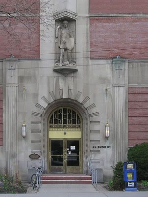
St. Michael on Bond Street

Bond Street entrance of St. Michael's hospital
with a relief sculpture of the sword and shield
wielding saint.


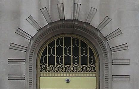
Archway above the door with filigree lattice work

[Photos by KPA]

Here is a historical plaque on the hospital building:
St. Michael's Hospital opened on this site in 1892 in a Baptist church which had been converted into a women's boarding house by the Sisters of St. Joseph. The hospital opened with 26 beds, six doctors and five nurses. In 1893 the sisters opened the first Catholic nursing school in Canada and in 1910 the hospital became formally affiliated with the University of Toronto Faculty of Medicine. Many Canadian "Firsts" took place during the hospital's first century including the first blood transfusion (1917), the most successful Canadian heart transplant (1968), the first muscle transplant in North America (1973) and the world's first sciatic nerve transplant (1988). In addition, numerous medical procedures and technological innovations were developed at the hospital. By its centenary in 1992, St. Michael's Hospital, still owned by the Sisters of St. Joseph, had become a 500 bed tertiary care hospital.
Nearby, there's a brand new addition to St. Michael's hospital, designed by Canadian architect Jack Diamond and built with donations from Hong Kong billionaire La Ki Shing. This new building stands as a legacy of our contemporary society, where the transcendental glory of God that forms a concrete society has been replaced by a spiritless worship of money from disconnected global sources. La Ki Shing's money comes from across the oceans, from a man who has no personal or historical ties to Canada. His only motive for his grandiose donation is to expediently own a piece of Canada, and to enlarge his global acquisitions. It is not surprising, therefore, that Jack Diamond is the architect. Diamond designed the latest version of Toronto's Opera house. I compare his unimaginative atrocity to Le Corbusier's vertically stacked structures. And I link Le Corbusier's buildings with the highrises that surround the French suburbs, and in which foments the anger of disconnected immigrant youth, who started the famous "banlieue" riots a few years ago.

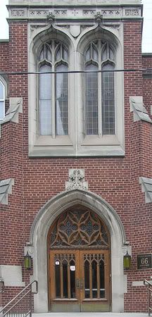
Facade or St. Michael's Choir School

[Photo by KPA]


The photos above show St. Michael's Choir School for boys and the back entrance to St. Michael's hospital, both on Bond Street. St. Michael's Cathedral is not far down from the school. Fine carvings and filigree lattice work adorn these buildings. But, neither these beautifying elements nor St. Michael's sword and shield were enough to ward off the ugliness of Jack Diamond's revolt-inciting glass panes, or the disconnected alien presence of a Chinese (war)lord.

Art is a testament of God. The new hospital addition discards God through the bland, expressionless, spiritless flat glass panes. Since God is not important, then man takes on a different dimension, whose importance is gauged not by his spirituality and his goodness, but by his acquisitions and his power. And money is rootless, so it can come from the highest bidder, from any corner of the world. Shing won this time around, but it could have been anyone. Anyone, that is, who could come up with extra zeros on the donation check.

20 Victoria Street

The former Imperial Life Assurance Building, on 20 Victoria Street. To the right, is the passageway that leads to Yonge Street, and the Tin and Copper Smith Building, which I wrote about here.

The former Imperial Life Assurance Building,
on 20 Victoria Street.


The Metropolitan Bar Resto, which has the ground floor of the building

[Photos by KPA]

I wrote here about Victoria Street, a quiet side street parallel to Yonge Street, which has some interesting early 20th century buildings. I tried to find more information about what I think is the Imperial Life Assurance building, on 20 Victoria Street, and asked the manager of the building about the architect of the building and when it was completed. She's emailed me some useful information from their files, which I posted below.

I also googled: 20 Victoria street Toronto 1910 imperial life assurance, and came up with this pdf file on Stevens Burgess Architects Ltd., who are the architects doing renovations on the building (html version here).

On page 18 of the html version is the information below:
20 Yonge Street [this is incorrect, although the below paragraph has the correct address, which is 20 Victoria street (there is no Imperial Life Insurance building with a limestone street facade on Yonge Street). This could be why it was hard to find information on the Internet)]:

Constructed in 1910, 20 Victoria Street is the original head office of the Imperial Life Insurance Co. SBA [Stevens Burgess Architects] undertook the conservation of the limestone street facade and buff brick courtyard and passageway. The project also included built-up roof replacement, snow avalanching abatement measures and lobby restoration. Mechanical, electrical and life safety systems and restrooms were also renovated.
And on page 19 of the file, under the heading: Conservation/Preservation/Restoration/Reuse Project, they have :
20 Victoria Street (Designated)
Alterations and adaptive reuse of 1910, 19 storey building
The image below is from the architects' files, and shows the 20 Victoria Street building from various angles. Right: The back of the building; Middle: The interior; and Left: The front.


And here is information from a file listing insurance companies:
The Imperial Life Insurance Company was a life insurance company that was founded in 1896. It officially ceased to do business under that name in 2001. The company was purchased by the Desjardins Group in 1994, but it was allowed to keep its name for the time being. At the time of its purchase, Imperial Life was the owner of Laurentian Life, a life insurance company it had purchased the year before. When the Desjardins Group bought Imperial Life, it also acquired Laurentian Life. The Desjardins Group merged with Laurentian Life to create Desjardins-Laurentian Life Assurance (DLLA) in 1994. In 2001, DLLA merged with Imperial Life to become the Desjardins Financial Security Life Assurance Company.
And finally, the email from the building's manager provided this useful information:
The original architect from 1910 was G. M. Miller and Co. The building was extended...in 1937, at which time the architect was Mathers and Haldenby Registered Architects.
Information on G. M. Miller and Co. is here, with a long list of buildings in Toronto they've built, but it doesn't list the 20 Victoria building. There might be more information elsewhere, which I haven't tracked down yet.

Brief Information on Mathers and Haldenby is here where their listed work includes:
Imperial Life Assurance Co., King Street East at Victoria Street, new facade, 1938

Tuesday, March 27, 2012

Typos!


I've noticed that I've been making typos in my recent posts (and posting them - criminal!). Even Blogger's spell check, which puts irritating red squiggles under the misspelled words, doesn't catch everything (it cannot read the context within which a word is misspelled).

The most recent is in my post: Lilium longiflorum:The Easter Lily, where I write about "a smattering of Eater Lilies" (I did spell it "lilly" to start with, then was advised by Blogger's internal spell checker to change it to "lily."

Well, "Eater" is a real word, and "Eater lily" in not problematic for Blogger. I've corrected the spelling, and I apologize for any past and future spelling errors.

I'm trying to do many things at once these days, including trying to write a blog post at least daily. And there's a little project called "writing an e-book" which will hopefully evolve into a real book, the non-ethereal, worldly kind that can be held in the hands.

So, apologies once again, but the world is too interesting not to document in this blog (and of course, critique as well, since it's all about making this world "a better place" after all).

Lilium longiflorum:The Easter Lily

Easter Lilies in the Allan Gardens Conservatory
[Photo by KPA]


The Allan Gardens Conservatory has a smattering of Easter lilies planted around the conservatory. I was expecting more. Perhaps there might be more closer to the holiday (April 8th), or more decoratively arranged. I went in to see what flowers had been planted for spring (the conservatory commemorates each season or holiday with a special display), but so far it looks sparse with cacti and leafy plants dominating. I hope it is a just matter of time before we see the holiday and seasonal plants.

Sunday, March 25, 2012

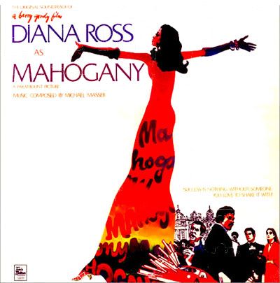
Diana Ross: Invocation of the goddess

Diana Ross in the poster for her film Mahogany

My local PBS channel recently had on Diana Ross' 1983 Central Park concert. I have always liked her music, but was never really a fan. Watching her concert, I was surprised at how well she sang. Even the best of performers have difficulty singing live, since synchronizing their voice with the orchestra and with electronic devices can be difficult. But it looks like Diana had some control over the volume at which the orchestra played, and could thus "hear" herself sing. She kept instructing the orchestra to lower the volume, or increase the volume, according to her needs. It worked, and the crowd didn't mind their Diana issuing orders from her stage to make sure the music reached them fine. "Can you hear me back there?" she would shout out.

She sang perfectly in tune, which is difficult even for experienced pop stars. But, I think she comes from a different era than the Britney Spears and Justin Biebers. She is a perfectionist, but she is also an intelligent performer. Her voice is weak (we are used these days to bombastic black singers) but she uses it extremely well, and musically. I didn't think she could have the kind of volume she maintained in some of her songs, but she did. A lot had to do with how she was able to control her voice. She must have learned over time how to make the best of her limited voice. She is also a performer, and gets emotionally into the music, which helps her deliver high quality singing.

The Central Park show was rained out (stormed out, more like) the first night, but she returned the following day to give a full performance.

She showed her emphatic nature, and her intelligence, as she managed the crowd the night of the storm. Most news coverage the next day praised her steadfast ability to direct the thousands of fans out of the park without a single act of vandalism or violence. The PBS program showed looking at the crowd, silent for a while, as she tried to assess the best way to handle this potential catastrophe. We could see her thinking. In the end, all she could offer was her presence, which was enough for the crowd. "I'm not going anywhere," she kept saying. And she softened her firm directions for the crowd to leave the park with "I love you guys," which I'm sure she meant. She saw these people as vulnerable children, who were at the mercy of her lucidity. She stayed as long as she could, singing to the crowd as is it quietly left.

Below are images of her with her fiery red scarf blowing in the storm, like some fire goddess fighting the torrential waters. I got the images from this video. At times the wind and rain push back her slight frame, but she stays as long as she could. Around the 3:07 point, she shouts out, "Alright, if anybody wants to leave I want you to quietly kinda try to go to your left, my right, and this way. Slowly leave if you want to." Soon after, she carefully says that everyone has to leave, making it clear that it was no longer a matter of "wanting to."


Saturday, March 24, 2012

How Immigrants Are Destroying Toronto (And Canada): The Colorful Mosaic That Canada Was Meant To Be

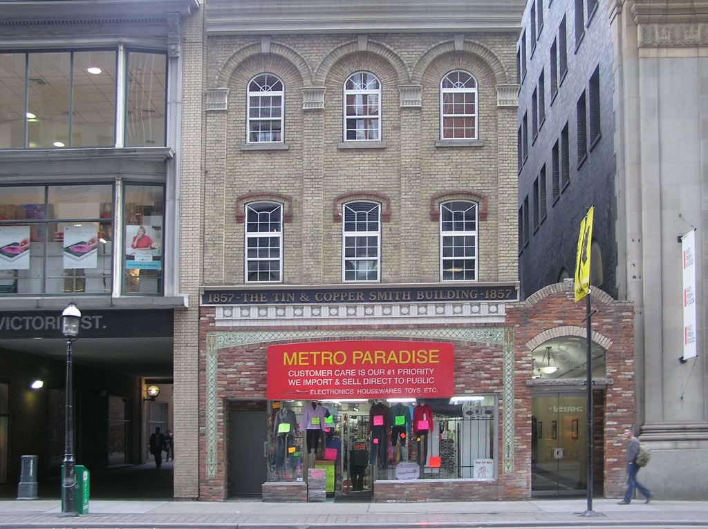
The Tin and Copper Smith Building, on 83 Yonge Street
With the walkway from Yonge to Victoria beneath
the adjacent building at 85 Yonge Street.

[Photo and Photoshop by KPA
Larger, photoshopped version here]


Below is how the building actually looks, with its gaudy red sign and cheap goods sprawling into the street:

[Photo by KPA]

My photographic version of the Tin and Copper Smith Building is to photoshop out the store sign and use the building's original sign, to put frames around the windows, and to add in an art gallery with lit paintings.

I've also "covered" the windows of the adjacent building, which looks like some xerox office that has posters of copy samples pasted on the windows(!).

"No. 83 … surely stood out even in its own day. The cut-stone capitals on the pilasters and radiating brick lintels over the windows rank among the city's finest." Quote by Patricia McHugh, author of Toronto architecture: A city guide.


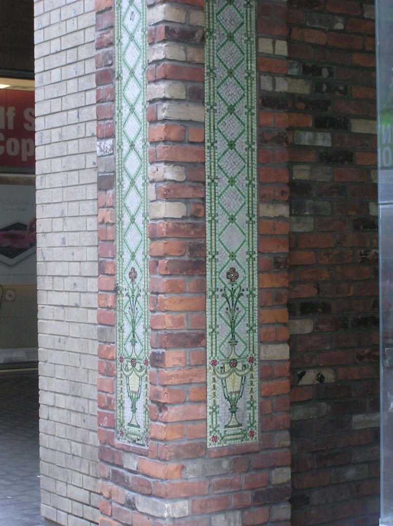
Details of the mosaic on
the bottom half of the building

[Photos by KPA]

I'm not sure if the mosaics are part of the original building. There is no source describing (or interested in) them.

Below is information on the Tin Copper Smith building from TOBuilt:

Tin and Copper Smith Building, 83 Yonge Street, Toronto, Downtown East:

- Alternate names: Hiram Piper & Brother Building / Toronto World Building
- Notes: This building had additions in 1895, and was altered in 1910 and 1914.
- Status Completed
- Year Completed: 1857
- Companies: The following companies are associated with this building:
- Architect: Hand, Harris & Merritt. Responsible for 1914 alterations.
- Architect: Charles J. Gibson. Responsible for 1895 addition.
- Architect: Joseph Sheard. Original building attributed to.

I'm not sure if the bottom half of the building with the brickwork is part of these updates. I think it is attractive, and matches the "brick lintels over the windows" so I will presume that it is part of the updated design.

Splashes of gaudy signs act like sharp, harsh contrasts to the
tawdry drabness all around.


Above is a photo I took of this building a couple of days ago. It's been like that for a long time, and I am sad to say I was never interested in going closer to have a better look at the details.

I took more interest in it this time because I was taking photos of a store window which is directly across the street from this building. I ran across the street to get a better shot of the store window, and stood by this building. Then, I noticed the flowers were actually carefully arranged mosaic tiles. From a distance, I always thought they looked like they were painted on the brick (clumsy graphic paintings) and seemed out of place. They are still out of place, but up close, they reveal themselves as little gems amongst what are mostly boring and generic city buildings.

Part of the reason I ran by them without so much as glancing back is the ugly convenience store that has taken over the ground floor, with cheap goods displayed under a gaudy red sign, which was simply strung on the brick facade without any thought for aesthetics. The store is one of those "dollar store" types, run by heavily accented Indians (or Pakistanis, or Bangladeshi), who have made not a single effort to conform their ways to the Toronto traditions, but are given ample encouragement to do just what they've always done "back home." And that is exactly what they're doing.

Toronto's downtown is becoming this weird, dark, dreary place, where people dressed in the latest Walmart black or grey jackets fill the streets talking in tongues other than English. So much for the colorful mosaic that Canada was supposed to be. And I don't think it is poverty either that makes people look (and settle for) ugliness. I think it is an inner discontent, where there's an alarmed realization that gold and sliver do not line the streets of Toronto after all, and hard work doesn't buy the real riches of Western civilization so generously displayed in TV shows and movies.

The building just a block down, at 79 Yonge Street, or better known as 8 King Street East (being on the corner of Yonge and King), is considered a "Toronto Heritage Property," and I'll post on that soon (including a ground floor which is taken over by...Hero Burgers - here's a photo I took.)

The building on 85 Yonge Street, next to the Tin and Copper Smith Building, is what used to be the Jess Applegath Building, that was also designed by Hand, Harris & Merritt (it was demolished and what stands is a 1989, reasonably O.K. construction). But what is interesting about this building is the walkway beneath it that goes from Yonge Street to the adjacent Victoria Street. It passes through the courtyard of the Metropolitan Resto Bar. I will post some photos of the highrise which houses this restaurant (the restaurant is also quaint and has a good menu, a little multi-culti but this is Toronto, and it is a nice respite from the busy Yonge Street). The highrise, known as the Imperial Life Assurance building, looks like an Art Deco style, but I have to do some more research on it.

In the meantime, below is a photo I took:

Imperial Life Assurance Building
[Photo by KPA}


Friday, March 23, 2012

How Immigrants are Destroying Toronto (And Canada)

Minister Rona Ambrose (second from left)
surrounded by employees and volunteers from
Changing Together: Centre for Immigrant
Women Association in Edmonton [Alberta].

From the first two paragraphs of the article with the photo:
Edmonton− The Honourable Rona Ambrose, Minister of Public Works and Government Services and Minister for Status of Women, announced Government of Canada support for a new project that will help end violence against immigrant and refugee women and girls, and held a roundtable with stakeholders involved in the project.

"This is an important collaborative project between Changing Together and the Edmonton Women's Shelter that can truly make a difference in the lives of immigrant and refugee women, who are victims of domestic violence and human trafficking," said Minister Ambrose.
-----------------------------------------------------------------------------------------------


The Thinking Housewife has an article on the Violence Against Women Act. She writes on violence between couples:
[M]ore than 200 studies have shown that women and men are equally guilty of verbal and physical aggression in the home. Domestic violence against women is extremely serious and women are injured and murdered by their spouses or intimates more often than men. But conflict is often initiated by women.
Many years ago, I worked for an immigrant agency. My role was a "counsellor" to assist new immigrants with integrating into Canadian life. After several years, I quit, cold turkey. Everyone was surprised. My "clients" as we called the people we gave service to, gave me good reviews. And I seemed to have had a modicum of success.

I quit because I felt that the kinds of immigrants I was seeing, mostly from Latin America (I speak reasonably good Spanish) and at that time many Somali and Ethiopian refugees, were not assimilating, and I didn't see them assimilating, into the Canadian society. Near the end of my post, I openly said that many of these immigrants/refugees should just return to their countries of origin.

During my years in the immigrant agency (early to late 1990s), new "women's issues" agencies started sprouting up to cull the government funds that were being allocated to women immigrants and refugees. Greedy and clever immigrant agencies discovered that there was money to be made on "violence against women" programs from these funds.

Now, a normal society would look at women as part of a unit of a family, either as a wife, a mother, a daughter, a grandmother, etc. But these agencies focused solely and only on women. And since their whole approach was divisive, they only ended up taking care of divisive issues.

What more divisive than "violence against women?"

I would say that most immigrant/refugee marital problems are related to the difficult financial and social problems these families experienced. And added to that, many of the men were not used to having their wives in such prominent roles, and sometimes more superior roles (from learning the language faster to getting jobs sooner, etc.). I would say that the women also behaved less traditionally subservient and possibly more antagonistically, with their new-found confidence (and attention). If violence ensues from these changes (I cannot say from my experience who initiates the violence most of the time), the women have a myriad of agencies and shelters to run to, while the men are left bewildered, angry and of course targeted as criminals.

I've had at a few men (often the situation is to embarrassing to talk about for men) recount their ordeals to me in detail, starting with a psychological blockage that doesn't allow them to continue a normal life, to missing their children. They were also profoundly ashamed that they were now known as wife batterers. I never went into the "violent" situations, but it was clear to me that the men lost the most.

I would start saying to my colleagues that such "violence" is becoming an epidemic. Many of these families wouldn't be experiencing such turbulent family lives back in their countries of origin, where there were a myriad of cultural and familial checkpoints to make sure this didn't happen.

First there was the family as a whole. In Ethiopian families (I cannot speak for other families, although I would think the situations are similar), older relatives, fathers and grandfathers (and uncles) played tremendously important roles in making sure that families were as harmonious as possible. Complaining wives did have a say. And a wife who was battered was the most protected of them all.

But of course, situations wouldn't reach the "battering" level. Through strict religious, Christian, mandates families were regularly reminded of the importance of roles and hierarchies. Only two generations ago (my grandparents' time), wives would call their husbands by the formal "vous" (I cannot think of a better word in English). A rebellious wife had many advisers (female relatives, sisters, mothers-in-law, and her own mother) to help her through whatever she was reacting against. And she may be right, so either she found a way to convince her husband of her correct, and beneficial, revolt, or other sources were found, from and elder male relative to approach the husband to the local priest, who could act as mediators and advisers. If divorce or separation becomes inevitable, again every social and cultural channel was used to prevent this. Separation was often used (with the wife "travelling" to visit relatives until tempers cooled off) to stall and put-off divorce .

In the end, although such societies look like they are full of coerced, unhappy marriages, they actually have unions which develop mutual trust, and even love.

I always said that those percentages of real violence against women were extremely small. The large numbers that are being touted everywhere I think are one of those liberal, anti-marriage, feminist propaganda, where everything and anything can become "battery" or "violence." The more one can show the inherent evil of men, the more the world can run according to women's agenda, including doing away all that claptrap on hierarchy and the outdated "king of his castle" role of men.

And women are more equal than men, in feminist language. This has torn society apart, made children fatherless (often living with the mother and with another male member who is not their father), made single women and their children poorer, and impoverished men, who often have to supply their income to two families if they remarry (alimony always comes from the man, in this equal world of ours), etc.

And it is especially brutal to immigrants, both men and women. There was a spike in immigrant men suicides in the 1990s (amongst Ethiopians to be exact, since I don't know enough about how other cultures responded to this problem). Many of these women receive welfare or some kind of government assistance, and stay it for long periods. Children grow up expecting government "benefits" which must affect what they aspire for as adults. Etc.

So, my opinion (although it counted for more than that at my counsellor job since it was based on my observations and research) was that we should find ways for these families to stay together. In terms of Ethiopian families, it was to restore some kind of traditional, Christian element, of male hierarchy within the family.

This, I think, is becoming more and more difficult in multicultural Canada, so I still say that Ethiopians should start a "return of the diaspora" movement (I said this once with a group of people, and someone told me that many, from young Ethiopians born in the West, to older retirees, are actually going back in large numbers).

Dependency on the liberal set up hasn't helped. And often, the supporters of radical liberal agendas, like those who speak for "abused" women and who support dramatic solutions like breaking apart families, are often white liberal feminist women, who have found ways to keep their own marriages and families intact (well, I wouldn't want to go in with a magnifying glass, since I will most likely find a liberal, wimpy, feminist male), but are ready to sacrifice others as foot soldiers for their cause.

The less political, and often non-white, women working at the front desks of the immigrant women's support agencies often have stable and what look like happy families (I noticed this, and mentioned it several times at my job), but they promote these ideas of family separation often because it is their job, and they have to accept it to keep their their jobs. But at some point, they too begin to believe the propaganda they are spoon fed (not for them, of course - there's always a hierarchy of recipients in the accusations and realities of battered women). But, they are participating in the destruction of a society simply because they don't, and possibly cannot, say otherwise.

For the sake of liberal rearrangement of society, everyone becomes a pawn, or at least a propaganda soldier. Those at the very bottom of that hierarchy, a hierarchy that is clearly and hypocritically present in the liberal set up, often have the most to lose. And in the case of battered women, it is the women who have somehow been convinced to discard their husbands as abusers, and who have to live a life dependent on another hierarchical superior: a cold and faceless government agency.
Thursday, March 22, 2012

Jewels at The Ryrie Building

Facade of 225 Yonge Street
[Photo by KPA]

Wikipedia has images of the building through the years


A few days ago, I posted on a jeans store, Buffalo Jeans, and its window poster which promises "The Sexy Escape." I wasn't impressed with their collection, and discovered that their advertizing image promoting this escape was catering to the "inner sluttiness" of young women.

As I noted, the building is attractive, and is clearly one of those heritage buildings that Toronto is trying to preserve. I wish those behind heritage building preservation would not just focus on the facades, but look at what's inside as well. There's no reason why a few years down the road Buffalo Jeans might not decide that it wants a slick, modern building, and slowly do renovations and demolitions that would dismantle this structure to give us those glass and granite cubes that are springing up everywhere.

Below is information on the building's history. I was right to feel that the building deserved more than jeans. It used to be a prestigious jewellery store.
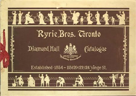
The Ryrie Brothers owned the most prestigious jewellery business in Toronto at the time this office building was re-modelled out of two existing structures by Burke, Horwood & White in 1913.

While the Ryries had their retail business down the street in "Diamond Hall" located at Yonge and Adelaide streets, this building at the corner of Shuter Street was an investment property. The Ryrie name survives in the Ryrie Building, but no longer in the jewellery business.

Ryrie Brothers amalgamated with Montreal jewellers Henry Birks & Son following the death of one of the three Ryrie brothers in 1917, and later in the 1930s another Toronto jeweller joined the company to form Ryrie-Birks-Ellis. For many years since however, the firm has been simply known as Birks.
The company describes itself as "jewellers and silversmiths."

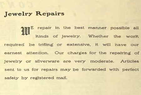
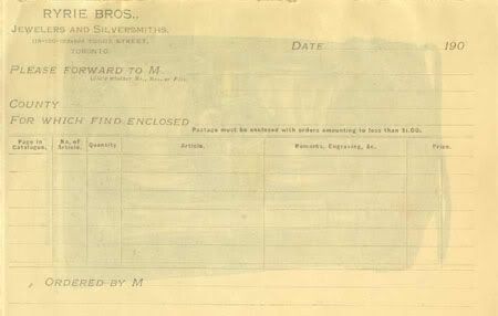
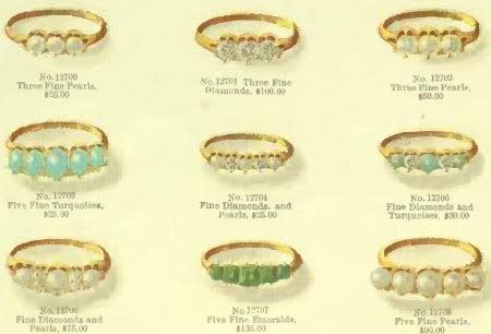
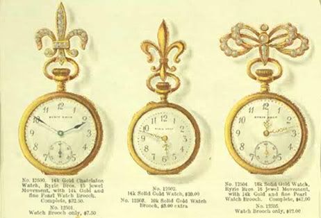
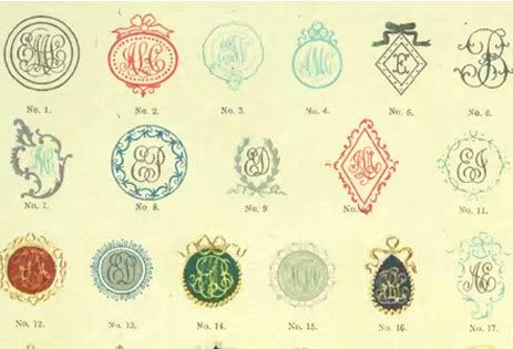
Below are images from their 1913 catalogue. I've included the cover page, and a description of the services. The bottom image is "steel dies for embossing stationary," which shows that the company branched out into various decorative items. The full catalogue includes everything from silver picture frames to silver-embellished pipes, (the complete 1913 catalogue is available here).


Wednesday, March 21, 2012

Not Spring Yet in Toronto

Collage from flowers at the Brooklyn Botanical Gardens
Images via the New York Post


I wish I could post photos like this, but not quite yet here. We still have leafless trees and gardens without flowers. But temperatures in the 2os!

Crumbs For the Children

"Blended families"

Image from article: "Author Rebecca Eckler talks about becoming a modern-day Brady Bunch"

------------------------------------------------------------------------------------------------

A Canadian correspondent sent me this email a couple of days ago:
Hi Kidist,

From one Torontonian to another, I was hoping you'd post something on the execrable exhibitionist Rebecca Eckler. I hadn't read this brat in years, since she was a columnist with the newly launched National Post. But the other day while waiting for takeout, I happened to open the Toronto Star (always a mistake), only to find this pearl of postmodern wisdom from Miss Eckler.

http://www.parentcentral.ca/parent/newsfeatures/article/1143048--blended-families-author-rebecca-eckler-talks-about-becoming-a-modern-day-brady-bunch

I don't have time to blog, but was hoping some Canadian conservative would take this twerp to task for her me-me-me first attitude and general godlessness. If Vera Wang is worth all the space you give her, surely Toronto's very own Miss Ick is worth a dart or two ... whadyasay?

I replied:
I gave up on this useless, talentless, fake Jewish woman a while ago. Her personal mess is really of no interest to me anymore. I wish her children luck. These adults have blood on their hands, nonchalantly divorcing, marrying, committing adultery, having bastard children, pretending to make it o.k. with "I'm engaged" while six months pregnant, etc. She makes it seem like some anguished choices, but don't believe her. If she had any heart, she would have stayed with her ex-husband. Didn't she cheat on him or something?

Their children won't forget all this trauma they went through. I'm sure it will affect their personalities, and even their own moralities. They are damaged goods, as far as I'm concerned, and I do feel sorry for them. Sins of the fathers, and all...

So, I'm not interested, and these days, I keep away from such people.

Why Vera Wang? Because she is a designer with some prestige, and a much more prominent and influential personality than Eckler. But, as I peel off the layers, I'm finding out that she copies other designers, has limited imagination, and if left to her own devices and imagination, wouldn't be able to do the things she does.

Have a good day!

Tuesday, March 20, 2012

Dancing With The Stars Has a Great Lineup


Simple photoshop to make Kym Johnson's costume
worthy of a Foxtrot
Top: Before,
Bottom: After
[Images from video stills]


I may seem like a TV junkie (well, if watching Jeopardy classifies me as that), which I'm not, but it's good to have Dancing With The Stars(DWTS) back again.

Part of the reason I don't watch much TV is because liberalism creeps in unexpectedly (although, who am I not to expect these things?) as in the Jeopardy "moment" I blogged about where a male contestant mentioned "my husband" during the show's "get to know the contestants" break.

DWTS is similar in that the dancers often come out in skimpy clothing and some lewd moves (although these moves never happen with the Foxtrot, the Waltz, the Two-Step, but always with the Samba, the Rumba, the Salsa - any pattern here?). But, their dancing talents surpass their costume aberrations (or I try hard to ignore them), and some of the dances actually inspire the designers to make beautiful costumes.

Anyway, one pair danced a good, subdued Foxtrot number to Frank Sinatra's "The Way We Were." What kind of dance could "The Way We Were" inspire anyway but the Foxtrot? Kym Johnson, the pretty Australian lead dancer, was teamed with that awful nerdy Steve from "Family Matters" who looks all grown up and mature now. Kym's dress was pretty, but almost went overboard. Couldn't they have covered the "mesh" upper part with real material, perhaps with the white feathers that make up the rest of the gown?

Still, this is one of the few shows (like Jeopardy) where the contestant's skill matters. Most of these stars have gone through some kind of dance training in their younger years, trying to get into show business, so they are actually quite skilled already. There is also a big screening process that goes on to get the ones with some dancing ability. Also, they go through grueling, day-long practice sessions, worthy of athletes.

But some invited stars just can't dance, and usually they're there because of a mischievous programmer who just wants to have a little fun. Comedian Adam Carolla was such a character, although he actually took his role very seriously! Who wants to look like a fool on the dance floor, and dancing the waltz?

Also, thankfully, there are no creepy contestants this year (I think!).

Sunday, March 18, 2012

Vera Wang's Eurasian Daughters

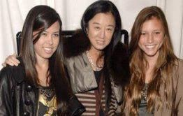
Wang with her two "Eurasian" daughters

I was curious if Vera Wang had any children. Most other designers talk, or introduce, at some point their children. Amsale has done this, as has Carolina Herrera.

When I googled "Vera Wang children" I came across this site: 8 things you didn't know about Vera Wang. #7 was: Vera has two adopted children."

This didn't surprise me, since Wang left her family-forming years until her early forties, busy as she was building her Wang dynasty with clothing. Then, I wondered what kind of children Wang would adopt. Not white kids, surely?

It turns out that Wang has two adopted daughters described as "Eurasian" in this article. This makes sense. She doesn't want her children to look white, after all. And her wimpy husband (here's my post on him) who married her, will have no problem fulfilling his liberal charity by adopting forsaken children with uncertain backgrounds.

I wonder why they didn't adopt a son? Is it because of the one child policy in China that left infant girls abandoned, or left in orphanages, which turned into lucrative adoption centers to provide rich Americans, often of mixed Asian/white couples, with ready-made children to-go?

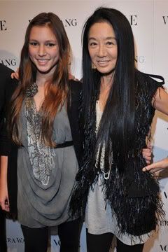
Wang with one of her daughters.
Wang is in some skimpy outfit,
perhaps trying to compete
with her daughter


Wang with leg showing, and holding a pose, next to a
more demure daughter. Did she consult with
Amy Chua a.k.a. Tiger Mom on how short
to wear her skirt/dress/t-shirt?


"Light My Fire"

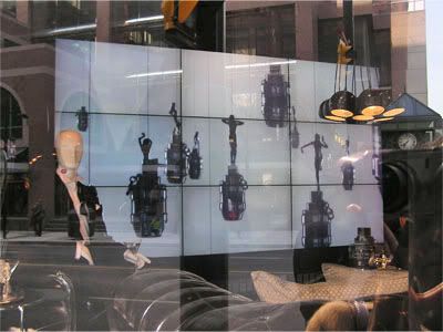
There's an elaborate window display at the Bay department store advertising a cologne for men. The cologne is Spicebomb by Viktor and Rolf, and it is shaped like a grenade. I went in the Bay to get a sample, to see if it lives up to its dark and dramatic aura. It doesn't. It is bland and benign. I asked the nice saleswoman about the bottle, and she said that you had to pull a string to "activate" the perfume. She thought it was quite ingenious, although I wasn't convinced. "Like a grenade!" I said.

The notes include: bergamot, pink pepper, cinnamon, vetiver, red pepper and tobacco accord.

I took photos of the big Spicebomb display that is in the Bay's windows, including a stills from a video that is looping on a huge screen. I've posted them below.

The window scene depicts a living room with solid leather furniture, and a male mannequin sitting in a sofa with a cocktail glass in hand. The staged room looks warm and comfortable until the images on the video screen begin to make sense. They start out with James Bond type women, dancing around in leather pants, then some start to whirl around on giant grenades. Eventually, the whole screen is filled with these women on grenades. Then a man's face fills up the screen. And finally the screen explodes into white.

The video in this nice interior is looping some kind of Armageddon, or ultimate annihilation.

After watching the video, I began to notice grenade shapes in the room, most prominently as a decanter at the bottom right of the stills and also as the perfume bottle/grenades in the bottom left.

Grenade as decanter, and smaller grenades by a cocktail glass

Below are shots with stills from the looping video:


I posted recently on a magazine spread of Eve and the snake, which I titled after the Doors song "Going to the Other Side."

The music that is looping with the video is "Light My Fire" by the Doors, but sang by Shirley Bassey. It was the Doors song "To the Other Side" that came to mind when I did my post on Eve, or Eve's doppelgänger. It seems that the Doors evoke some kind of evil, where even what should be a perfectly manly perfume takes on grenade-carrying females, and exploding scenes (the end of the world, then to the other side). Perhaps it is appropriate that Bassey, a female, sing this song for the Bay perfume display.

But, there is nothing clear-cut about the Viktor and Rolf concoction. Even the Bay's window designers have put a feminine cocktail glass in the mannequin's hand, while the setting (and the "masculine" perfume) call for a strong a whisky tumbler.

Shirley Bassey singing "Light my fire"

Lyrics to "Light my Fire"

You know that it would be untrue
You know that I would be a liar
If I was to say to you
Girl, we couldn't get much higher

Come on baby, light my fire
Try to set the night on fire

The time to hesitate is through
No time to wallow in the mire
Try now we can only lose
And our love become a funeral pyre

Come on baby, light my fire
Try to set the night on fire, yeah

The time to hesitate is through
No time to wallow in the mire
Try now we can only lose
And our love become a funeral pyre

Come on baby, light my fire
Try to set the night on fire, yeah

You know that it would be untrue
You know that I would be a liar
If I was to say to you
Girl, we couldn't get much higher

Come on baby, light my fire
Try to set the night on fire

Saturday, March 17, 2012

Catherine, Duchess of Cambridge

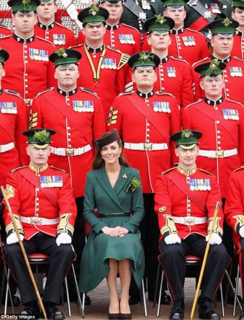
Kate wearing a green dress for St. Patrick's Day

Her brown hat, not black as most
stylists would chose, is a
perfect match for the dark
green dress


I've always liked Kate. She seems quiet, smart and has adjusted remarkably well to royal life, unlike her sad mother-in-law Diana and her aunt Sarah. Perhaps she learned from their sad mistakes. I've got a few blog posts I've meaning to do on her, and her modest but elegant style, which I'll get to.

Above, she's celebrating St. Patrick's Day at the Aldershot Barracks with the Irish Guards. Here's more on her visit:
For St. Patrick's Day 2012, Catherine visited the Aldershot Barracks in Aldershot, England, where she presented shamrocks to 40 members of the 1st Battalion Irish Guards during the St. Patrick's Day parade. The regiment was formed in 1900 by Queen Victoria, to honor the Irish soldiers who served in the British army during the second Boer War in South Africa.
Here in Toronto, there was emerald green everywhere today, although the official parade took place last Sunday. It was a rather cloudy day, so the green could be seen from a distance, peppering the streets. What a refreshing gathering of people, who are having a good time, and remembering a good thing. Let's not forget that this is all for St. Patrick, as one girl reminded me when I wished her group "Happy Irish..." "St. Patrick's Day!" we both finished at the same time.

I overheard some guy say that the Irish Embassy will be pretty busy tonight. I suspect he means with drinking Irish. I was going to reply to his stereotypical remark (he looked Anglo-Canadian to me, with the strict, no-nonsense demeanor, since clearly he was unable to join in the mini festivity), but I left him alone.

Toronto hosts the largest "gay pride" parade in North America, where half naked men and women prance around the streets, rerouting traffic and unsuspecting pedestrians away from the main streets. And the Caribbean Carnival, where there is at least one gun shot, if not murder, every year, brings in thousands of tourists from the Caribbean. The city foots a portion of the bills for both these events. These parades take over the several blocks of streets, and fill the television and newspaper news for days.

The official St. Patrick's Day parade was last Sunday, and was hardly noticeable. There were no dramatic stories other than a few green-haired jumping leprechauns. It is organized by the The St. Patrick's Parade Society of Toronto, and if you look at their sponsors, not one is a government agency.

A footloose leprechaun on Yonge Street
An early start last Sunday