Monday, May 31, 2010

Purple Glories

A time for Irises

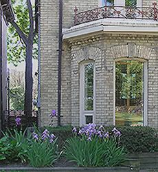
Irises are in bloom again, in front of the traditional yellow brick houses in Cabbagetown.

Friday, May 28, 2010

Neurotic, Middle-aged Women from New York City

Hit the town
 
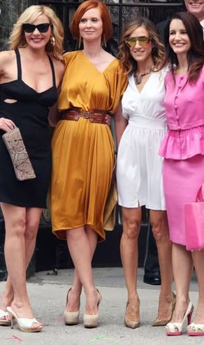
A scene from the "Sex and the City 2" movie

Those Sex and the City non-glamor gals just want it all: the exciting sparks of living in a large city; looking young; looking beautiful; relationships; husbands; children; careers; girls night outs; and Manolo Blahnik shoes to do this all with.

I don't know why they call the movie, especially the second one that is showing now, Sex and the City. They should call it, The goings-on of four neurotic, middle-aged women in New York City.

Wednesday, May 26, 2010

Feminist Glamor Stars

No strength of personality
 
Kim Cattrall, the feminist glamor star

Sex and the City Part II is being advertised all over the place. Kim Cattrall, who plays the "sexy" Samantha in the movie, tries hard to live up to that role in real life. But, she is worse than her movie character, and comes of as insipid and flat. Glamorous stars of Hollywood past, like Marlene Dietrich or Lana Turner,kept up that glamorous role in real life. They were the real sexy stars and glamor queens.

I think Cattrall wants it both ways. She wants to be the nice, approachable film star, but is obliged (in her feminist ways) to be "her own woman," and "claim her sexuality." Being the hard, unapologetically glamorous star requires an uncompromising, strong personality. Modern feminist women lack that strength, and are always caving in at moments of difficulty or unexpected sacrifices. They are essentially people pleasers. This is what I've also observed about Hillary Clinton.

Tuesday, May 25, 2010

More Architecture of Death

And its stubborn persistence
Randall Stout's Art Gallery of Alberta

I have written extensively about the collapsing buildings of Toronto. Attractive, even beautiful, heritage buildings are literally torn down for the sake of expanding retail and residential space. And hideous public constructions, like the Daniel Libeskind's Royal Ontario Museum Michael Lee Crystal extension (and even the tamer new addition to the Art Gallery of Ontario by Frank Gehry) are built in a manner which implies their impending collapse.

Such architectural principles of destruction (which I have also written about at Chronwatch.com in an article titled, "Conquering the Architecture of Death" ) have now become the norm, with second generation architects emulating their "masters." Frank Gehry, who also designed the Walt Disney Concert Hall and the Bilbao Guggenheim in Spain, now has his very own protege: Randall Stout, who is the architect behind the Art Gallery of Alberta (shown in the photo above). There is no mistaking Gehry's influence in the Art Gallery of Alberta, showcasing his undulating and confusing structures.

People are left to their own devices in trying to understand such building, where they are forced to decipher the entrance, the front or the back of the building, and even its true top (and bottom). I believe the aim of such architecture is to destabilize people, instilling a sense of chaos (and collapse) into their psyche. Perhaps these New Age architects feel that they are releasing a sense of playfulness and creativity in the public. But the reality is that they are doing the opposite. Visiting edifices which appear to be on the verge of collapse, and trying to figure out one's bearings around such buildings are not pleasant feelings. I will remain cynical and conclude that the intentions of these architects are more nefarious than mere playfulness.

Thursday, May 20, 2010

Lilac Temptations

Not for the plucking

A few more weeks (maybe days) of my favorite flower. This bush is in a public parking lot, which heightens one's inclinations to pluck just one flower. I never do, though.

Arab Mannerisms


From Miss USA


Here is a short video of Rima Fakih, the now reigning Miss USA, being interviewed on Regis and Kelley. In this segment, Fakih is defending her pole dancing photos. This is a very preliminary analysis, and I'm doing it purely in an intuitive way. But, there is something unfamiliar about Fakih's mannerism. She doesn't have black or Hispanic behavior. She acts mildly aggressive (assertive?) with a lot of hand movements. Even her smile puts on harsh elements at times. Normal talk seems to be an exercise in emphatic discussion. Her charm also entails an element of aggression. Maybe she's just nervous about the pole dancing exposure. It will be interesting to see how she performs on her Miss USA duties, after all this "controversy" has died down.

Still, here is yet another mannerism we have to learn and adapt to.

Change of Title

Michelle's Physique

I've changed the title in the previous post from "Michelle's Athleticism" to "Michelle's Physique."

I've read that Michelle does work out prodigiously. But, I don't know how athletic she is. The commenter who linked her with the tennis athlete sisters Venus and Serena was remarking on how similar they look. I do agree with him, and she could be the forgotten third sister. But, I'm pretty sure she's not a tennis player (nor an athlete of any sort). Such muscularity on female athlete's bodies can be understandable, especially if they are black women, whose muscle development exceeds that of women of other races. But, such pronounced muscles on a "regular" woman, is disconcerting. Especially if she is the First Lady, and she flounces it with such pride. What is her point?

Tuesday, May 18, 2010

Michelle's Physique

Muscling in at the White House
Michelle Obama at the DNC

From a commenter at View from the Right:
Michelle Obama as one of the "Three First Ladies of the West?" More like the third Williams sister (as in Venus and Serena), if you ask me.
 Why didn't I think of that? Who said that there is no humor at VFR?

I have linked below to more blog posts I did on Michell, mostly on her fashion sense (or non-sense). The list is by descending chronological order. It is interesting that the first post I have on Michelle is titled, "Michelle's Fashion Sense." I start to discredit her fashion sense there, and finally could see nothing to redeem by the post "My Last Post on Michelle, Ever!" That post was a little premature, since amonst other things, Michelle seems to "influence" women, including Candada's First Lady. I wrote about that in "Michelle Obama's Non-Fashion Sense." And she is often compared to Jackie Kennedy, a position I refute in "Obamascare," appropriately the last post I have on Michelle. For now, at least.

She certainly is a phenomenon. But, it's one of those phenomena where people see things that aren't there! A curious affair of the state.

Obamascare
Michelle Ma Belle
Doing Good for an Audience of One, Maybe Two
Obama's Enemy List
Michelle Obama's Non-Fashion Sense
Photo-Op for the Obama Family
Malia Obama's Peacenik T-Shirt
The Chic Homesteaders
Michelle's Inelegance Exposed
Michelle's Insolence
Michelle's Fashion Sense

Friday, May 14, 2010

Lilacs

Just two weeks of their glory
Lilacs blooming in front of a Cabbagetown house

This is about the time when lilacs are in bloom. It is surprising to see how many homes grow these lovely bushes. There are a couple of weeks of whites, dark purples and lavenders blooms which leave behind a trace of their perfume as we walk by them. It is hard not to pluck one of these floral clusters, even in public parks. But, I never do. Better let them stay for those few weeks for everyone's enjoyment.

Hillary the People Pleaser Feminist

An extension of her "yes-man" role
Hillary the People Pleaser Feminist

Laura Wood author of The Thinking Housewife has a photo of Hillary Clinton dressed in a dowdy gray suit, which Laura titles "The latest in Maoist Chic." I have made some comments on this photo. I also made points about women in general, and how being attractive is more important to women (even in hard-driving jobs like Secretary of State) than to men. But, is Hillary's image specific to Hillary's character?

I have written about her previously, describing her as Obama's yes-man. I started to get this image of a people-pleasing Hillary when she ceded her very popular position during the presidential campaign. I thought that even Sarah Palin, another female contender, would have never given up the fight, and would have gone on to the end. I thought that perhaps Hillary's exit was a tactical move, in order to work more closely with Obama. But, it wasn't even that. She left to return to her old post as Senator, with no intention of returing to national politics. The clever Obama had to woo her into the Secretary of State position. She left, I think, not having any fight left in her. Fighting is hard and grueling work, liable to bring on new enemies, and often with battle scars as trophies. Fighting can make one unpopular.

What is Hillary's psychology? I don't puroport to be an expert, but I think that deep down, she is a people-pleaser, a do-gooder. Despite enduring years of her husband's infidelities, she never left her him. In this age of rapid divorces, I'm not advocating divorce as a solution to marital problems, but these people had problems. Clearly she married the wrong man - but that is for another post. I think she simply wanted to be seen as the good guy (or the good girl), sticking with an impossible position, and garnenring the support of the public, and surely her friends and family too (and Bill Clinton, in a way).

She went into the Senate, and her work, although not ground-breaking, was received with admiration. She was someone who did her work, and her homework. This is how writers are describing her input as Secretary of State. She doesn't waste time, puts in long hours of grinding work, and is the perfect global ambassador for Obama's foreign policies. She aims to please.

Yet, there is a strange contradiction in her as well. She marches on as though she is a lone soldier, with no auxiliary guards at her side. "I can do this," seems to be her motto, or better yet "I can do this alone." She is the ultimate feminist at heart. Notice her livid reaction in Kenya when a poor audience member dared to ask her about her husband's opinions.

Many successful female politicians admit, and search for, strong male support. I would even call it patriarchal support. Margaret Thatcher had a supportive husband. I remember reading how her husband went looking for her at a meeting that had run for too long, and slowly convinced her to end the meeting and to go home and rest. Even Sarah Palin always talks about her husband's support. Reading a biography on Queen Elizabeth I, what I was struck with is that she ruled absolutely under the premises of the male system: she may be Queen, but she had to concede to the patriarchy. Even the liberal Nancy Pelosi (whose make-up consists of being "remade") seems happily married with a supportive husband. Support of men seems to be essential for successful women leaders.

That is where Hillary's weakness is revealed. She thinks she is one of those "strong" females, but when the chips fall down, she seems unable to handle things. The photo at The Thinking Housewife looks like Hillary in a moment of overwhelming stress, when she has even given up on looking good. It's as though she's saying, "Come and take care of me. Look how tired and overwhelmed I am." Perhaps Bill could have helped, but her feminist ideology has already alienated him. So, now, all she has is to please the President, running around the globe advocating his policies.

Monday, May 10, 2010

Christine Williams: Model Immigrant

Cross-posted at Our Changing Landscape
 
Christine Williams hosts the popular current affairs show On the Line. She could be the female Michael Coren, since she doesn't shy away from unpopular topics, and is one of the few television hosts in Canada who is leans more to the right. I don't use "leans more to the right" lightly, because she is a moderate on many issues. Like Coren, she takes special care to cover all the grounds, and often defends many of the non-right issues in Canada in a, well, right angle.

For example, she has clearly stated that she believes the problem with Islam is that it has adherents who prefer to enact its more violent messages. Hence her insistence that it is the radical elements of Islam that are the problem, and not Islam itself. She has actually described jihadists as psychopaths and not as what they really are: the vanguard of Muslim society who are fulfilling their religion's commands through violent means.

She discusses multiculturalism extensively on her show. Her view is that since Canada is now inevitably a multi-ethnic society, there is no choice but to deal with it through multiculturalism, or more precisely, through generalized respect for all cultures. This implies that she is sympathetic to some multicultural policies. She still supports, and believes in, assimilation. But, she has outdated or incorrect data about the assimilation of nonwhite immigrants. Children of immigrants from non-European countries repeatedly say that they feel less assimilated than their immigrant parents. Immigrants of different cultures are having a difficult time relating with each other let alone with the culture at large. More and more immigrant and ethnic ghettos are cropping up in major Canadian cities. These are the kinds of facts that Williams should have at the tips of her fingers. Otherwise, she is simply be building a "wishful thinking" scenario, and deluding her public in the process.

Williams is interviewed here [two-part video], providing many insights into what formed her character. She came to Canada from Trinidad as a four-year-old, and spent difficult years growing up. Her parents often shuffled her back and forth between Canada and Trinidad as they adjusted to their adoptive country. Eventually, through rebellions and then conversion to Christianity, she became one of the model immigrants in Canadian society.

But, there are a few strange elements in her life too. The most outstanding is that her parents' lifestyle in Canada was initially dramatically inferior to that in Trinidad. By her account, they seemed to have been respected members of Trinidadian society, and perhaps even relatively wealthy. It took them many years to adjust to Canada, but they persisted until they achieved some success.

Another piece of information she provides in her interview is that despite having been in Canada since she was four, she never dissociated herself totally from Trinidad. She went back and forth to Trinidad regularly, sent by her parents as a child, and later on as an adult of her own free will. It was at one of those trips as an adult that she met her Trinidadian husband, who joined her in Canada. Twenty years later, they have two children in their teens. Are these the kinds of children of immigrants that I discussed above who feel less Canadian than their immigrant parents? Quite possibly.

I always wonder about people like Williams and her parents. The parents caused their daughters (Williams has a sister) a lot of anguish while growing up due to their stubborn insistence to "make it" in Canada. Williams herself is either delusional about the realities of non-Western immigrants in Canada, or she is being disingenuous, and ignoring important data about immigrants and assimilation (or lack thereof).

Ultimately, Williams comes off as a semi-advocate of multicultural policies, of the "lets all assimilate, but respect each others cultures" variety. I think this is is her way of reconciling her Trinidadian background with her Canadian reality. So, perhaps unconsciously, she wants it both ways. She is certainly holding two contradictory views: supporting a multi-ethnic, and by extension a multicultural, Canada; and promoting immigrant assimilation through Canadian "values" and "culture."

Harboring multicultural sentiments can be pernicious, such as respecting Muslims, and only reining in on the violent (jihad) and stealth (sharia) activities they exhibit. These, according to Williams, are only practiced by a radical handful. The rest, like all other nonwhite immigrants in Canada, and just like her and her family, simply wish to assimilate and become "Canadian." But the reality shows otherwise.

I wonder if people like Williams, successful, and by all appearances assimilated immigrants, have ever thought of going back to their countries of origin? There seems to be a subtle disconnect within even the well-intentioned non-Western immigrants like her, who get pulled into contradictory statements as they try to work out their place in Canadian society. Surely Williams would have a much easier time in Trinidad. After all, she followed her roots by marrying a Trinidadian man. And by all accounts, her children are less likely to feel Canadian, and more likely to accept their "differences" than she is (or can). She can be at least honest (although she is certainly very genuine, and her problem is lack of systematic thought on the subject) and say: "I am different, and I am leaning on multiculturalism, ethnic diversity and the wonderful smorgasbord that is Canada to allow me to live comfortably in Canada."

If this is how I assess Williams, then what about all those who adamantly do not wish to assimilate, and who fight to change Canadian society to fit their needs by unequivocally supporting the policies of multiculturalism? These are the ones that really need to go back, to their familiar societies, which do not require any radical changes in order for them to feel "at home."

What a concept! I haven't heard anyone argue about solving the multicultural disaster this way. So, it is time for concerned citizens like Christine Williams, and Salim Manur who wrote about the pernicious effects of multiculturalism here, to reassess themselves and their solutions.

Sunday, May 9, 2010

Imaginary Flowers

Or how minimalist designers have taken over
An example of an abstracted textile print,
often of unidentifiable flora and foliage,
popular at Kravitz, a New York Design 
Center showroom.

I attended the Ontario College of Art and Design's graduating students' exhibition this weekend. I was surprised to see a reasonably solid piece of textile work that was featured in the "Fabrics" section. In the past years, fabric work has been the weak link at OCAD. The jewelry students were often the stars - they still are. In this year's work, the fabric student had prepared a bedroom ensemble of a quilt and throw pillows, with flowers printed on satiny material. The work was well thought out, and well designed. It looked professional.

But, something bothered me when I returned home after my quick first visit. I thought it had to do with the overly simplistic, yet cleverly executed, idea. It felt shallow to me. I went a second day to analyze it further. This is my field after all, and I'm trying to find allies.

Looking carefully a second time, these are the weaknesses I found - and I say this with a positive spirit. I don't think her teachers would make these assessments, since I've found that home decor is the least of their interests; they're more into the "art" of it all.

- Although the flower print was supposed to depict a lilac, it resembled a foxglove much more. Now, what this student did was to work with an elongated form stretching the flower upwards. But a lilac doesn't stretch up, it spreads outwards. Also, her rendition didn't show the clusters of flowers that are part of a lilac's structure. This inaccurate depiction affected the whole concept of the design making it long instead of wide.

- There were no leaves in the design. All good floral works incorporate leaves in their patterns, adding an extra dimension and complexity to the design.

- There were no secondary colors within the flower. All the student did was to print different colors of the same (foxglove) shape. Often, good floral patterns have some aspects of dark and light shades (dark purple for shadows, light purple for highlights, etc.), giving a fullness to the shape.

- There were no variations in size. The flower was the same size throughout. This, once again limits the complexity of the work.

- What became clear as I looked at this deceptively simple work was the ways in which the student used just one pattern, of one flower (same size and shape) to accomplish her successful work. Good design work often incorporates a minor (secondary) shape, even if it is a smaller version of the original. Even animals and birds could be added as these secondary elements. This once again gives complexity and interest to the work.

- Finally, as I looked through her workbook - which was available at the exhibition - I noticed right away that she couldn't draw.

That was it, I thought! That was what made me come back a second day to figure out what I found wanting in this strangely accomplished work.

Firstly, without drawing ability, it is hard to capture the true nature of an object, unless one resorts to photocopying - which is problematic in many ways. I will go into it later, perhaps, but one of the problems is that photocopying doesn't allow one to experiment with the many dimensions of the size, direction, angle etc. of the shape.

Drawing also allows for study of details, like leaf structure, direction of veins, color variation, petal shape, relationship of the different parts, and so on. Studying these elements helps give even more authenticity to the design.

Another thing I realized was that her list of influences was a total of two names. Whoever heard of a two-name reference in a student's thesis! And both of these influences are minimalist designers, who are now the rage all over the design world. One is Clarissa Hulse, and her silhouettes of leaves and plants. The other is the Finnish Sari Syväluoma, who brings a cartoon-like element into her designs. Neither of these designers seems to be concerned with representing true plants and flowers, but rather creates her half imaginary world instead. Granted these designers never design totally in the abstract, but they never fully (accurately) depict nature and other objects, either. Now, I am beginning to wonder if it is a problem with basics, i.e. a problem with drawing!

"Ah, that is why they let her do her thesis," was my thought. After all, all kinds of famous names are cropping up (such as Allegra Hicks) who are promoting this minimalist style. Who wants those passé William Morris and Charles Voysey as influences!

At one point, designers were accomplished drawers (or illustrators). That is why I spent a good two years studying that skill after I finished my textile courses. I learned to respect accurate rendition, and its infinite possibilities on the imagination.

What contemporary designers have opted for, including students, is a half-imagined, over-simplified and often inaccurate depiction of the world around them.

Imagine having pillows on your couch where you are not really sure what the prints are. Are they foxgloves or lilacs? Is it a rose or a rock? Imagine, a rose passing as a rock. I have been confronted thus.

Although I was pleasantly surprised to find a student who had clearly put hours of work into her design, I couldn't help but feel sorry for her. If she at least had had the basics of drawing, she would have managed a truly beautiful piece. She is clearly talented.

From the pink flowering dogwood project:


Friday, May 7, 2010

Ode to a Garden Urn

"Beauty is truth, truth beauty"


As I wrote about the simple garden urn whose presence gave grace and beauty to an empty passageway, I remembered the famous "Ode on a Grecian Urn" by John Keats.

I was enchanted by the concept of describing the frozen scenes on an ancient urn when I studied this poem in high school.

Here is an online link to the poem.

The Collapsing Architecture of Toronto

rong>
The old Royal Ontario Museum with its new extension
On the quieter side street


The new Royal Ontario Museum extension
built by Jewish Polish architect Daniel Libeskind
On the busy Dundas Street


I wrote yesterday about a heritage building that had partially collapsed. I opined (and some forums and blogs have a similar assessment) that renovations on the building probably caused some structural damages, which caused it to collapse.

Throughout Toronto, there are many projects involving "renovating" or destroying heritage buildings in order to build high rises, or to accommodate retail stores.

In this post, I describe how crafty real estate developers manage to circumvent development regulations in order to tear down old buildings and replace them with condos.

Some are using the facades of these buildings to incorporate them onto the new high rises, but the original structure is no longer there.

I had left this topic dormant for a while, but the recent incident with the collapsed building made me realize that this problem is here to stay.

I discuss some of the causes of accelerated development in the city, including overzealous architects, immigration, and a changing urban aesthetics.

One of the very first posts I wrote on "Architecture" invovled the dismantling of one such building (which I named "The Lilac House").  As I predicted in that post, the building was replaced by a condo very soon after.

Later on, I wrote a number of posts on the Royal Ontario Museum renovations. In fact, one of the posts is titled "Collapsing Architecture," describing the new ROM extension.

Thursday, May 6, 2010

Simple Gestures of Beauty


Here is another of the spring explosions around campus. What I find endearing about this set up is the attempt at classicism, with the cheap ceramic urns decorating the plain (and ugly) passageway.

Even a ceramic urn from Home Depot can give grace to hard concrete and dark bricks. Who knows, some day a sculpture may decide to put the real thing there, influenced by this simple gesture. Or better yet, an architect could improve on the cold passageway, to meet the urn halfway.

Destroying Our Heritage

One brick at a time


In a recent post, I wrote about ruins in the historical, positive sense, where we get a glimpse of our traditions. Here is a terrible kind of ruin. Part of a building suddenly collapsed  near Ryerson during lunch hour about two weeks ago. Fortunately, there were no injuries. The photo above shows the building on Gould Street. It also wraps around onto Yonge Street.

The building houses a Thai restaurant and a recently opened Japanese restaurant. I took this picture a couple of days ago. The whole section is closed, including the Thai restaurant, all losing a lot of business.

No one is making speculations on why the building collapsed. But, I will. I remember that building housing three stores, and not two. I think that during the renovation of the Japanese restaurant, the workers removed walls to increase the space inside, and destroyed some foundational structures. This is my guess. Well, Steve, who comments at the BlogTO post (third down in the comments list), says something similar to what I'm saying. Here is Steve's comment:
Crazy. Looking at the drywall and studs, it appears it was recently renovated. I wonder if they pushed the wall too hard when doing the renovation, compromising the structure.
It makes me think twice about projects involving drastic renovation of old buildings, which is sooo common is Toronto. You have to be careful to preserve the strength of the original building.
My larger point is that heritage (or older) buildings like this are constantly being renovated or demolished for the sake of retail or resident space. With this reckless and constant construction work going on, I would think that it is easy to make mistakes. Money is more important than heritage.

Tuesday, May 4, 2010

Ryerson's Façade

And spring revival

Ryerson University's campus is glowing with spring blossoms. Here is one of the oldest buildings on campus, now a mere façade but still beautiful, surrounded by flowers. This might be the closest we come to a ruin (in the positive, historical sense).


The plaque by this facade reads:
The Toronto Normal and Model School

1851-1962

The central facade has been left standing to commemorate the long and close association of St. James Square with education in the Province of Ontario.

Here Egerton Ryerson superintended the work of the first Department of Public Instruction in Upper Canada.

Here generations of teachers prepared themselves for careers in education.

Here thousands of Armed Forces personnel were re-trained for civilian life after World War II.

Here was founded in 1948 the Ryerson Institute of Technology, which pioneered a whole new level of education in this province.


John Galliano's Homage to Fashions of the Past

Even as  modern fashion changes all the time

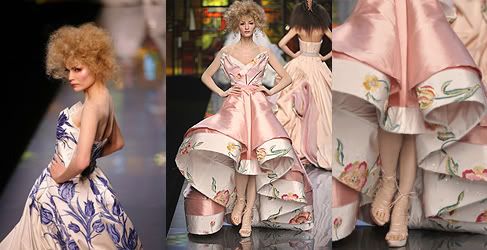
Tulip dresses from John Galliano's Fall 2009 collection

John Galliano designs couture for Christian Dior. He is one of the most eccentric, yet also one of the most talented designers out there. His clothes are often complex pieces, with intricate tailoring and superior design. But, his strategy is simple. He copies (I’m sure he prefers “borrows”) from various periods and traditions, and brings those elaborate fashions into our modern era, with a few twists and tweaks.

Last year, he revived Vermeer’s Holland in his brilliant collection. Although I thought the clothes were unwearable, but beautiful – almost like theatrical costumes, upon reflection, I think some could be mildly adjusted and worn at formal functions.

But, with Galliano, it is always hits and misses. He experiments with each new era he discovers, and tries to bring his own style into the clothes. This year, for his Fall/Winter 2010, he scored higher with the misses while trying to channel Russian folklore. Fashion designers are expected to produce a complete line of unique clothes for each season – Fall/Winter and Spring/Summer. Most designers overcome this obstacle by trimming down and over-simplifying their clothes. Not so Galliano. He goes all the way, every time. This must take its toll on his imagination, which is why I think his Fall/Winter 2010 is his weakest (and I hate to say his ugliest) so far.

I don’t envy contemporary fashion designers. Throughout history, fashion has had a grace period of several years to decades before it organically transforms into something else. Now, designers have six months! And Galliano surpasses all of them in his brave attempts at short-notice, dramatic changes.

One final thing about Galliano. He never gets the faces of his models right. I won’t delve into his reasons why, but unfortunately they are an odd mixture of dolls and prostitutes. But I still give Galliano a pass. I don’t think he’ll really revolutionize fashion, and give us something we can wear for four to five years (what a concept!), but he has the right idea to hold on to the superior qualities and styles of the past while trying to put his modern stamp on them.

Monday, May 3, 2010

Oprah's Exit

And her resting place in pop culture 

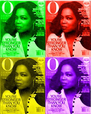
Oprah à la Andy Warhol. I'll work on a
"flatter," more of a silk screened rather
than photoshoped, version of this poster

Kitty Kelley's Oprah book is a measured, non-hysterical account of Oprah's life. I have never read any of Kelley's unauthorized biographies before, and always associated her with gossipy, unfounded stories. I don't think that's the case with Oprah’s. In fact, she seems quite mild and generous towards her.

But, still, a sad truth prevails throughout the biography. Contemporary America (and the world too) embraced Oprah fully. But, when searching for something substantial, all we get is sensation. Even her "dangerous" moments like her New Agey "The Secret," where one wills positive outcomes and they simply occur, are taken for Oprah's more kooky moments.

She never shook any foundations. For example, she hasn't done anything extraordinary with her money. In fact Kelley writes that Oprah's charities do not reflect her financial worth – which is her way of saying that Oprah is somewhat stingy. Her one major project of opening a girls academy in South Africa is a failure.

Everyone from presidents to ordinary viewers who enter the Oprah zone resort to teary confessions of past victimhood, but a few tears on T.V. don’t harm anyone. And I would think that once away from Oprah’s blunt questions (I can imagine that’s how women in their "girls night out" interrogate each other), people resume normal lives.

It was a revelation to me that she is simply an insubstantial sensation. One of her last words in Kitty Kelley’s book is where she says, "I wanted [President Obama] elected, and I think I did that." This is a woman who thinks (and who everyone thinks) wields more power than she does. In fact, when her show did influence the election of G.W. Bush, it was the adroit Bush who got the better of her and sent a positive message to her audience. The forces do not revolve around Oprah.

Oprah leaves her daytime show for her new network the Oprah Winfrey Network (OWN – Oprah is always ready to focus on her "girl power") next year. I think she’ll simply be relegated to a respected, but somewhat obscure, chapter of American cultural history. I honestly don’t think people will remember her into the next century (or generation) other than the apparent sensation she caused: "What did she do?" people will ask. Well, she hosted a paradoxically big but inconsequential "first black woman's" talk show. She has no followers, unlike the old guards like Johnny Carson or Bob Hope. She strangely works alone and independently, in a cocoon of her own making. Even Barbara Walters has more gravitas and influence.

In another entry, I will try and elaborate on why Oprah became such a worldwide phenomenon. I think it is an interesting and complex cultural story, which involves her just as much as her audience. I am inclined to believe that she needed her audience more than they needed her, and in another sad turn of her life's events, they used her more than she used them.

Sunday, May 2, 2010

Spring Revives Hope

As we look back to a lost tradition

Spring blossoms next to the statue of Egerton Ryerson, the founder
of Ryerson University


I walk through the Ryerson University campus almost daily in order to catch the various public transportation options. The majority of voices and faces on this "urban" campus are of Toronto's brave new inhabitants: Arab, Indian, Chinese, Korean, Filipino, a smattering of blacks, and some who speak various Eastern European languages.

The library, which I often use, is filled with staff with strange accents, who often cannot help me with simple requests (such as renewing my I.D., for example), and I have to return when a more seasoned librarian is on duty. The librarian is the least appreciated, but the most knowledgeable, person I know (or knew). These days, these "new-comer" employees seem hired simply to swipe our library cards.

Once I heard (and saw) a student - at least I think he was, but he looked older - talk so loudly and aggressively in Arabic on his cell phone, that I reported him to campus security guards, saying that he looked suspicious. They took my comments seriously, and confronted the guy. Later on I asked what had happened, and one of the guards told me they didn't find anything unusual, and just told him to keep his voice down.

I took the photograph above last year, but the image is exactly the same this year, as the spring blossoms and young leaves decorate the various campus locations. The trees in the above picture are in front of the statue of Egerton Ryerson, the founder of what is now Ryerson University. I wonder what this Protestant minster would have thought of his learning institution being filled with Arab Muslim students, so much so that someone felt so startled by the behavior of one of them that she had to call the authorities on him.

Perhaps that the flowers bloom every year under his statue is a sign for hope that someday, somehow, normalcy will be restored. In the meantime, it is enough to enjoy these beautiful spring blooms.