Monday, February 28, 2011

Man and Woman in Chagall's Dancing Pair

I wrote in my previous post on Chagall's painting Dancing Pair that the colors (and contrasts) in the painting indicate to me that Chagall is assigning male and female essences to his protagonists. The following struck me as I re-read my post: Is woman more in tune with her surrounding environment, and is man more in tune with himself?

I wrote about the woman's position in the painting:
[T]he red/rose of the woman's dress contrasts with the green of the background... But, this contrast, as it isolates the woman, also gives her a self-contained environment.
What I mean by this is that the woman validates her womanhood, her essence, by interacting and melding with her surrounding, her environment, which includes both its physical presence and the people and objects in it. Perhaps this is what we mean by the vanity of woman, who, like Eve, will solicit the approval of anyone, including the serpent, to feed that vanity, or that desire to be included in her (in all her) surrounding. Yet this constant desire (more narcissistic than altruistic) aids her to be more in tune, or more in empathy to use a kinder word, with her environment and gives her an identifiable personality, and a unique perspective or essence, which makes her a woman.

Whereas about the man, I wrote:
The man's bright yellow straw hat contrasts with his blue costume, also giving him a contained, individual presence.
Man's relationship to the environment is through himself. His color "contrast" in the painting is not with the surrounding field, like the woman's, but with his own colors. Unlike the woman, he doesn't require external validation. He has to validate his manhood to himself, and this validated manhood allows him to lead his woman (wife), family, and ultimately his surrounding (his environment). He cannot lead all this, including that elusive environment, if he is fully in empathy - "in tune" - with it.This separation (or isolation) from the mundane world, from the environment, gives him the position to destroy/dismantle what he finds wrong with his world, and restructure it for the best. He is not sentimental about his environment. His task is to make it right, not to be engulfed in its experience.

Extremes of this masculine prerogative for destruction and reconstruction can give rise to demagogues like Hitler, whose ventures arose from a misguided masculinity, and ultimately an evil enterprise to destroy all life and to restructure it according to his mandate. Hitler's missing factor, of course, is that man is not guided by his wisdom alone, but by God's wisdom, who has given him temporary lease on the world. Without this transcendental factor, man's recreations are likely to lead to disaster.

Extremes of a woman's empathy leads to an inability for a woman to separate her emotions, positive or negative, from the lives around her, and especially her children's lives. In Greek mythology, Medea comes to mind.

An overly (feminized) empathetic man cannot lead, would be lost in a myriad of choices in the spherical engulfment of empathy. A masculine woman, who secludes herself, ignoring her environment, could never muster the necessary emotions to take care of a crying baby.

What would feminists make of these ideas? And of the painting? I wonder if they would laugh at the exuberance of the man, and be annoyed at the passivity of the woman?

And all this from a painting!

Saturday, February 26, 2011

Chagall's Charms

Marc Chagall
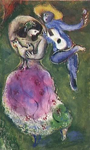
Couple de Danseurs (Dancing Pair), 1941
Gouache, watercolor, and ink on watercolor paper
16 1/2 x 10 1/4 inches
Musée National d'Art Moderne, Paris

I have had a Chagall on my wall for many years, either as a poster or as a postcard (or two). One large poster which I've had now for close to two decades, and which never seems to tear or crease despite having been in and out of various packages over the years, is of the painting A Dancing Pair (shown above).

What first attracted me to the painting is the woman's dress. Its floral pattern blends in with the background, merging woman with nature.

Music is melded into the man's persona, like nature is in the woman's, where his waistcoat has been ingeniously transformed into a guitar. He is wearing a bright yellow, cheerful straw hat, which softens a little his frenzied leap towards the woman.

There is also a dance going on, or the beginnings of a couple's dance, where the man is bringing a flower to the woman, leaping and a bounding towards her.

The colors, especially in the original, and in the poster I have, are deep and saturated (the above image doesn't quite do it credit, but it is close enough). In design language, the red/rose of the woman's dress contrasts with the green of the background, and with the lower strip of the dress itself (see this color wheel, where opposite colors are "contrasting" colors). Contrast makes the image interesting through the tension of these contrasting colors. But, this contrast, as it isolates the woman, also gives her a self-contained environment. She becomes important in her own world; she becomes an individual - a woman.

Then we have the "foreign" element, the leaping man in blue (even his face is an alien blue), who pushes into the woman's sphere from some other galaxy (it seems as though he's emerging from the sky), adding a new dynamic (constellation?) to her world. The man's bright yellow straw hat contrasts with his blue costume, also giving him a contained, individual presence. He is also contrasting with the woman's colors: hers are warmer, his are cooler (here is another version of the color wheel, showing groups of colors on opposite - contrasting - sides of the wheel).

Finally, even the man's movement is in contrast with the woman's stasis; he is moving (leaping) towards here, she is waiting (glancing back for encouragement) for him to approach. Yet the man's blue shadow is reflected on the woman's pink/red dress, merging the two both in movement (direction) and in color, albeit with the man imposing himself on the woman.

The painting is dealing with two energies, male and female, man and woman.

But, in Chagall's paintings, it is not only the humans who are given importance, but also the surrounding, often farm, animals. Perhaps it's Chagall's memories of Russian Jewish peasantry that encourages him to repeatedly include animals in his paintings, even after he moved to sophisticated, urban Paris (yet another contrast). In that earlier, earthy world, the farm is the center of life, and the animals have to be taken care of equally well, like the human inhabitants. Some of Chagall's paintings take on an anthropomorphic turn, where man and animal merge together to form a new beast. At other times, the animals make allusions to some human condition. In the above painting, the woman is clutching a rooster. Is she anticipating the man in her arms? Is she encouraging him that this could be (if he is clever enough) where he belongs?

Often, in Chagall's paintings, it is a violin which is the central musical theme, and not a guitar (as in the above painting), where it is often played by a man with a green face (as the money-greedy Jew?). Here is one writer who explains the "greenishess" of the violinist:
Is this a lament over the death of tradition and the anxiety of change? No, the man’s greenishness, while possibly meaning various things like envy or greed, is best understood as a symbol of life and living. This is in keeping with other of Chagall’s works where he celebrates the theme of life with living plants, flowers, and other botanical elements. This fiddler, central to “the tradition” of the [Russian Jewish] village is also alive and well even in the midst of the fast-paced changes all around him. And the purple speaks of stable passion, emotional exuberance under control of the mind. Excited about the future even while retaining memory of the past.
Plaintive Yiddish melodies, so aptly captured on the violin, come to mind, as concludes the Guggenheim's on-line description on Chagall's Green Violinist:
In Green Violinist Chagall evoked his homeland. The artist’s nostalgia for his own work was another impetus in creating this painting, which is based on earlier versions of the same subject. His cultural and religious legacy is illuminated by the figure of the violinist dancing in a rustic village. The Chabad Hasidim of Chagall’s childhood believed it possible to achieve communion with God through music and dance, and the fiddler was a vital presence in ceremonies and festivals.
Hollywood pays homage to this image, and popularized Chagall's violinist, by giving us Topol in Fiddler on the Roof. Although the musical is an adaptation of the short story Tevey and his Daughters by Yiddish writer Sholem Aleichem, Topol takes his character from another of Chagall's green-faced musicians, The Fiddler.

When Chagall migrated to France, he continued to paint his multi-faceted images. His view may have changed from the earthy farms to the more sophisticated Parisian vistas, but he kept his ancestral imagery in his works. His roosters, dancing couples and bouquets of flowers, amongst many others, continued to be important themes in his paintings. Here is what he says about Paris:
I left my native land in 1910. At that moment I decided that I needed Paris. I came because I sought the light of Paris, its freedom, its refinement and the skills of the craft. Paris lit up my shadowy world like the sun. But in seeing the light, at the Louvre and elsewhere in France, I did not forget the country where I was born. On the contrary. I saw it more clearly. I could, of course, have expressed myself in the town where I was born. But I wanted to see with my own eyes the things I had heard about so far away that "revolution of the eye," the colors that blended freely into each other, reflecting the light whilst striving energetically with one another in the flow of a studied or a casually dominant line. The sun of art shone only in Paris. It seemed to me then, as it still does, that there can be no greater revolution of the eye than that I experienced on my arrival in Paris.
Here are some common motifs in Chagall's paintings:
- Roosters
- Donkeys
- Goats
- Ox
- Fish
- Other barn animals
- Horse and carriage
- Flowers (often bouquets)
- Weddings
- Brides
- Moon (both full and crescent)
- Lovers at night
- The Eiffel Tower
- Views of Paris from windows
- Clowns
- Peasants
- Angels
- Scenes from the Old Testament
- Jesus' crucifixion (more on this later)

---------------------------------------------------------------

Reference:
Chagall: Watercolors and Gouaches. Werner, Alfred
Wednesday, February 23, 2011

Toronto's Sins

[Skyline of the southern part of Toronto, where most of the recent
high rise development has occurred]

There's a new word that has been coined to describe the high rise
frenzy of cities: Skyscraperization


I've written that one of the charms of Toronto is the Victorian architecture. "Architecture" might be too grand a word to describe the pretty, and sometimes beautiful, Victorian townhouses, with their intricate gable lace work, but it is clear that when the British came here, they built their houses for a permanent stay.

Modern architecture's masterpiece, the skyscraper, has its own grandeur, and no other city demonstrates that better than New York. A recent television program on the evolution of New York City, We Built This City, shows that the city's construction, at least starting at the beginning of the twentieth century, was systematically planned, and was not some haphazard positioning of streets and tall buildings. Here is what the Discovery Channel website says about the construction of the city's streets:
The city was growing fast, characterised by the Randel Plan that constructed a grid work of streets that were numbered, rather than named.
I think the main reason for the recent Toronto building spree of towers is more to accommodate a fast-growing city, due mostly to immigration, than any sense of design. There is no "Randel Plan" in this building frenzy. And we haven't had a housing bubble yet, but I think it will be a long, slow process here, which might take years to manifest itself.

Here is a post I wrote contrasting Toronto's quaint Victorian neighborhoods with the "collapsing architecture" that is now gracing the skyline. The destruction of these neighborhoods started sometime in the 1960s, where many were demolished to build ugly, sterile apartment buildings. I quote Jane Jacobs, who said:
Remember how people despised Victorian buildings earlier in this century? They were just ruthless with them. They were just thought to be automatically ugly and disgusting. Many wonderful, wonderful buildings were destroyed. Well, that was a big rejection of Victorianism. Not just the buildings. There was the feeling that it was stuffy, it was repressive.
We have learned nothing, and are playing that all over again. Of course, this is the symptom of a bigger problem. The multicultural makeup of Toronto (Toronto is touted, with pride, as the most multicultural city in the world) provides no unified contemporary culture. Recent architectural designs in the city are mediocre, with little planning (described as "urban sprawl" by critics). The underlying intention is simply to accommodate the growing numbers of disparate people, immigrants, who simply don't care how the city looks, as long as it provides them with the amenities that they expect from a Western city. Architects are forfeiting their excellence, and ultimately their discipline, to side with city planners (since I suspect this translates mostly to increased revenue for the architects) whose primary objective is to accommodate these growing numbers of people.

Sunday, February 20, 2011

Detroit's Horrors

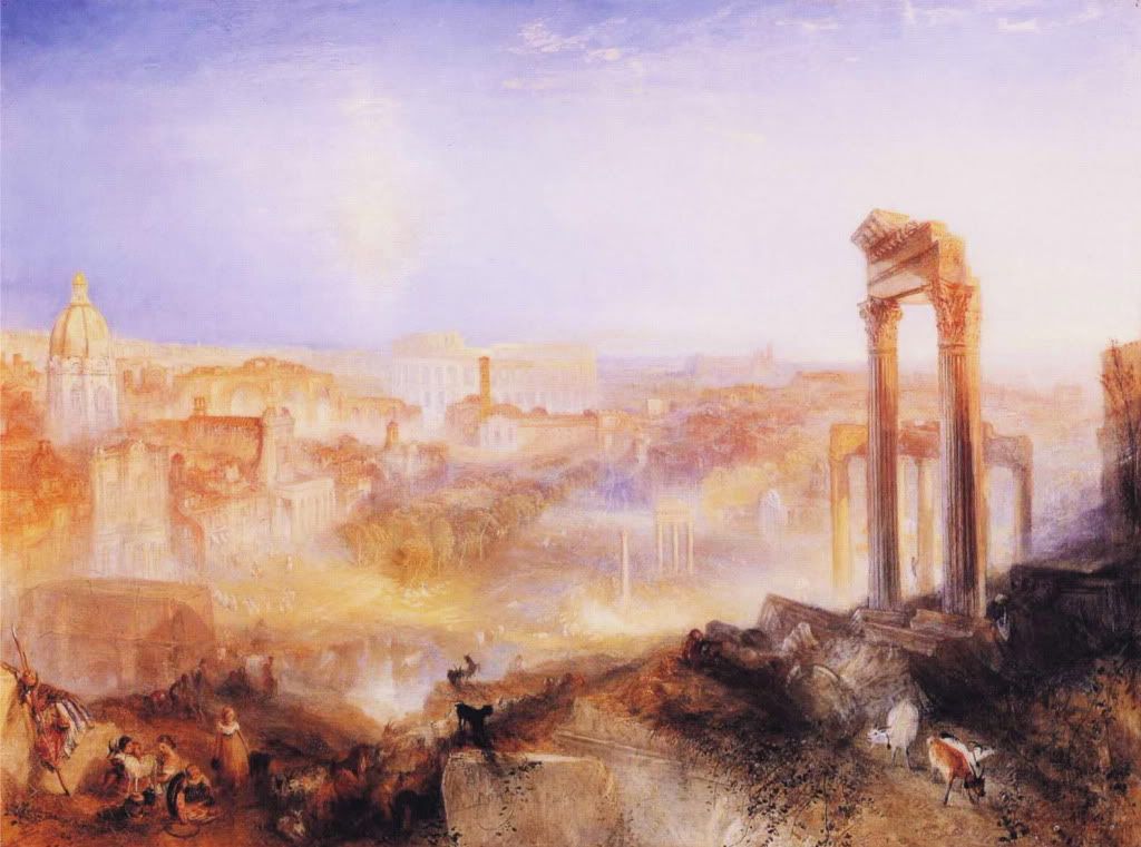
J.M.W. Turner, Modern Rome - Campo Vaccino 1840

There is something both majestic and horrific about the images Yves Marchand and Romain Meffre display in their book Detroit in ruins: the photographs of Yves Marchand and Romain Meffre. The book chronicles the city's and its buildings' abandonment by its inhabitants. Marchand's and Meffre's buildings stand empty and rotting, as though they were part of a great civilization that was ransacked by invading barbarians. Destroyed hotel ballrooms and school libraries alike acquire a hauntingly grand, decadent presence. The photographs seem to aspire to the ruins paintings Turner loved to paint partly as a dedication to those ancient civilizations that preceded, and nourished, his own. But I don't think Marchand and Meffre have such lofty or grateful intentions.

The Guardian understands this horror, and starts its review of the book with an account of Detroit's abandoned police department:
In December 2001, the old Highland Park police department in Detroit was temporarily disbanded. The building it vacated was abandoned with everything in it: furniture, uniforms, typewriters, crime files and even the countless mug-shots of criminals who had passed through there. Among the debris that photographers Yves Marchand and Romain Meffre found there in 2005 was a scattering of stiff, rotting cardboard files each bearing a woman's name.

In total 11 women had been catalogued by the police, including Debbie Ann Friday, Vicki Truelove, Juanita Hardy, Bertha Jean Mason and Valerie Chalk. Down in the dank basement of the police station, where "human samples" were stored – and had been abandoned along with everything else – the two French photographers also uncovered the name of the man who was linked to all of the women's deaths. Benjamin Atkins was a notorious serial killer. Between 1991 and 1992 he left the bodies of his victims in various empty buildings across the city.
Like the serial killer who destroyed the lives of the 11 women, Detroit's ransackers have done the same to their beautiful city.

Marchand's website for his own photographs displays what resemble fashion photos of models for a style magazine. None of the Detroit images are on view at this site. A few of Marchand's models are bleached blond white girls. As unattractive as all the models are, the Caucasian girls are given the brunt of ugliness, or at least of horror. They look like zombies resuscitated for the photo shoot. Or what the mad witches and ghosts from Shakespeare's plays or the Brontë sisters' novels must look like.

Many of the other models are amorphous "Asian" girl-women, doll-like both in posture and in appearance. Marchand seems obsessed with some hybrid of a Caucasian/Asian female, who is now prominent on fashion runways, as well as on the streets of Toronto. This must be the century of the "Asian look" where even ordinary folk, white or black, and mostly men, are dipping into the Asian DNA. Despite Marchand's attempt at channeling vulnerability, or even as close to beauty as he can get, there is an aura of decadence surrounding these doll-women. Some are placed in compromising poses, alluding to S&M, putting a sinister spin throughout the photographs.

The background image which surrounds the screen for his model photographs looks like one of the ravaged Detroit building interiors. And some of the shots of the models look like they were taken in those very rooms in Detroit, which Marchand seems to have taken over and converted into studios. Perhaps Detroit real estate is at give-away prices. Artists are always looking for that ideal, super-cheap location, with lots of empty space and lots of light. These are not wanting in this Detroit.

Marchand, like all artists, builds around his works to provide some kind of continuation and evolution of his ideas. From decaying, destroyed buildings to Asian hybrid, doll-like fetishistic models, what could he be trying to tell us?

Let us leave his internal monologue to himself. We see what we see. The conclusion I come up with is that Marchand doesn't see much future for America, and his photographs of both buildings and models could be seen as metaphors for the decline of America. Decadence, portrayed through racial ambiguities, sexual immaturity and the destroyed grandeur of truly beautiful buildings, is the future of America, seems to be his message. And all photographers have symbolic ideas behind their works, however much they may deny this.

Even Marchand's architectural photographs have their (invisible) racial component. Perhaps race is everything in America, something which people constantly mention, or circle around, but never confront. Detroit was a prosperous, affluent city, with "the highest median income in America." Now, it has one of the highest levels of of black crime in America, and its white population has abandoned it. From the Council of Conservative Citizens:
1) In 2000, Detroit ranked as the United States’ eleventh most populous city, with 951,270 residents. Metro Detroit, is a six-county area with a population of 4,425,110, making it the nation’s eleventh-largest metropolitan area.

2) The city population dropped from its peak in 1950 with a population of 1,849,568 to 871,121 in 2006. In the 2000 census, 70% of the total Black population in Metro Detroit lived in the City of Detroit.

3) Detroit is usually listed as 82% black. However this is the figure on the 2000 census. The figure is much higher now as the US government estimates that Detroit shrank by a staggering 80,000 people between 2000 and 2006! Today Detroit is probably more like 90% and most of the rest are immigrants.

4) In the 2000s, 70% of the total Black population in Metro Detroit lived in the City of Detroit. Of the 185 cities and townships in Metro Detroit, 115 were over 95% White. Of the more than 240,000 suburban blacks in Metro Detroit, 44% lived in Inkster, Oak Park, Pontiac, and Southfield; 9/10ths of the African-American population in the area consisted of residents of Detroit, Highland Park, Inkster, Pontiac, and Southfield.
Marchand's and Meffre's statement on their joint website has this:
Ruins are the visible symbols and landmarks of our societies and their changes, small pieces of history in suspension.

The state of ruin is essentially a temporary situation that happens at some point, the volatile result of change of era and the fall of empires. This fragility, the time elapsed but even so running fast, lead us to watch them one very last time being dismayed, or admire, making us wondering about the permanence of things.

Photography appeared to us as a modest way to keep a little bit of this ephemeral state.
Despite its simplistic and pompous language (yes, it manages to be both at the same time), Marchand's and Meffre's statement makes it clear, as I had suspected, that their photographs are a false eulogy for America. The American "empire" has not yet fallen, and if so, out of the ashes fallen empires, like the Greek and the Roman, come newer and possibly greater civilizations. That is after all the course of our Western civilization. Turner was lamenting fallen empires and yet was optimistic enough to pass on meanings and symbols of hope from their ruins.

Our two contemporary chroniclers simply throw pessimism, and even nihilism, at us, as though basking in the horror and unwilling to relinquish it. We don't have to accept their message.

Thursday, February 17, 2011

Lara Logan: Bomb Raider

Angelina Jolie in Lara Croft: Tomb Raider

I was going to leave the Lara Logan story alone. After all, whatever happened to her, and not all writers are unanimous that she was actually raped, is still an assault and has left her incapacitated for now, and hospitalized. I'm pretty sure, though, that she will bounce back to resume her Lara Logan: Bomb Raider adventure out in the Orient (metaphorically, at least).

I became suspicious of her (actually, I would became suspicious of any female "war" correspondent, blond and pretty, who goes in the midst of war-mongering, sexually frustrated Muslim men) when I started hearing about her personal behavior right out there in the field. Here's what Wikipedia says about her:
Her husband [Joe Burkett] is a U.S. Federal Government defense contractor from Texas, whom she met in Iraq. They had a son in January 2009. Her previous husband, Jason Siemon, was a professional basketball player in the United Kingdom...Joe Burkett's former wife Kimberly Burkett, accused Lara Logan of breaking up their marriage. She was also said to have been courting Michael Ware, another reporter, at the same time as she became involved with Joe Burkett which was said to have resulted in a brawl between the two men.
While the suddenly prudish Wikipedia uses "courting" to describe whatever was going on between Ware and Logan, The New York Post throws out the word "fling" to describes more succinctly what they see. What she actually had was a fling within a fling. Michael Ware is subsequently (consequently?) divorced, as are both Logan and Burkett from their respective spouses in order to get married to each other. This sounds steamy and romantic, but is as sordid as it gets. I wonder how long this "fling" at (re)marriage will last?

And why wasn't Logan at home taking care of her vulnerable toddler, and instead running off to duck bombs? These points are important to consider. We have transferred tremendous responsibility to these people in times of war. We are depending on them to serve us well during difficult, chaotic times. If they cannot do that, then let them set up their own backdrops for dangerous romances. Casablanca might work, but even those protagonists eventually preferred the good guys to the bad ones.

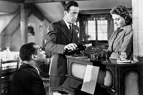
As Time Goes By

Rick and Ilsa at the piano with Sam in Casablanca

In my previous post, I put up a video of Elizabeth Taylor's White Diamonds commercial, where the setting reminded me of the film Casablanca. I wrote "Casanova" for the film. I would think that Casablanca is now part of our our iconic imagery that this didn't cause too much confusion. Perhaps I had the casino scene in mind, which prompted me to write "Casanova".

Here is the scene where Sam (Dooley Wilson) sings "As Time Goes By" at Ingrid Bergman's request. In this scene, Ilsa Lund (Bergman) is waiting for Rick Blaine (Bogart), the man she fell in love in Casablanca thinking that her husband Victor Laszlo, a resistance fighter, had been killed during the war (WWII). She left Casablanca and Rick for her husband when she heard that Laszlo had escaped a Nazi prison. She has come back to Casablanca with her husband to ask Rick to help them with refugee papers. Later, Ilsa confesses to Rick that she is still in love with him. Later still, Rick does all he can to get the two out of Casablanca safely. But, as convoluted (and perfectly credible) the plot is, we cannot but be optimistic about the final outcome.

Everybody Comes to Rick's, the original play that developed into Casablanca, was produced in Newport, Rhode Island, in August 1946. But the film version became much more successful, and long-lasting.

Casablanca is referenced in many films, television shows, books, plays and musicals, and even in at least one cartoon. Below is a short list (as far as this list goes) of such occurrences. As I've written before, one superior piece of art (film, book, painting) will constantly furnish references across the art disciplines, and across the ages, and gets embedded within countless works. It becomes part of our culture.
References to Casablanca in films, plays, books, television, etc.

- The Marx Brothers' A Night in Casablanca is set in Casablanca
- Passage to Marseilles reunited Bogart, Rains, Curtiz, Greenstreet and Lorre in 1944
- There are many similarities between Casablanca and two later Bogart films, To Have and Have Not and Sirocco
- It provided the title for The Usual Suspects, from Captain Renault's line "Round up the usual suspects."
- Neil Simon's The Cheap Detective casts Peter Falk in Humphrey Bogart's mold
- The two best-known radio versions were a thirty-minute adaptation on The Screen Guild Theater in 1943, starring Bogart, Bergman, and Henreid, and an hour-long version on the Lux Radio Theater in 1944.
-- Woody Allen's Play It Again, Sam took Bogart's Casablanca persona.
- The Bugs Bunny cartoon Carrotblanca parodies Casablanca
- It was a plot device in the science-fiction television movie Overdrawn at the Memory Bank
- There were two television series, the first aired on ABC from 1955 to 1956, another on NBC in 1983
- Casablanca is referenced in Terry Gilliam's Brazil
- When Harry Met Sally references Casablanca's storyline, as well as using "As Time Goes By" during the credits and in the film
- The film Barb Wire sets Casablanca in a futuristic 2017
- In Casablanca, a novella by Argentine writer Edgar Brau, the protagonist finds himself in Rick's Café Americain and listens to a strange story told by Sam.
- The novel As Time Goes By, written by Michael Walsh and published in 1998, picks up where the film left off, and also recounts Rick's mysterious past in America.
The song "As Time Goes By" was written for the Broadway musical Everybody's Welcome by Herman Hupfeld in 1931. Francis Williams sang the song in the original Broadway show. I cannot find a recording of her singing that song, but here is a song she sang in 1933, to get an idea of her style: "Sunny Disposish".

Here's a short list (Youtube links), from the very long one available, of singers who have performed this song:
- Billie Holiday (1937)
- Bing Crosby (1940s)
- Frank Sinatra (1940s)
- Vera Lynn (1961)
- Barbra Streisand (1963)
- Sammy Davis Jr. (just a short sample, 1970s)
- Rosemary Clooney (1977)
- Shirley Bassey (1978)
- Carley Simon (1987)

Sunday, February 13, 2011

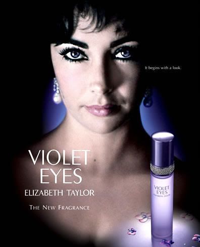
Violet Eyes


The small caption on the top right of the poster says: "It begins with a look."

Saturday, February 12, 2011

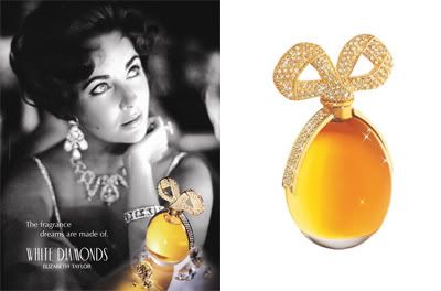
White Diamonds for Elizabeth Taylor

Elizabeth Taylor with her White Diamonds perfume

Here are the notes for White Diamonds:

Top notes: Aldehydes, bergamot, neroli, orange and lily
Heart notes:  Violet, rose, jasmine, ylang-ylang, Egyptian tuberose and narcissus
Base notes: Oak moss, patchouli, musk, sandalwood and amber
--------------------------------------------------------------------------------------------------

Sophisticated perfumes are showing up at drug stores for half or a third their value. As I've written before, it is a good way to get reacquainted with these scents since our 21st century tastes seem to prefer soapy fragrances (sold at exorbitant prices, nonetheless), mostly "created" by some insipid celebrity or other. Yet, there is something sad about Elizabeth Arden's superior 5th Avenue going for mere dollars (I recently saw Arden's Sunflower for $8.99). And now the perfumes in Elizabeth Taylor's surprisingly sophisticated White Diamonds series (which includes White Diamonds, Diamonds and Emeralds, Diamonds and Rubies and Diamonds and Sapphire) are going for $19.99 each.

Elizabeth Taylor may be a celebrity, but she is from a different era. Her "Diamonds" perfume collection is clearly a labor of love and taste. But, in Taylor's time, celebrities didn't run around in embarrassing outfits confessing all kinds of unmentionable things to callous magazine interviewers who have to take things (gossip and ugliness) up a notch in order to sell their stories. Despite their clearly difficult lives (Elizabeth Taylor was married eight times), there still was an aura of mystique and mystery around these celebrities. This provided them with the shelter to continue with their creative energies. And it gave Taylor room to create her perfumes.

Many perfume blogs write that the original White Diamonds was a collaboration between Elizabeth Taylor and Elizabeth Arden. That really says it all. I wonder if Elizabeth Arden would ever collaborate with, say, Paris Hilton or Britney Spears? The aggressive Jennifer Lopez managed to convince the prestigious Coty perfumers to help her with Glow, but what Coty gave her, perhaps to simply get rid of her, is a soapy mediocrity.

Below is the commercial for White Diamonds, which features a confident, mature Elizabeth Taylor. The setting reminds me of the film Casanova. White Diamonds is described as Chyre/Floral by Fragrantica, giving it an exotic flair. Perhaps that is the reason the commercial director used images similar to that Moroccan backdrop. Here is what Wikipedia says about chypre:
The term chypre is French for Cyprus, and goes back to François Coty who created in 1917 a perfume of the same name from fragrance materials that came predominantly from Mediterranean countries...The chypre concept is characterized by the contrast between the fresh citrus accord and the woody-oakmoss fond [base].

A fresh, Mediterranean scent is what Elizabeth Taylor is giving us now. Perhaps to lighten her mood. She was recently admitted into hospital (yet again) to treat congestive heart failure. This doesn't appear to be life threatening. I couldn't find any videos or photos of her latest visit to the hospital, as there have been in several previous occasions. The various news channels keep showing us one of her in a wheelchair, which I think was filmed around 2009. Even for such a trip, she puts on her best clothes, and best face.

She recently collaborated with Elizabeth Arden, once again, to launch another perfume, Violet Eyes, which came out in 2010. Her famous eyes, which are really a deep blue color, appear violet under some light conditions. The advertisement for Violet Eyes, with her deep turquoise eyes which are convincingly tinted a thin veneer of purple in this ad, could surely become her signature look.

Advertisement for Elizabeth Taylor's
latest perfume Violet Eyes

Wednesday, February 9, 2011

Keeping Good Company

Jim Kalb's website Turnabout has a link called "Other Trads" which is a short list of bloggers who write about traditional issues. I have made that (undeserved) shortlist with other bloggers like Bruce Charlton, Mark Richardson, Laura Wood and the team at What's Wrong With the World.

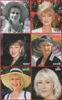
Mr. Kalb recently sent me an email, commenting on my post on the actress Helen Mirren "Elimination of Beauty" where I wrote:
Ugliness rules. In clothing, in films, in art and even in our "representatives" of beauty. I don't think it is a lack of knowledge about beauty. We've developed standards and often unanimous agreement about what constitutes the beautiful. So I'm not going to into the beauty-hater's argument that beauty is relative; beauty can be objectively measured. What's going on is that people are hating beauty. It is a form of envy. If I cannot be beautiful, then why is she beautiful? It is like wealth, or intelligence, or a sense of entitlement to live anywhere one pleases. Spread the wealth, accept I.Q.ers of 91 into Harvard, let everyone from every corner of the world come into the prosperous West. Or youth. Why cannot I be as young (and attractive) as any fifteen-year-old, at my ripe old age of seventy? Such are the mantra of the equal-opportunity narcissists.

Helen Mirren in forty years of photos. From the "English Rose"
of the 1970s to the disheveled senior citizen in 2011.
From Camera Lucida blog post "Elimination of Beauty"
Here is what Mr. Mr. Kalb emailed me:
Dear Kidist,

For some reason I hadn't been a regular reader of yours, but I subscribed just recently and wanted to tell you how much I enjoy your blogging.

Your comments on Helen Mirren (who I had never heard of) are very much to the point. She's evidently clued into the fashion world, and youth substitutes for class and beauty there today. So that's what she aspires to.

I agree that indifference to aesthetic and cultural issues is a major weakness on the right. There's not much interest in the big picture, which is one reason the right keeps losing.

All the best,

Jim Kalb
There are moments when I go into into pure politics, mostly on my "Islam" blog Our Changing Landscape. But my efforts at Camera Lucida have always been to record and analyze how our aesthetics are being influenced by our politics, and that often art (or the corruption or the dissolution of art) is an early indicator of where our culture is headed.

Iron Lady Lite

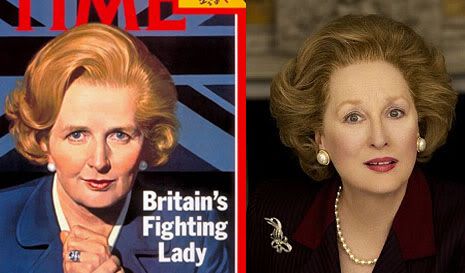
Left: May 14, 1979 Time magazine cover of Margaret Thatcher
Right: Photo of Meryl Streep as Thatcher in upcoming movie The Iron Lady

Meryl Streep will be channeling Margaret Thatcher for her next movie The Iron Lady. I've written about Streep's never-ending creative (almost musical) ability for mimicking accents. But, from the above photo, I doubt Streep will go any further than caricature, like her depiction of Julia Child in Julie & Julia. Streep doesn't even follow Thatcher's political philosophy. In fact, she may be against it. I think this will add to her turning Thatcher more into a cartoon rather than an all-rounded figure.

Streep's expression in the photo above, which appears to be the early promotional photo for the film, says it all. She has a deer blinded by headlights look, which I'm sure Thatcher never had even in her most difficult days. In fact, the film is about one of Thatcher's most challenging moments, when she protected the Falkland Islands from Argentinian aggression.

Here is a synopsis of The Iron Lady:
The film is reportedly set in 1982, chronicling 17 days of Thatcher's life leading up to the Falklands War and how she dealt with the events.

Saturday, February 5, 2011

When the Moon Hits Your Eye

Dean Martin singing "That's Amore"

-------------------------------------------------------------------
When the moon hits your eye like a big-a pizza pie
That's amore
When the world seems to shine like you've had too much wine
That's amore

-------------------------------------------------------------------

I hate to write in cliche, but they don't write songs like this anymore. (I've posted here on another great classic song from bygone years.)

I always thought Frank Sinatra, the quintessential Italian American performer, who really is the quintessential American performer, sang "That's Amore." He did. But it is the signature song of another great crooner, Dean Martin. But, here is something about Dean Martin I didn't know (or I vaguely knew, otherwise I wouldn't have tried to confirm it via Wikipedia):
Dean Martin (June 7, 1917 – December 25, 1995), born Dino Paul Crocett...Martin was born in Steubenville, Ohio, to Italian parents, Gaetano and Angela Crocetti (née Barra). His father was from Abruzzo, Italy, and his mother was an Italian of part Neapolitan and part Sicilian ancestry.
There you have it, another (Italian) crooner.

The song was composed by Harry Warren in 1953. Wait, another musical Italian:
Warren was born Salvatore Antonio Guaragna, one of eleven children of Italian immigrants Antonio (a bootmaker) and Rachel De Luca Guaragna, and grew up in Brooklyn, New York. His father changed the family name to Warren when Harry was a child. Although his parents could not afford music lessons, Warren had an early interest in music and taught himself to play his father's accordion.
"That's Amore" plays during the opening and closing credits of Moonstruck ("when the moon hits your eye..."), which stars Cher - no Italian she, but as fiery as any stereotype - and Nicholas Cage (born Nicolas Kim Coppola , yes, that Coppola family). The supporting actors are also mostly Italian, except for Olympia Dukakis, whose background is Greek, but that is close enough to Italian.

The only gripe I have is that Cage ends up sounding sub-intelligent (a little like Marlon Brando in A Streetcar Named Desire - perhaps that is who he was channeling), but all the others, with their mild melodramas, are perfect. Cher transforms into a real beauty at the end, when she meets Cage to go to the Lincoln Center - yes, Italians and opera - unlike her recent, unfortunate plastic surgery make-over.

Harry Warren has a long list of film song credits, including winning three Oscars, many Broadway hits and dozens of #1 hits of popular songs.

Thursday, February 3, 2011

Toronto Gables

My last couple of posts were photos of a close-up of a gable. My fascination with gables goes a way back. One of my first series of photographs were of these Victorian structures. For all its metropolitanism, Toronto still has a Victorian town feel to it. Many residential areas still have town houses with gable structures. Some are elaborate, others simple yet still attractive.

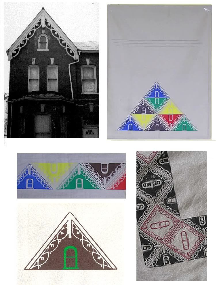
Below are images from my October 2010 blog post on how a mundane photo of a town house (I took the picture to record different gable patterns) evolved into a design.

Clockwise from top: Victorian townhouse; Wall hanging;
Table cloth (detail); Card; Table runner (detail);
[From my "Evolution of Design" series]

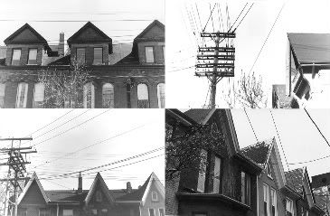
Below are more of my photographic records of gables.

Gable Collage

[Click on images to view larger versions]

Delicate Lines of Snow: Link to Larger Version

[Click on image to see larger version]

I keep forgetting to add under my photo posts that by clicking on the image, you can link to a bigger version of the image, to see more details. I cannot post photos larger than a height of 300px on my blog without cutting off parts of the image. Those specks of snow will be easier to see on the larger version.

Wednesday, February 2, 2011

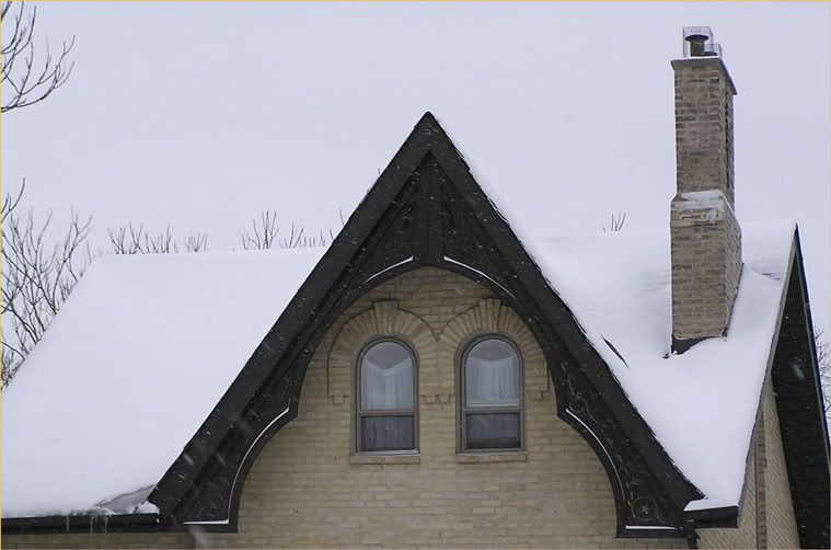
Delicate Lines of Snow

[Photo by KPA]

I haven't posted a photo in a while. Here is what I took today. The white, curved lines on the gable are snow deposits, producing fine lines which look like they were drawn around the curves of the gable. Snow is still falling, visible in the foreground of the dark wood as delicate white specks. The light gray/white background of the sky also contrasts with the dark wood of the gable, making the gable more prominent. And the bare, dark branches of nearby trees are silhouetted against this light background. Even the loopy curtains fit in the picture, mimicking the curves of the white traces of snow.