Friday, October 30, 2009

The Tyranny of Liberalism

And the pursuit of traditional conservatism

I just finished James Kalb's seminal book The Tyranny of Liberalism: Understanding and Overcoming Administered Freedom, Inquisitional Tolerance, and Equality by Command.

It is an incredible whodunit unravelling the great liberal machine. There are many things that I knew instinctively about liberalism, but it was fascinating to read it so articulately and thoroughly written by someone who has spent much time and scholarship on the subject.

I'm not sure if non-conservatives would read it. And if they picked it up, I don't think they would see these machinations. It seems to me that one already has to be "converted" to conservatism to understand and appreciate this book. Also, I don't think it is for those border-line cases. The book is a little too dense and intricate for that. Perhaps someone like Dennis Prager, who is very good at putting things in concise list terms, might pick up where Kalb left off.

Kalb's proposes that traditional conservatism (traditionalism) is an organic entity that grows from local, particular efforts. He suggests that this is how people should tackle traditionalism:
Practice, with the help of observations and reflection makes perfect.

That step-by-step process is the way in which tradition develops, and it gives it its coherence and reliability. Tradition starts with basic functional patterns that establish themselves because they work. Those patterns grow and extend themselves through the strengthening and development of what is helpful and through the rejection of what leads to conflict and failure. Beliefs, attitudes, and practices that work are extended and refined. Those that do not wither and die.[p. 197]
The most difficult thing is to get the organically-growing patterns to start in the first place. He outlines his ideas for a traditionalist movement:
Traditionalists cannot choose withdrawal. They must take part in public life at least in self-defense…[p. 262]

The immediate practical function of a traditionalist movement would be to make life in accordance with traditions easier and more practical for those inclined to it…[p. 263]

Tradition is never far away. It does not invent but secures and fosters the good everywhere present…[p. 267]

Every man who starts his own business, every family that adds to its independence by reducing its expenses, every woman who stays home to run the household and educate her children, every local congregation that takes on more demanding standard of conduct, every independently minded scholar who writes a book, gives a speech, contributes to a little magazine, or sets up a website, establishes a zone of ordered freedom within the anarchic tyranny that is advanced liberalism…Eventually, we may reach a tipping point and social life begin to take on a different form.[p. 268]
Kalb spends the second half of his book trying to define traditionalism, as well as give guides as to how that can be achieved. But, I think this is the least successful part of his book, and is more sketchy than his dismantling of liberalism in the first half. Perhaps that is his next project, both a philosophical/political delineation of modern (or contemporary) traditionalism and a much-needed practical guide of how to concretely implement this traditionalist movement. That looks like two more books to me.

Why Can't Conservatives Get It Together?

Some passing thoughts

Peter Brimelow, founder and editor of Vdare.com, has written a blog on his website about a lingerie company using the word Christmas on their catalog. Not only that, Brimelow graces his blog post with a photo of a woman in Christmas-red underwear.

A group of conservatives (I hate to use that word, because I'm convinced that many of them are variations of libertarians) are attending the The HL Mencken Club 2009 conference. And the conference is titled...

"We are Doomed!" with an exclamation mark, no less. It is of course after John Derbyshire new book (with exclamation mark in tact): "We are Doomed! Rediscovering Conservative Pessimism."

It is hard to imagine how anyone can accept to speak at such a conference. But James Kalb will be there to speak on "The EU Globalized--The Ends of Liberal Internationalism," so perhaps it isn't all that odd. Although, these days, I think Kalb is trying to be the great reconciler of conservatives.

Wednesday, October 28, 2009

Design and Home

More design discussion at The Thinking Housewife.

Tuesday, October 27, 2009

My "Chicken or Egg" Question on Design Gets an Answer

From two traditional conservative writers

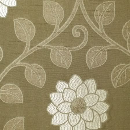
An example of an abstracted textile print,
often of unidentifiable flora and foliage,
popular at Kravitz, a NYDC showroom.

I had asked in my previous blog post "From MAD Designers to the Public's Desires" who sets contemporary design trends: the designer or the public?

Here is insightful commentary about the sorry state of design by Laura Wood of the Thinking Housewife, who posted some of my post at her blog:
Possibly when people get more instant gratification, especially in sex and popular culture, they don’t care as much about their surroundings. When desire is sublimated, it creates more beauty in life, more craftsmanship and studied effects. Women are highly sexualized today, but less sensual in their approach to home.
Her comment is later quoted by Lawrence Auster from the View From the Right, which he explains further in terms of liberalism:
The remark goes to the heart of the traditionalist critique of liberalism. Liberalism gives people what it thinks they want, which is unimpeded satisfaction of their desires and impulses. But in doing so, it closes them off from what they really want, which is beauty, truth, and goodness, and membership in an enduring human community that embodies those things.
I am seeing a trend where people are looking for some sort of "beauty, truth, and goodness, and membership in an enduring human community that embodies those things." I mean, how long is the Emperor not going to get called at for not having any clothes? How long are people going to live in dreary grey homes? Craftsmanship is still sitting on the sidelines, and designers for the most part are not willing to follow the public’s under-the-radar demands - it costs them too much in terms of their independence, having to acquire new skills, and having to learn whole new ways of looking at things.

But, I've always said "one step at a time." It is incredible the forces that are against beauty, goodness and truth. But each little repeat pattern that defies that monumental force is, in my humble opinion, one good step away from its bottomless pit.

Monday, October 26, 2009

Heather MacDonald's Secular Anger

And her vindictive quest to discredit Christianity

I was recently browsing through Secular Right, to which I was directed from Taki's Magazine, where I linked to from this article (it's not called a web for nothing). As I looked at the bottom of Taki's, the website's list of blogs and sites has been categorized into "Right," "Left," "Libertarian," "International" and "God." Looking under "God", I was surprised the atheist "conservative" Secular Right was not listed there. It is apparently more appropriate to put it under "Right." I disagree, but it's not my website.

Anyway, Heather MacDonald, who's a contributor at Secular Right, and whose strange discourse on morality set off my (mild) anger here, is now at it again.

She writes at this post:
Conservative pundits occasionally imply that other-directed human virtues, such as charity, compassion, and mercy, came on the scene only thanks to Christianity. No one has ever shown hospitality to a stranger or helped survivors of an earthquake in other cultures, it would seem.
This is a vindictive piece of writing. I have never seen conservative writers imply this. In fact, many write about zakat or charity, one of the five pillars of Islam, with respect.

But, never mind that. For an esteemed journalist, who is a contributing editor at City Journal and is also a Manhattan Institute felow, this is a shoddy piece of writing.

She is saying that the moral codes that Christians adhere to started at the inception of Christianity, which is a mere 2,000 ago. So according to Christianity, there was no charity before that at all, period. Of course this is absurd. It is the whole Bible that Christians look to for moral codes, and not just the New and much more recent Testament. And since we say that the Bible starts from the beginning of time, then that is when our moral codes started. So yes, there was no "other-directed human virtues" before that, because there was no world before that.

Either MacDonald is so negative about Christianity that she cannot think straight, or she is willing to say anything that comes to her head to discredit the Christians and Christianity that she apparently hates so much.

Saturday, October 24, 2009

From MAD Designers to the Public's Desires

There is hope yet for design

An example of an abstracted textile print,
often of unidentifiable flora and foliage,
popular at Kravitz, a NYDC showroom.


I visited the New York Design Center's trade showrooms while in NYC. They are the places to find the latest trends in fabric and interior design. But the question, which becomes a chicken or egg one, is: "Who sets the trends these days, the designers, or the clients and public at large?"

Until the 1970s, interior design has always paid respect to beauty (or mere prettiness) and craftsmanship. I was struck by this when I did my tour of the newly renovated American Wing's Period Rooms at the Metropolitan Museum. Here is what I had to say about that visit:
* Design, and fabric design, have always been about aesthetics, at times mere prettiness, at other times overwhelming luxury and sometimes just pure beauty.

* I felt going throughout the Period Rooms, which showcased about twenty rooms dating from the late seventeenth century to the early twentieth century, that people then had the confidence to design strong, beautiful pieces. Unlike our own period, whose gloomy designs I think begin around the 1970s - but more on that later.

* Craftsmanship was very important, but for the sake of constructing a harmonious, coherent piece.

* Color, intricate designs, patterns and other ornamentations were always present. There was hardly ever a "plain" chair, and if it existed, it was embellished by careful caning and weaving or luxurious materials like velvet.

* Looking at these rooms, there was nothing repellent about them, nothing "edgy." They were meant to be lived in, to be admired, and to be sources of pride for their owners.
While in New York, I also visited the Museum of Art and Design, which at that time had an exhibition of selected works from its permanent collections. This exhibition was called Permanently MAD – which was meant to be a pun, or something, but ended up truer than expected.

Permanantly MAD's displayed works included clay, glass, wood, metal, and fiber pieces. Although MAD has works in its collections from 1895 on, this exhibition showed pieces mostly from 1980-2008. These works are for the most part of inferior craftsmanship, without concern for aesthetics, and often non-functional. The whole purpose of design for MAD’s fabric designers is: a) self-expression - they consider themselves more artists than designers/craftsmen; b) innovation, since they want to discover that next, magical composition for the ideal thread. Therefore the public is of less importance.

So, if artist/designers don’t really care about their public and the real world, and they are much more interested in experimentation and self-expression, what happens to the products? As I’ve discovered, they suffer a great deal.

How does this tie in with the NYDC? Well, textile and interior design is created by…textile and interior designers. If designers are more interested in expressing themselves, which often results with ugly, idiosyncratic pieces, and in trying to invent the next magical golden thread, when do they find the time to design things?

The answer is: they don’t. And this was dismally visible at the display of material I found at the NYDC.
* There were very few intricately designed works, such as I saw plenty of in the Period Rooms at the Met.

* Although natural floral and plant designs were prominent, most of them were abstracted or extremely simplified and silhouetted forms.

* It was hard to distinguish what these plant and animal forms were. Unless they were distinct shapes like palm trees or roses, it was difficult to identify specific plants or flowers.

* Colors were often unimaginative and monotonous. There were whole ranges of grey/blues or brown/tans. But the more vigorous colors such as I found in the Period Rooms were rare.

* Where there was strong color, it was used as a single splash in the midst of greys, blacks, navies and whites. Strong colors were rarely used on their own.

* The lack of intricate design was often compensated for by size. Large empty flowers and leaves, often with a smattering of color, dominated both furniture upholstery and wall coverings.

* There were traditional designs, but they were almost exact replicas of past masters.

* Luxury materials such as silk and velvet often tried to make up for the lack of design.
My conclusion is that it is the designers (or the lack thereof) that have guided the trends and tastes of the public so far. If there is nothing but greys and blacks to buy, well the public has no choice but to comply. And so much for innovation; creativity in design has nose-dived in the past four or five decades, and is incomparable to the turn of the century and even going back another four or five hundred years!

But, there is a positive note to all this. There is a creeping realization by some – I’m not sure if it is the public demanding so, or concerned designers – that beauty should indeed be part of home decor and design, and that good designs are worth the effort. There is a tendency to avoid chaotic, incomprehensible and disordered patterns. Floral and leaf designs are coming back. Old masterpieces (as in Toile de Jouy) are imitated with contemporary twists. And color is making a tentative reappearance. People cannot (will not) live in dark, ugly rooms for eternity.

The Sad Saga of the NYC Power Women

The true picture of Sex and the City

I admit that I saw the last Sex and the City movie. I even watched some of the TV show, although I did it after the show ended to see what all the hype was about.

I actually went to the movie to enjoy myself. There was a lot of talk about the costumes, and that the fashion designer had hundreds of shoes and dresses she had put together for the four actresses. Who doesn't want an hour or so of bright colors and fancy dresses?

But, the overall feeling I had during the movie was not of disappointment; there were some nice Manolo Blahnik shoes, and the designer didn't cut back on any extravagances. The feeling I had was of depression.

These women flaunt their clothes and supposedly fancy lives in one of the greatest cities in the world, yet they were all unhappy, or unhappily trying to make sense of their lives. One woman was almost ditched at her wedding by her fiancé, another had to deal with a distant husband while she's away at a full-time job, a third married too late to conceive her own child but got lucky thanks to modern technology, and the last was humiliated by her much younger boyfriend breaking up with her. I was surprised at the honesty of the writers. They wanted to infuse a bit of reality into the film, it seemed to me.

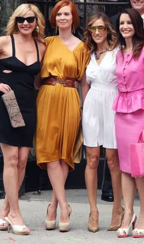
The "Sex and the City Part II" photo shoot

Here they are again, in part two of the movie. Their awkward and inelegant poses, their unattractive dresses exposing too much of themselves, their strange sense of color (blame it on the designer?) their listless hairstyles, and their forced smiles show the culmination of years of a TV show and a previous movie.

Their film lives also seems to spill over into their real ones.

Sarah Jessica Parker is undergoing tabloid-level scrutiny about the surrogate mother she and her husband (any longer?) decided to use. They already have a son, why not be happy with that?

Cynthia Dixon has become a lesbian, and is active in the California Proposition 8 scene.

Kim Cattrall, who is in her fifties, was dating a man decades younger than her, who also recently broke up with her.

Kristin Davies is perennially single, although she is pretty. But, her dark secret is that she is a recovering alcoholic.

So, needless to say, I won’t be watching Sex and the City Part II. I will probably buy a Vogue magazine if I want to look at pretty clothes and shoes.

Wednesday, October 21, 2009

"Fiesta Latina" in the Casa Blanca

And we all better learn Spanish

That was pretty much what the whole evening was like. Songs in Spanish, and hosts speaking English with Spanish added for effect. PBS replayed the "Fiesta Latina" that was hosted by the White House a few days ago in a special this evening.

Jennifer Lopez came out in a strange truncated dress to present her husband Mark Anthony. She talked in English, but added a few words in Spanish (with her Bronx Spanish accent), while Anthony sang in Spanish. Gloria Estefan sang "Mi Tierra," the song made famous when it was sent into space for the (Mexican) American crew member on the Discovery Shuttle. George Lopez made his customary jokes, which often deride his own ethnic group - the Mexicans. Obama danced with a gracious Latina star and Michelle was ungraciously miffed. Sotomayor was told she was loved, but no-one asked her to dance. And all this on PBS.

I watched the hour-long show to get a sense of this Hispanic presence in America. It is very large, and very deep. It really is a completely separate society. It was rather frightening.

If music and fiestas are the hallmark of Hispanics, then we're in for difficult times. I don't foresee any Frank Sinatras coming out of this group of Latino pop stars. But even Sinatra always sang in English, unlike the Bronx-born Anthony who, like his eccentric wife, would have us believe that he was born and raised in Puerto Rico. I bet Sinatra never gloated over his Italian roots, and if he did, he worked out a silent and dignified way to do it. Not so this group.

Sunday, October 18, 2009

Job's Beauty

In Blake's watercolors

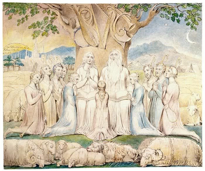
Job and His Family, William Blake

During my recent trip to New York City, I made a point of seeing William Blake's illustrations for The Book of Job at the Morgan Library. These are delicate, lovely watercolors which are nothing like the emptiness some would like to give that book. Perhaps that is the testament in Blake's watercolors, that Job's story is indeed one of beauty and redemption.

I have had many arguments about Job and his relationship to God. It is one of the most intriguing books in the Bible - more obscure and annoying (if I can say that of biblical stories) than the one about David's adultery and murder-by-proxy. Non-believers or quasi-believers, often rational and clever thinkers, will ultimately say that God was wrong. Of course, we as humans can question God's actions, and the hurt and anguish we suffer at times as His children. But, saying God is wrong is the easy way out. And that view ultimately helps these nominal/non Christians in their quest to distance themselves from God.

As I thought more about it, perhaps Job is the quintessential tale of our times. Every time I talk to a nominal (liberal?) Christian about some error I see in his approach to God's Word - not that I'm an expert, but there are a few times when I don't shirk criticizing - he is astonished at my criticism and says that he is a good person trying to do good things. Isn't that what Job was saying? But, of course being a biblical character, he seemed to understand this, and tried to correct whatever errors he thought he saw in his actions.

There are many phrases in the Bible that we can transform into our own self-serving sanctimonious interpretations: "love thy neighbour," "all things work together for good," "turn the other cheek." The piety can be endless. I think the final meaning in Job is to leave our relations with God in His hands, however obscure and paradoxical that may seem at times. Our freedom, and our ultimate joy, comes from this relinquishing. Even the too-holy can get condemned. That is the mystery of God.

Job found favor back with God. He accepted that favor. There are many these days whose disappointment and stubbornness alienate them further away God, who refuse to see the redemptive path in front of them, and who will forever say: "I was such a good person. Why has God forsaken me?"

Besides universalistic interpretations, there is as always a specific and historical context to all biblical stories, and surely with this story as well. I wonder what is the significance of having Job’s story at that particular time in the Bible. Was it then that men started to consider themselves on par with God and that they started taking themselves too seriously, thus undermining God? Is that the punishment God had to mete out in order for man (Job) to resume his reverence for God? What would (will) God do in our modern times? Just some points to ponder upon.

Wednesday, October 14, 2009

Hosta Repeats

From leaf to pattern

From this:

To this:

To this:

Tuesday, October 13, 2009

Why Does Oprah Cry On Air?

A little for the camera, and more for herself


Oprah seems to be going back to her sensationalism style of the 80s. This must mean that she's hard up for ratings. In fact, they have gone down since she disappointed all those women when she cast her support publicly and actively for Obama.

Well, I recently managed to catch the tail end of her interview with Mike Tyson, and thank God - who wants to go through a whole hour of the creepy man, with a tattoo across his face, no less. Tyson has just had a documentary about him, and supposedly was with Oprah to talk about this.

The part I caught has Oprah talking about hearing Mike Tyson say in the documentary how all he wanted was to live a better life, be a better person. Oprah said this made her cry.

Now, Oprah cries much more than expected. Ellen Degeneres, the Crown Princess of talk shows, hardly ever cries, except when it was to have a break down on air when her adopted dog was taken away from her. Martha Stewart never cries, but then her shows are sane, pleasant moments and often with beautiful things like her own flower arrangements.

As I've written in a previous post where she interviewed Whitney Housten, Oprah delves into the dark side of people, and has her moment when she makes them out to be weak and pathetic. This is something Whitney resisted during her time with Oprah.

Of course, the genuinely pathetic Tyson just loved all this, and the attention too, and broke down crying himself during Oprah's interview. I didn't get to watch this, but it is all over the internet.

Why does Oprah cry? I don't think she cries for the people she interviews. I really don't think she's an empathetic person. I actually think it is two layers of things going on: one is to make herself look good on T.V. – somewhat; and the other is that she's crying for herself. As I mentioned in the Whitney episode, I think these journeys and probings into the dark sides of people she interviews are really ways to understand her sad and violent childhood, something I think she has never gotten over, and something that she keeps returning to with her strange collection of guests. I think she cries to alleviate that pain. But she does so in this detached, unconnected manner, as though it is the little girl – distant and faded – who's crying. Hence, her crying looks a little forced, and disconnected from her guests or the stories she's portraying. Of course, being the narcissist she is, Oprah cries a little for the camera as well.

It is during these moments that I feel sorry for her, except that I resume my original view that she is the most dangerous woman in the media now, and needs to fight her own inner demons alone and away from the millions of impressionable viewers.

Monday, October 12, 2009

New Website in the Works

Update

I am remodeling my design website. Originally I had called it Kidist Designs, and it included graphic and other non-textile works. I am building up my portfolio, and this new website will feature just my textile and pattern work. Furthermore, I will change its name. Kidist Designs is too esoteric (although it has a lovely meaning, which is "blessed designs"). Still, I love the word "pattern" and the many meanings it holds, so I am working on a workable (and web-available) name that incorporates that word.

Kidist Designs in now non-functional.

Exquiste Design

All for a chair

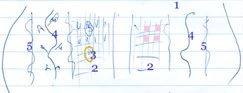
Below is a very rough sketch I did on my lined paper in blue ink as I was going through the Period Rooms (there is a very good summary at the link provided, including photographs) in the newly completed American Wing of the Metropolitan Museum of Art. The sketch is of the seat of an upholstered chair of the "neoclassical" period, and unfortunately I cannot find an image of it in the Met's vast online database.

I drew it because it characterized many things for me.

* Design, and fabric design, has always been about aesthetics, at times mere prettiness, at other times overwhelming luxury and sometimes just pure beauty.

* I felt going throughout the Period Rooms, which showcased about twenty rooms dating from the late seventeenth century to the early twentieth century, that people then had the confidence to design strong, beautiful pieces. Unlike our own period, whose gloomy designs I think begin around the 1970s - but more on that later.

* Craftsmanship was very important, but for the sake of constructing a harmonious, coherent piece.

* Color, intricate designs, patterns and other ornamentations were always present. There was hardly ever a "plain" chair, and if it existed, it was embellished by careful caning and weaving or luxurious materials like velvet.

* Looking at these rooms, there was nothing repellent about them, nothing "edgy." They were meant to be lived in, to be admired, and to be sources of pride for their owners.

Sketch of the upholstered seat of a "neoclassical" chair of the late eighteenth century.

This small chair, hidden in a side room besides the "neoclassical" section, got my attention right away. This was a chair that was certainly not kept as a piece of art, but merely as a household furniture to keep a person comfortably seated, a person who probably only briefly glanced at it before sitting down. Yet so much attention was paid its design.

There are several design elements going on at once in the upholstery:

1. The background color of the upholstery is a creamy, ivory white.

2. There is a checkered pattern near the middle – where alternate squares are colored in pale pink so the overall middle section is dominated by this pale pink.

3. The outlines of gold flowers were embroidered on top of these checkers.

4. Realistic vines and leaves, were embroidered in the spaces to the right and left of the checkers, in variations of greens and browns – adding shading and texture to the vines and leaves.

5. On either side of the vines, were curved lines, embroidered again in gold.

6. The stripes were all done in greyish/silver to offset against the ivory white of the background.

So there was a mixture of: stylized flowers and realistic vines with leaves; straight and curved lines; and checkered squares filled alternately with delicate color. Such rich design, done with the utmost delicacy to harmonize everything together on a seat!

Of course this all didn’t come out of nowhere. In the room adjacent to this exquisite chair – notwithstanding my inadequate sketch! – two of the big three 18th century furniture designers’ books were cited:

George Hepplewhite’s Cabinet-maker and upholsterer’s guide (1788)
Thomas Sheraton’s Cabinet-maker and upholsterer’s drawing book (1793)

The third big name was Thomas Chippendale.

Friday, October 9, 2009

Vermeer's Light and Movement

A precursor to cinema?

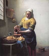
The Milkmaid, 1657–58

At one point, Vermeer was my favorite painter. I still think he's magnificent - although that is not really the word used to describe the quiet and almost serene paintings.

I was able to see The Milk Maid at the Metropolitan Museum of Art in New York. The painting was on loan from Holland's Rijksmuseum, to commemorate the 400th anniversary of Henry Hudson's voyage from Amsterdam to Manhattan. The museum's other five paintings by Vermeer were also on display, as well as paintings by Dutch artists who were contemporaries of Vermeer.

I won't say much about this painting, since I really had a just few minutes (maybe three) in front of it, since the gallery was so crowded. So, I will only write of my impressions.

As always, with Vermeer, I am struck by the light surrounding many of his subjects. This is a diffuse, all-over light, which illuminates them delicately, unlike the dramatic flashes that Rembrandt uses. Another thing that strikes me about these paintings (portraits, more like) is that they almost appear as though the subjects are moving, but not just performing their task, but moving (or about to move) their heads as though in contemplation. The milk maid stands with her jug ready to pour the milk, but at the same time, she could turn her head to look out of the window maybe to look for someone, or wishing she were outside.

I have done two pieces on Vermeer. One is an article, which I wrote sometime in 2006 (unpublished) which I called Vermeer's Discerning Light, an expository piece on this diffuse, gently illuminating light that Vermeer uses. You can read it hear.

The other is a short animation I did of The Lacemaker, again partly a contemplative piece, and partly a piece about this lacemaker’s task (although in the final version, I opted not to include movements of her hands working on the lace). The animation was done with Photoshop, then in a film editing software called Premier.

The Lacemaker, 2000

So, light and movement - a precursor to cinema, all those centuries ago.

Thursday, October 8, 2009

Two Mountain Ranges

In one trip

I made a mistake a couple of days ago when I said I traveled through the Adirondack mountains. I did travel through two mountain ranges, one was the Pocono, the other was the Allegheny, which is north of the Pocono, but south of the Adirondack, cutting through both Pennsylvania and New York State. The Adirondacks are much further up north New York State.

Here are maps of the mountain ranges, and one of my trip's route, which I've marked in red. I like looking at maps when I travel, it gives me a sense of a place - both orientation-wise and the geography around the place. I can also see cities and towns in relation to one another. Unfortunately, for this bus ride, I had no map, and was craning my neck to see signs of towns and cities as they passed by me.

The Pocono Mountains, and the Allegheny in Pennsylvania
[Click image to see larger map]

The Allegheny Plateau (or Mountains) in New York, and the Adirondacks
[Click image to see larger map]

Route from New York City to Toronto, stopping at Binghamton, Syracuse, Rochester, and Buffalo
[Click image to see larger map]

Tuesday, October 6, 2009

Burke's Wisdom

The Evils of Revolution

Edmund Burke wrote an extraordinary book titled A Philosophical Enquiry into the Origin of Our Ideas of the Sublime and Beautiful which I was quite taken by, and which I will discuss sometime in the future. Burke wrote it at nineteen years of age. I found this book looking for his seminal Reflections On The French Revolution. I'm slowly working my way through this, but just before I set off on my trip, I found Penguin’s 84-page selection from Reflections On The French Revolution which is titled: The Evils of Revolution. The longer title on this booklet includes this prescient phrase: "What is liberty without wisdom, and without virtue? It is the greatest of all possible evils," which is a quote from Reflections.

There is much to quote from this tiny book, which is just a preliminary for getting into the real thing. Here are just a few:

About the wrong, and destructive, types of leaders:
Compute your gains: see what is got by those extravagant and presumptuous speculations which have taught your leaders to despise all their predecessors, and all their contemporaries, and even to despise themselves, until the moment in which they became truly despicable.
On leaders:
There is no qualification for government, but virtue and wisdom, actual or presumptive. Wherever they are actually found, they have, in whatever state, condition, profession or trade, the passport of Heaven to human place and honour.
On revolutions:
The worst of these politics of revolution is this; they temper and harden the breast, in order to prepare it for the desperate strokes which are sometimes used in extreme occasions...This sort of people are so taken up with their theories about the rights of man, that they have totally forgot his nature.
On religion and Christianity:
We know, and it is our pride to know, that man is by his constitution a religious animal; that atheism is against, not only our reason but our instincts; that it cannot prevail long.

Monday, October 5, 2009

Mountain Views

My trip to New York took me through the Adirondack and the Pocono Mountains. Here are just a few shots I took of those spectacular views. Fall must be the crowning glory of those mountains.

More posts to follow on the trip.