Monday, May 29, 2006

Lilac Memories

An early intuition


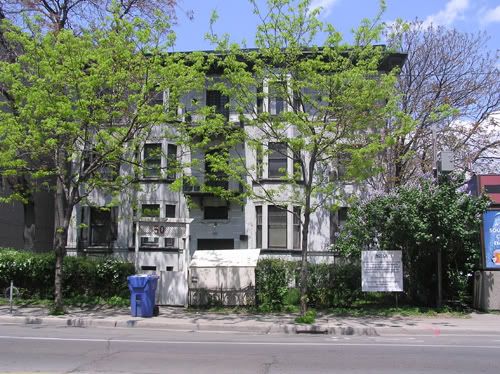
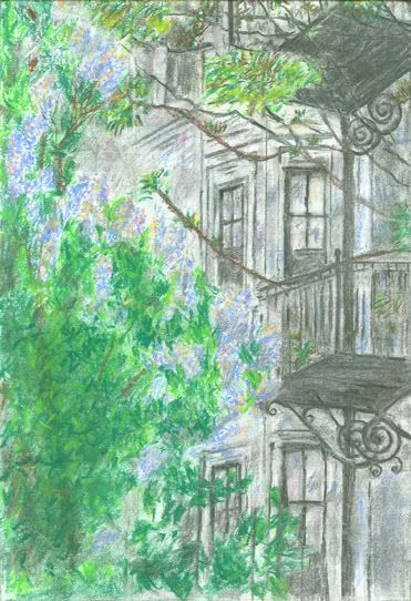
I was struck by this beautiful stone house late last spring. There were a lot of contrasts that attracted me: the light grey walls with the dark outlines around the windows, the lilac bush's spontaneity and curvature alongside the rigid architecture of the building, the swirls under the balconies contrasted with the railings. Besides, it looked like a great study on dark charcoal drawing against a more colorful pastel palette.

After taking numerous photos, at various angles, I managed to come up with this cropping that seemed to work.


Here is the end result.


Yet, this year, while I walked along the street (Gerrard Street, just blocks away from Yonge), I came to this shocking discovery! The house was being demolished. And the beautiful lilac trees were gone.


I guess you can call it an early intuition. But, I'm very glad I took the time to make some kind of recorded memory of this understatedly beautiful house and its lovely lilac trees.

Makes one wonder though, who gets to decide which building stays, and which one goes. I assume that the empty space will soon be filled by a bland high rise.

Thursday, May 25, 2006

Lilac

Temptations

[Photo by Camera Lucida]

Lilacs are the flowers of late May and early June. It is tempting to pick them from the road-side and park bushes. But, I will settle for photos instead.


Monday, May 22, 2006

History Repeats Itself

How Islam is making a stealthy comeback


The Beautiful Byzantine Hagia Sophia, now under Muslim Turkey. Notice the Arabic calligraphy depicting sections of the Koran

Hagia Sophia is one of the most important, and earliest of the Christian churches. It was originally built during the 4th century in Constantinople – albeit burnt down and rebuilt in the 6th . When Muslim Turks conquered Constantinople, not only did they change the city’s name to Istanbul, but also converted this great church into a mosque.

Although now Hagia Sophia is a museum, there are some eerie reminders that it still really is in Muslim hands, especially with those discs of calligraphy in Arabic script scattered around.

This occurred in 1453. Yet, right under the eyes of European Catholics, Muslims are converting churches into mosques.

In Belgium now, illegal immigrants, with the blessings of Catholic bishops, are seeking refuge in churches.

But not only that, they are converting those churches into mosques.

At least the Byzantines put up a fight. When will the Catholic bishops realize their supreme error?

Monday, May 15, 2006

Is the Governor General Haitian or Canadian?

Her Quick Trip Back to Haiti

Michaelle Jean, the Governor General who should really be occupying a behind-the-scenes role, is in the news yet again.

In a world full of symbolic reminders (her exact words are "we live in a world that needs symbols”), she is returning to the country she fled, to attend the inauguration of the new Haitian President.

She also says: “Sometimes symbols change things".

I wonder if that is her goal for Canada? By changing Canada’s symbols, is she trying to change Canada too?

Perhaps, people’s motives really are subconscious. Here is the Coat of Arms she presented for her governor generalship. Almost all the symbolisms are Haitian, from the false goddesses to the reference to the black slave. And our coast to coast to coast has now also included the Caribbean – in Jean's best of all possible worlds.


Thursday, May 11, 2006

Chicken Soup

Andy Warhol’s Clever Canning of the Human Condition


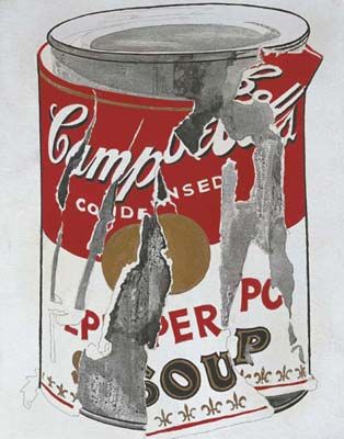
(Andy Warhol's Small Torn Campbell's Soup Can (Pepper Pot), 1962 sells at $11.8 million at yesterday's Christie's auction house.)

Behind every modern artist is a (once) dedicated illustrator. In fact, Warhol started out making advertisements for I. Miller shoes and Christmas cards for Tiffany’s and Co. before he became famous with his commercial-laden Campbell’s soup cans.

His Small Torn Campbell’s Soup Can (Pepper Pot) is perhaps one of his most painterly renditions of that infamous can. Unlike his regimented, streamlined and silk screened representations from photographs of famous stars and other figures, his Small Torn Campbell's Soup Can has a personal, and delicate touch. He used pencil and paintbrush in this case.

Ironically, although for Warhol it must have been a deliberate irony, his iconic illustrations became paramount advertisements for himself, making him rich and famous.


Saturday, April 29, 2006

In Search of Truth

Documentaries and Artistic Licence

Our infamous [1, 2] Governor General is in the news again. Her husband and cohort has entered a documentary film at the now internationally acclaimed annual Hot Docs Festival (of documentary films) held in Toronto.

The problem is, Jean Daniel Lafond's film “American Fugitive: The Truth About Hassan” is raising eye-brows for his portrayal of an American assassin who killed the former Shah of Iran’s press attaché in 1980, and who is now a fugitive living in Iran.

Lafond's film includes speculations that the Carter administration allowed the assassination to occur in order to gain favors from the Iranian government in the release of the American hostages, and that Reagan’s campain team asked to delay the release of these hostages to ensure Reagan's presidency.

Well, conspiracy theories are a dime a dozen. But, if it hadn’t been for the role that Lafond plays in Canadian politics, his film would have suffered the same obscure fate.

Film critic Brian D. Johnson interviews Lafond in MacLeans magazine, and here is a pertinent and interesting quote from that interview, in which Lafond thinks of himself as a protected, self-appointed artist.

"I'm a filmmaker, someone who treats discourse in an artistic manner and puts it up for debate. It's not up to me to answer the question. I'm not an investigative journalist. I don't want to be a journalist. I'm someone who gives voice to what's being said and challenges it. I'm a spectator working with the same moral offered by Spinoza in the quote at the start of the film: "Neither laugh nor cry, but understand."


Here are some simple dictionary definitions:

doc·u·men·ta·ry, adj.
Consisting of, concerning, or based on documents.
Presenting facts objectively without editorializing or inserting fictional matter, as in a book or film.


fic·tion, n.
1.
a. An imaginative creation or a pretense that does not represent actuality but has been invented.
b. The act of inventing such a creation or pretense.

2. A lie.

3.
a. A literary work whose content is produced by the imagination and is not necessarily based on fact.
b. The category of literature comprising works of this kind, including novels and short stories.

4. Law. Something untrue that is intentionally represented as true by the narrator..


Upon reading the interview, it seems as thought Lafond is following the definition of fiction more than documentary. This is well and good, but if only he would admit it.


Wednesday, April 26, 2006

What's in a Logo?

When Diversity Weakens Design

There are many immigrant services agencies around Toronto. One of the most famous is an organization called COSTI. It was originally founded in the 1950s for Italian immigrants, mostly to help them with trades-related employment.

It has since grown to accommodate any current immigrant that enters Toronto.

Recently, the organization updated its website, and even changed its logo.


Original COSTI logo

Its original logo, obviously meant to represent the colors of the Italian flag, was much more dynamic and effective. It had three colors (red, green and usually a tan background rather than pure white), and a subtle symbolism with the red line indicating a path , leading the new immigrant into their new society. Its colors, concepts and message was, ironically, more diverse than the new logo.


New COSTI logo

The new logo has a two color scheme: a bland white background and an indeterminate (is it green, turquoise or blue?) logo. Thin, awkward lines resembling the skeleton of a not very stable umbrella embrace the diversity that COSTI is now meant to represent. Rather than indicating a path of integration as the original red line implies, this broken skeleton of an umbrella suggests instead that these diverse newcomers remain under a separate, unified ghetto, rather than seek the manifold opportunities of an open society. And not only that, but that their shelter is not stable or protective.

Diversity, in this case, means a badly designed logo, a paucity of colors and mixed (or even incompatible – for the new immigrant) messages. Diversity becomes enclosure - a lack of diversity.

The proud Italians at least understood that their bold colors would get them into their new society. Whereas this new diversity seems to prefer that its members remain in the bland, broken and unstable boundaries of its own making.

My humble advice to COSTI would have been: do not change the logo. The Italians have left a mark in Toronto. Their success can only serve as a role model for future immigrants. Just the bold confidence of the original logo's design would have conveyed that!

But, I'm afraid in these days of diluted diversity, COSTI deliberately sought just the kind of logo they got.