Friday, December 22, 2006

The Diamond Receptacle

Intermediary between folk and fine art

Ethiopian fine art history consists entirely of religious art. Any non-religious art is the result of very recent modern-day art training and art schools.
But, there is an equally strong folk art history of textiles. I think, at its peak, textile/folk art reached the level of art. This is especially visible in the embroidery of dresses and shawls.
The word for embroidery is "tilet". For art it is "tibeb" – Fine Art being "Sine Tibeb". These borders go both by "tilet" and "tibeb". Somehow, the designers have found a term that would describe these borders both as a folk art (tilet) and as an intermediary between folk and fine art (tibeb). This is a clever nomenclature. I think English terminology could make more use of this.
Now for the embroidery. As Albers found through intense and life-long experimentation, these borders did indeed find a receptacle for art to permeate into the wider society. The primary shape that contained these colors is the diamond, rather then Albers' square.
Here is the example of the border. I will try to analyze it briefly.


First -

There are four diamond shaped colors as part of the overall theme: purple, yellow, red and green.
The first and second rows are the same colors, but flipped. Purple is substituted for yellow, red for green.
These two rows are then repeated for the rest of the design.
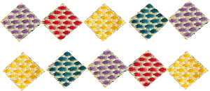

In color terms, purple and yellow are opposites, red and green are opposites. So at the very initial design stage in choosing the colors, the designer made a clear aesthetic decision.


Second
Vertically, the colors have been juxtaposed with their opposing partner – purple with yellow, red with green.
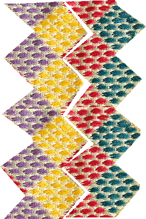


But, to make the design more interesting, each vertical combination was flipped, and joined in rows. Purple-yellow-red-green links with Yellow-purple-green-red.
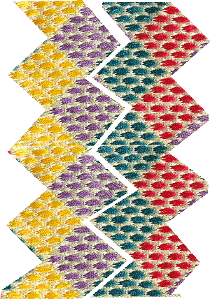
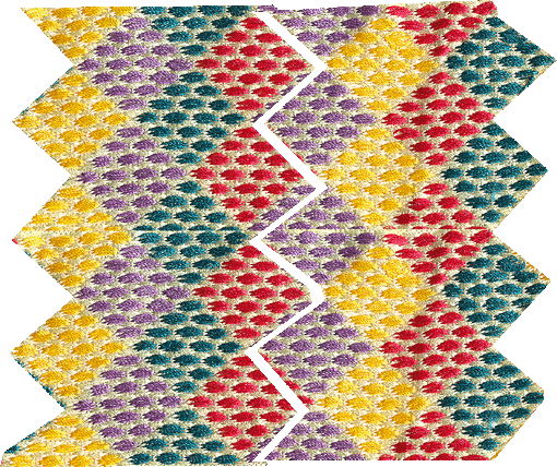


As complicated as even these four color combinations manage to be, it is in the initial step, where the individual colors were chosen and placed, where this more complicated design becomes possible.

Third
The eye starts to pick up pockets of color where the diamonds have joined making larger diamonds.
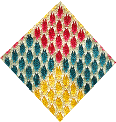
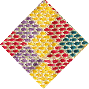


So there is a horizontal, vertical and shape-influenced reading of the design.

Fourth
The perennial cross shape is clearly decipherable within the design.
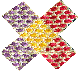


Fifth -
How do the viewers/wearers interact with this "tibeb"?
Well, as mentioned above, they pick up on the various shapes and juxtapositions – vertical and horizontal lines, and diamond and cross shapes.
Also, the shawls are not worn in one position. Draping the cloth and the embroidery across the shoulders and around the back allows for the embroidery to be viewed straight across, at an angle, and moving with the person’s body.
Thus it would seem that the shapes, colors and lines are always fluctuating.
So this diamond shape seen at one angle can look quite different at other angles.
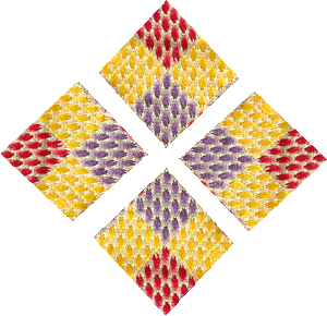


Most importantly, the colors which are doing all this enunciation of shape line and direction also play a separate and independent part.
Yellow is pulled brightly forward, green is more subdued and stays in the background, red is less forceful than yellow, and purple isn't as passive as green.


Albers' idea of interacting the "viewer" with the art has gone a step further with this embroidered shawl.
Since the piece is not static, motion, direction of wear, even body size and shape, will all influence the viewer. The initial color choices, with their clever use of color dynamics and juxtapositions act as the important base for the work. The rest is completed by the human body and the human eye.
I wonder what Albers would have made of this subtle work of art?
Thursday, December 21, 2006

Folk and Fine Art

Albers as choice leader

Color as a predominant element in most folk art. The irony is that what is considered the most sophisticated of the arts - the Fine Arts - started to adopt that idea in the 20th century.

Albers, for all his pedagogy and experimentation, is really a Fine (and fine) artist.

But, Albert was always trying to externalize his work and relate it directly to his viewers/audience/the community at large, and keep it within the outside world.

This is not entirely Albers’ conception – all art is really about trying to connect to the outside world some inner realm (usually spiritual). But I think Albers put it to another level, where he tries to make the audience do more of the imaginative work.

A pieta by a renaissance artist already has the story complete in the painting. The audience is expected to appreciate a new rendition of an ancient theme, but his vision is locked in the vision of the artist.

I think Albers tried unlock this method. His strategy was to leave representation out of his art, and instead find a receptacle from which he could unleash his audience’s imagination.

The square worked wonderfully because all people could concentrate on was the colors, and their interactions. And each individual can “fill in the gaps”. Red and green does what? Blue surrounded by yellow evokes what? Each person can fill in his own experience. Each person can make art, in a way.

Now, I don’t really think this is the best way to go for Fine Art, since the onus for the masterpiece is on the artists, and a common viewer can never achieve that level of perfection. But for 20th century artists, in their communal viewpoint, it was crucial to their art.

So, what of folk art and Albers? Well the purpose of folk art is really to involve rhe whole community. Everyone gets to dance, everyone gets to wear the clothes, everyone gets to paint the house.

Everyone participates. With a few choice leaders, of course. Which is the role that Albers has been trying to take all his life.

Still, for all his attempt at popularity, Albers remains in the tradition of the Fine Artists whose work is influenced by their more mundane.


Saturday, December 9, 2006

Color within Form

Study of Josef Albers' Design Strategy 

Josef Albers used his “Homage to the Square” series to try to contain color in form, but to keep color the center of attention.

A tree painted in saturated and vibrant colors will still be a painting of a tree, irrespective of the strength and force of the colors. Thus, form takes precedence over color.

Albers managed to side-step this difficulty of form almost always overriding color by making the most basic of forms, the square, the container of color.

There is no pronounced visual, psychological, cultural, contextual meaning attached to the square. It is just a square.

Thus, Albers put his juxtaposition of colors in this square (or nested squares) to get us to concentrate on color instead.

No randomness, no abstraction and no alien shapes and elements. A simple form of a square saturated with color.

But, what was his intention?

His response, as all artists will have a reason as to why they do things, is that he wanted people to interact with these colors in their own time, and in their own way.

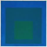
How does an outer dark blue square interact with a nested bright green one? How about the an outer-most square of a brighter blue and its relationship with both these nested squares?


Study for Homage to the Square: Beaming 1963

[The squares] move forth and back, in and out, and grow up and down and near and far, as well as enlarged and diminished. All this, to proclaim color autonomy as a means of plastic organization.'
Josef Albers


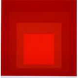
Homage to the Square: MMA-2, 1970


Tuesday, December 5, 2006

Visual Experience

In NYC


Josef Albers, Hommage to the Square, 1963

I took advantage of my recent trip into New York City to upgrade my visual vocabulary, or at least my visual experience.

Besides realizing the greatness of New York architecture, there was a lot to see.

The Metropolitan had the Weimar Republic German artists do their rendition of that decaying society. But, one can see their supreme (for lack of a better word) talent when viewing their drawings. I believe it is the drawing that makes the artist, and these ones are no exception.

Since the theme was German (well, I also got to see the Tiffany estate collection, the American Painters in Paris and Sean Scully’s Wall of Light - more of a patchwork colorist - I went to the nearby Whitney to see the exhibition on the Bauhaus designers Josef Albers and Moholy-Nagy. These were the artists that were eventually kicked out of Germany by the Nazis.

Albers experimented with color extensively. His deceptively simple squares are really an attempt to put color, and our interactions with color, to the forefront.

I think he succeeded both experimentally and in a small, genius sort of way, artistically.

I am working on another blog entry called “Albers and the Abyssinians”. Another charming genius creation, which I’m sure Albers would have appreciated.


Friday, November 10, 2006

Ode to Cathedrals

Jacques Brel's Poetry

Here is some Jacques Brel, to enjoy reading and to listen to.
Audio/Video of Le Plat Pays.


Le Plat Pays

Avec la mer du Nord pour dernier terrain vague
Et les vagues de dunes pour arrêter les vagues
Et de vagues rochers que les marées dépassent
Et qui ont à jamais le cœur à marée basse
Avec infiniment de brumes à venir
Avec le vent de l'ouest écoutez le tenir
Le plat pays qui est le mien

Avec des cathédrales pour uniques montagnes
Et de noirs clochers comme mâts de cocagne
Où des diables en pierre décrochent les nuages
Avec le fil des jours pour unique voyage
Et des chemins de pluie pour unique bonsoir
Avec le vent d'est écoutez le vouloir
Le plat pays qui est le mien

Avec un ciel si bas qu'un canal s'est perdu
Avec un ciel si bas qu'il fait l'humilité
Avec un ciel si gris qu'un canal s'est penduvAvec un ciel si gris qu'il faut lui pardonner
Avec le vent du nord qui vient s'écarteler
Avec le vent du nord écoutez le craquer
Le plat pays qui est le mien

Avec de l'Italie qui descendrait l'Escaut
Avec Frida la blonde quand elle devient Margot
Quand les fils de Novembre nous reviennent en Mai
Quand la plaine est fumante et tremble sous Juillet
Quand le vent est au rire, quand le vent est au blé
Quand le vent est au sud, écoutez le chanter
Le plat pays qui est le mien


The Flat Country

With the North Sea for the last bit of waste land
And the waves of dunes to stop the waves
And the shapeless rocks that the tides pass over
And who forever have their heart at low tide
With an infinity of mists still to come
With the wind from the west listen to it hold
The flat country that is mine

With cathedrals for its only mountains
And black church towers for greasy poles
Where devils in stone unhook the clouds
With the passing of the days for the only journey
And roads of rain for the only good evening
With the wind from the east listen to it want
The flat country that is mine

With a sky so low that a canal lost itself
With a sky so low that it acts humiliated
With a sky so gray that a canal hung itself
With a sky so gray that you just have to forgive it
With the wind from the north that comes tearing itself through
With the wind from the north listen to it break
The flat country that is mine

With a little of Italy which will climb down the Escaut
With Frida the blond when she becomes Margot
When the sons of November return to us in May
When the plain is steaming and trembles under July
When the wind is for laughter, when the wind is for the wheat
When the wind is from the south, listen to it sing
The flat country that is mine


Wednesday, October 25, 2006

Warhol's Universe

Mastery over the stars


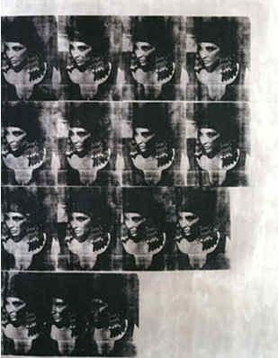
Andy Warhol, Silver Liz as Cleopatra, 1963
Silver paint, silk-screen ink and pencil on linen


The small but effective Andy Warhol Supernova: Stars, Deaths and Disasters exhibit at the Art Gallery of Ontario ended just after I got a chance to visit it. There were a few bonuses for this delay, including a free audio device with commentary by David Cronenberg, who acted as guest curator.

Warhol was a savvy promoter. He did work as a graphic illustrator for various agencies before becoming "an artist." The medium he eventually settled on, silk-screening, avoids all the meticulousness and time required for painting or drawing. And unlike photography, there is no attempt at continuously and obsessively trying to get the perfect image.

One of the things that always struck me about Warhol's silk-screens was how his images started off grid-like and relatively unblemished, with each image squeegeed with more-or-less the same amount ink. Then, progressively near the end, they are full of smears and overlaps.

My only conclusion was that he wants to degenerate his subjects, destroy them. Not only that, he wants to destroy the "work" altogether. I think that his lazy and controlling nature spawned this proclivity for destruction. Since he cannot make a masterpiece, he may as well dramatize his incompetence by destroying it. I've noticed such a tendency toward degeneration by many "artists" who have forfeited mastery and skill for self-expression, which eventually portrays itself as outrage and destruction.

Warhol's unimpassioned car crashes and race riots silk-screens are really a camouflage for his real interest – his desire to control creation and destruction all at once. He cannot be those Hollywood stars, so he may as well create, then destroy them, from his alternate Hollywood in his New York art studios.

It seems his whole being was infused in finding his own star. He certainly found something, albeit longer than the fifteen minutes he predicted for everyone else. But then, he was always a savvy self-promoter.


Saturday, September 30, 2006

Warhol's Icons

Heeding the warnings of Byzantine Emperors


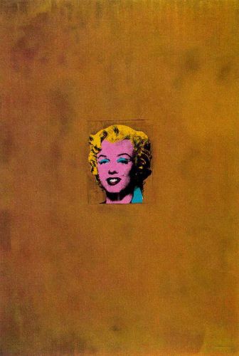
Golden Marilyn, 1962

I've been busy these past few days, with visitors and also updating my website and completing a design study. I'll be posting on those soon.

Meanwhile, a lot has been going on. The Pope initiated a scholarly dialogue about Islam, and has had to make some amends with public relations meetings with Muslim leaders.

He quoted a Byzantine Emperor’s interaction with a Persian scholar, on the nature of Mohammed.

An exhibition entitled Andy Warhol / Supernova Stars, Deaths and Disasters is currently on show at the Art Gallery of Ontario.

Now, there is a connection somewhere, which I will try to elaborate in a later blog entry and possibly an essay.

Mainly, that Warhol, who was Byzantine Catholic, produced some very iconic-like works which are reminiscent of the Byzantine religious imagery.

If the Byzantine Emperor were to see Warhol’s imagery, given that his Empire went through the infamous Iconoclastic period where icons were destroyed following the 10th commandment’s ordinance against worshiping graven images:


Exodus 20:4-5
4 Thou shalt not make unto thee any graven image, or any likeness of any thing that is in heaven above, or that is in the earth beneath, or that is in the water under the earth.
5 Thou shalt not bow down thyself to them, nor serve them


I wonder what he would think of Warhol’s art? And does art like Warhol put Christian civilizations at risk for the kind of Islamic invasions the Byzantine Emperor was describing?

The whole of Warhol’s life, and not just his art, appears to be forsaking these very Biblical verses. He made iconic images of famous stars and people who were the subject of admiration, at the very least, by great numbers of people, including himself.