 |  |
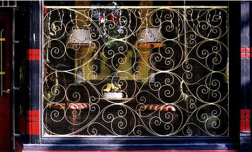
The photo on the right is titled: "Beautiful security, Queen Street East, Toronto."
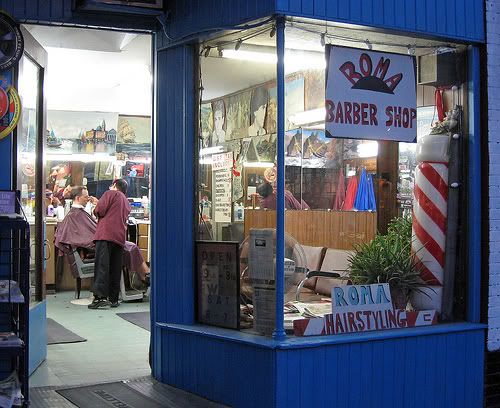
The photo on the left could be any barbershop in a more modest neighborhood in Toronto (many barbers are Italian). The barber has taken the time with make-shift signs, and painted the exterior a dynamic blue. Even the interior walls are filled with paintings and drawings, giving the store a personal touch
[click on the photos to see larger images]
-------------------------------
There is a long tradition of adorning shop windows so they reflect the business or the trade that they front. Some settle for simple decorations, others go for the more ornate.
But, there is nothing more depressing than a shop which makes no effort on its windows, not just to attract shoppers, but to brighten up its space by the sidewalk.
I think shopkeepers make this effort when they feel they are part of the street, part of that community and the neighborhood. This way, they show some pride and care in their store, which after all is an extention of themselves.
These days, there are an infinite number of convenience stores which have sprung up at every corner of every street (well, that's what it feels like). Its owners are often silent Asians, many Koreans and Chinese, who don't go through the preliminary greetings, and often don't even to call out the price of the item as they ring it in.
Of course, part of this is their lack of English. But, I've experienced this with those more fluent. It is as though the shop is just a storage place for the goods they are to sell, which will bring them the income they need. Everything else is secondary.
Not only is this attitude visible in their shop exteriors, but often the interior is a heap of articles in narrow passageways, which simply encourages the shopper to get the item and leave as quickly as possible
