 |
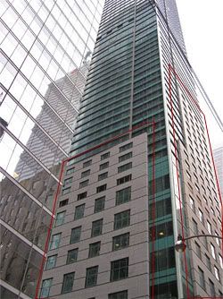
structure of the Toronto Trump building.
I've outlined the facades in red.
 |
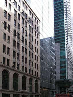 |
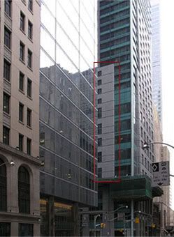
Bay-Adelaide Centre, which is a glass
highrise using the 1920s National Building
facade
Describing the buildings on Adelaide Street, I also mentioned the Trump highrise, where I wrote:
Around the corner from the building is the new Trump International Hotel and Tower, the reason I went in that neighborhood in the first place...It is the usual, glass-heavy, post-modern architecture that is sprouting all over major cities these days, but has none of the beauty and, I think, lasting power, of the older skyscrapers like the Concourse building. The Bell Canada building looks like it was the bridge between the "old" skyscraper age and our new one. Glass and marble are not cheap and they are hard to carve and decorate. So many current buildings are left plain. And it is as thought the expense of the material is enough to throw out ornament.Wikipedia describes the Trump building as:
[A] 65-story (57 occupiable floors)[tower which is] 276.9 meters (908 feet) tall and is clad with a steel, glass, and stone facade.Trump cleverly uses many elements to make his building "fit" in the Bay-Adelaide neighborhood, including the glass and steel with a stone facade, and decorative mosaic.
Here's how I think he achieved that:
- Trump's building is steps away from the famous Toronto landmark, the Mies van der Rohe's Dominion Centre, which uses steel and tinted glass much more aesthetically (although austerely). I asked the bustling attendant in the Trump hotel if the green color on the glass is the tint on the glass, or shades. She answered that it is a tint, a one-way tint to be exact. The van der Rohe building has no residential sections and tinted bronze glass works there. Besides, the bronzed glass is much more attractive than the opaque green used on the Trump windows. So, whatever happened to elegant curtains and drapes?
- The glass highrise right next to the Trump building, the Bay-Adelaide Centre, demonstrates perfectly how unaesthetic glass facades are, (although the architects tried to overcome that by placing the building on top of another legacy building, the 1920s National Building). Trump positioned his building (perhaps it wasn't deliberate, but the effect is the same) next to this insipid building, which would make anything look attractive, including the Trump tower's uninspiring design.
- The stone facade resemble bathroom tiles, like the nearby I. M. Pei building. But Trump's "tiles" are less rigidly placed, and are combined with other elements, to make his building more interesting.
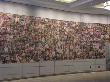
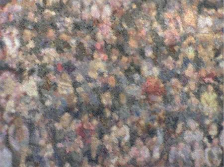
- The mosaic is a blurry rendition of a crowd. The informative attendant in front of the building told me that the designer is Stephen Andrews, and that the crowd is from photographs of audiences in the Air Canada Centre and the Roy Thomson Hall ("watching us"). He called it a multicultural piece, although I gently told him that concert hall audiences are hardly multicultural, and there are no "multicultural" faces in the panel. I think he was just repeating what he had been told (to say) by his superiors.
I think Trump (or his designers) took the idea of a mosaic from the nearby Wilson mural, which although abstract in nature, has recognizable images embedded in the works. Andrew's is one big lump of blurry, faceless, pinkish heads.
 |
 |
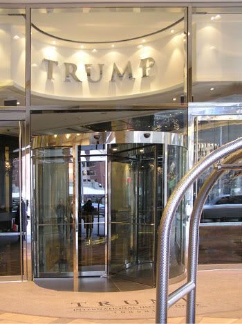
- Trump tried to jazz up the entrance of the building with shiny steel framed doorways, Italian marble in the ceiling of the reception area, and walls of dark onyx. A back wall is adorned with a crude rendition of branches, encrusted with coarse crystals from the Czech Republic (as a pleasant receptionist told me. I'm impressed by how much the ordinary staff know about the hotel!).
- Although marble, guild and chandeliers are part of the older hotels and buildings in the neighborhood, they are more discreetly and artistically incorporated into the designs. The historical One King West, again not far from the Trump building, is a hotel and residential complex where Trump might have got his inspiration from, but without the classic (and I think, enduring) effect.
Rather than a classy hotel, what comes across in Trump Toronto is a gaudy and ostentatious building, where the underlying factor is "money, money, money, moneeeeee."
Still, let me give Trump (or his architects and designers) some credit. I took this photo of the hotel's entrance because I liked the curving lines of the steel frames on the building and the luggage dolly, the shiny reflections on the light marble. These elements combined got my attention briefly to take not a documentary picture, but attempt an artistic one.
 |
[All photos by KPA]